Wireless Factory
Isleworth, London
Reimagining an old radio parts factory in Isleworth as a design-led workspace, crafting a nostalgic brand identity and stylish interiors to attract creative tenants. From typographic glazing to interactive maps and a photo-ready show suite, The Wireless Factory was a bold workspace campus for this hidden West London gem.
Brand Identity, print, glazing decals, signage & wayfinding, interior styling and procurement
.jpg)
.jpg)

.jpg)





A commission to mastermind the brand identity and show suite interior design for a new creative workspace hub. After purchasing a business park in leafy West London, the client Dunmoore got to work on big plans for the site and brought us in to help them re-invent it as The Wireless Factory.
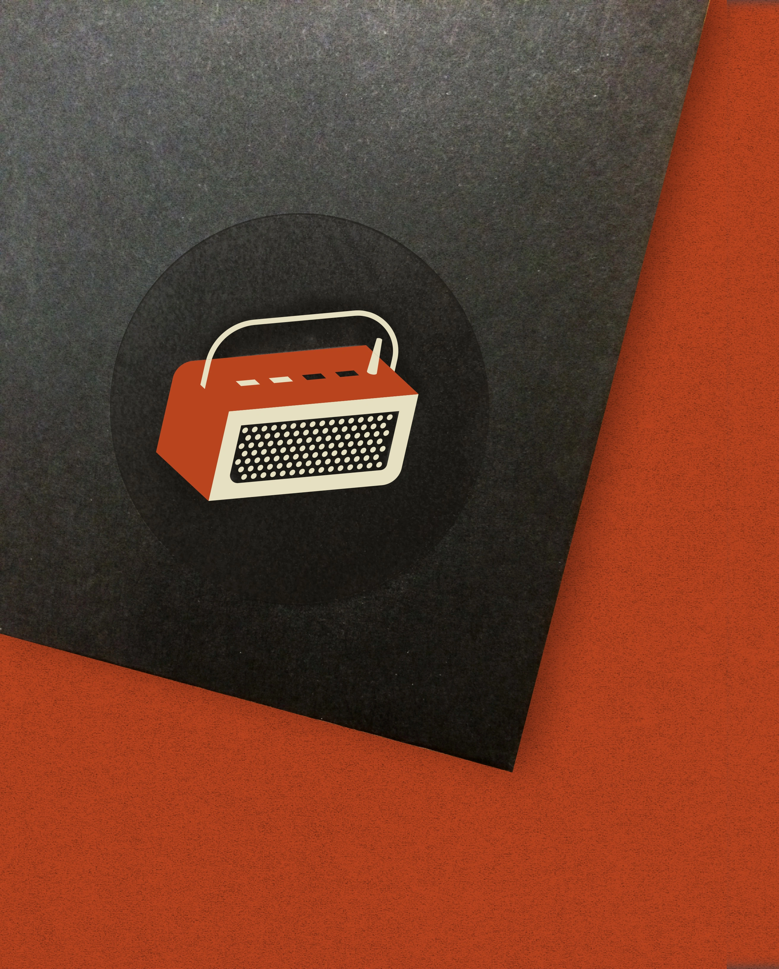
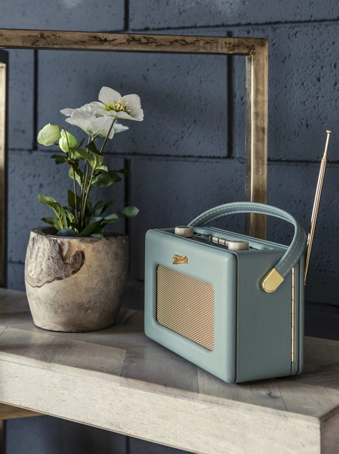
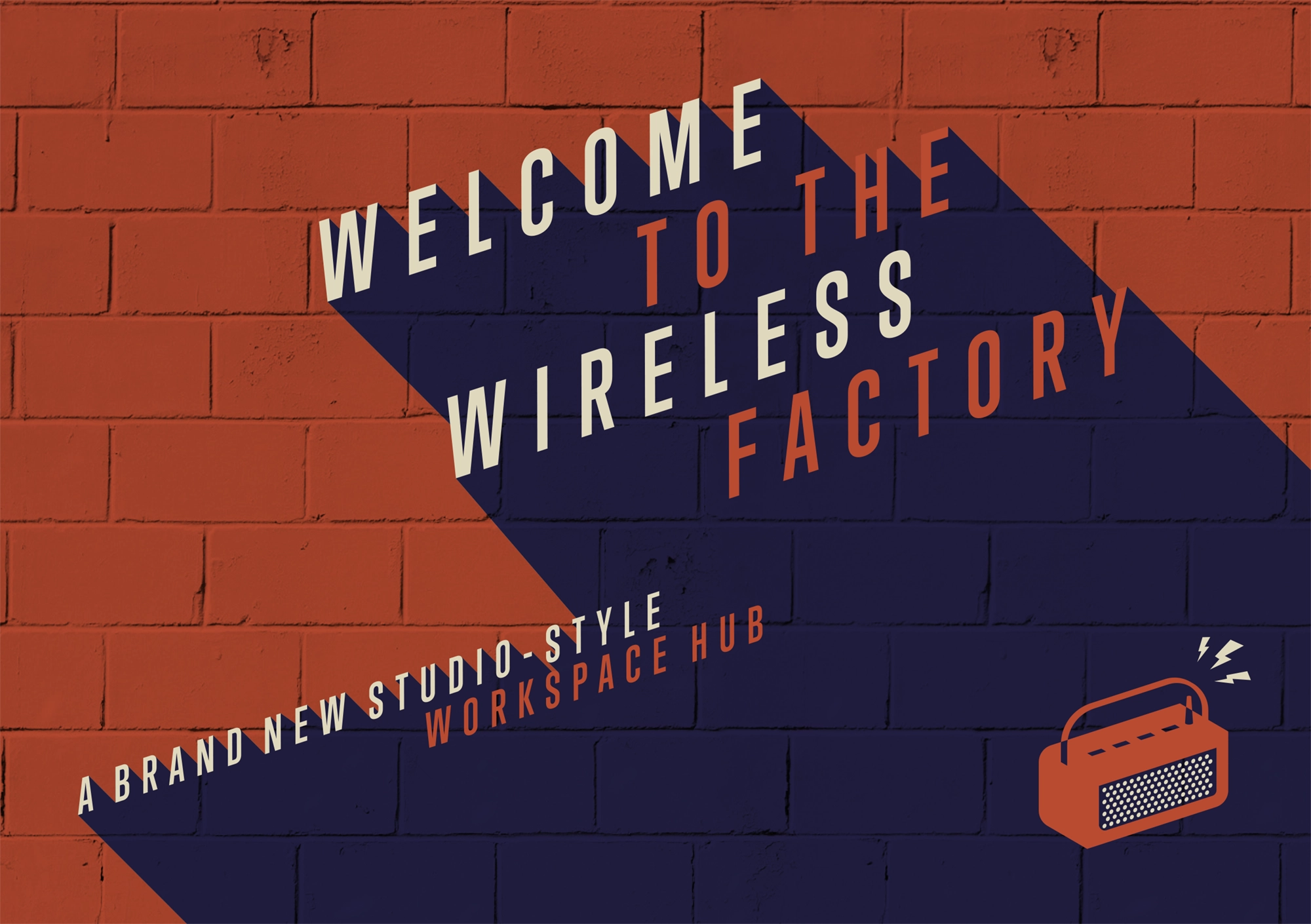
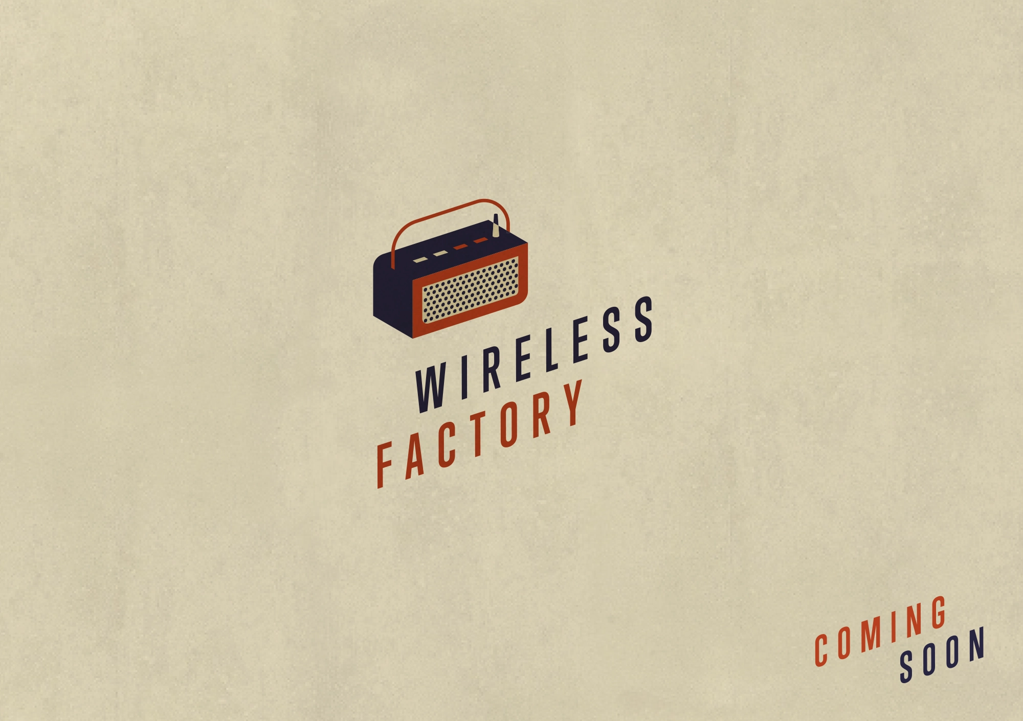
The client had come up with the moniker The Wireless Factory because of the building’s origins as an old Roberts Radio spare parts factory. We used this as a springboard, shaping the new brand around a cool retro-styled logo, inspired by the iconic design of old fashioned radios.
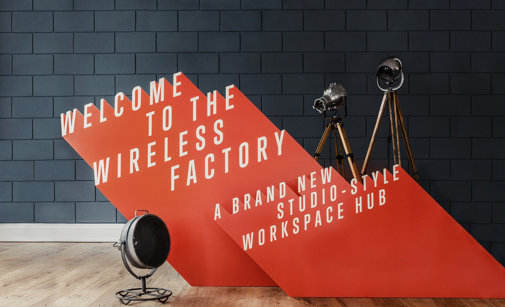
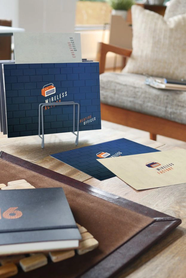
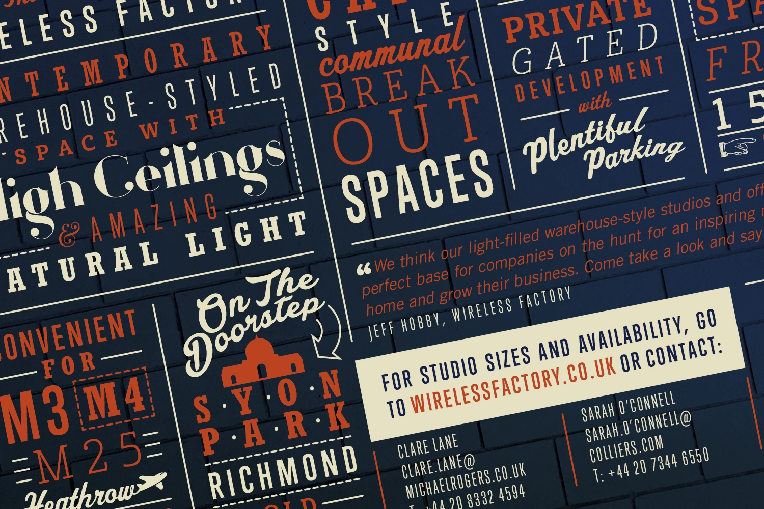
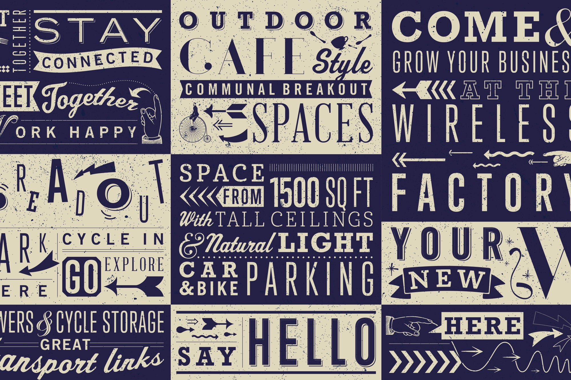
The branding came to life with a vintage colour palette, incorporating a cool inky dark deep blue and burnt orange and we developed a playful style of illustrative typography to tell The Wireless Factory story, playing up the workspace hub’s creative credentials.
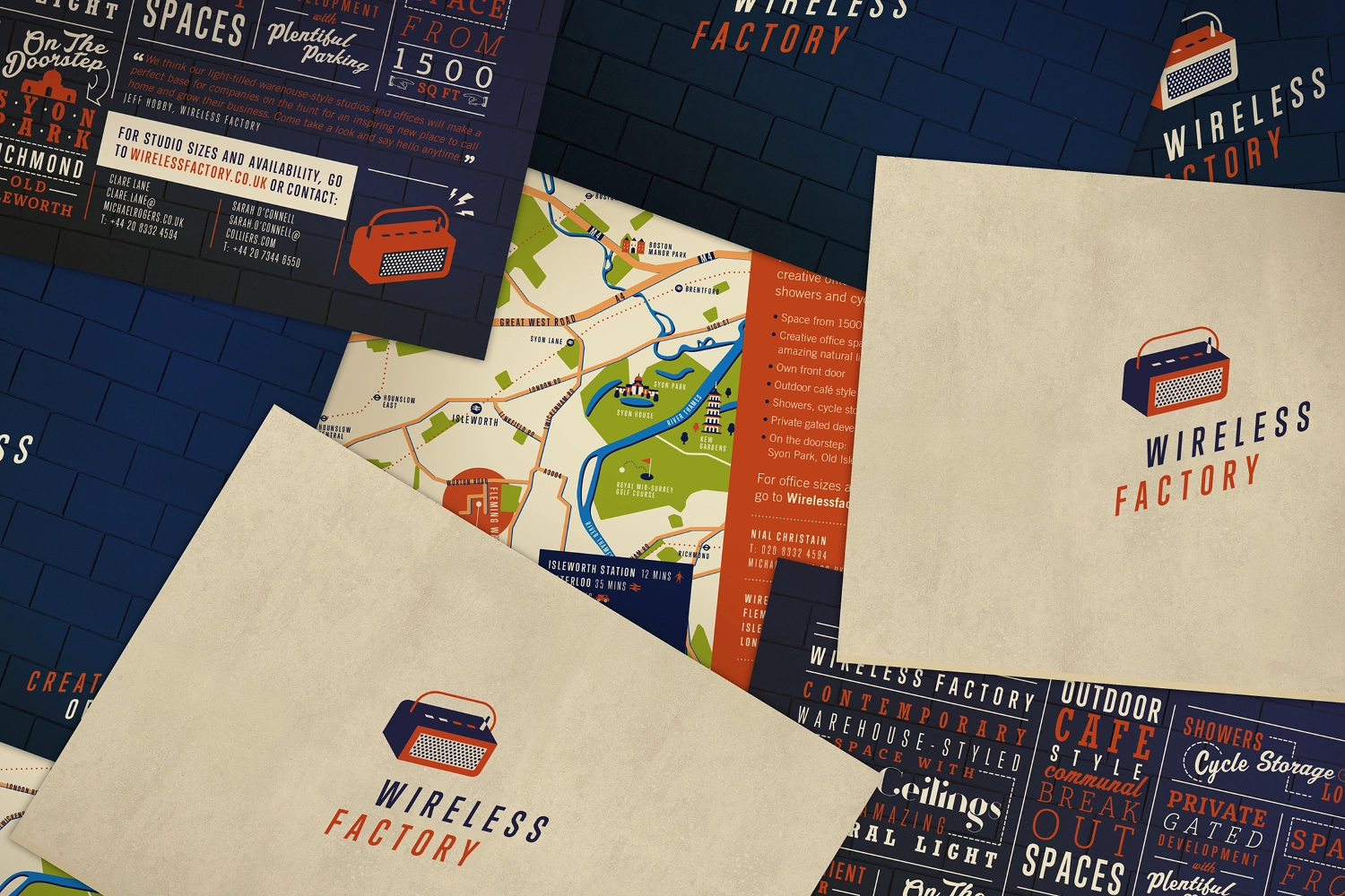
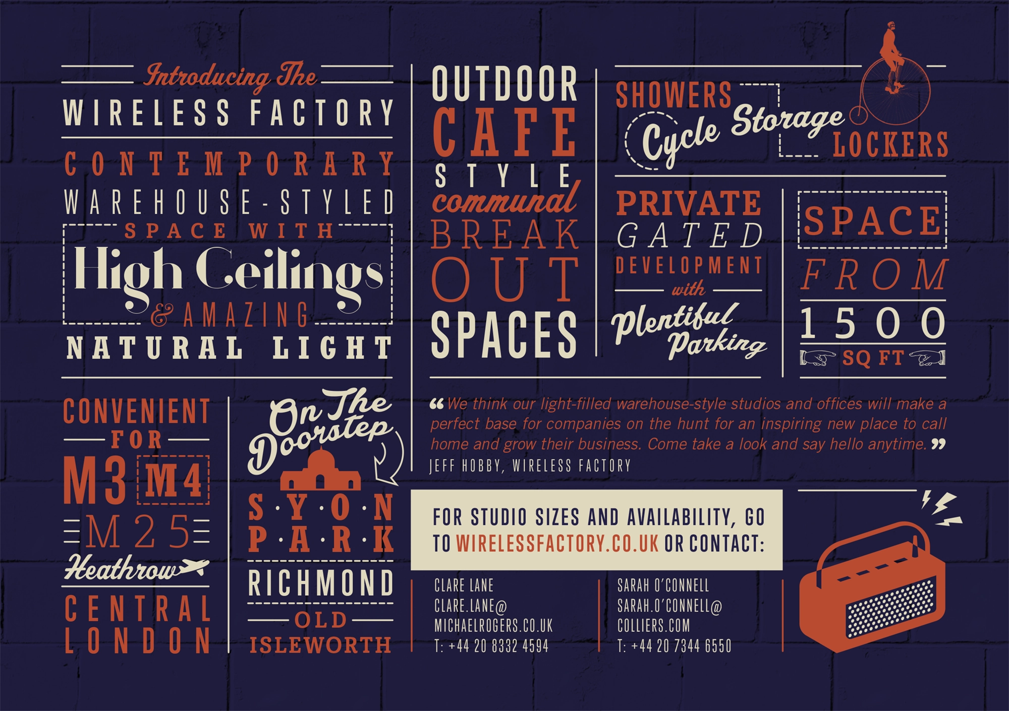
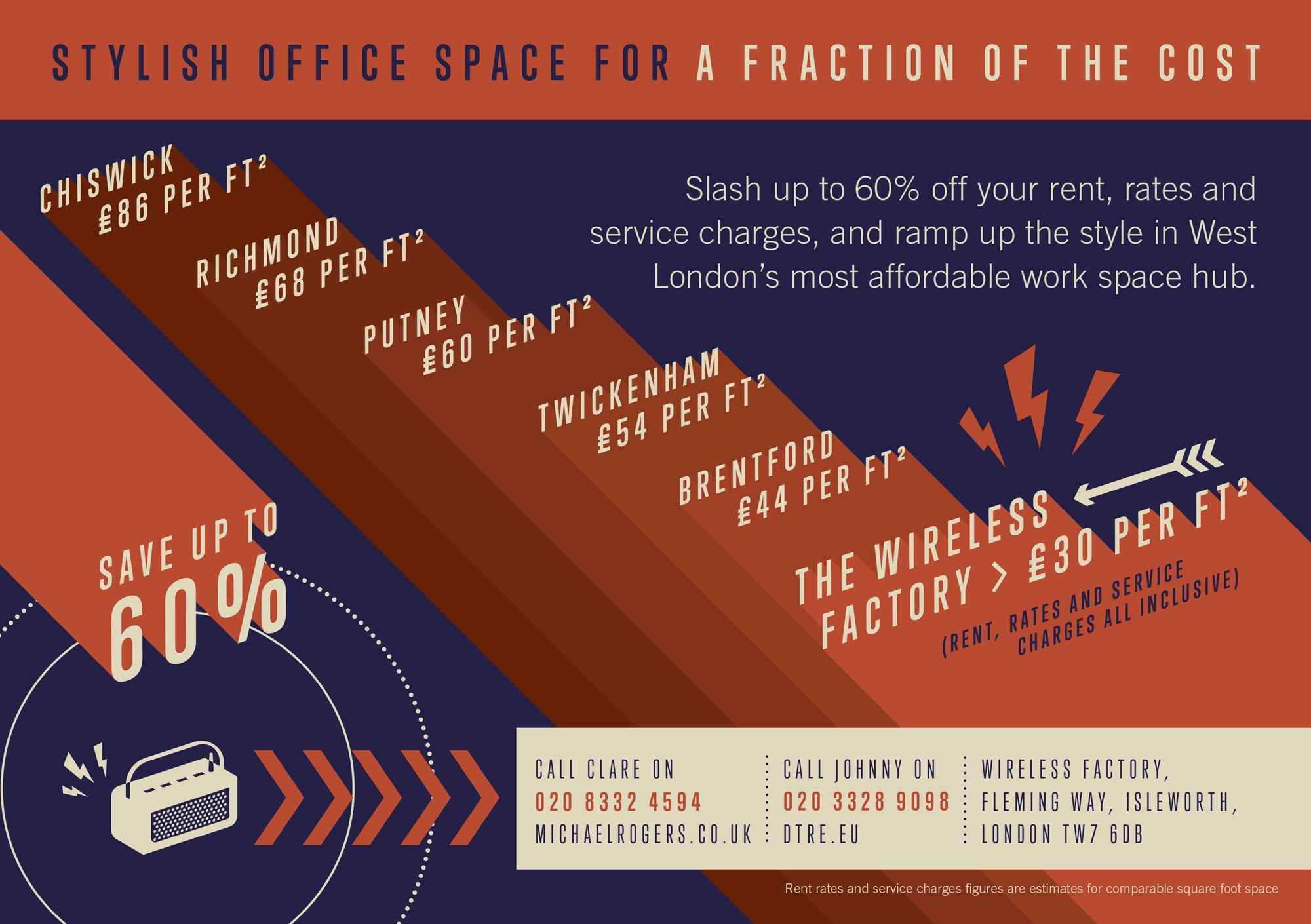
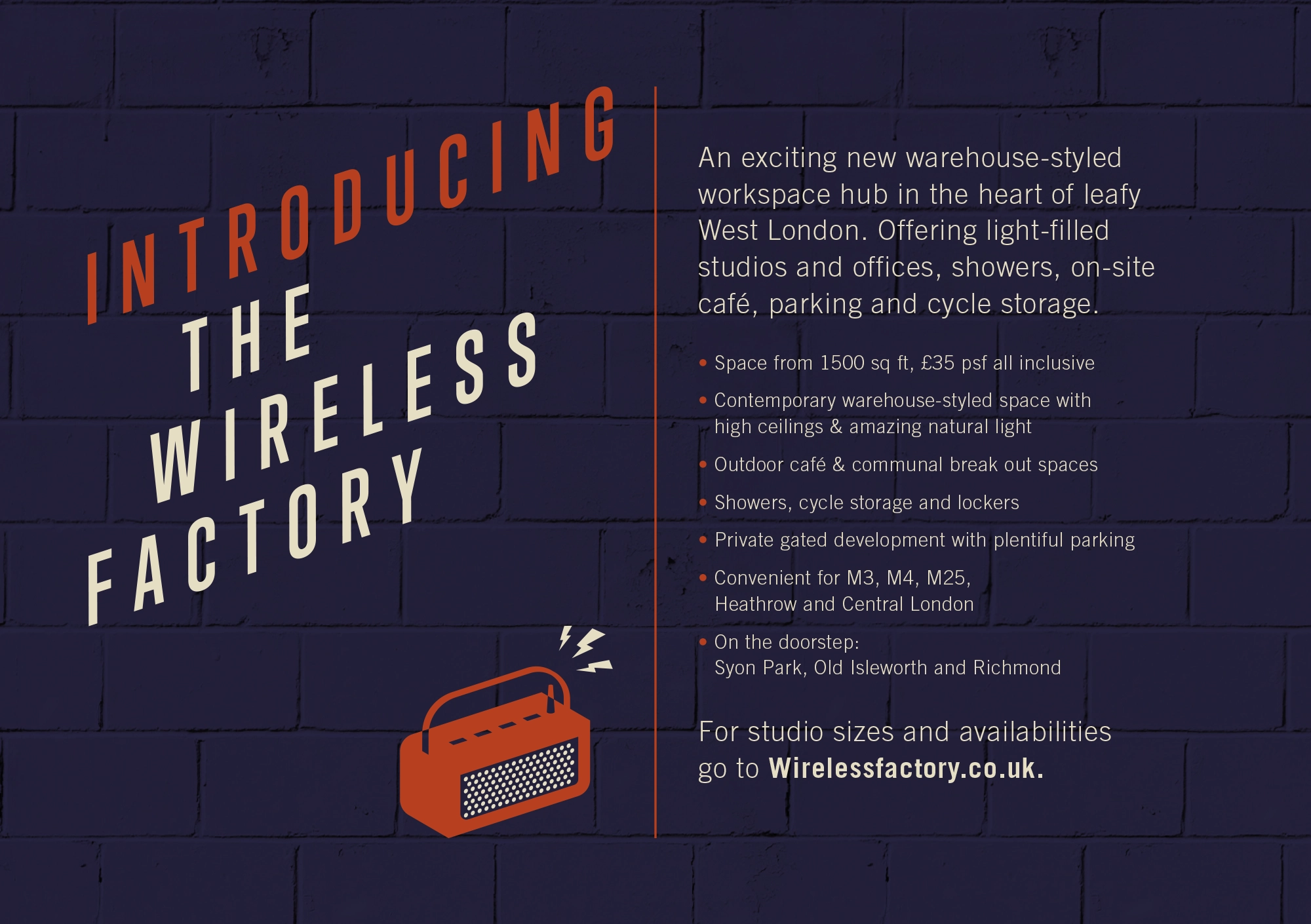
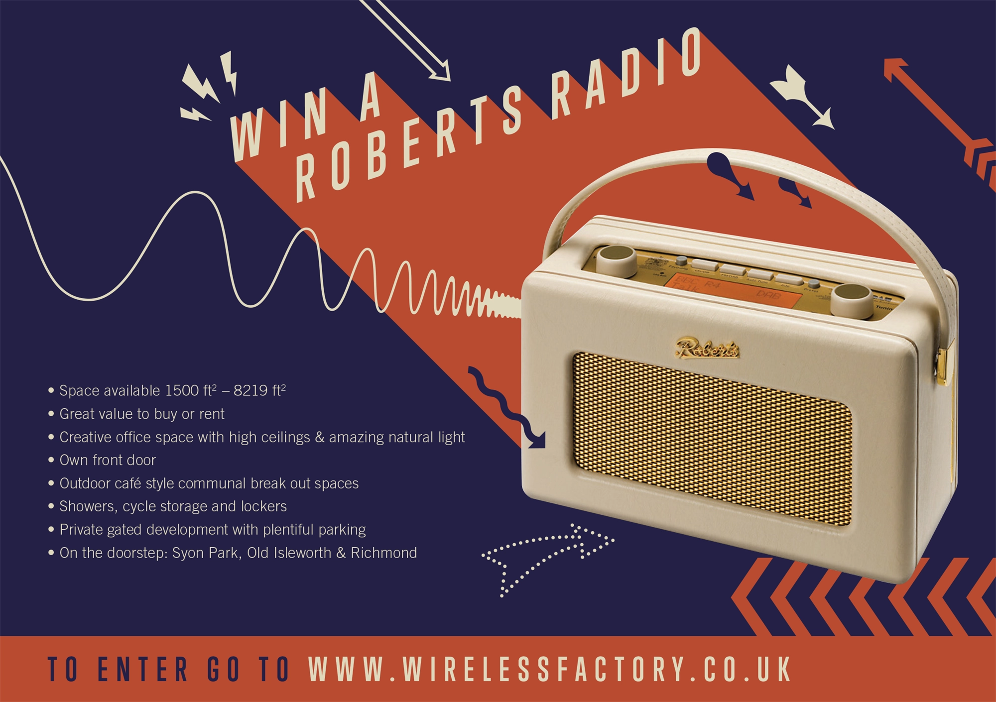
We launched the brand by sending out a series of postcards to local media, businesses and agents. To tie in with the vintage brand feel, they were printed on recycled and textured kraft paper. Since no brand photography had been shot at this early stage, we decided to introduce the brand using pure graphics, as a teaser of the cool things to come. The postcards went out in sleek black envelopes with a subtle Wireless Factory logo pinned to the corner.
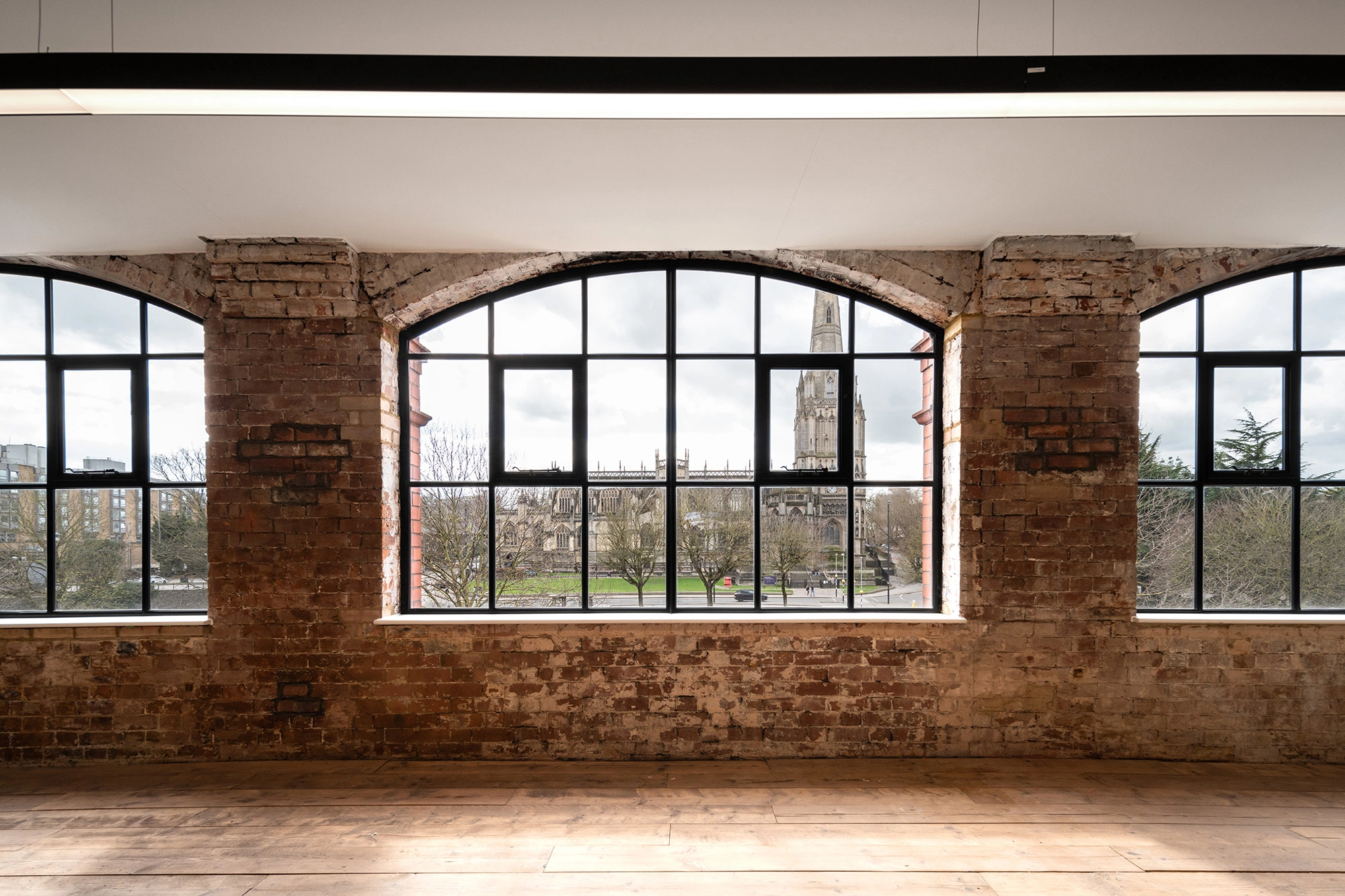
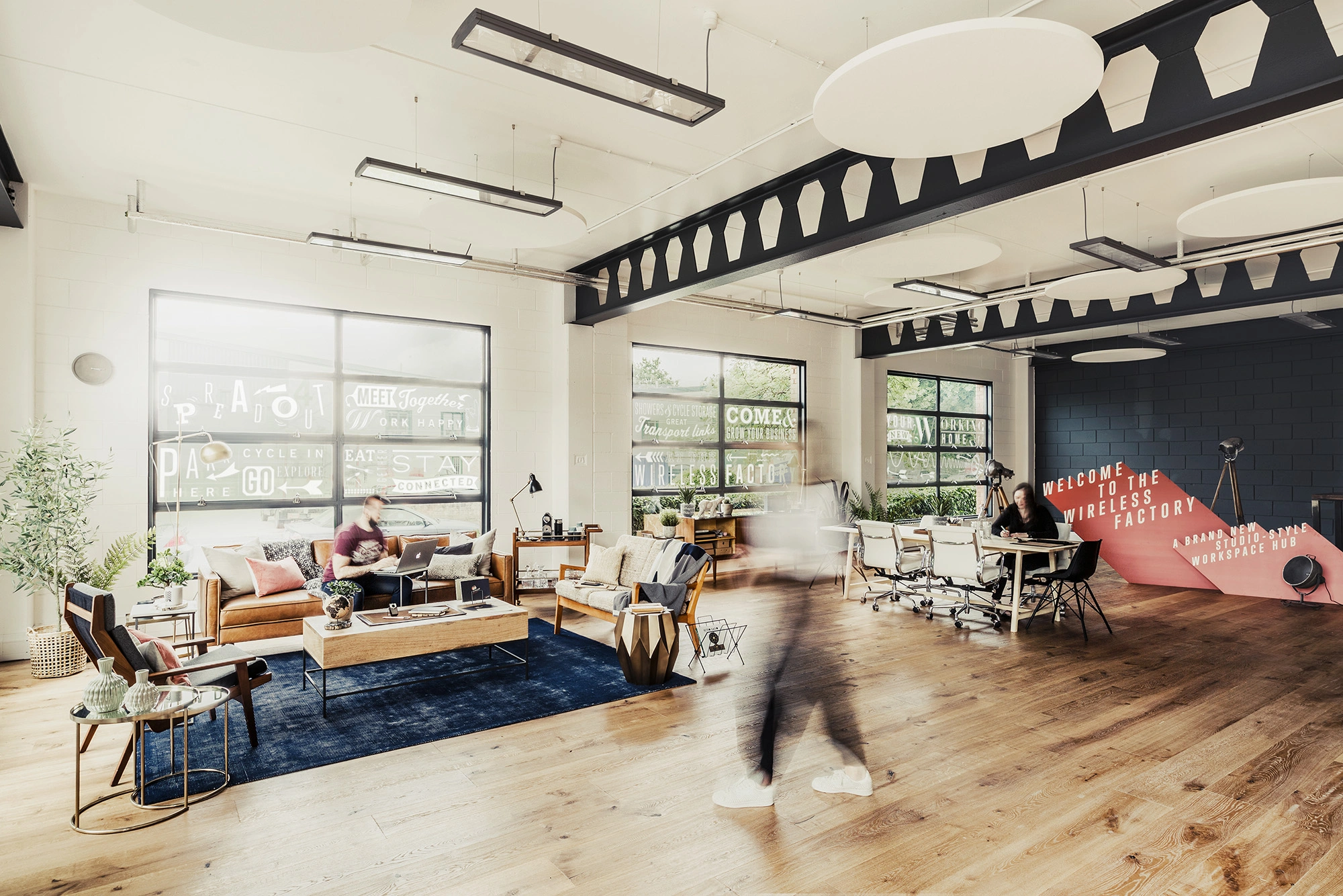
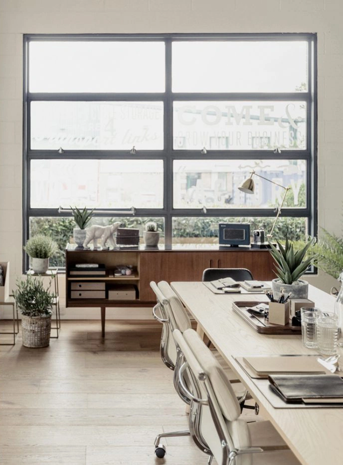
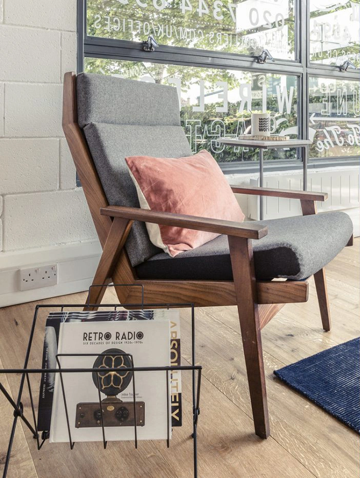
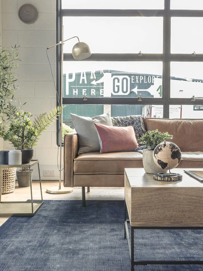
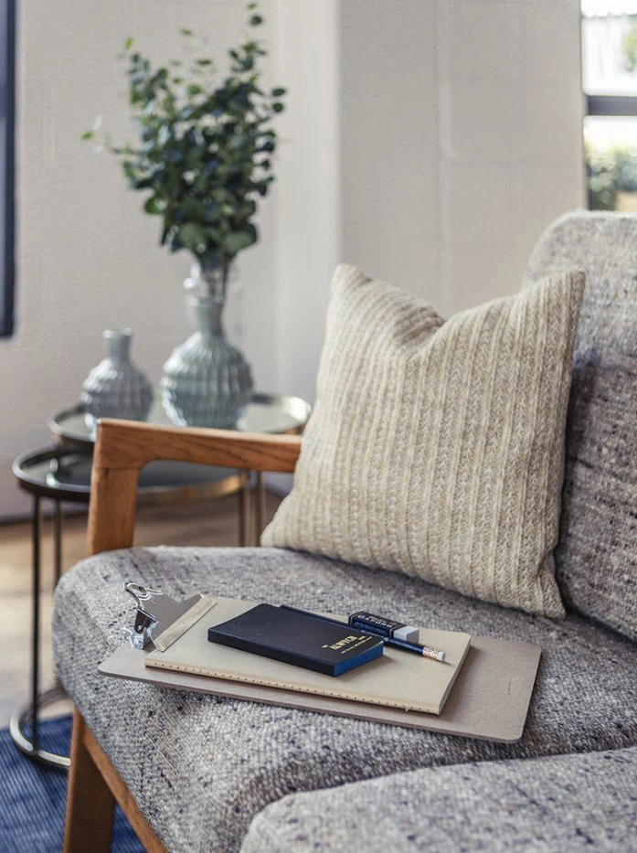
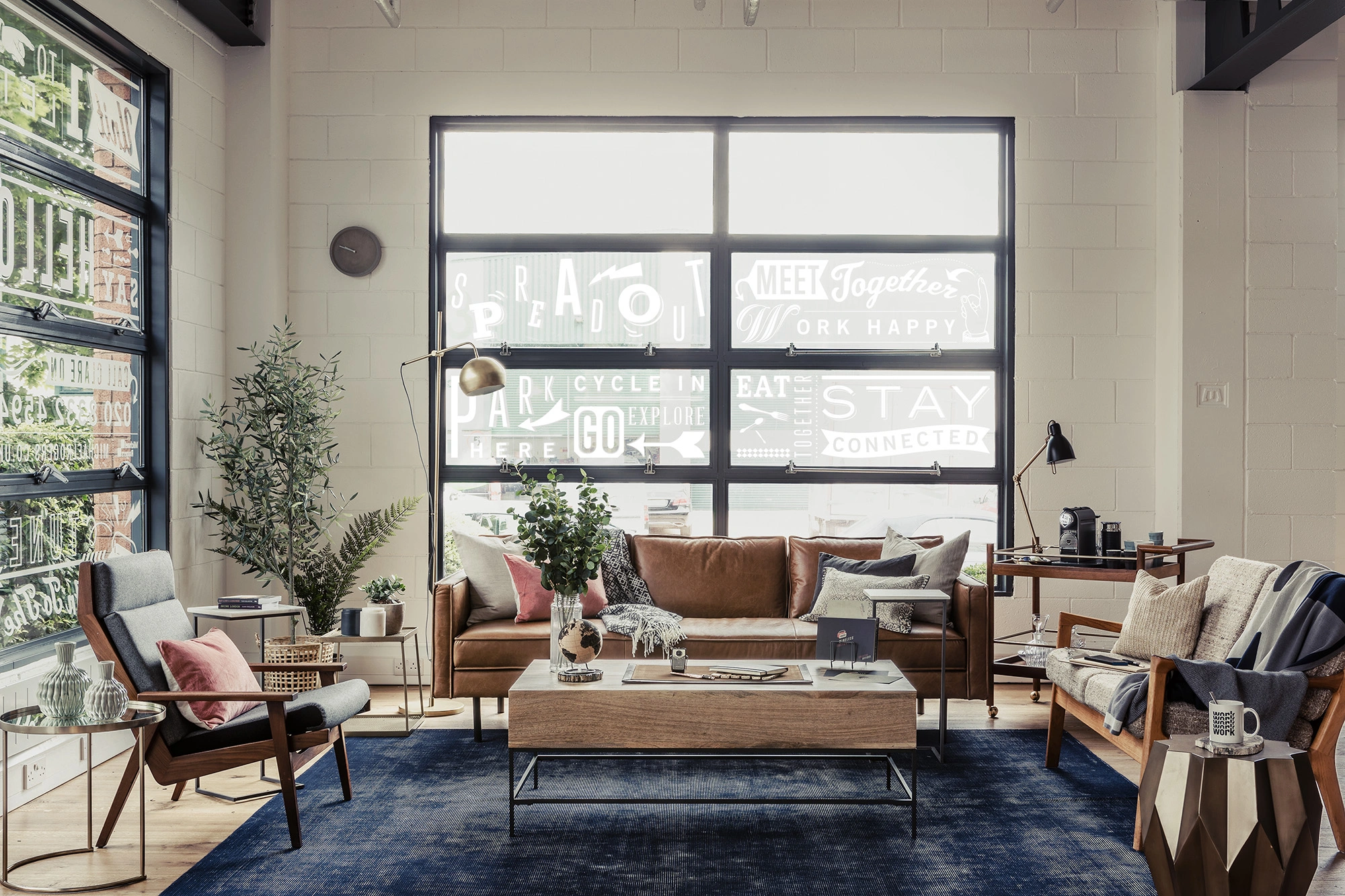
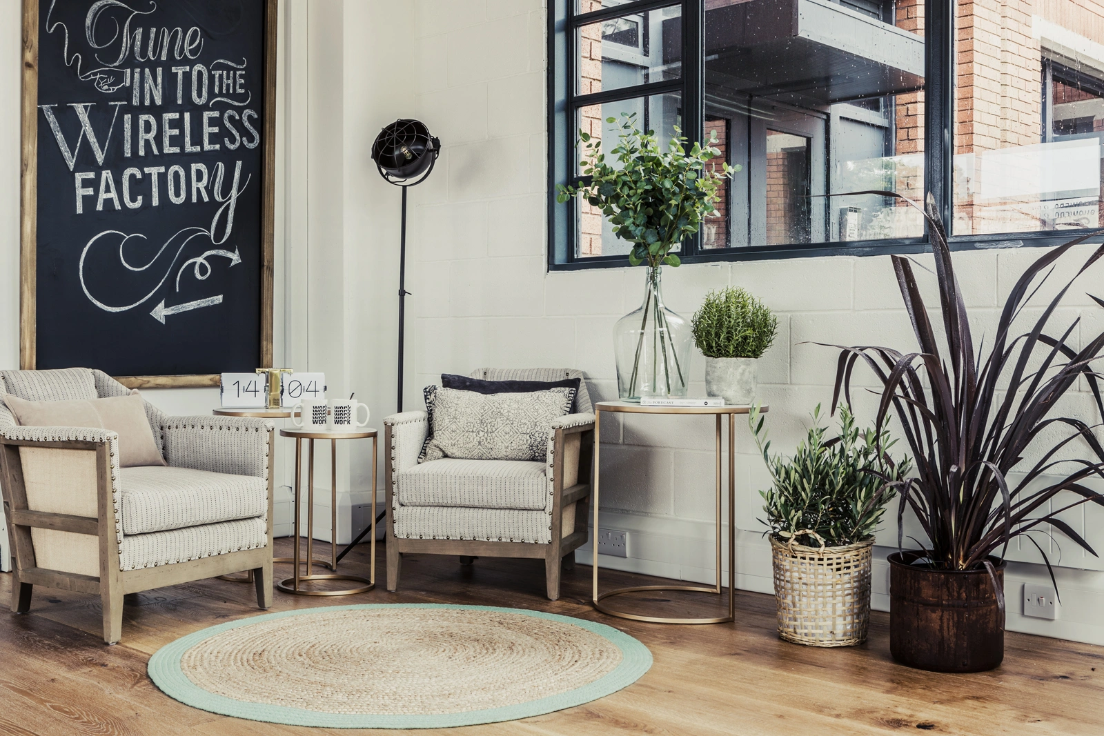
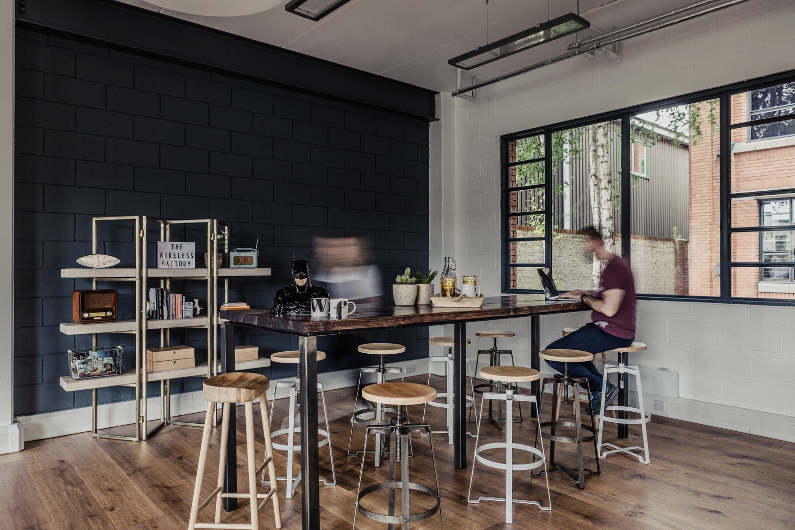
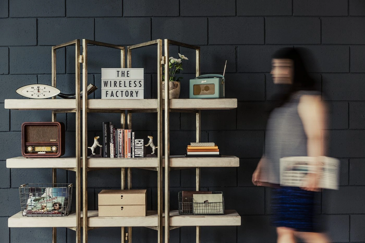
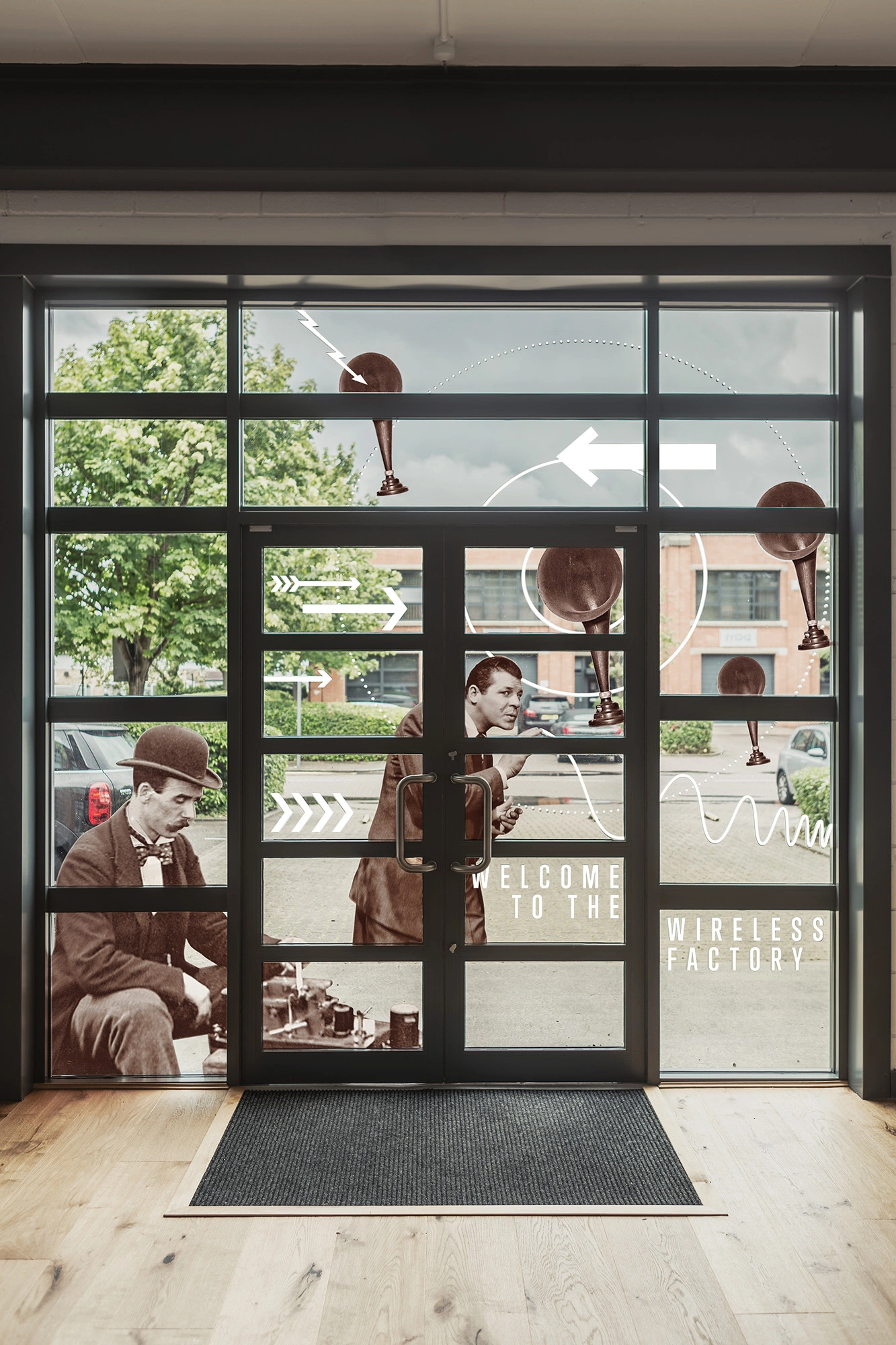
Our interiors team set about styling the Show Suite, a large unit, bathed in natural light from floor to ceiling warehouse style windows. Our design concept fused tailored industrial furniture and finishes, softened by a touch of timeless, mid-century charm to reflect the retro branding. 3D standees and glazing graphics brought the brand’s playful typographic style centre stage within the physical space.
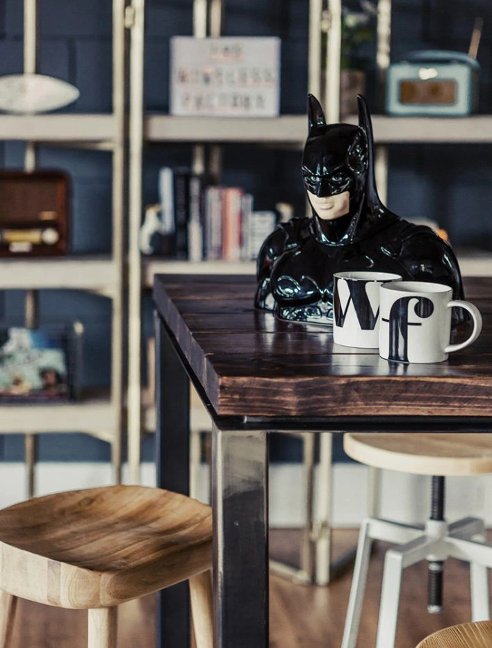
We zoned the suite into distinct social, dining and hard-at-work desk spaces to inspire tenants in how they could create an exciting studio style environment for their company. With sourcing and styling complete, we added a final layer of accessories before shoot day, capturing a range of beautiful images for the brand gallery.
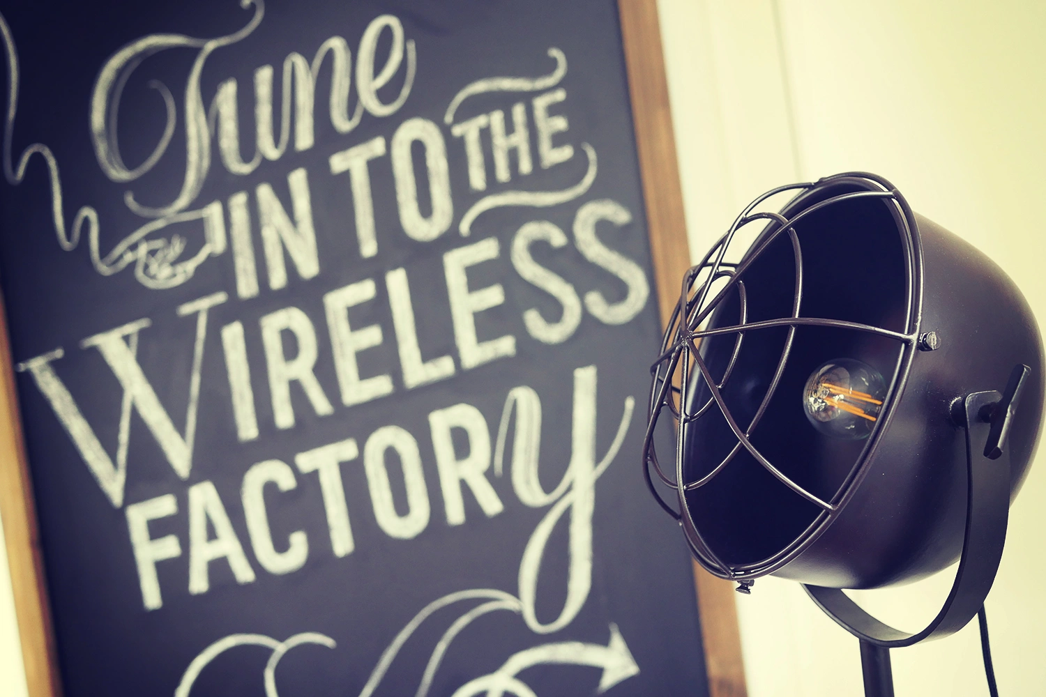
The informal reception area was given a Run For The Hills personalised touch, with a hand-drawn chalk board illustration greeting guests with a warm welcome.
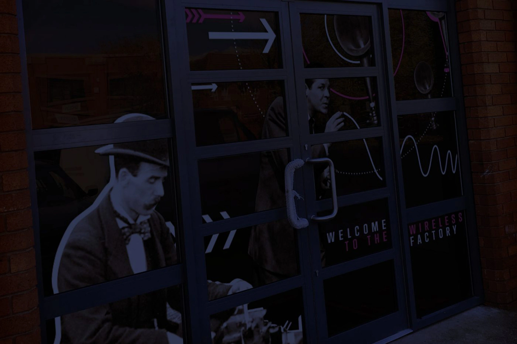
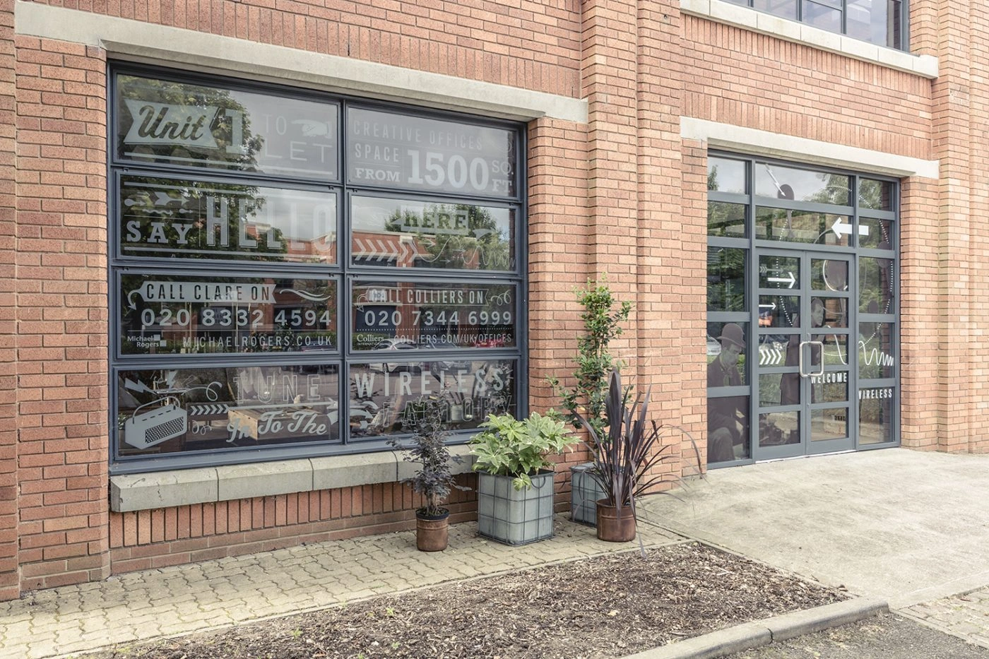
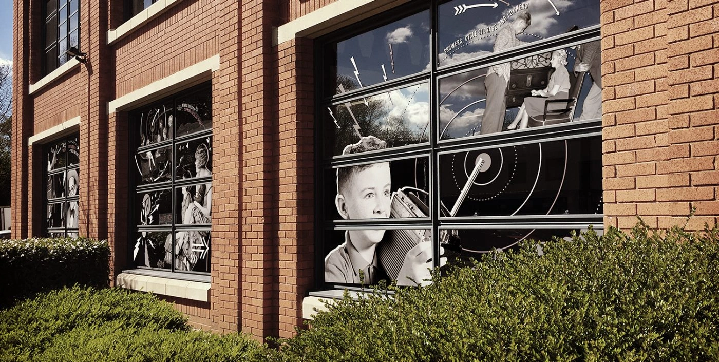
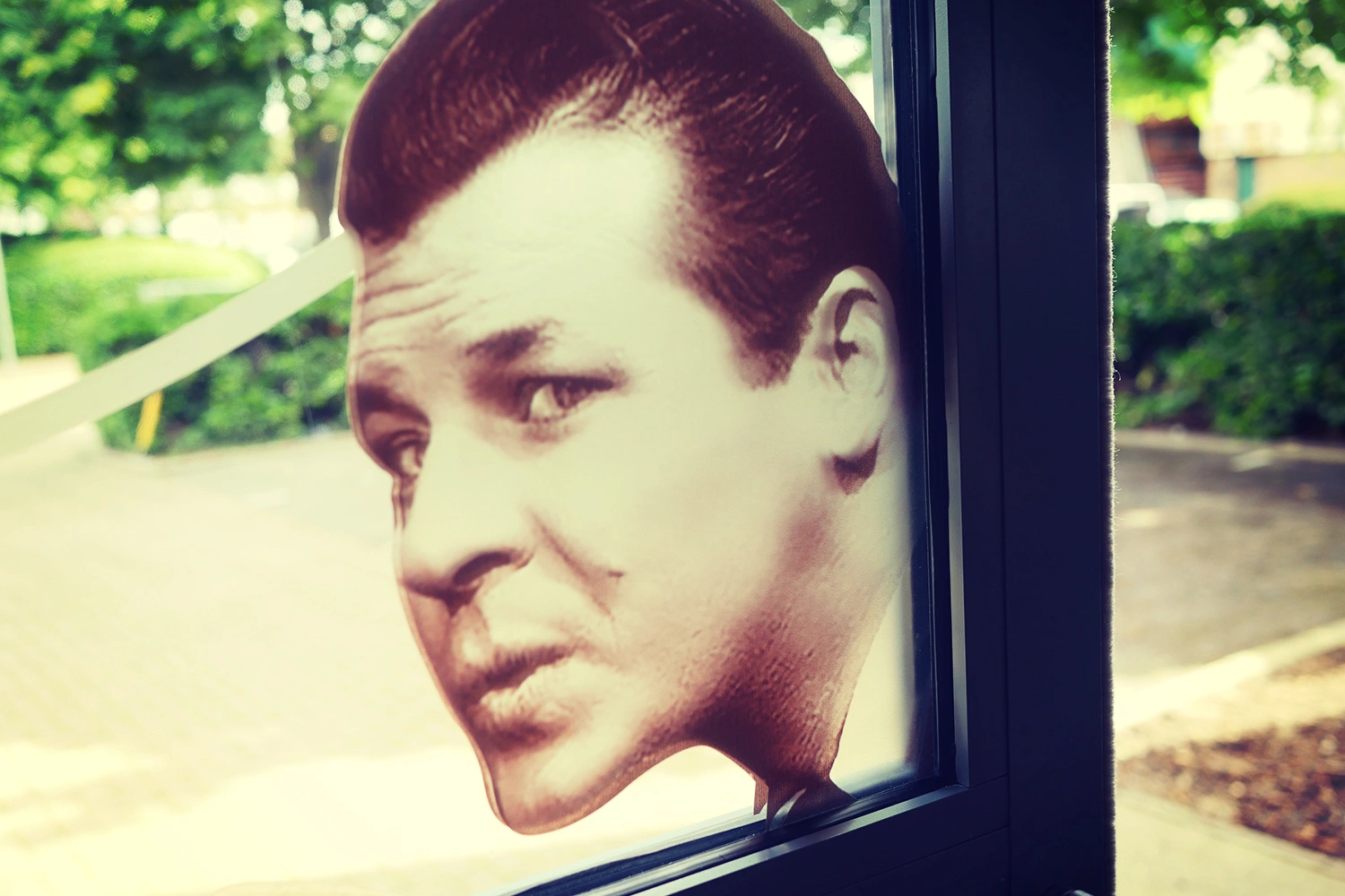
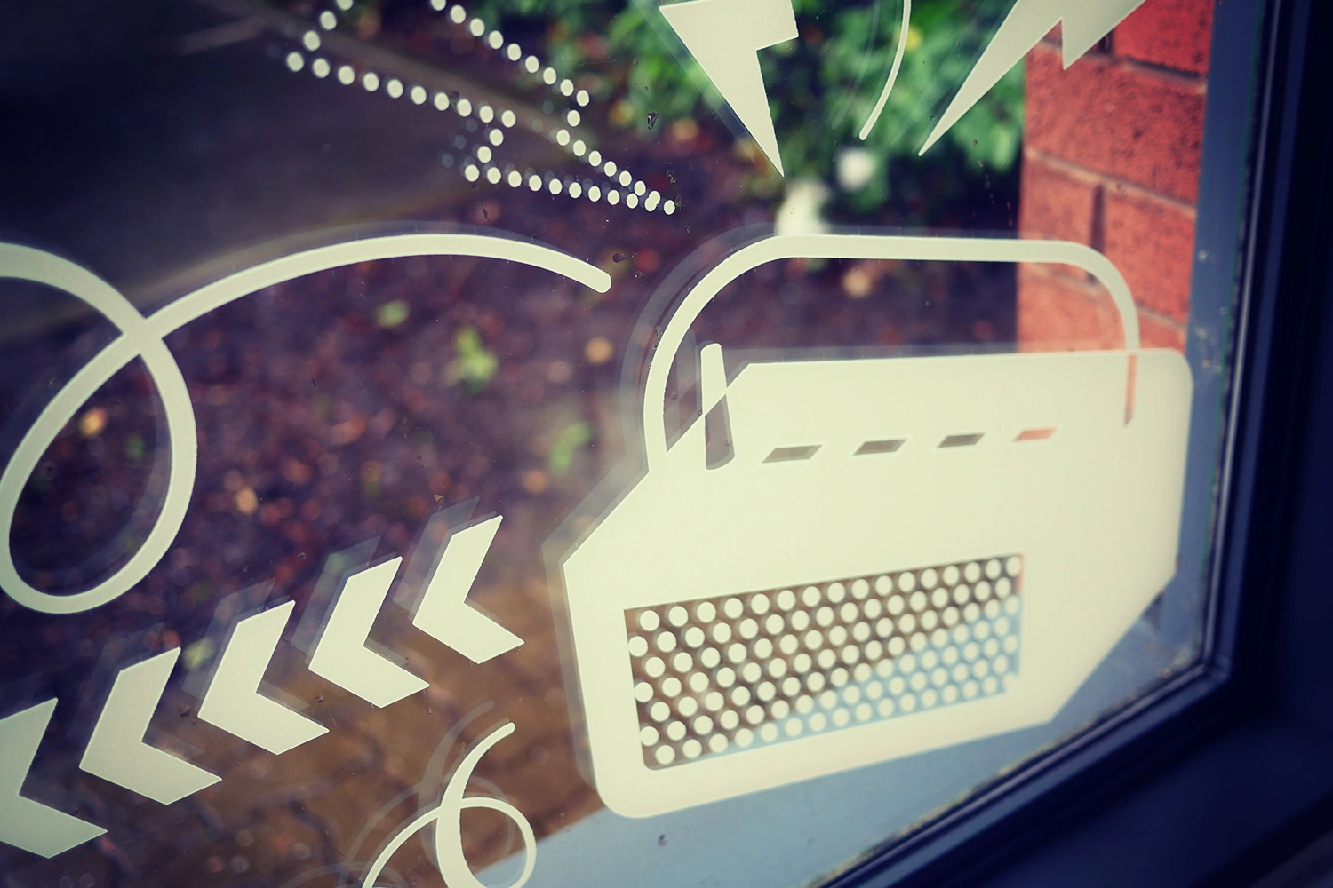
Our creative typography adorned the windows of the Show Suite, wrapping around the entire unit. Graphic decals were also applied to windows of other units available to let around The Wireless Factory. Infusing the new branding across the whole site, creating impactful and eye-catching displays to draw people in. We incorporated vintage out-of-copyright photography to add to the nostalgic retro feel, juxtaposing them with a punchy modern design style to create something original and fresh with the feel of yesteryear. Some of the glazing graphics were designed exclusively for the show unit. Others reflected stylistic content and imagery from the branding and website to reinforce the new identity.
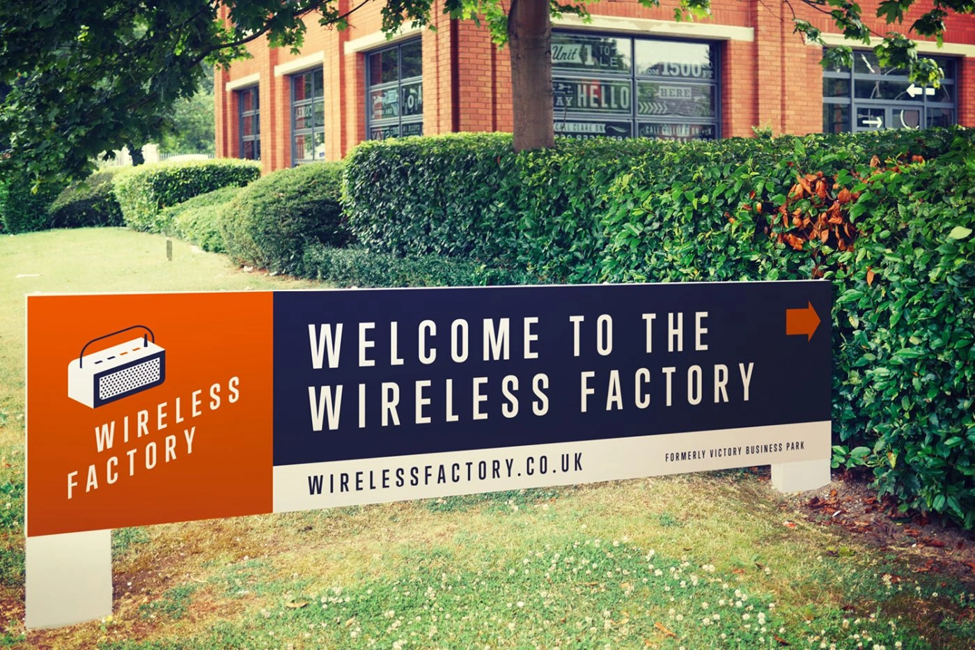
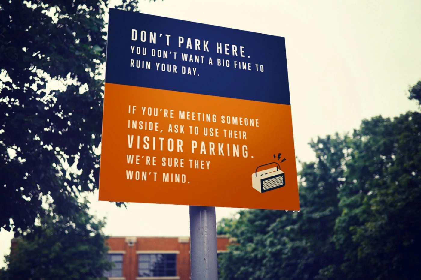
Signage and wayfinding around the campus boldly reinforced the new brand, guiding people into and around the site. We also subtly included the business park’s former name on the main sign, to help the Postman with the transition.
We brought The Wireless Factory to life with a creatively designed website. Featuring image galleries, interactive maps, transport links and downloadable ebrochure and floor plans of available units.
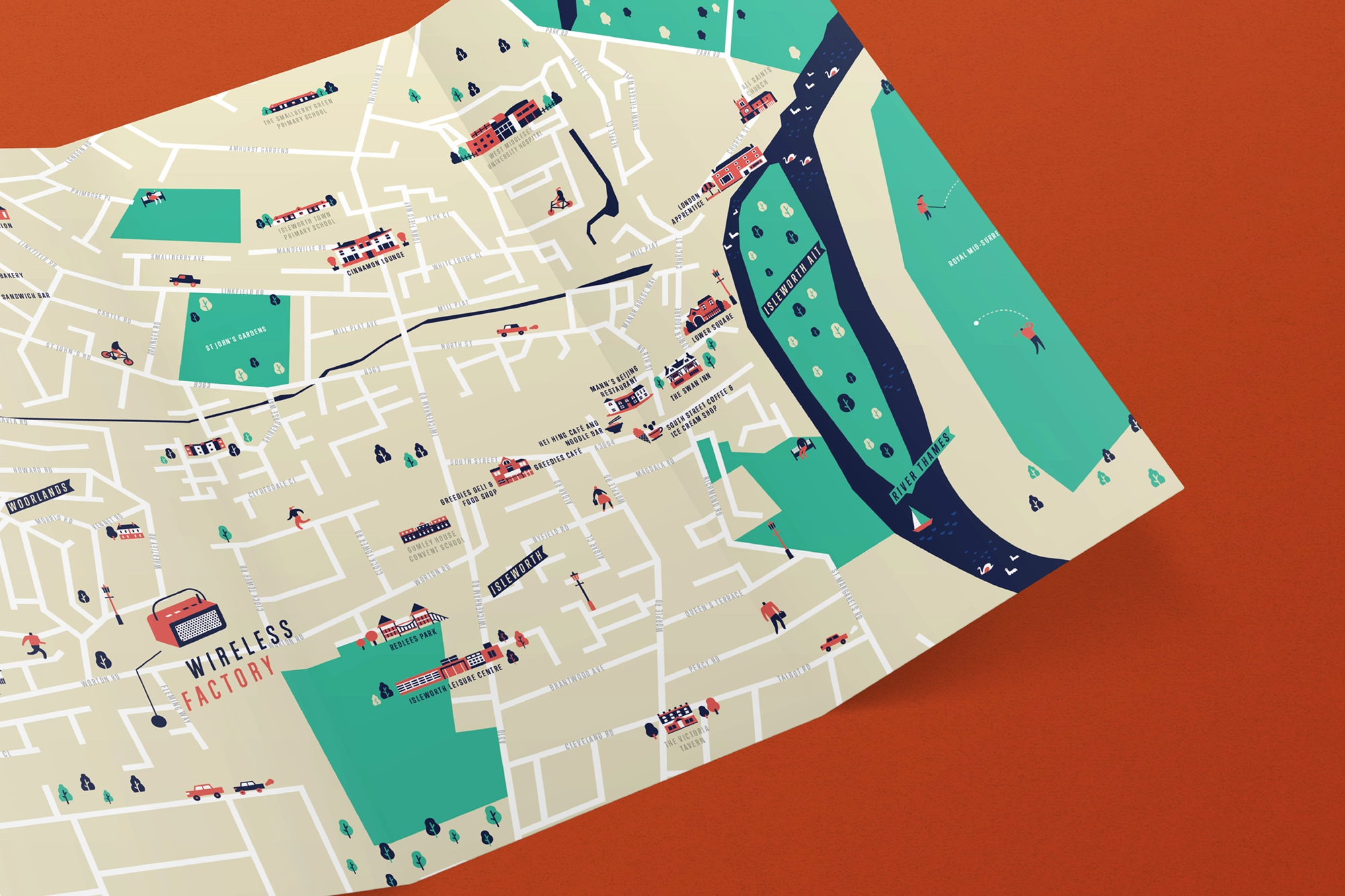
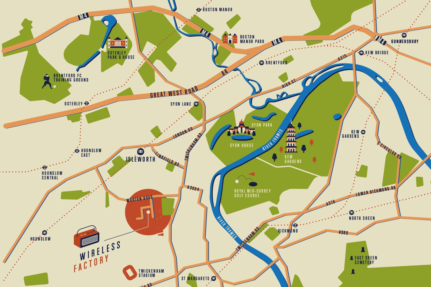
The interactive, illustrated maps were of the local area, exploring interesting places to visit in and around Isleworth, offering insider tips to potential tenants about good spots for a lunch break and places to invite clients for an after-work dinner or drinks.
It was important to put Isleworth on the map, a little known leafy corner of West London. So our design highlighted the great transport links, connections, and proximity to motorways and Heathrow airport. Not to mention its riverside location.
The website dug deeper into Isleworth’s rich history: The fact that TV legend Sir David Attenborough was born here, champion of the natural world and owner of the most soothing voice on TV. And that St John’s Road railway bridge is one of the most bashed in Britain. Where more than 19 deceptively tall vehicles came a cropper between 1990 and 1996. And where, in 2015, a double decker bus ripped its roof clean off (no one was hurt, luckily). It is also the place where England’s first edible, cultivated strawberry was bred and exhibited by a man called Michael Keen, in 1806.
Services used
Brand Identity
Logo Design
Animation
Website Design
Brochure Design
HTML Emailers
Illustration
Workspace Design
Branding
Graphic Design
Copywriting
Exterior graphics & Signage
