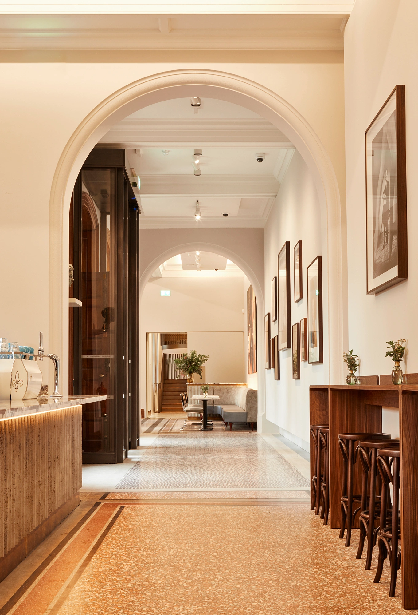
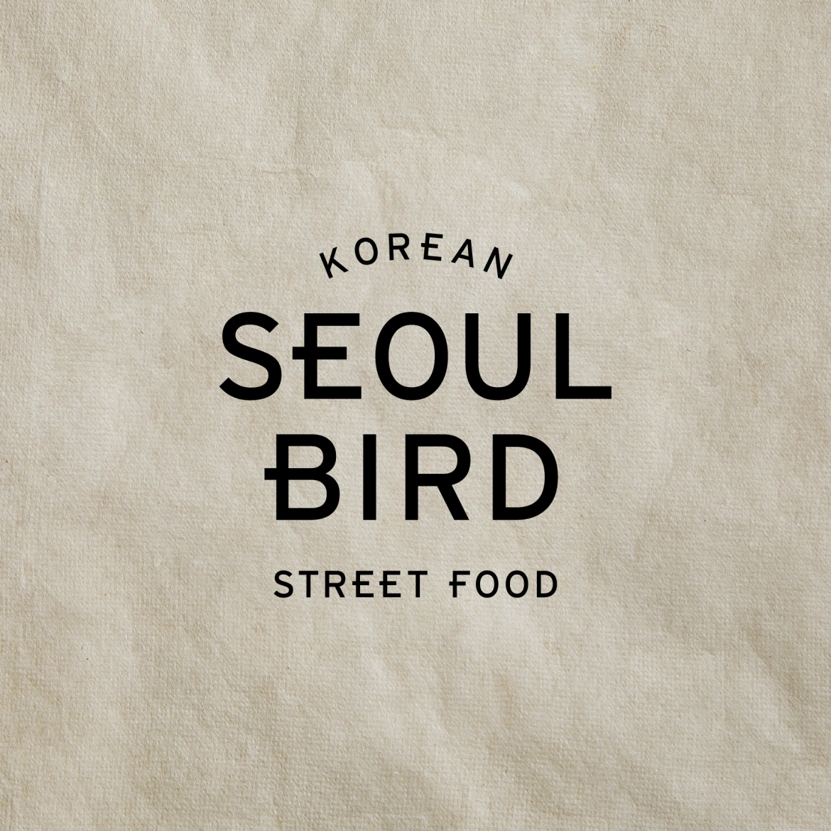
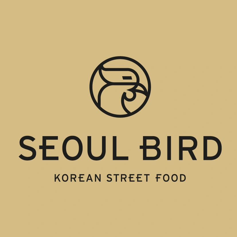
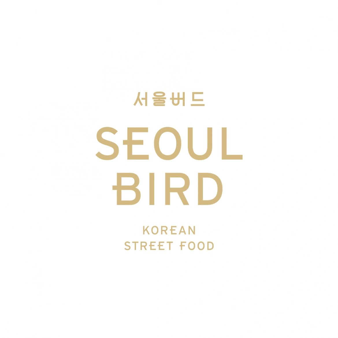
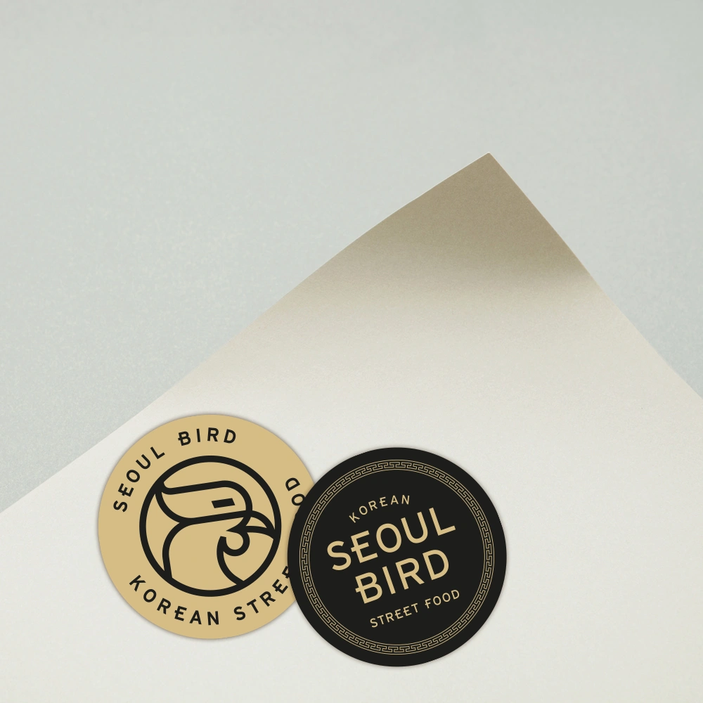
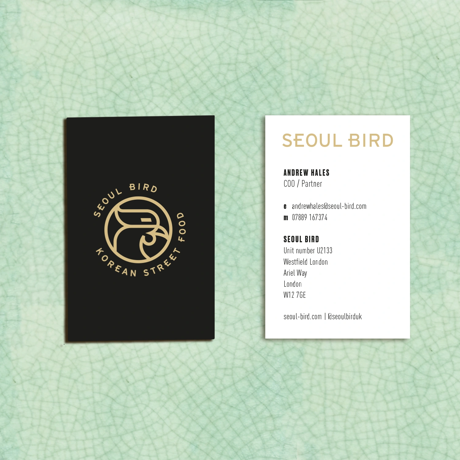
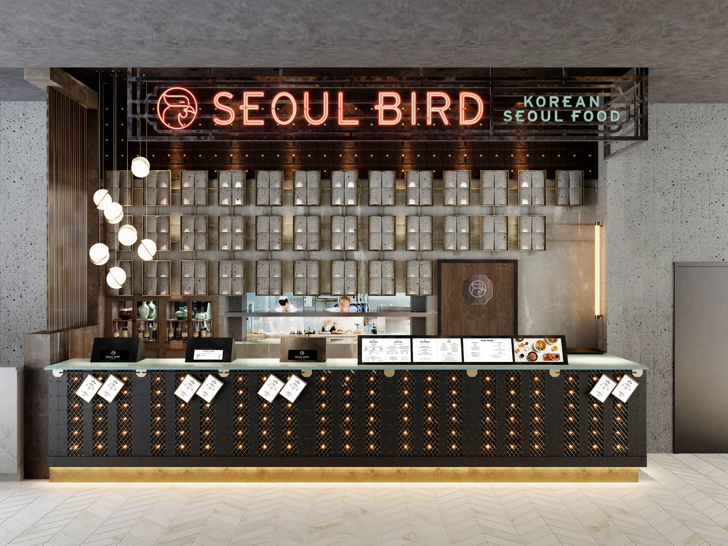
SEOUL BIRD
Korean street food
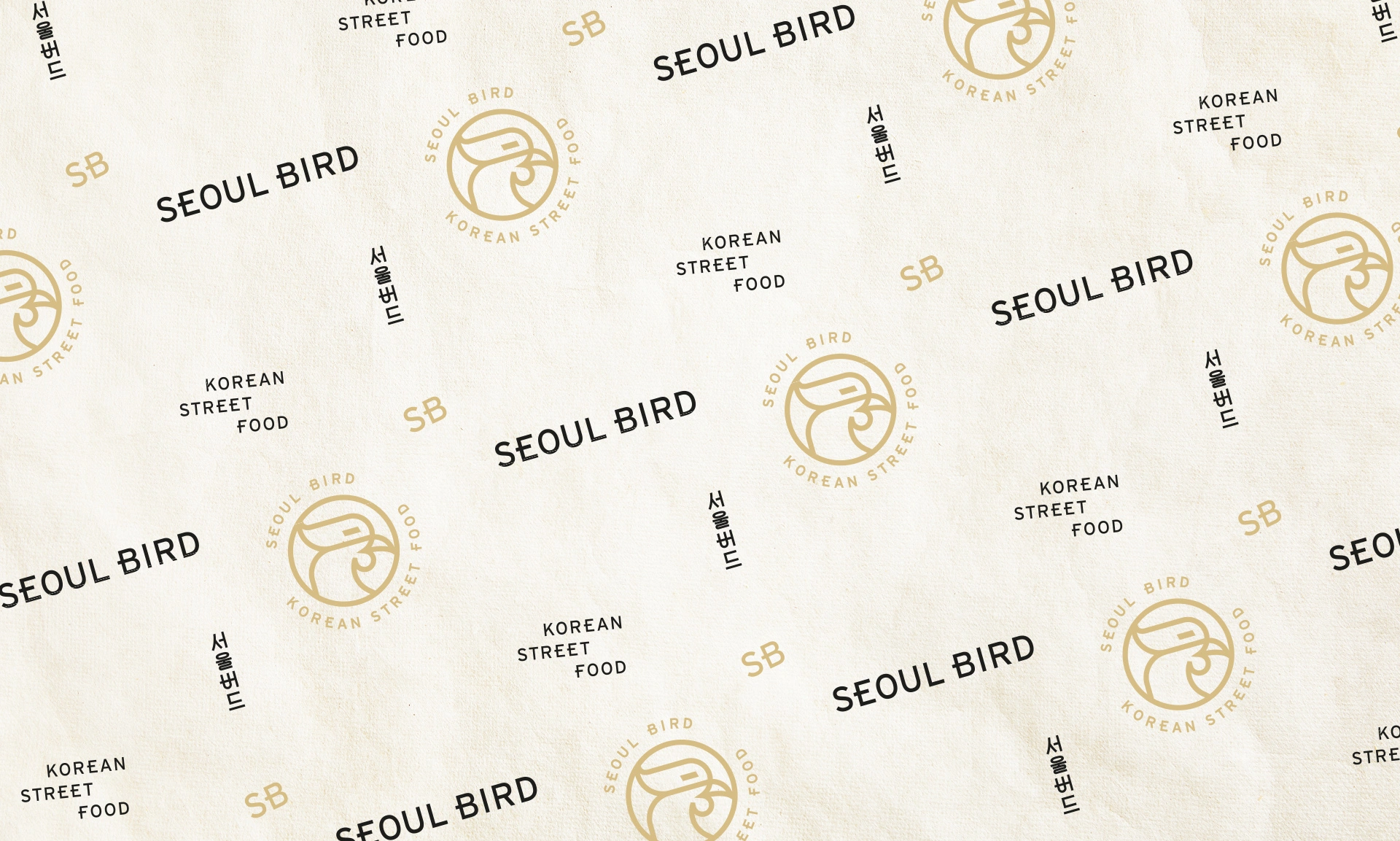
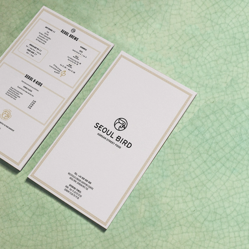
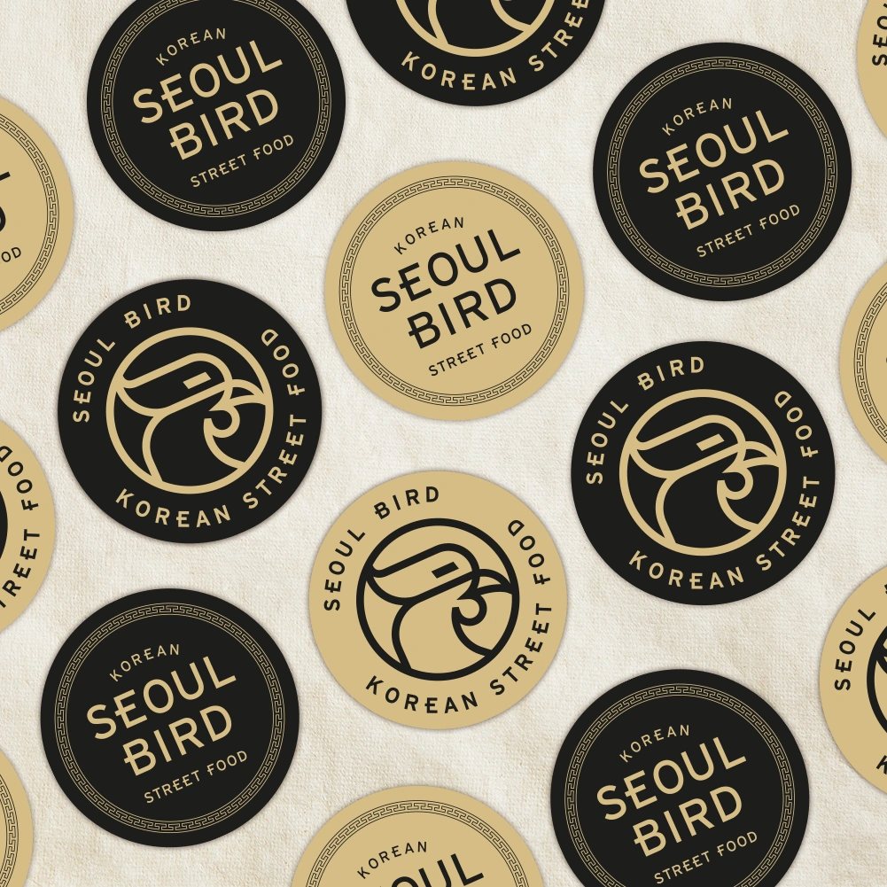
World-renowned chef Judy Joo asked us to help bring her new Korean fried chicken concept to life — from logo and brand assets to interiors and digital menus. Inspired by Korean architecture and heritage, Seoul Bird stands proudly apart from the fast-casual crowd. Designed to delight food lovers with its bold personality, modern edge and authentic roots.


We were thrilled to be approached by world-renowned Korean-American chef Judy Joo to help bring her new food concept to life — Seoul Bird. The brand celebrates Korea’s most beloved street food: crispy, double-fried chicken, elevated with bold spices and authentic flavours.
Our job was to develop both the branding and interior design, crafting a bold and distinctive identity that would stand out in the fast-paced, highly competitive world of premium fast-casual dining — starting with Seoul Bird’s flagship at Westfield London.
We looked to Korean heritage for inspiration, taking cues from traditional latticework to create a striking circular logo featuring an abstract chicken head. We developed a suite of logo lockups for different uses, all sharing the same graphic DNA — sharp, geometric, and packed with personality. In a category crowded with clichéd chicken logos, we designed Seoul Bird’s to be proudly different.
The interiors are a stylish fusion of modern design and Korean influence. We used a palette of blackened steel and burnished brass to create a contemporary edge, with a standout crackle-glazed lava stone counter in Korean celadon green. The counter is paired with tubular custom lighting, and the main visual backdrop is a wall of concrete Korean-style roof tiles, set in metal frames and softly lit to add texture and drama.
Our design nods to Korean architectural motifs but reinterprets them with a modern eye. Every detail of the compact space was carefully considered, balancing utility and beauty to ensure it feels both unique and welcoming, even within the busy bustle of a food hall.
Alongside the physical design, we created animated visuals for the digital menu boards. Using still food photography, we employed clever zooms, pans and layered depth to create the illusion of movement — helping Seoul Bird stand out and attract hungry customers with visual storytelling alone.
The combination of the confident brand identity and slick visuals gave Seoul Bird real curb appeal, helping the brand land successfully in one of London’s most competitive foodie arenas.