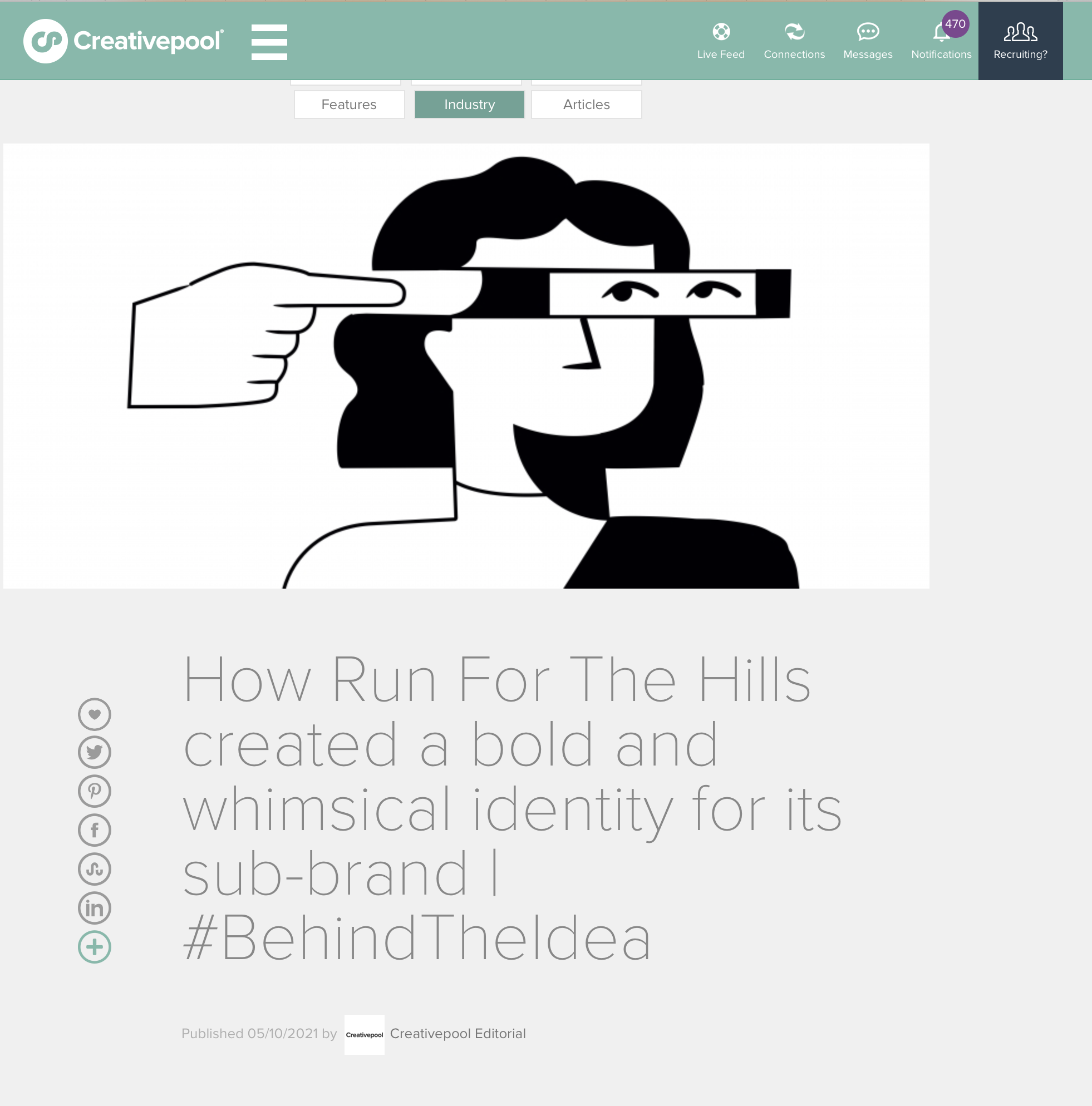
Find out more about how we created Miscellany in this Behind The Idea article on Creative Pool, over here. Or scroll down to read below.
How Run For The Hills created a bold and whimsical identity for its sub-brand | #BehindTheIdea
Run For The Hills is a creative design house specialising in interiors, branding and original art. The team is made up of experts in a number of sectors, from property to hospitality and boutique residential – and they decided to launch their very own sub-brand, Miscellany, over summer.
Rather than choosing to commission illustrators and external creatives for the new identity, however, Run For The Hills chose to work on the identity themselves, to make sure their fresh, edgy and whimsical signature style would be captured in the new brand.
Today we are getting Behind the Idea following a chat with Chris Trotman, Founder and Creative Director of Run For The Hills, to learn more about the exciting and delightful project below.

What was the brief?
To create an innovative brand identity and website for Miscellany, the more affordable interior design diffusion range, from the award-winning team at Run For The Hills.
How did the initial pitch/brainstorming phase go?
Miscellany was born out of lockdown, when our interiors team was inundated with enquiries from clients desperate to make their homes work better under the pressure of working from home and home-schooling. What people needed was often quite small and contained and ordinarily we would turn them down because they weren’t particularly economically viable to service or juggle with our bigger, more complex projects. But we had always struggled with the idea of turning lovely clients away, particularly those who we felt a real creative affinity. So, we started to brainstorm whether there could be another way of doing things, allowing the design team to work quickly over Zoom with clients on these mini projects, allowing us to offer our creative expertise at a lower cost.
Our interiors team came up with the gem of an idea for a different kind of service and turned to our graphics team to help develop the idea into a business strategy and creative brand. And so, Miscellany was born. A new way of working, which would be perfect for those who might ordinarily think they couldn’t afford an interior designer.

Tell us more about the concept. How did it come to life, and why was it the right choice?
Interior design doesn’t need to be exclusive and Miscellany is a response to a changing world where consumers, even super-non-creative clients, are actually incredibly design savvy and care about creating a home they’re proud of. But they don’t always have the time or confidence to do it on their own, or they might need to bounce their ideas off an expert, before running with things themself.
There are other brands in the market doing something vaguely similar called e‑design, but Miscellany is unique in its approach to offering tailored, but super speedy design on whatever level you might need. A lot of e‑design services design a ‘room’ for a certain price, but Miscellany is far more flexible than that, offering professional advice on literally any aspect of a home renovation or improvement project. Also letting people buy into gorgeously curated, ready-to-buy shopping lists.
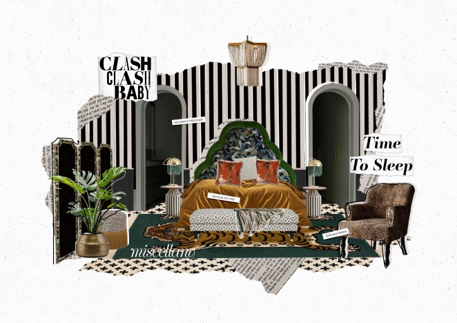
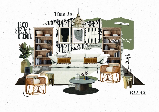
In terms of the identity and brand expression: we knew we wanted Miscellany to be a very graphic, illustrative brand, to create clear water and a real contrast with our interiors image-heavy Run For The Hills website. We opted for creating a unique illustration style, super cool animations and highly stylised mood boards. Showing amazingly styled, finished project photography from complex, fully interior design projects would also be misleading.
Miscellany isn’t about hiring a designer for a year-long, highly detailed and technical turnkey interiors service (the kind of work Run For The Hills does). It’s about getting affordable, bite-sized design tips and help with the smaller things, like choosing paint colours, working up a lighting spec, or space planning to work out the right size of furniture to buy. And we call that service ‘Design Lite’. People in a real hurry, who need to furnish their new place with furniture, can buy a ready-to-go ‘Instalook’ design concept which comes with an instant shopping list of products to buy to ‘get the look’ at great prices. We know just how daunting it can be for people to make decisions about a house renovation and how tricky it can be to put together the information their builder, tiler or electrician might need. But that’s where Miscellany can help, removing stress and giving people the tools, they need super-fast.
What was the production process like? What was the biggest challenge?
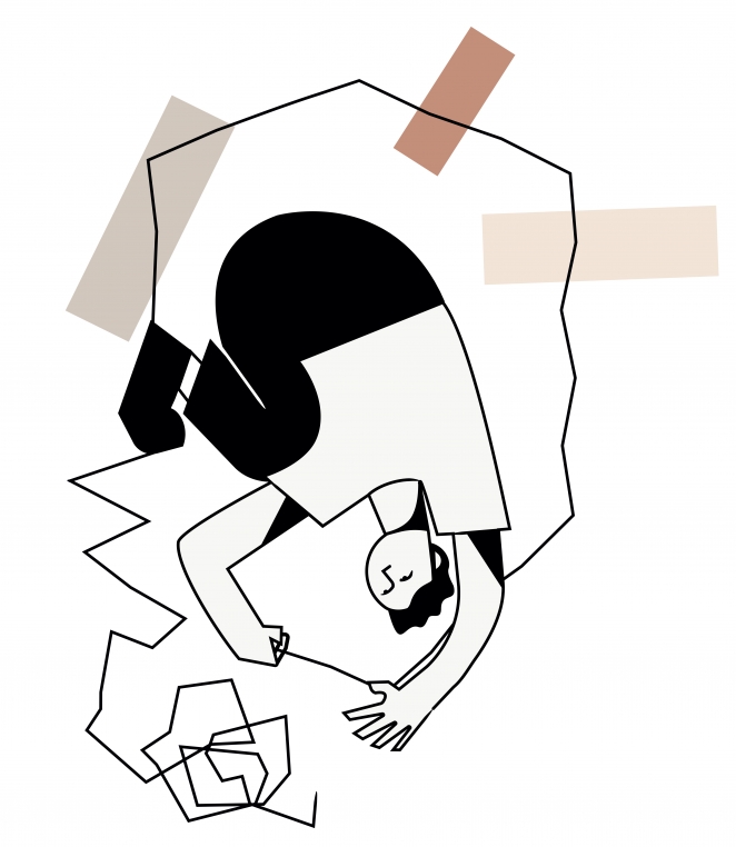
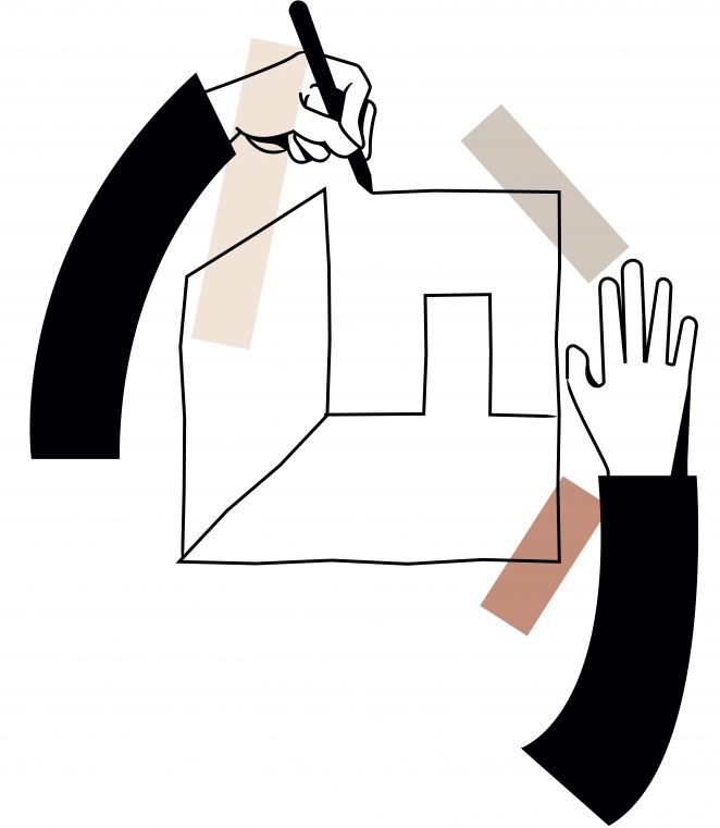
We loved every minute of the production process! Not just because we are the ‘client’ (and what a great client we are – we don’t say no to any great creative ideas!). Also, we sketch and draw everything in-house, rather than commissioning illustrators, so Miscellany benefitted from a passionate pool of talent eager to work their magic to embellish the identity with artistic touches. The creative brand was truly a team effort, overseen by me, with Miscellany’s logo designed by Gosia, web page design by Becky, with Rita creating the illustration style, designing a light and playful set of line drawings and collages breathing life into Miscellany.
Since this was an in-house project, no-one was watching the hours, so we poured love into every part of Miscellany. From helping our interiors team by designing the unique look of the mood boards, to creating all of the quirky animations. For the interiors team, Miscellany was just as much a labour of love, crafting the ‘Insta-Looks’, from Eco Sexy Cool to Dark & Stormy to Clash Clash Baby, each with a unique look and feel concept. Anna Burles, co-founder of Run For The Hills, wrote the copy for the site (drawing on her background as a journalist back in the day) and Mimi, Jemma and Nicola put together the room-set vignettes and hunted down all the amazing products for the instant-shopping lists.
Being created in lockdown had lots of its own problems, as we and the rest of the world adapted to working remotely, which definitely made the process more time-consuming. We used Webflow rather than WordPress, our traditional forte, for the Miscellany website. We’d been wanting to move into Webflow for a while, so it felt right to test ourselves out on a project where there wasn’t a real client – so we could really experiment and learn, but not under pressure. We looked for support and mentoring in the form of Webflow expert Daniel Drabik (Buck Rabbit) who guided us through this first foray into the wonderful world of Webflow; developing for us, but also training us to do it ourselves at the same time. Miscellany is a very complicated site, with much more going on than the usual ‘looky looky’ hospitality sites that we tend to design for our restaurant clients. We really challenged ourselves to do something really sophisticated and innovative that reflects our vision.
What is one funny or notable thing that happened during the production of the campaign?
We’ve had a lot of laughs along the way, pushing ourselves to make Miscellany uber cool and really unique, which hasn’t been easy. Coming up with a pricing strategy was also headache-tricky (charging always is!). As Miscellany is an own-brand-in-house project meant it did often take a back seat to pressing paid client project design work. So inevitably the project stretched from a planned hot-house 3–4 months to three times that. But we launched it, and we couldn’t be prouder. It’s not often you get to showcase your design skills to the ultra max.
What’s the main message of the campaign and why does it matter?
Miscellany is all about democratising Interior Design. Hiring a designer has long been considered the sole preserve of people with a serious amount of money, but it doesn’t have to be. Miscellany exists to show how accessible it can be to people who just need a bit of help and don’t know where to look. Even just a small amount of expert guidance on your thorniest design-related questions and challenges can really unlock things for a client, saving them a huge amount of time and worry as well as heaps of cash and potential costly mistakes.
What is one unique aspect of the campaign?
It’s a bold move to launch an interior design service website that doesn’t really have any interiors photography. But we felt the need to stand out and create a more creative type of e‑design service, for people who love our style and the look of the site really has gone down amazingly with people. It’s full of our signature creative style and beautifully considered graphics, as well as gorgeous mood boards and interior collages, so people can really ‘feel’ the Run For The Hills award-winning style connection, but Miscellany stands on its own as a really strong and different diffusion service. Having such a lovely graphic backdrop also creates the perfect platform for a multiplicity of different interior ‘Insta-Look’ designs to breathe side by side.
The styling has unashamedly ‘editorial’ feeling, which we used to celebrate the difference between us and the other e‑design services. Miscellany is the perfect partner for clients who love our eclectic, bold interiors style, but who just might not have the budget to hire us for the full duration of their refurbishment. So, the web design ’talks’ to those who love what we do and who we are as an agency. It’s creative and edgy and cool, but it’s also friendly and warm.
How long did it take from inception to delivery?
Like a regular baby, it was about 9 months. Conceived in the early months of lockdown and born just in time for the world opening up again.
What do you hope it achieves for the brand?
Our mission for the Miscellany website and launch campaign is to bring hope to despairing homeowners worrying about where to start making their homes look amazing and work better on a budget. Miscellany is here to make professional interior design help easy, affordable and accessible to all.
Credit list for the campaign?
Creative Directors: Christopher Trotman and Anna Burles
Web Design: Rebecca Webb
Logo and icons: Gosia Bugaj
Illustrations and animation: Rita Nicolau
Interior Design Team ‘Insta-Looks’: Jemma Busby, Nicola De Decker, Mimi Pearce
Webflow Developer & digital design team tutor: Daniel Drabik
- AI
- Animation
- Art
- art deco
- Awards
- bar design
- branding
- coffee
- Custom Neon
- Exhibition
- Graphic Design
- great spaces
- hospitality
- hotel
- illustration
- Images
- images that make you stop
- In Conversation with...
- In Venue Graphics
- Inspiration
- interior design
- jobs
- Lighting Installations
- Limited Edition Art Prints
- maps
- miscellany
- Nature
- Neon
- New work
- Opinion Piece
- Our Process
- photoshoot
- Press Coverage
- product design
- residential design
- restaurant design
- shop
- sourcing
- styling
- Taxidermy
- tee shirt design
- The Other Art Fair
- The Studio
- Travels to remember
- Uncategorized
- Video
- Wallpaper
- website design
- window decals
- workspace

