
Bennetts Hill House
This project saw us transform an unloved and dilapidated Georgian bank in the heart of Birmingham into an urban chic, loft style office space. Restoring the heritage building to its former glory and raising the bar on workspace design in the city at the same time.
The space is spread over five floors, comprises close to 20,000 square feet. The building has an amazing location, less than five minutes walk from New Street Station, where the HS2 will arrive, linking Birmingham directly with London, The East Midlands, Leeds and Manchester.
Bennetts Hill House is the second collaboration between Run For The Hills and property developer Dunmoore, following the success of the redevelopment, styling and rebranding of the Wireless Factory warehouse style workspace project in West London.
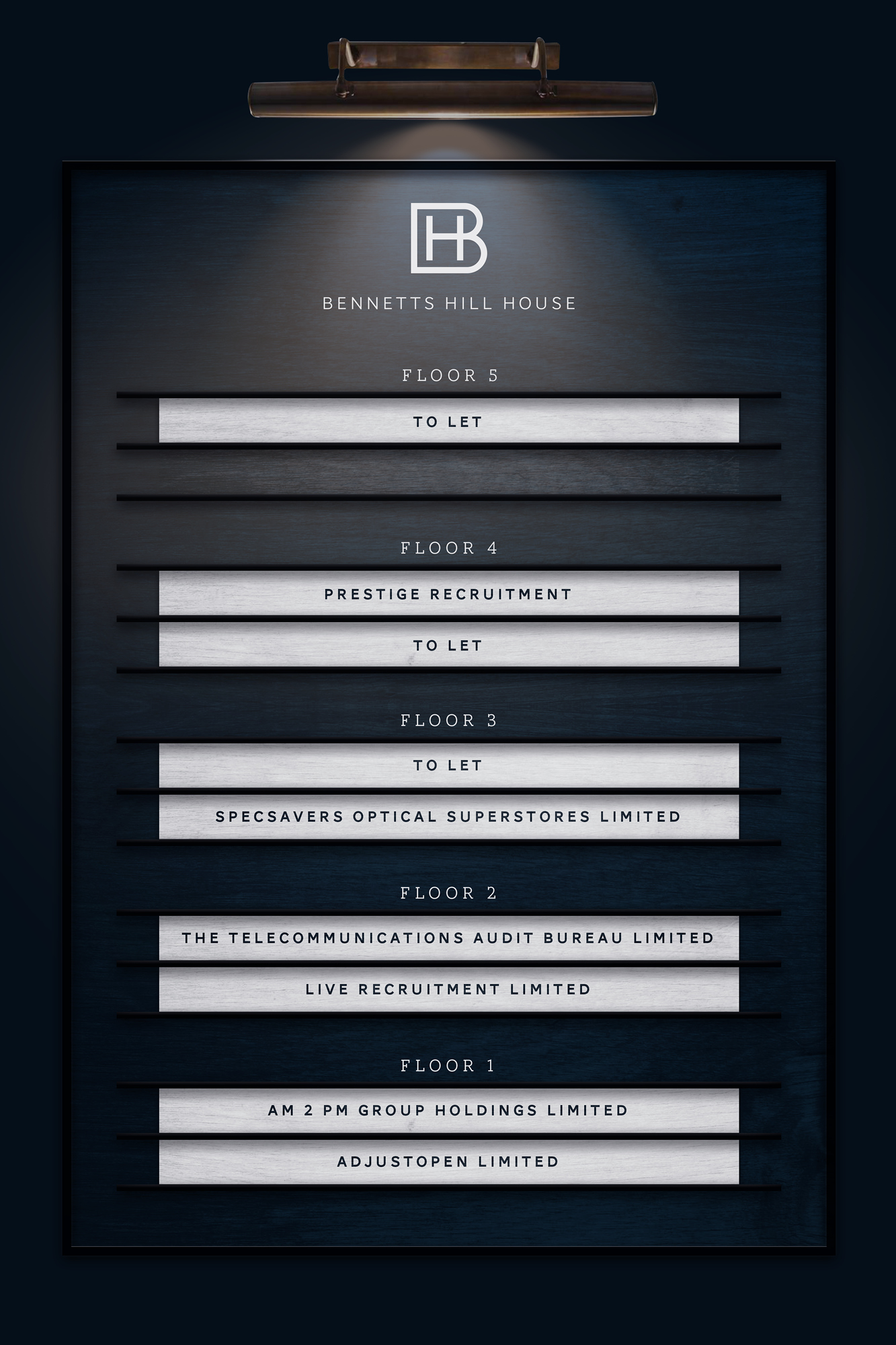
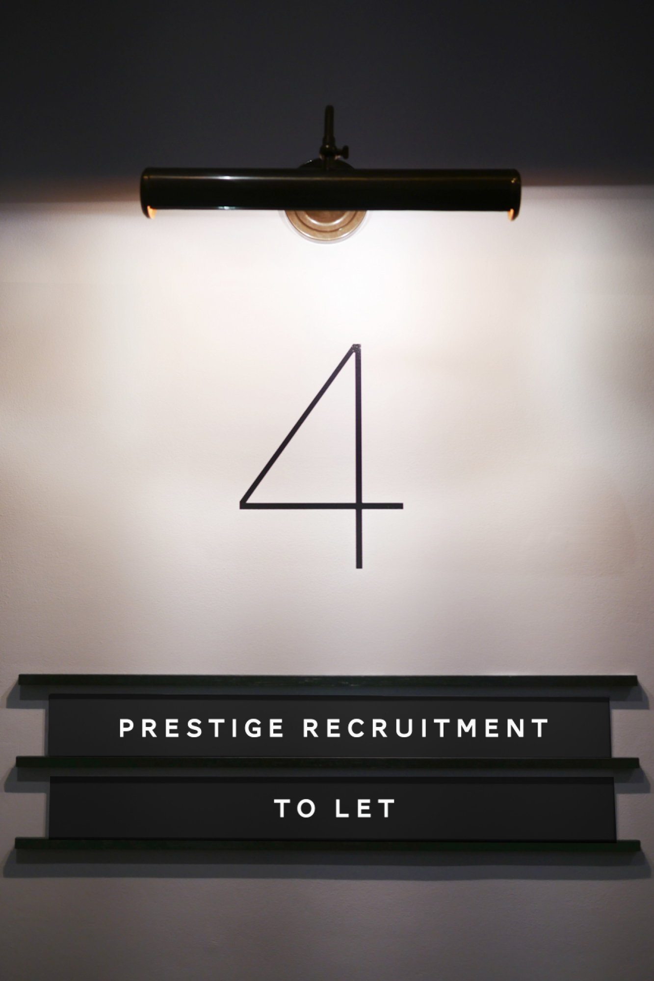
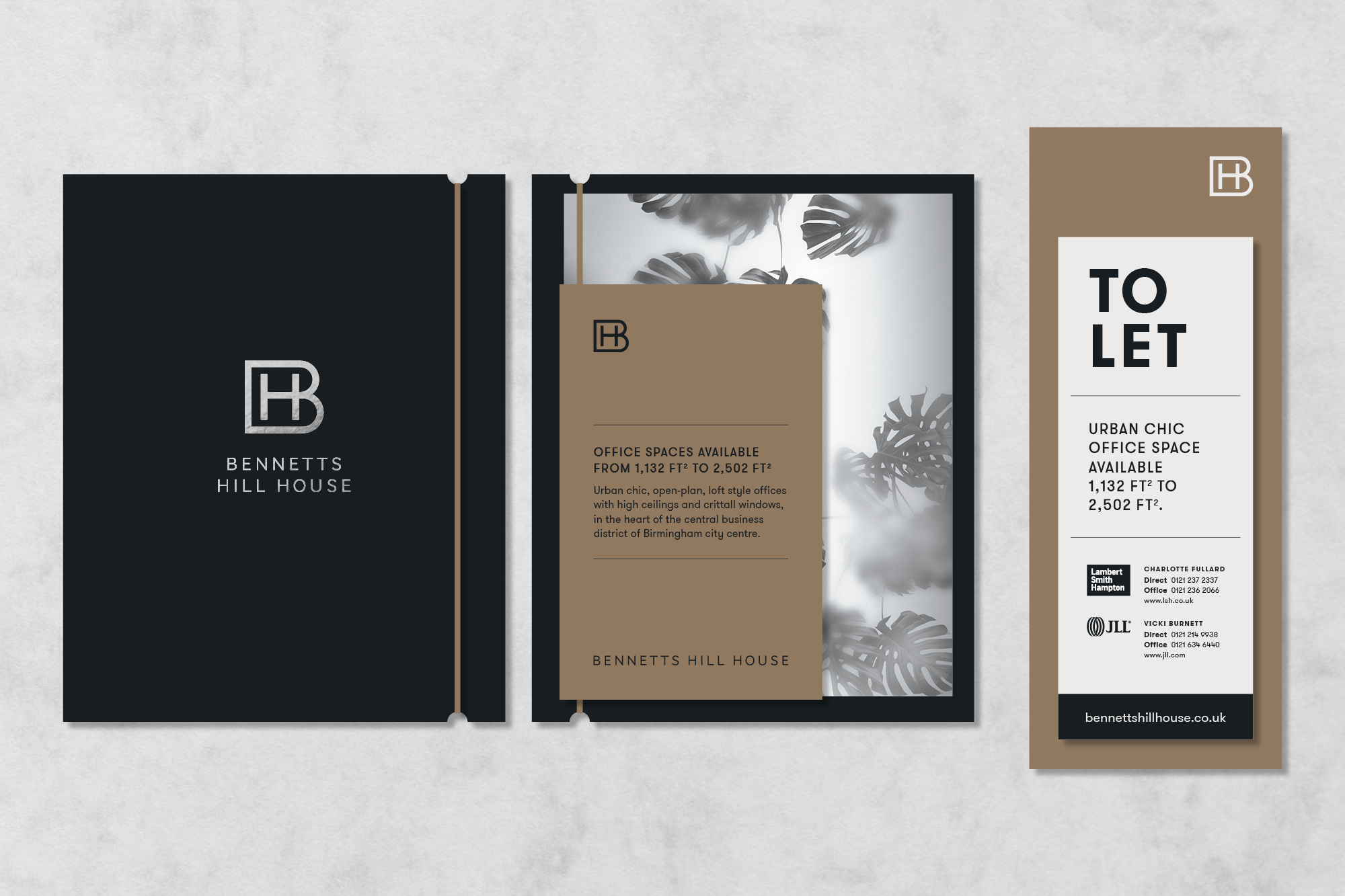
Our holistic approach, included working on everything from the interior design of Bennetts Hill House, to origination of the branding, logo and entire visual identity and website. Designing everything from the exterior signage and the ‘to let’ board outside, to the company board in the main lobby and internal way-finding and signage throughout the building. Having both interior and branding teams in-house has allowed a design synthesis between all elements of Bennetts Hill House’s new creative identity.
Welcome to the club
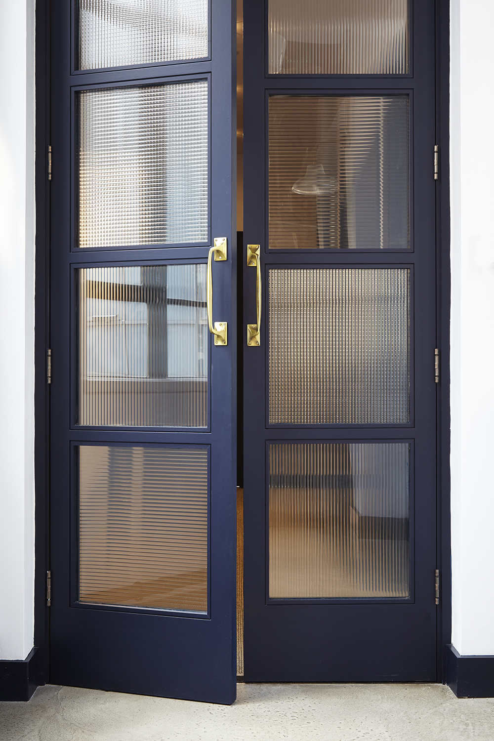
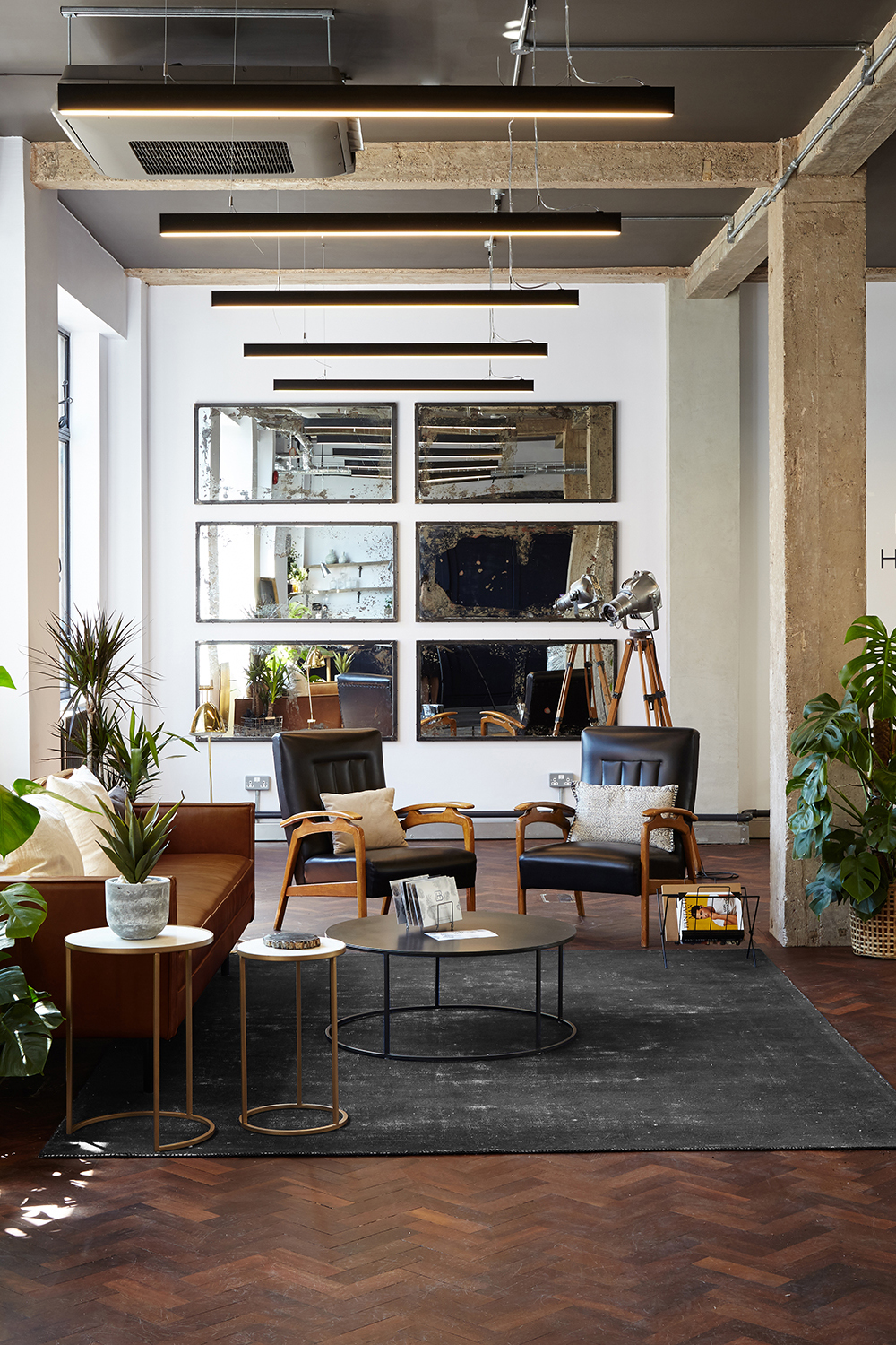
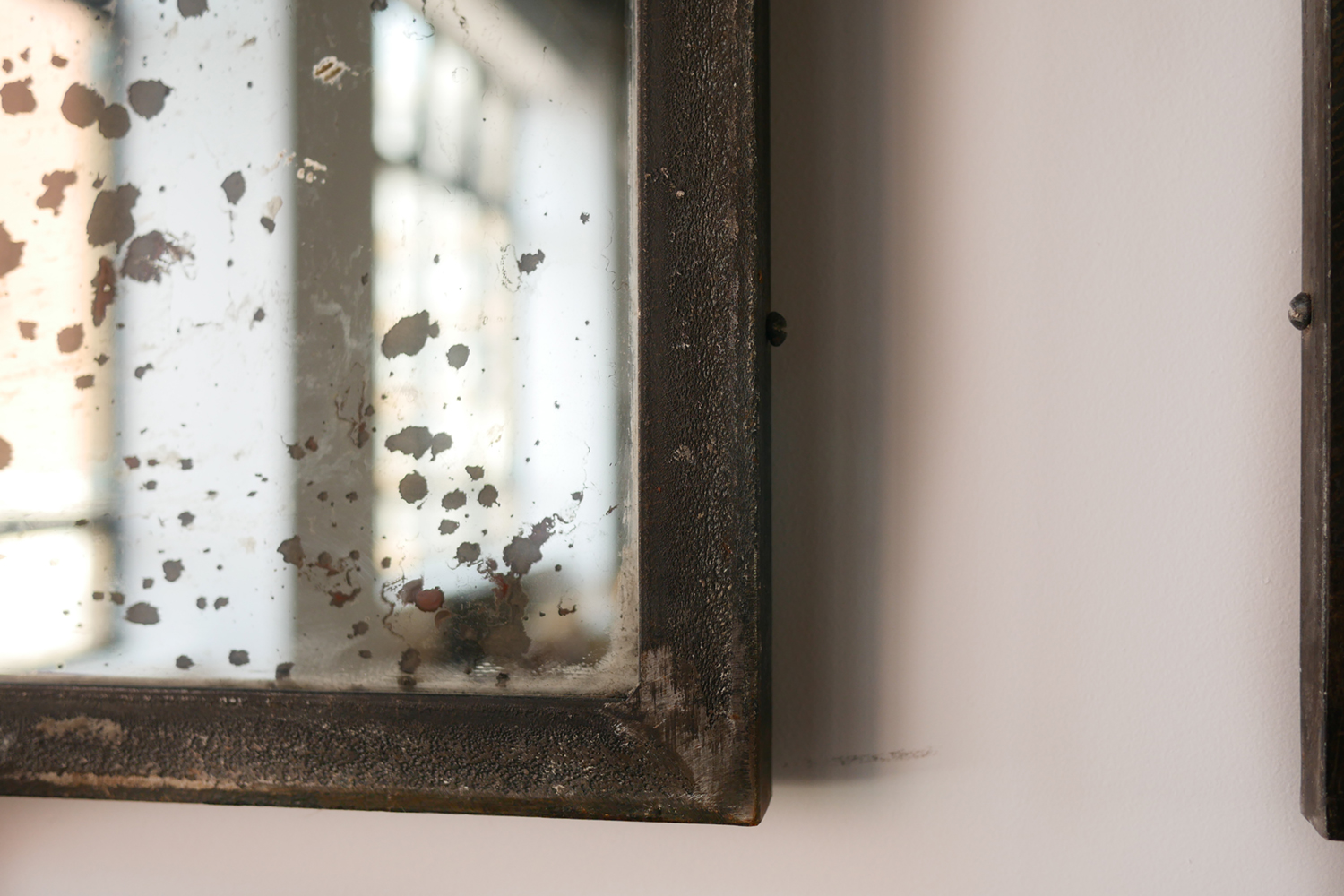
Drawing inspiration from Georgian facades and private members club entrances, the exterior of the property is now befitting of the young, vibrant clientele it seeks to attract. The front door, repainted in an inky dark Paint & Paper Library blue, is adorned with bronze ironmongery; an antique-style bell, door knocker, letter plate and buzzer. Above and around the main sandstone entrance, statement new signage in blackened steel and antique brass give visitors a hint of the premium design within. The main lobby features oversized antique mirrors, flanked by the project’s eponymous dark blue painted walls.

Shoreditch Chic
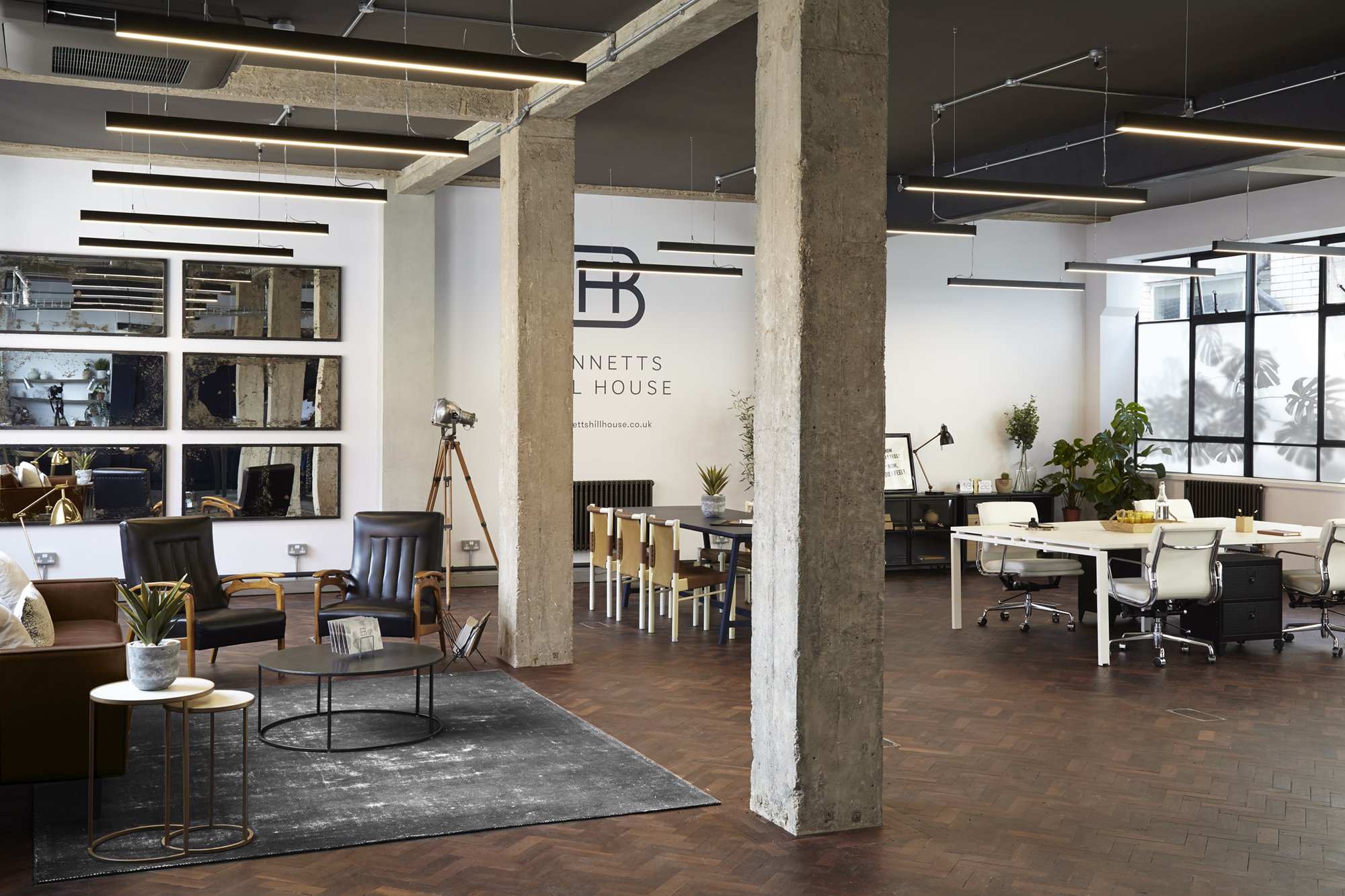
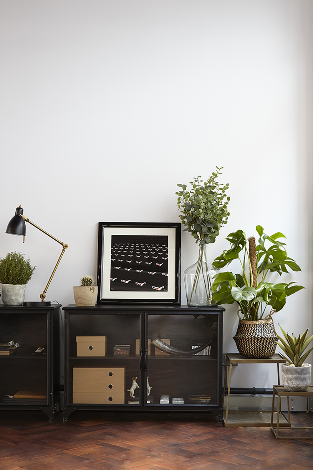
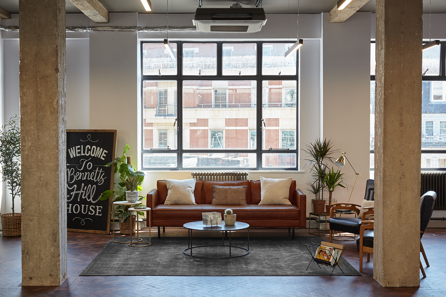
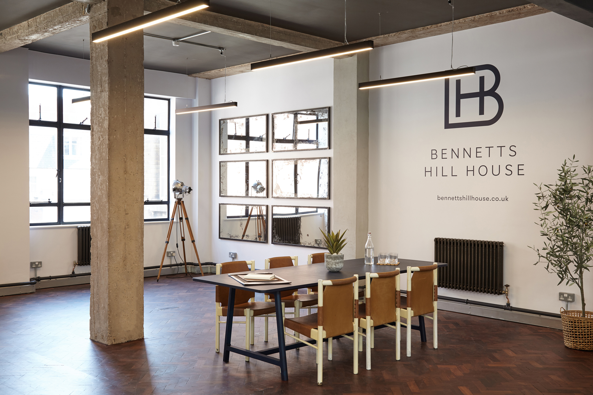
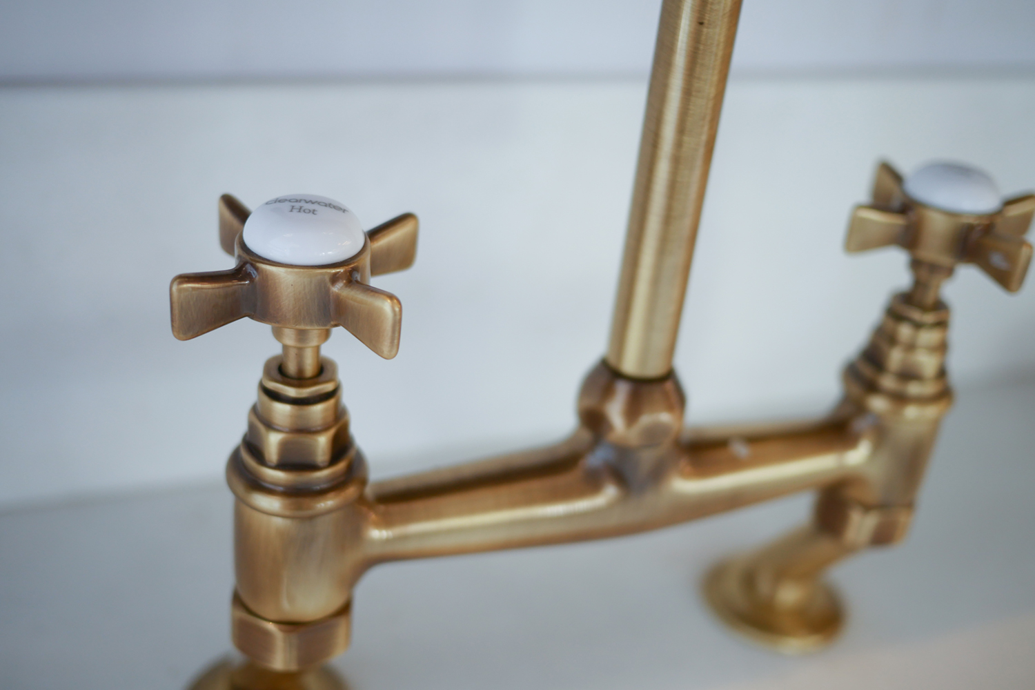
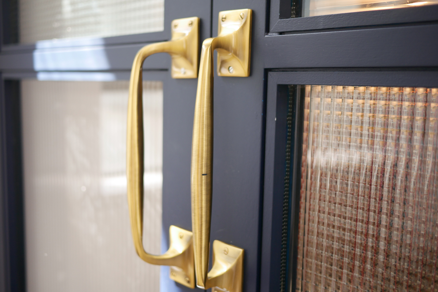
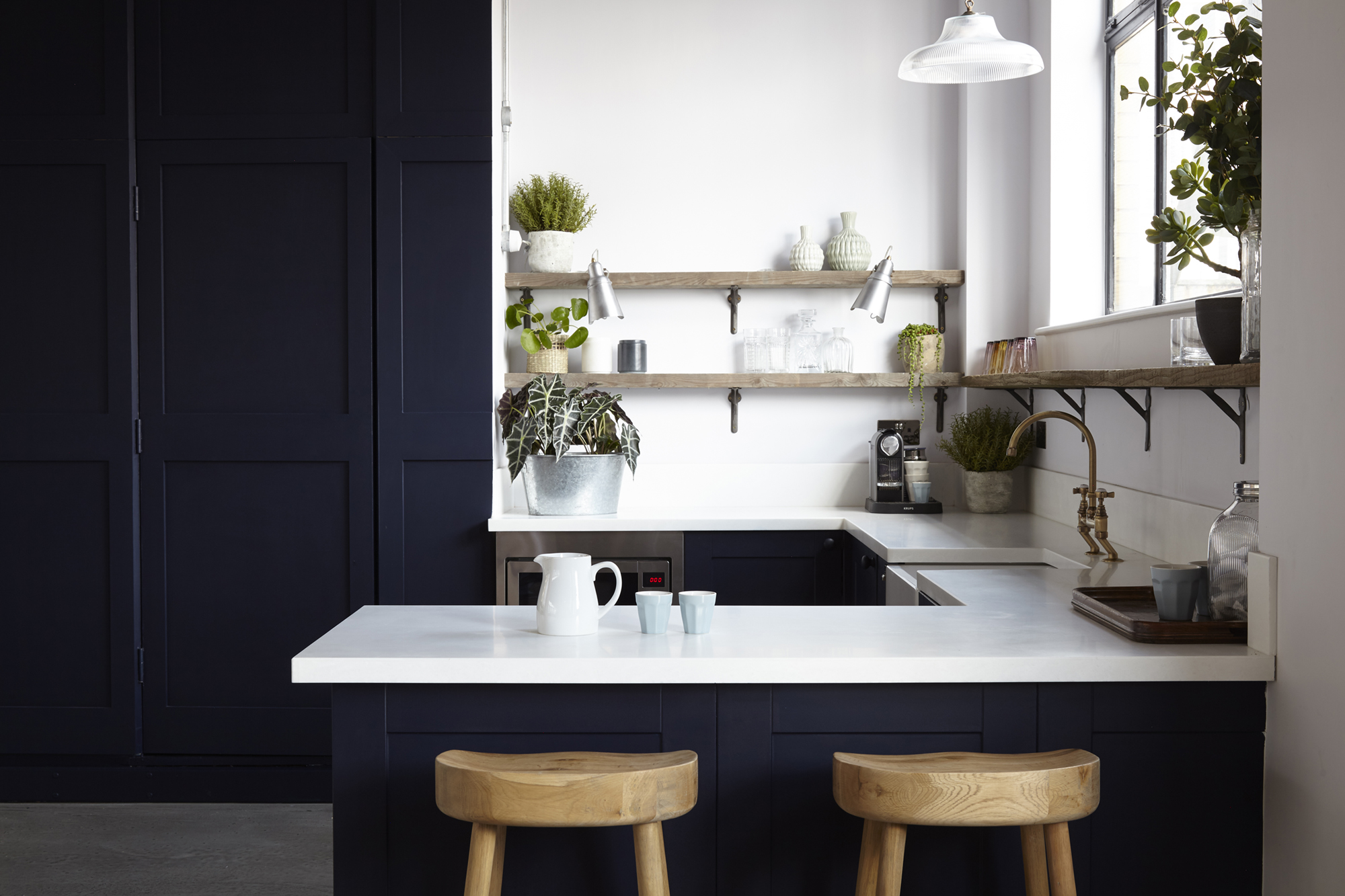
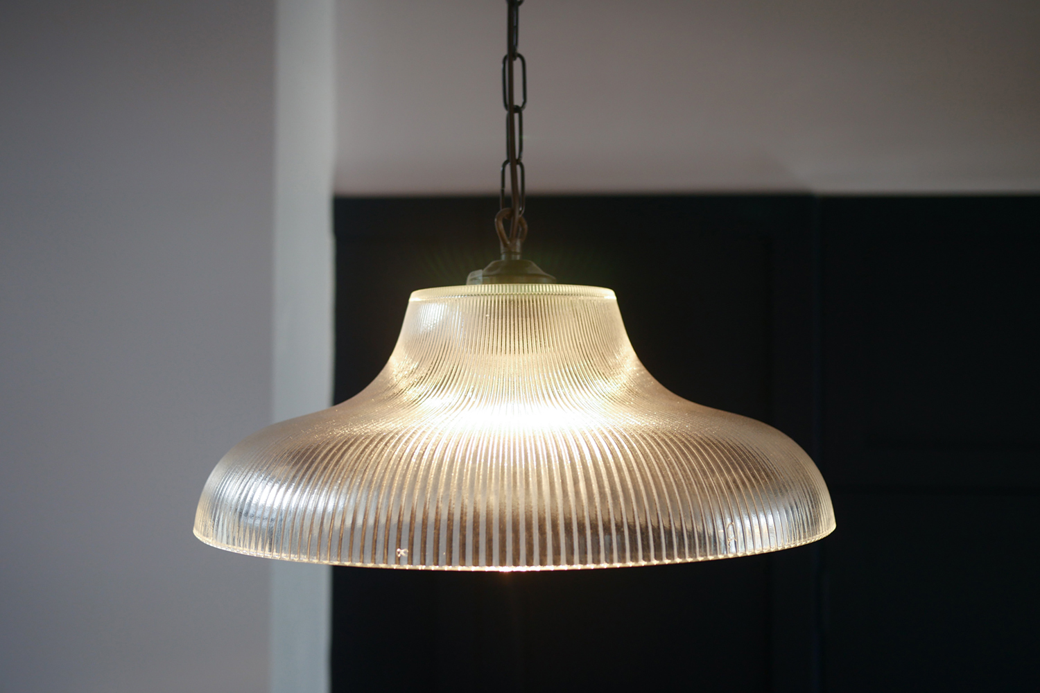
The new open-plan offices feature super high ceilings with exposed concrete pillars, exposed steel beams and oversized vintage blackened steel mirrors. The ‘studios’ also feature large, steel-framed Crittall windows on all sides, allowing swathes of natural light to flood through the space. The show suite on the 4th floor also showcases the stylish shaker style kitchens designed by the interiors team, featuring crisp marble worktops, super dark painted cabinets and doors, antique brass taps, butler sinks and apothecary style cabinet handles. Rather than overhead cupboards,the kitchens have reclaimed timber open shelving with cast iron brackets, making a style statement and keeping things feeling light and airy.
Georgian Shower
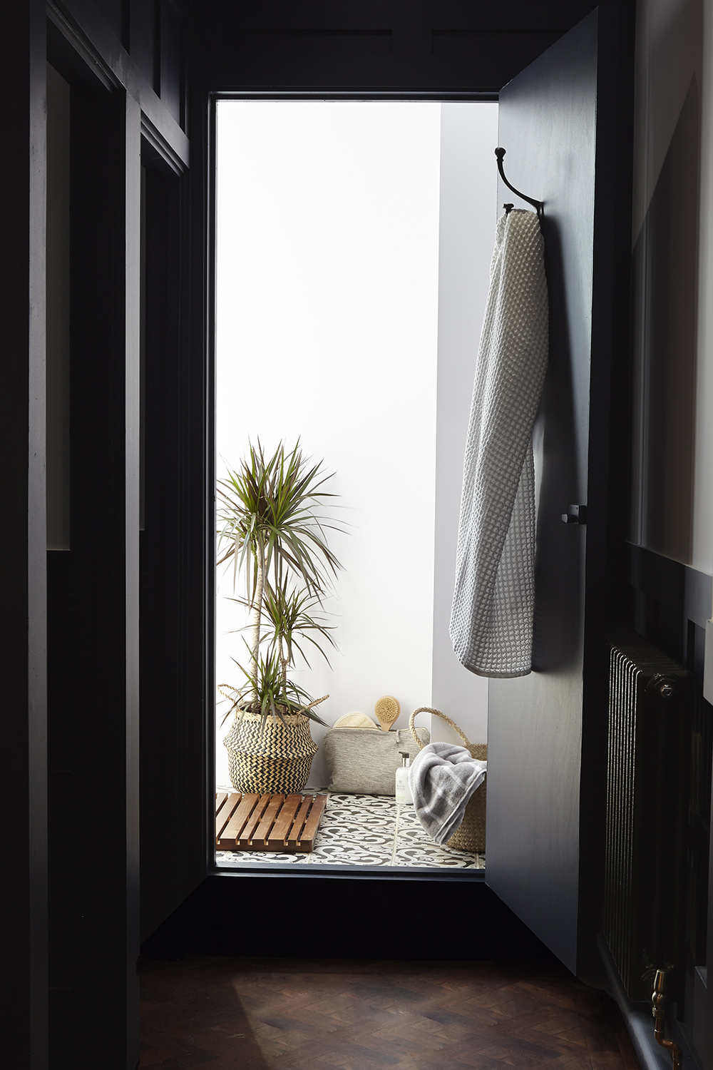
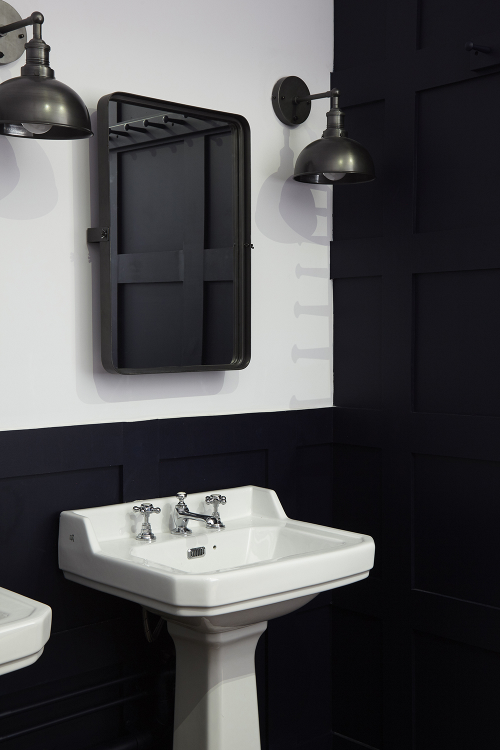
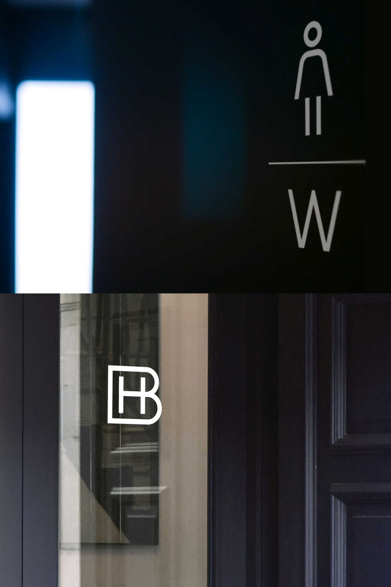
Each floor of the building also has beautifully styled WCs and private showers, featuring the original reclaimed parquet from the Georgian Bank’s original fit out, and new dark painted geometric timber panelling, new Victoriana style sinks and high level cistern WCs, with industrial cool wall lighting and tilting mirrors. All of which would be much more at home in a boutique hotel than your average workspace.
Understated elegance
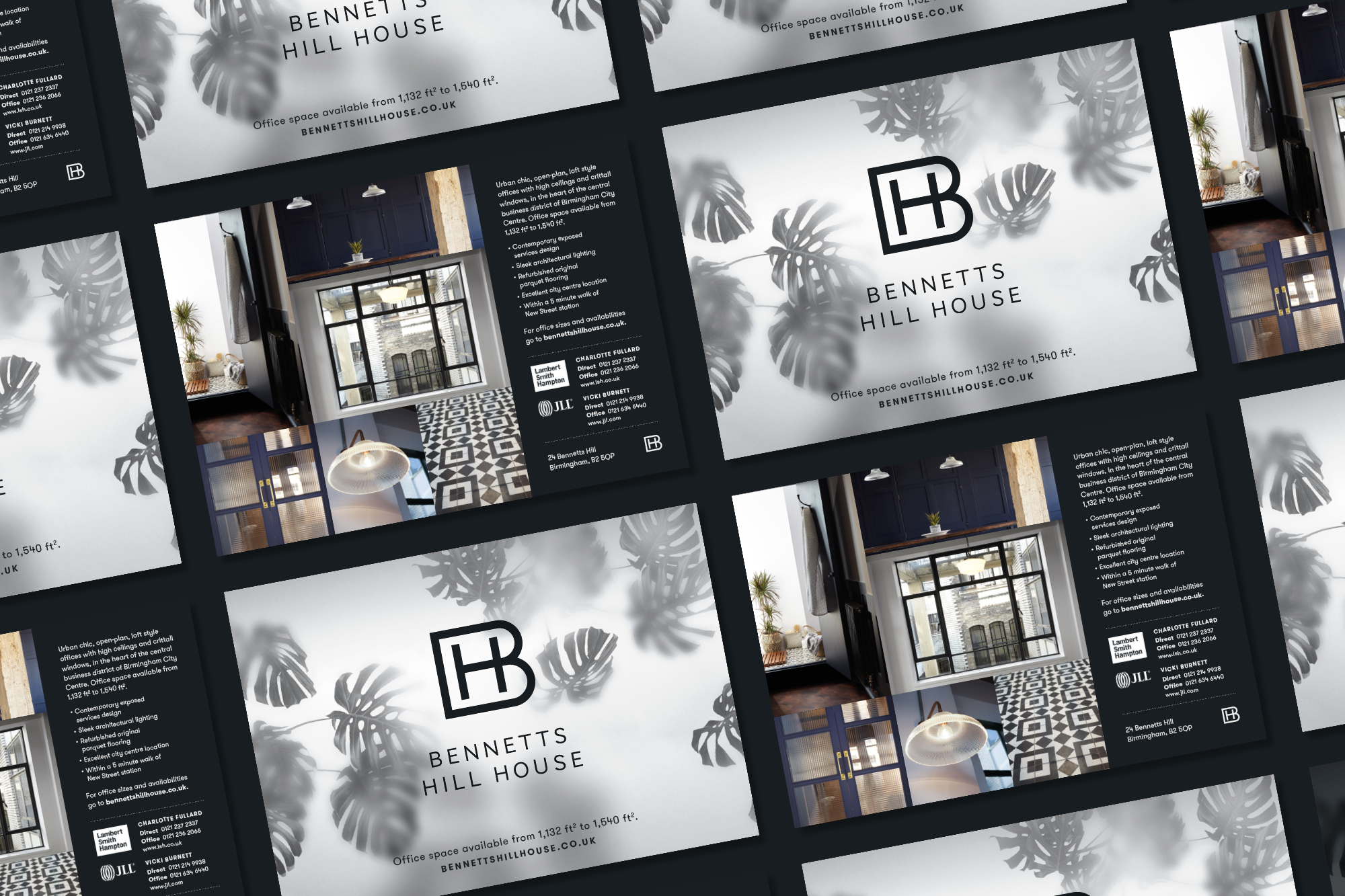
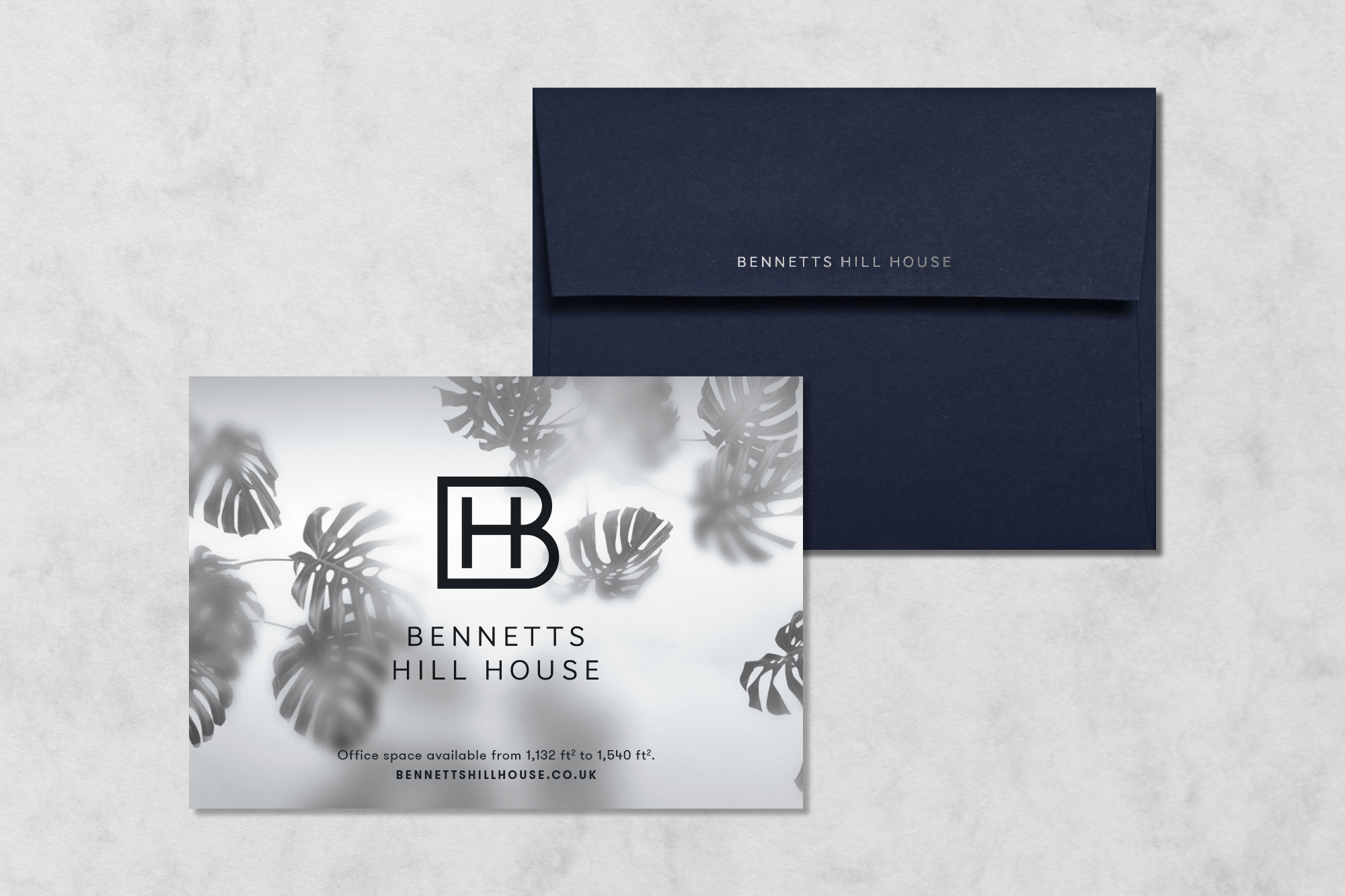
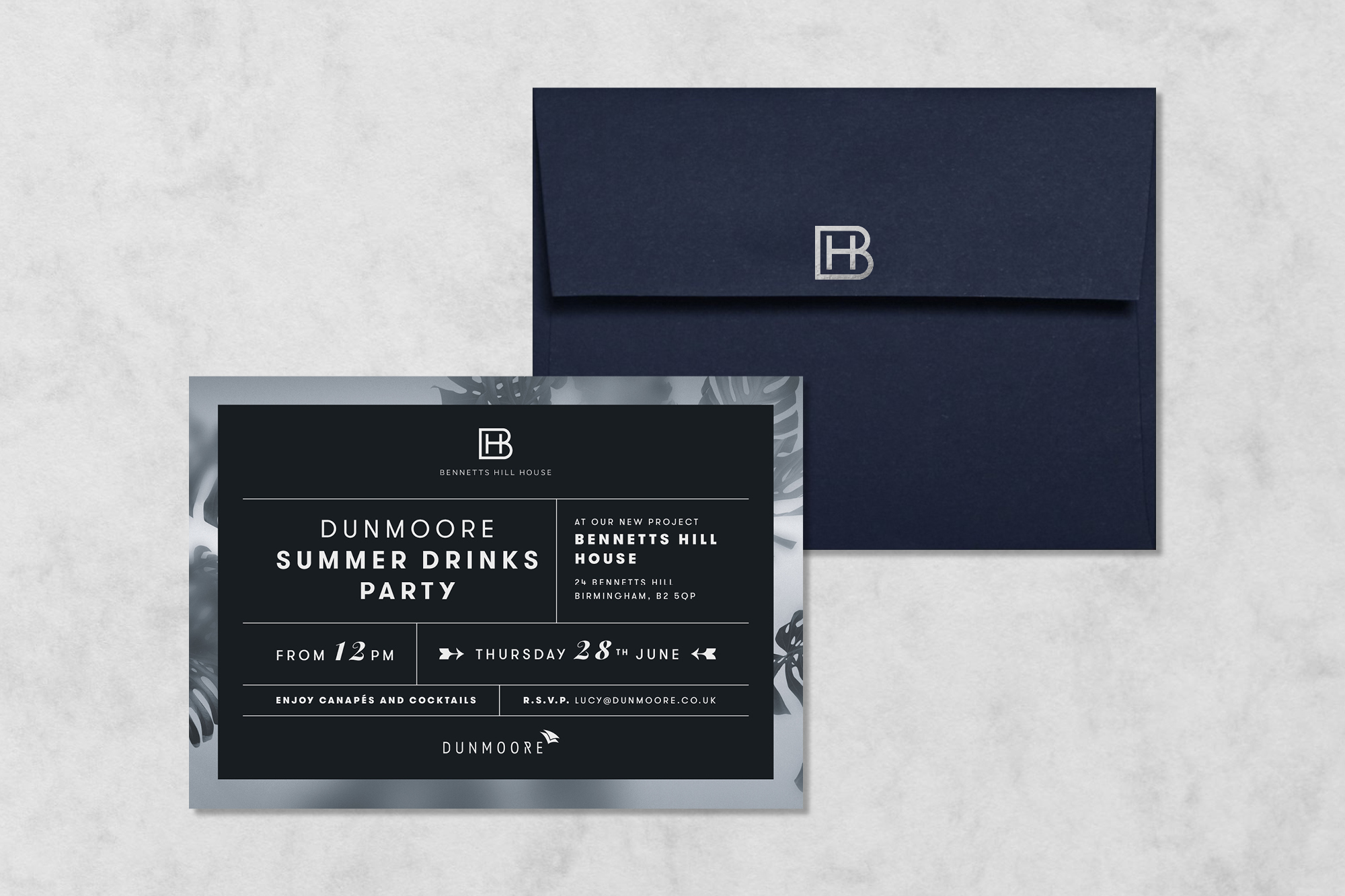
We kept the branding sophisticated and sleek, with a Member’s Club feel, in-keeping with the interiors, using a palette of dark blue and white. Our signage designs, in die-cut metals have been kept discreet and minimal. Bringing in textures and patterns including the cheese plant decals.
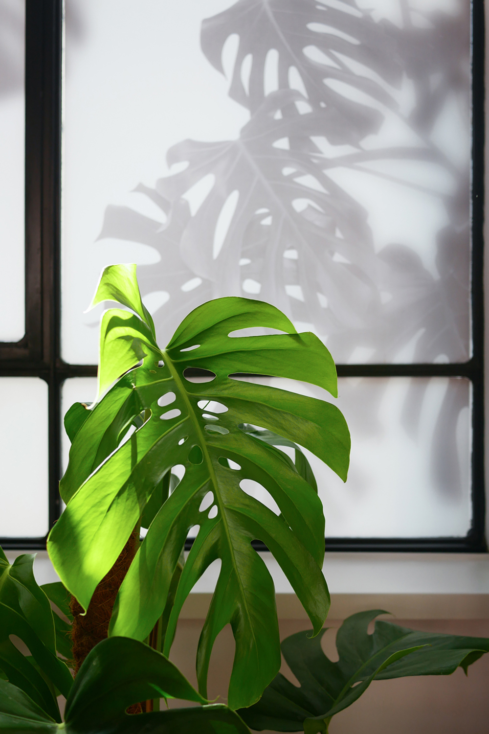
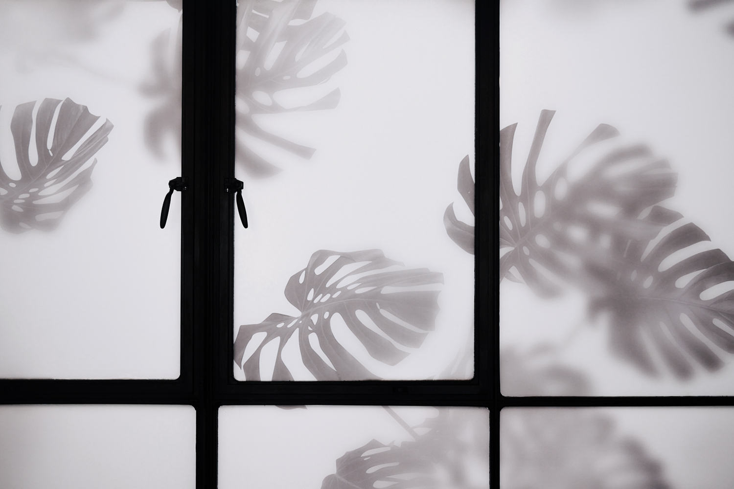
Monstera deliciosa
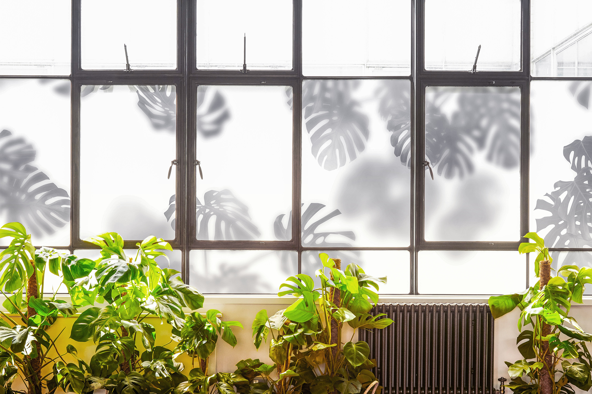
We used an atmospheric Monstera semi-opaque plant graphic created for the crittal style windows of the show suite within the interiors and on the website, connecting the marketing campaign to the physical space.
Website Design
We designed a responsive WordPress website featuring images of the show suite, downloadable floor plans and a local area map.
Services used
Brand Identity
Logo Design
Website Design
Illustration
Branding
Workspace Design
Signage and Wayfinding

