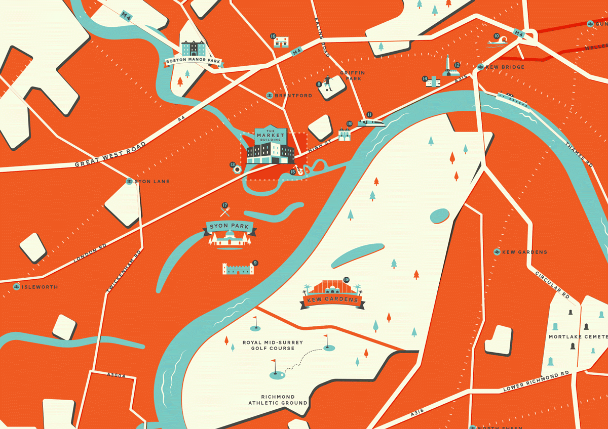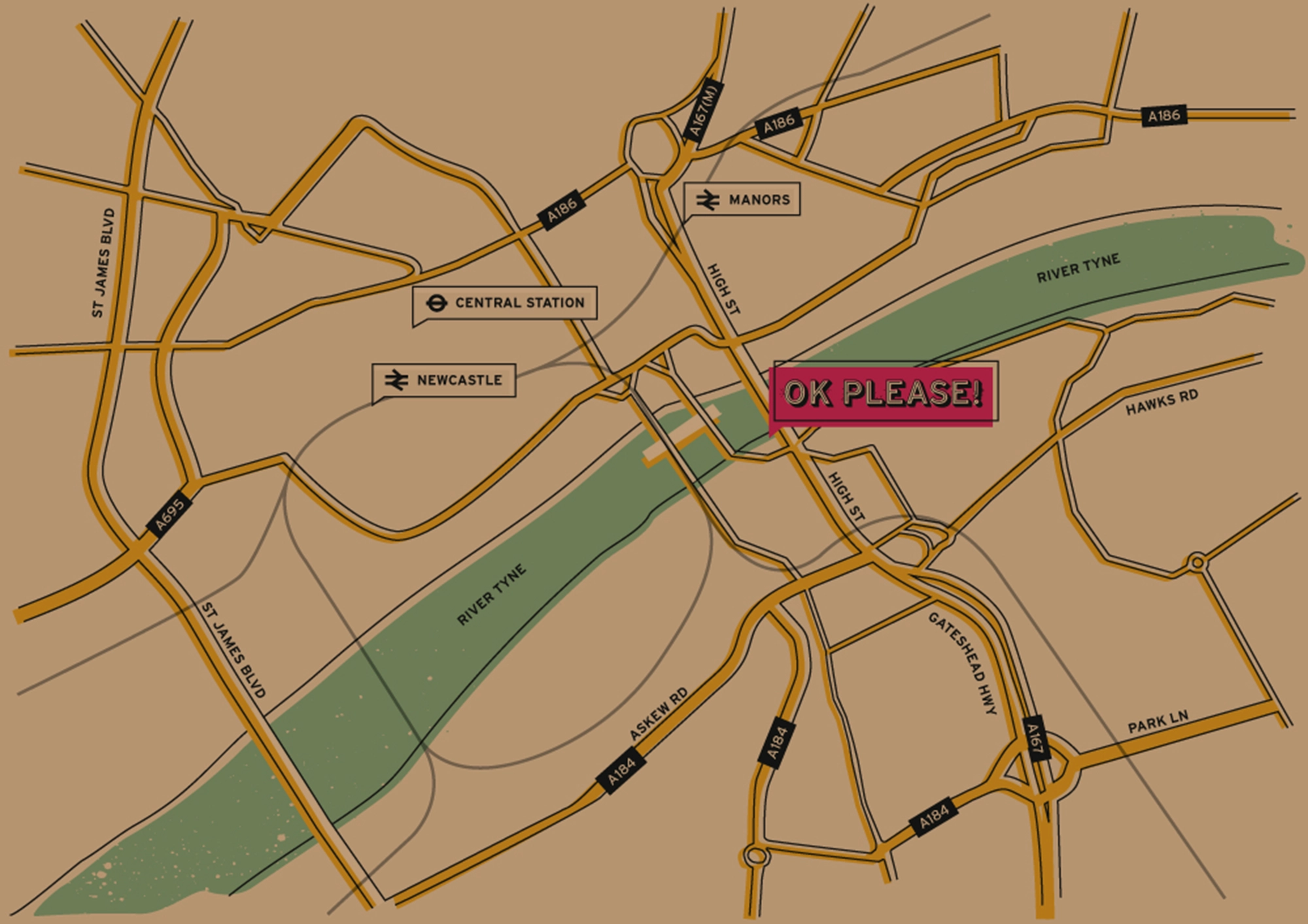
It’s no secret that we love a map here at Run For The Hills. We see them as a lovely graphical embellishment to our hospitality and property projects – beautifully designed, custom-crafted, brand-infused location maps that feel like a natural extension of the world we’ve created.
They’re built using the brand’s colour palette and typefaces. Often illustrated, sometimes animated. They might show nearby landmarks, the closest tube station, a nod to a local haunt, or a witty bit of brand messaging. They’re not meant to be fully navigable – that’s not really the point. Everyone’s got Google Maps in their pocket. What ours do is orient you at a glance and pull you further into the feel of the brand.
They’re also a signal – a marker of care, craft, and attention to detail. Visitors don’t need to say “wow, great map” (though they sometimes do). They just feel like the brand knows what it’s doing. That it sweats the small stuff. That it has personality. And when we can sneak in a touch of humour or a mini animation? Even better. It’s just another way to make the websites we build more distinctive and memorable.
A bespoke map isn’t just a visual flourish. It’s brand storytelling, cleverly disguised as wayfinding.