We love it when interiors and graphics speak the same language — when branding isn’t just something applied at the end, but something that emerges organically from the spatial design and evolves with it. Our work with Kricket is a perfect example of that connected, collaborative approach.
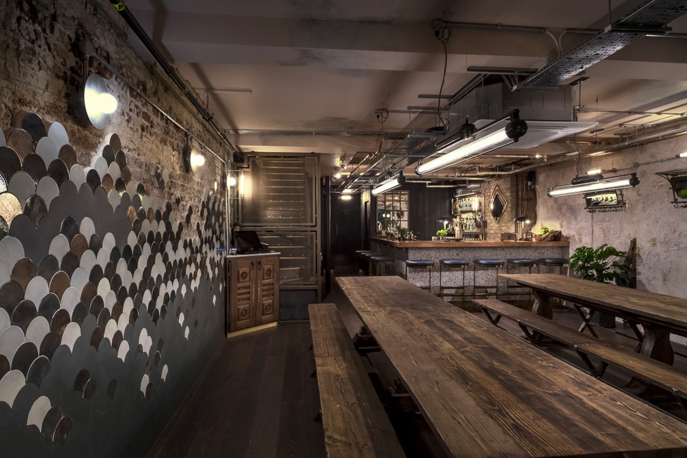
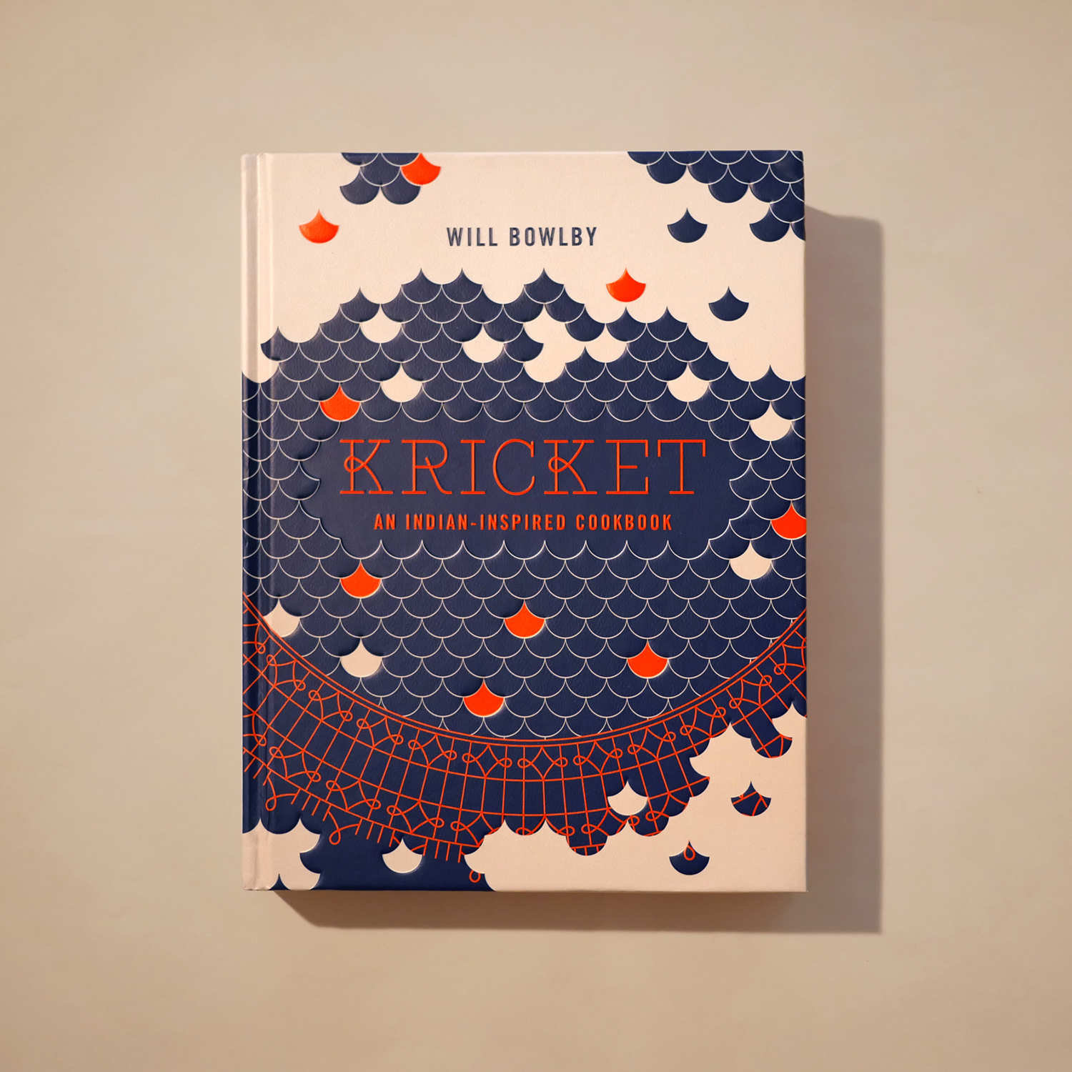
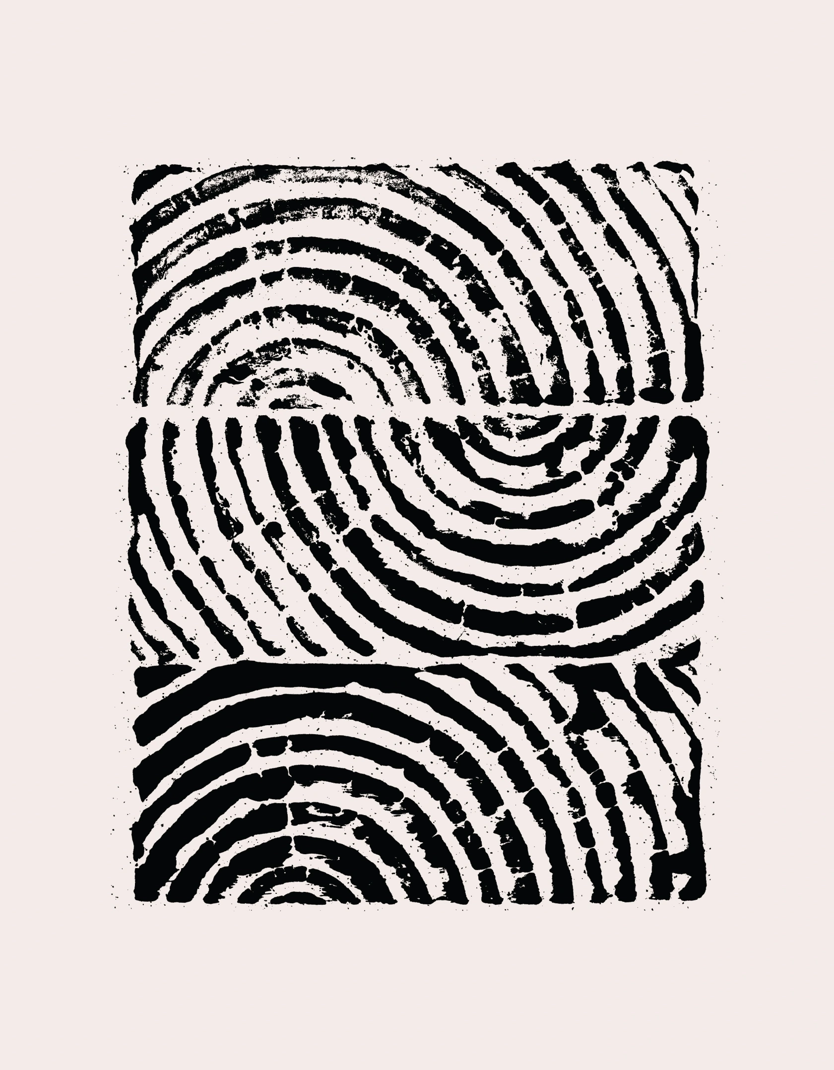
When we designed Kricket’s very first bricks-and-mortar restaurant in Soho, our interiors team clad one of the basement walls in shimmering, hand-fired fish scale tiles. Fast forward a couple of years, and our branding team took that same detail as inspiration for the cover of the Kricket Cookbook. The result: a beautifully embossed, textural design featuring a mandala-style motif built from a repeated ‘K’ — an abstract celebration of the brand’s name, ethos, and evolving aesthetic.
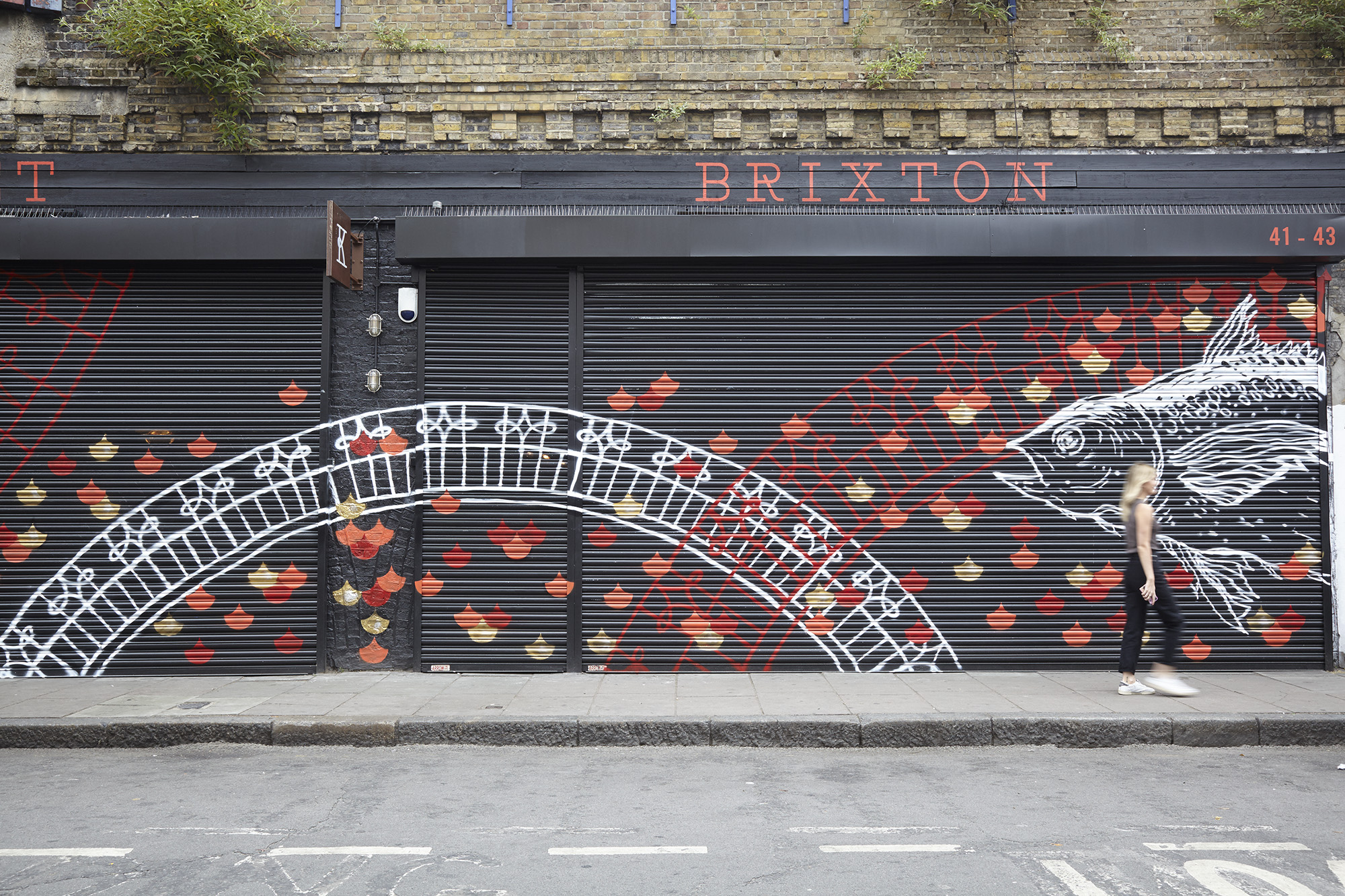
That design didn’t stop at the page. When Kricket opened their second venue under the arches in Brixton, we collaborated with a local graffiti artist to bring the mandala to life on the venue’s exterior shutters. He pulled directly from the cookbook artwork, fusing the illustrative elements and fish scale patterns into an eye-catching streetscape piece — bold, textural and unmistakably Kricket.
These motifs have since become synonymous with the brand, threading through every touchpoint. From restaurant walls and cookbook pages to the homepage of their website, the visual language coming full circle.
It’s a lovely example of our joined-up approach, where interiors inspire branding, branding feeds back into the built environment, and everything works together to build a rich, layered brand world.