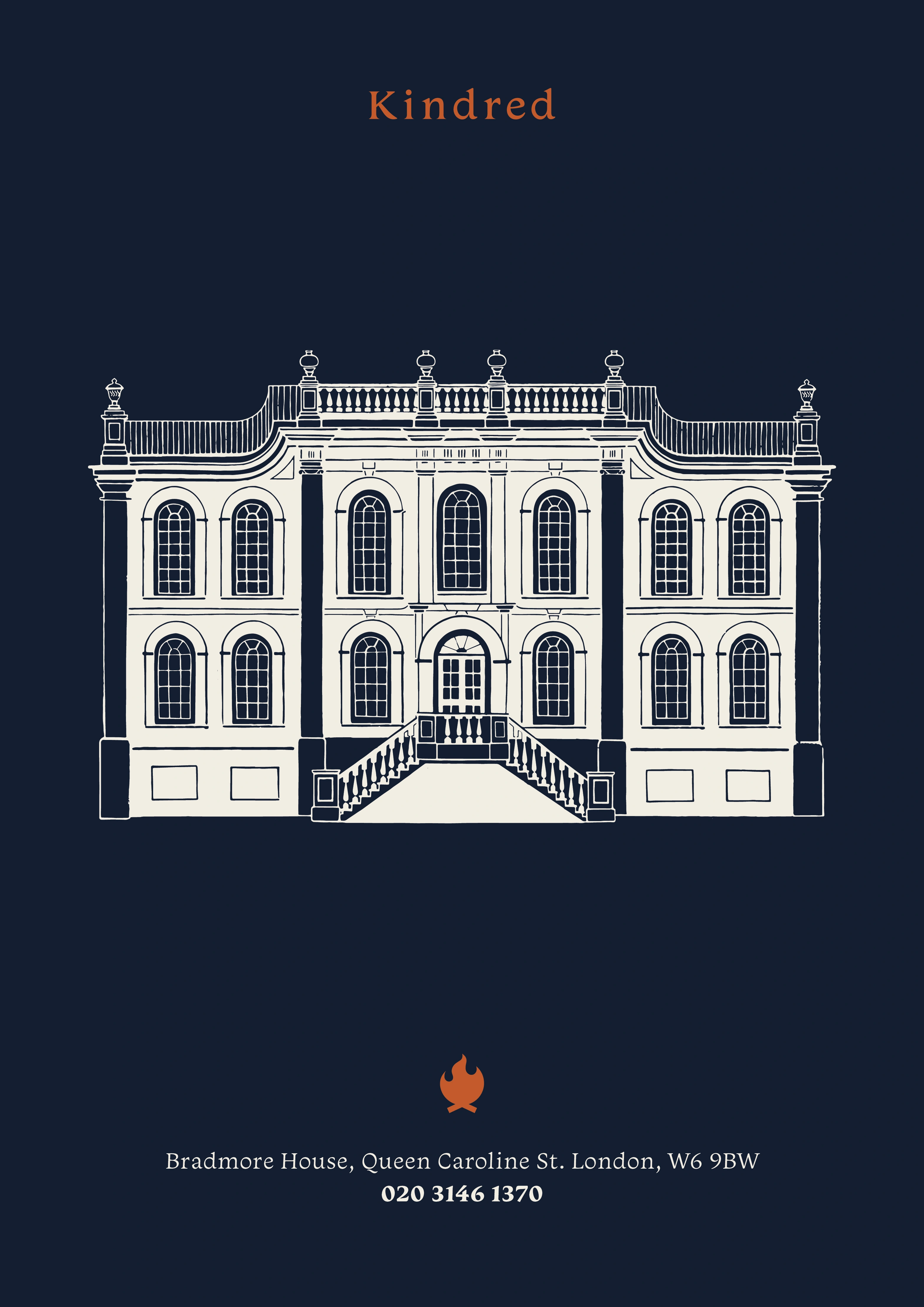
kindred
open house club
We reimagined this hospitality and events venue as a warm and welcoming community hub, redesigning interiors across three floors of a historic Hammersmith landmark. From a characterful lounge and co-working zones to a show-stopping top-floor cocktail bar, we layered tactile, eclectic styling with a refined visual identity. Our branding work included a full design toolkit, from logotype to cocktail book.


interior makeover
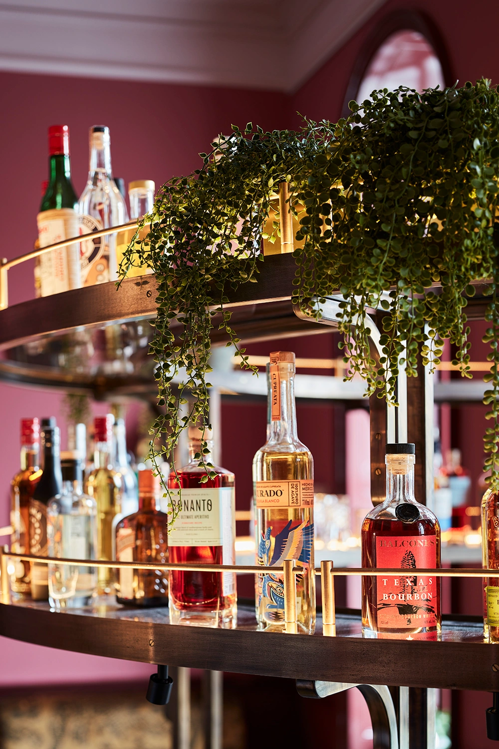
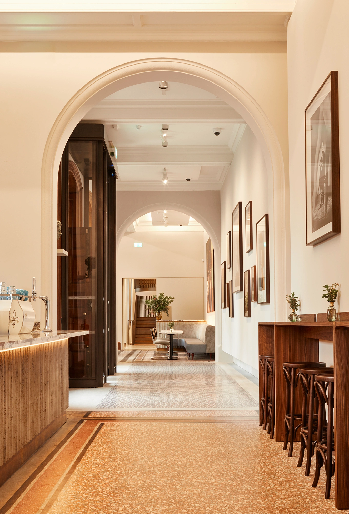
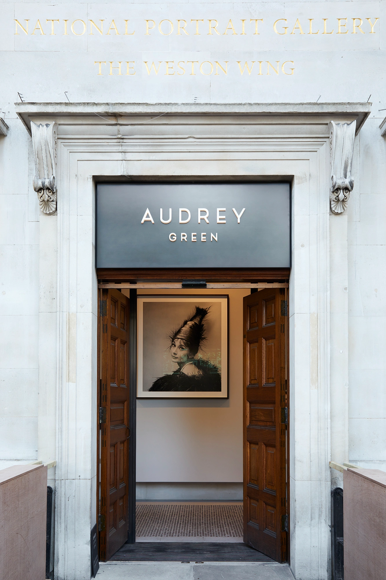
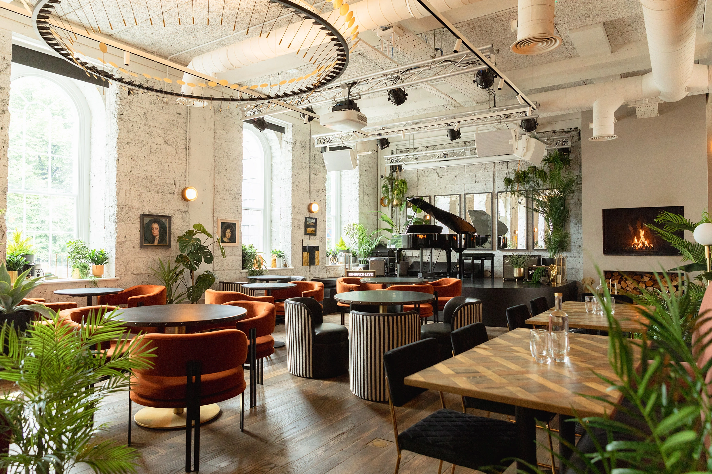
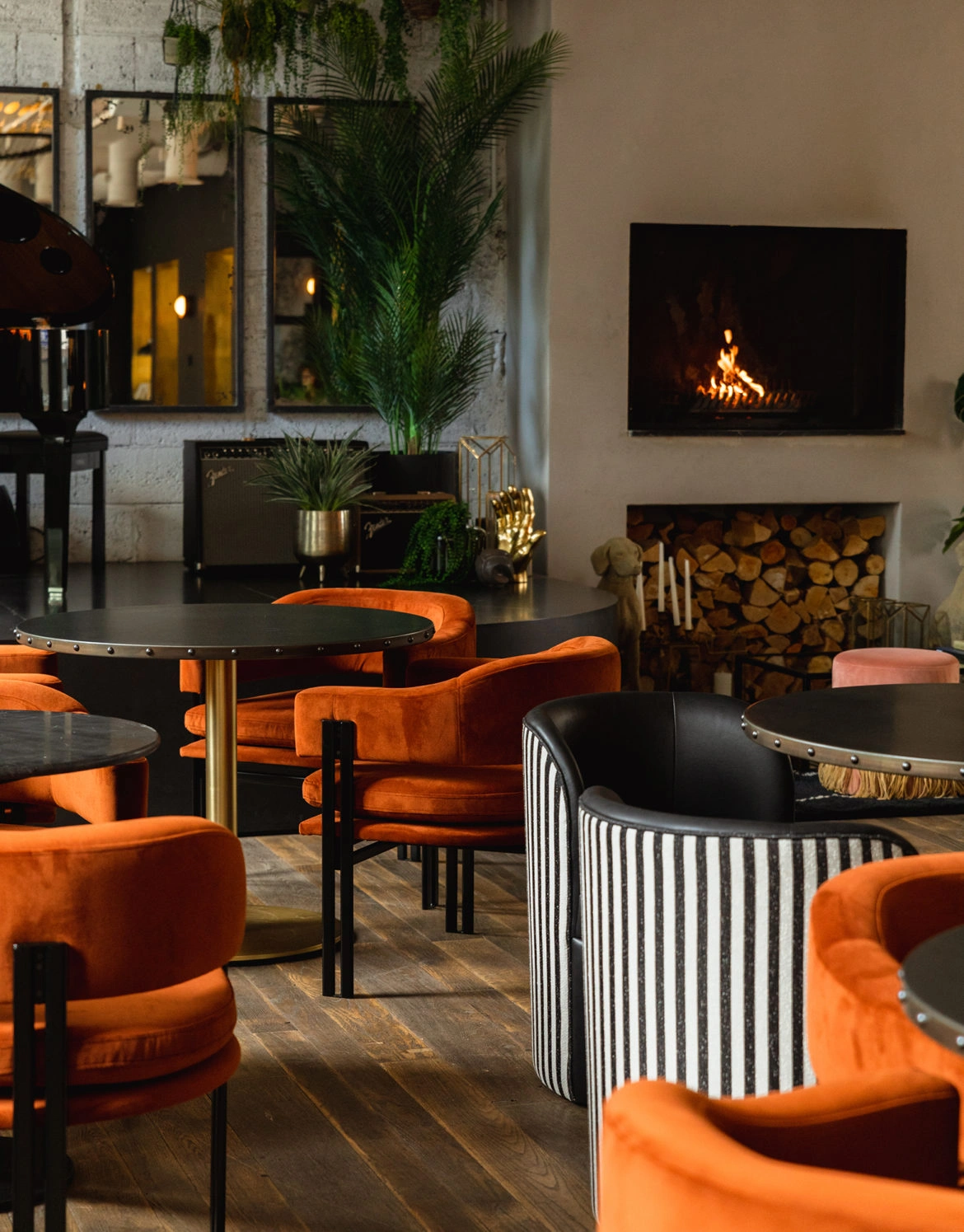
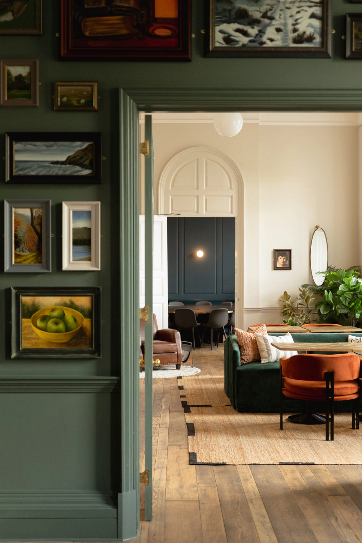
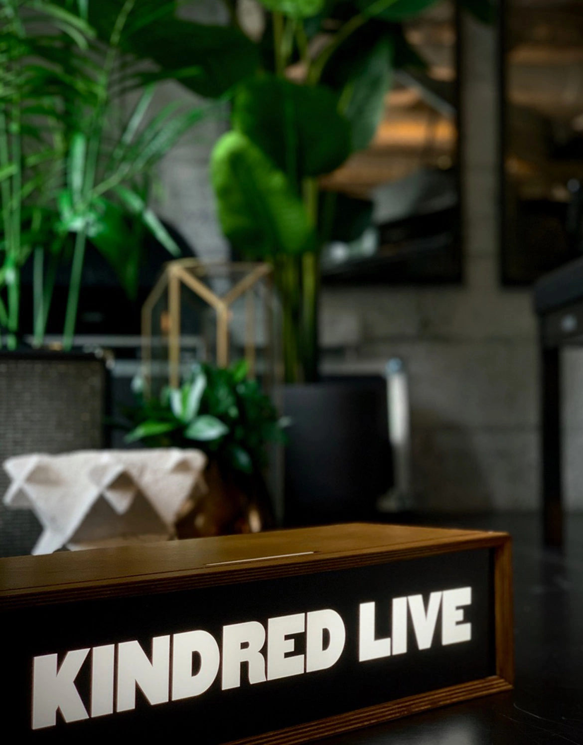
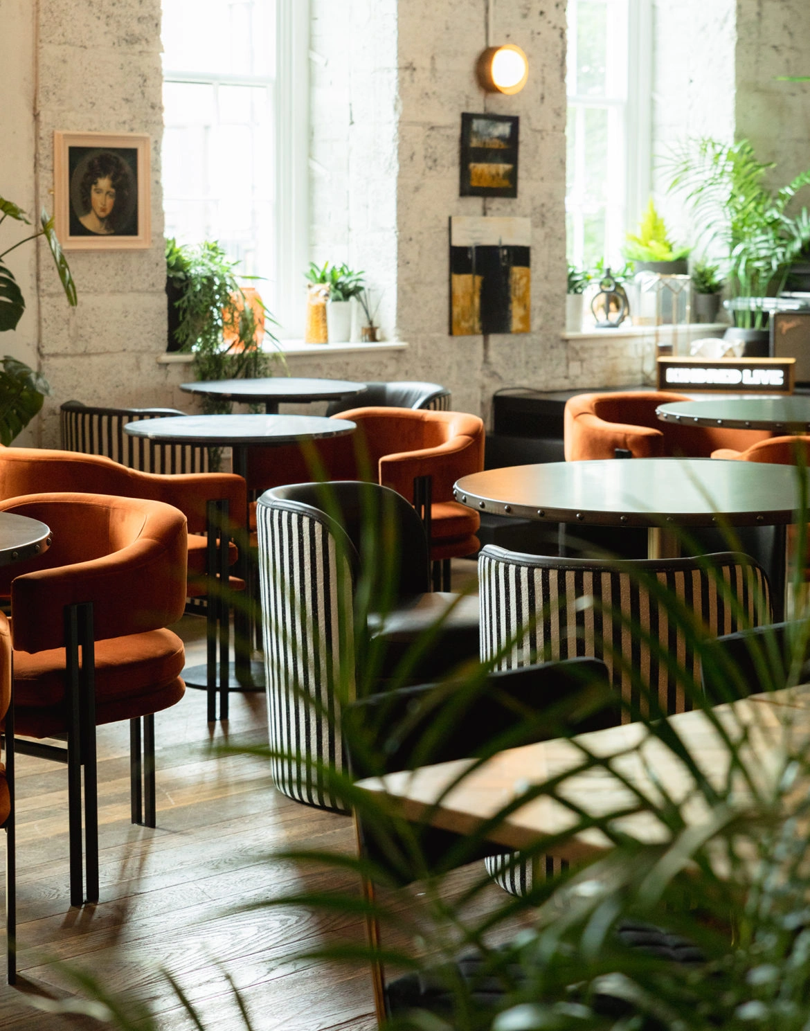
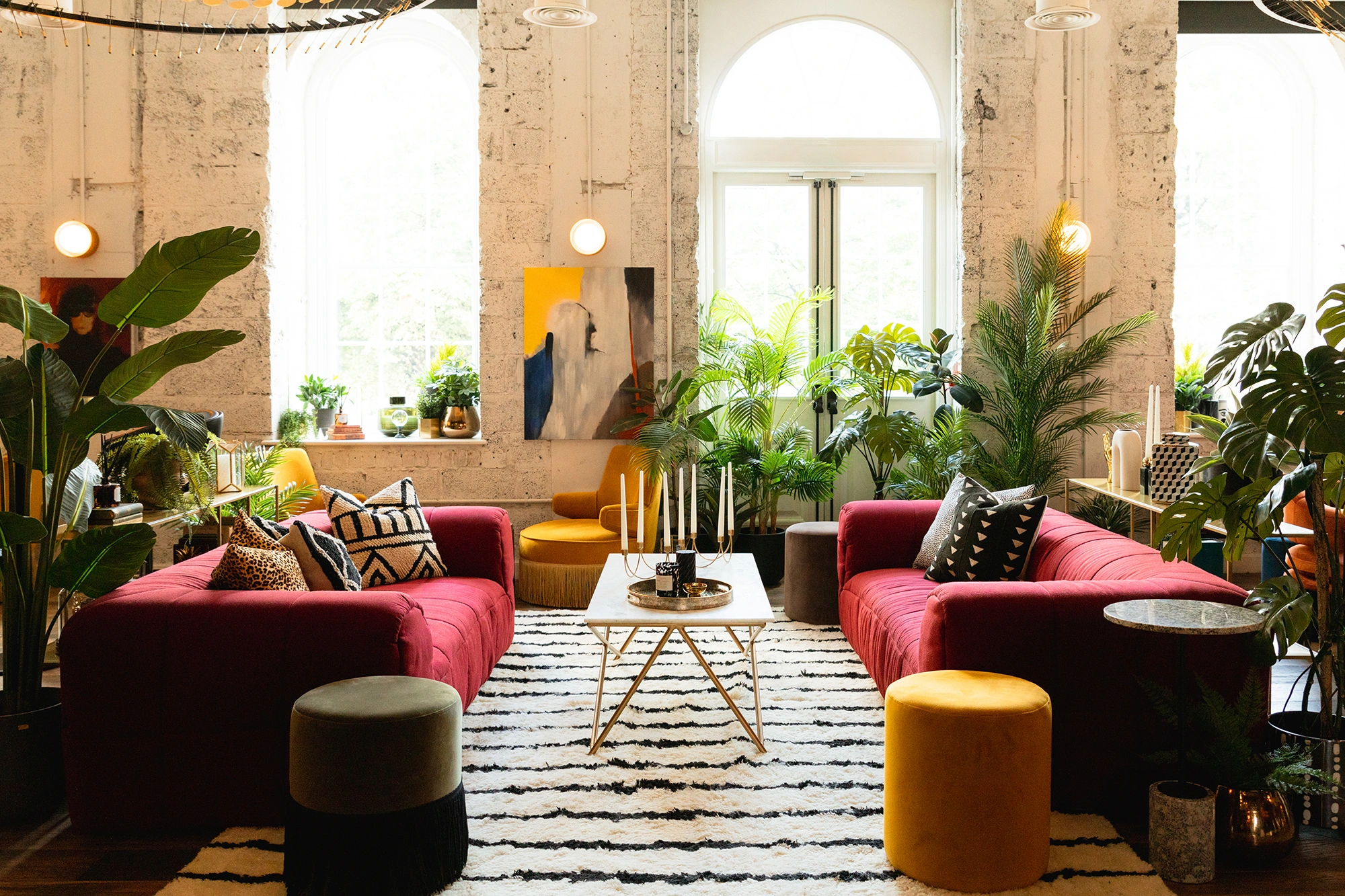
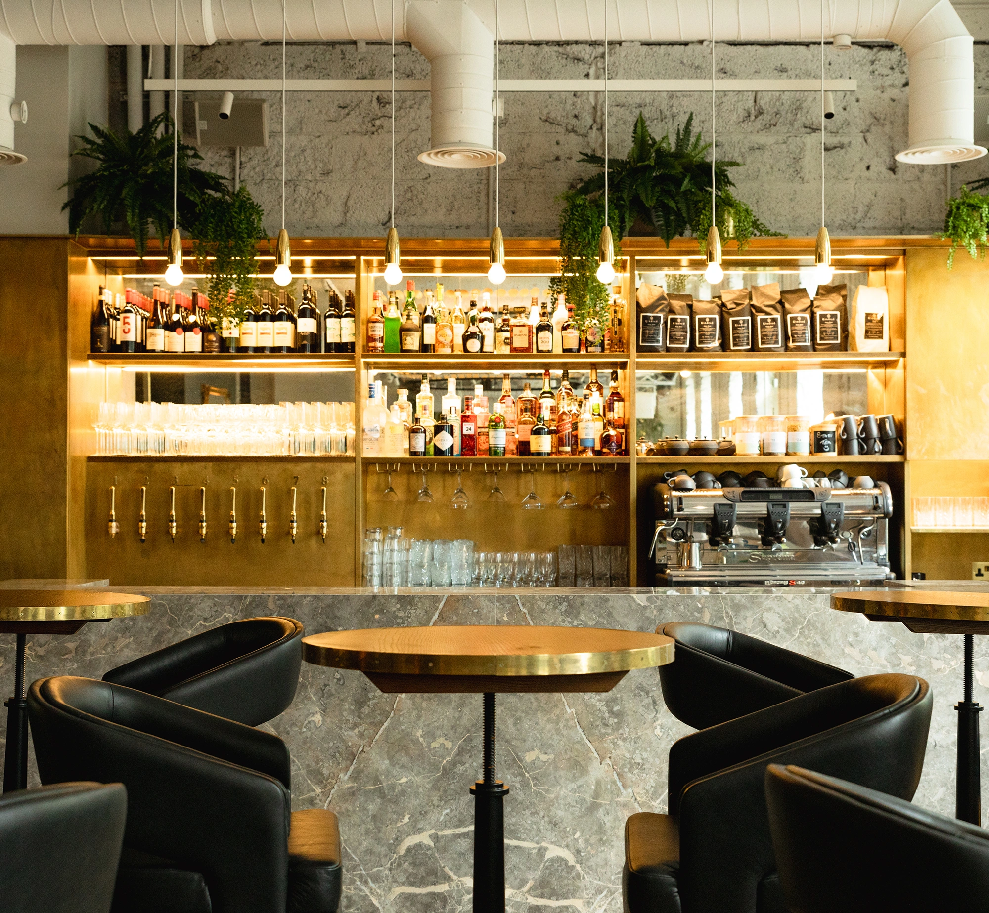
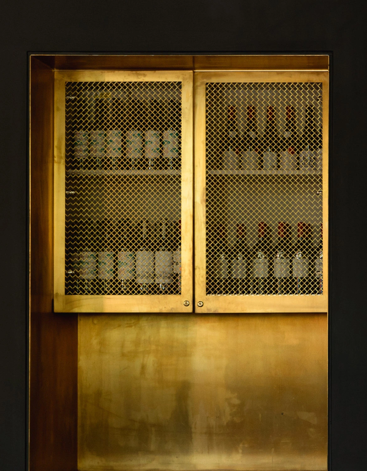
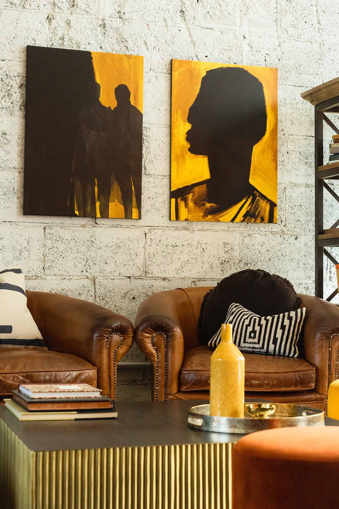
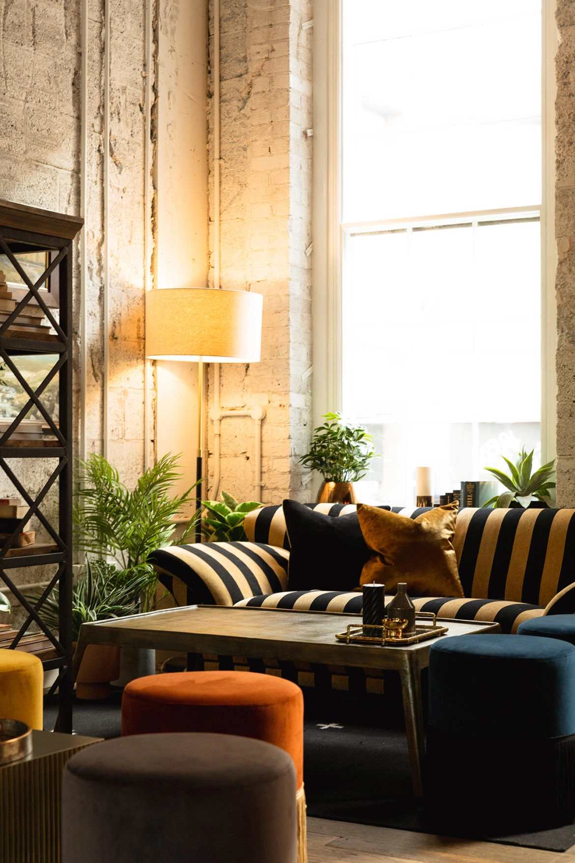
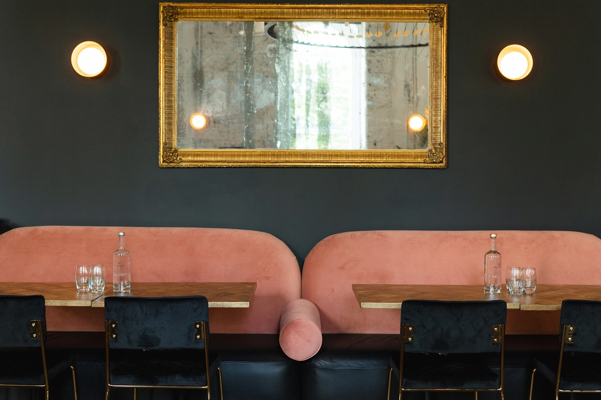
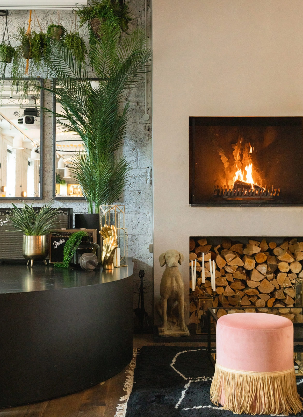
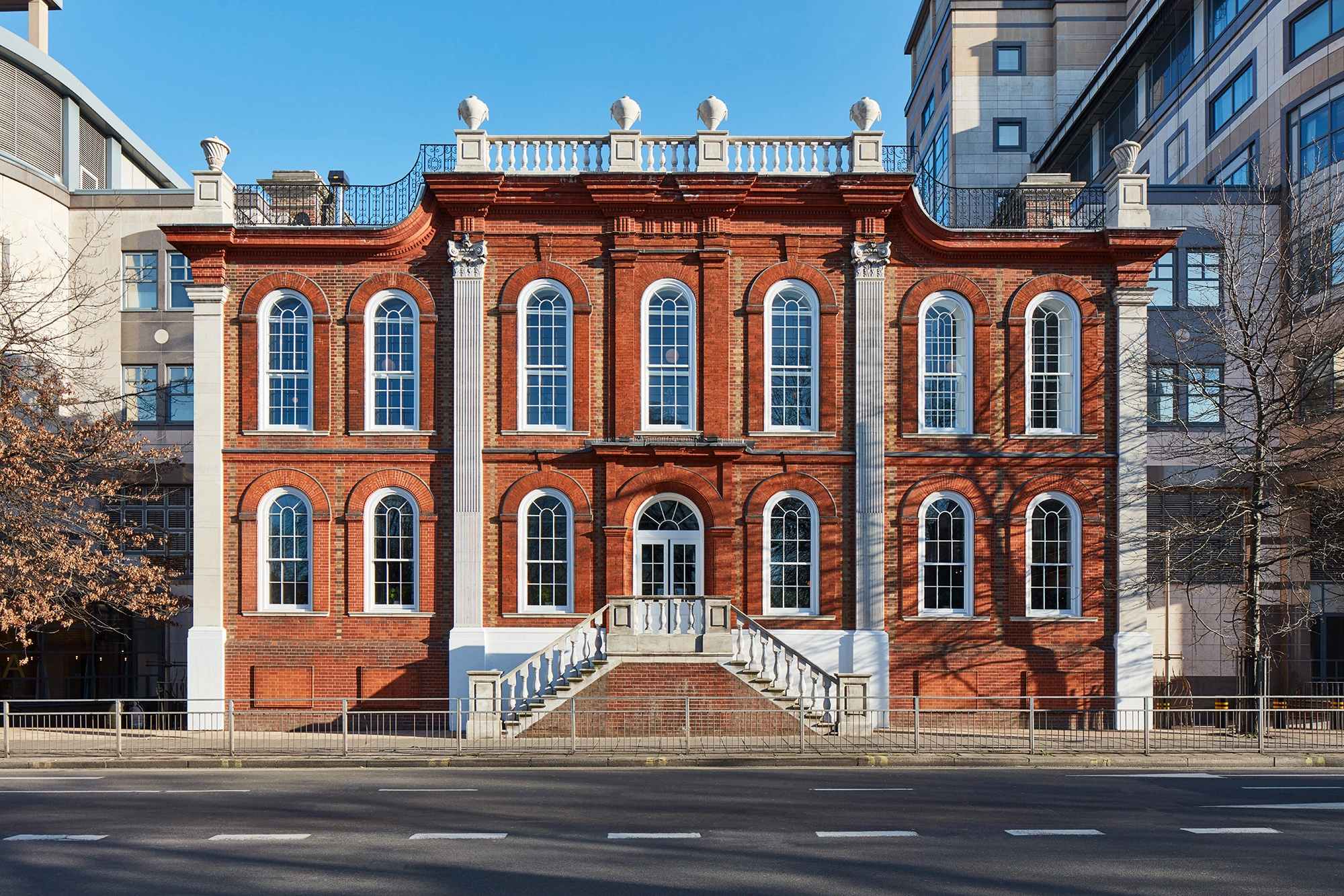
We designed the branding and interiors for Kindred, a hospitality and events venue in the heart of Hammersmith. Housed in the grand, Grade II listed Bradmore House, the space is a warm and welcoming space designed to inspire community, connection and creativity. The building’s initial fit-out by Studio Shaw gave us a great base to build upon. We focused on injecting more personality into the space, creating new lounge zones and social pockets with custom banquettes, plush seating, rugs, screens and plenty of characterful layers. We styled every corner with tactile accessories and lush botanicals, introducing zoned lighting to shift the mood from day to night. The central cocktail bar and stage remained untouched, but we enhanced its surroundings with floor-to-ceiling antique mirrors and stacks of vintage speakers, dialling up the drama for the club’s ‘Kindred Live’ music programme.
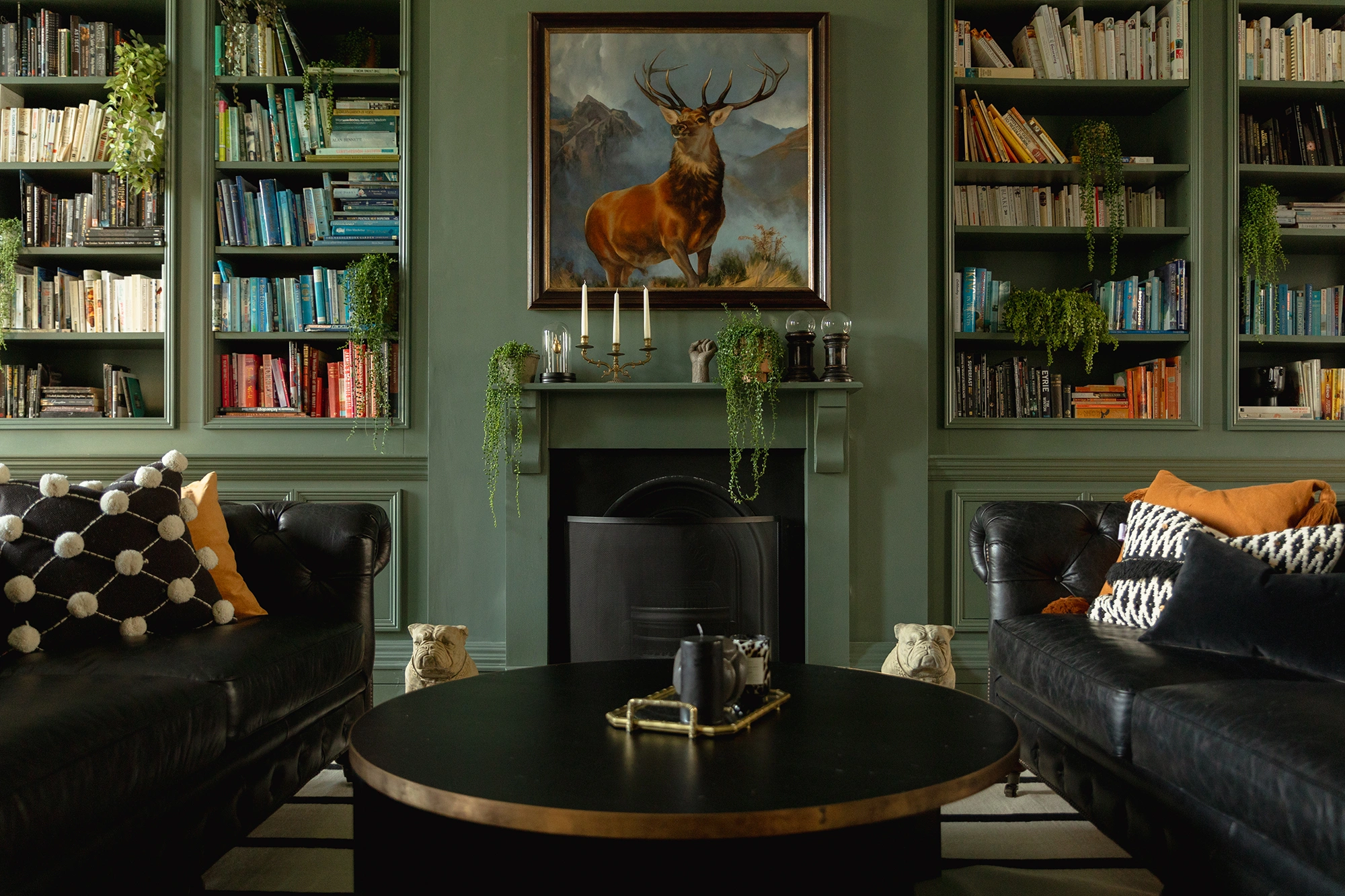
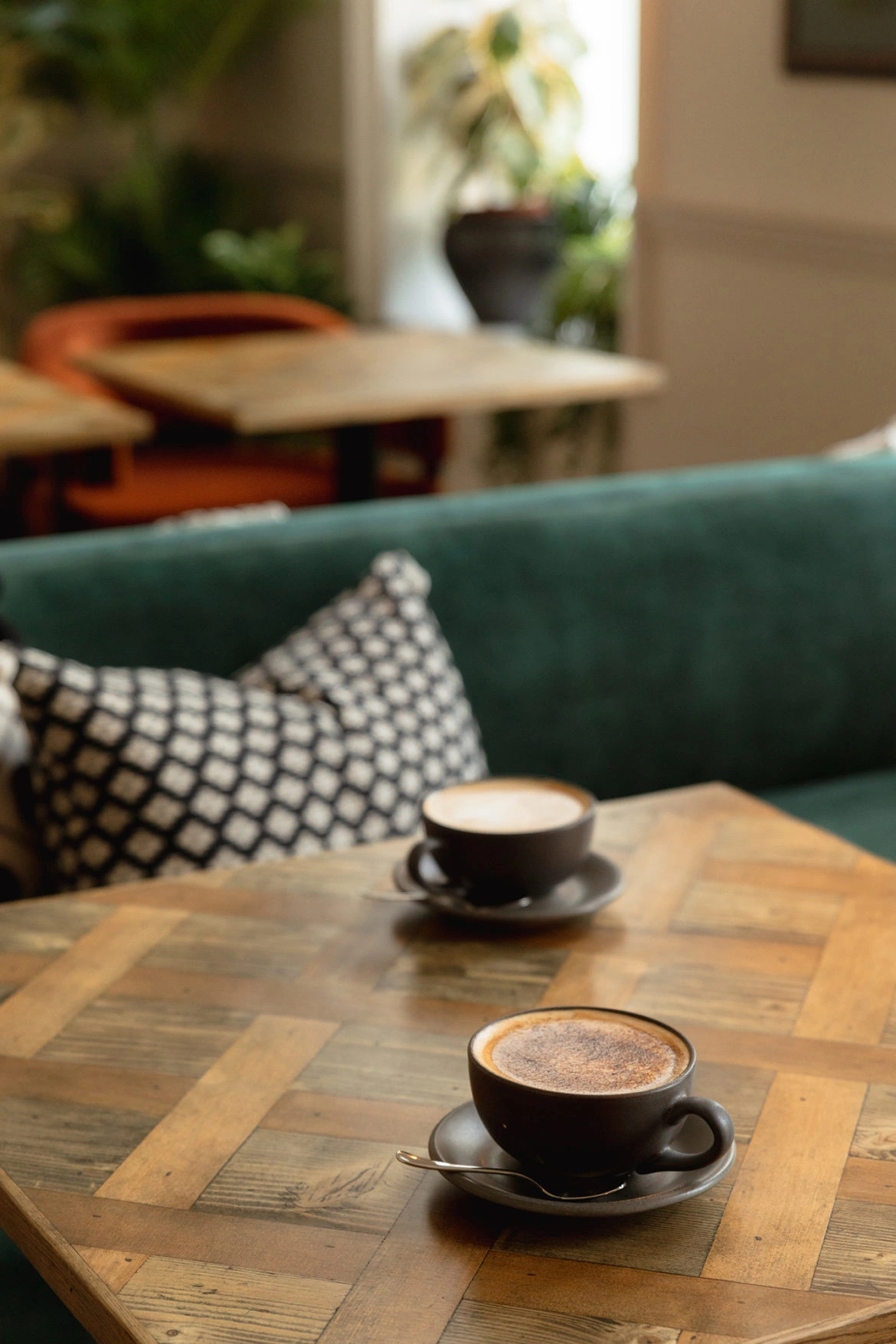
Upstairs in the second-floor Salon, we introduced a softer, more nature-inspired palette — think velvet green seating, neutral walls and warm timbers — creating a calming space for solo work and social lunches. In the adjoining Library, we designed a central co-working hub around the fireplace, adding character through layered textures and classic Chesterfields.
KINDRED: rebranded
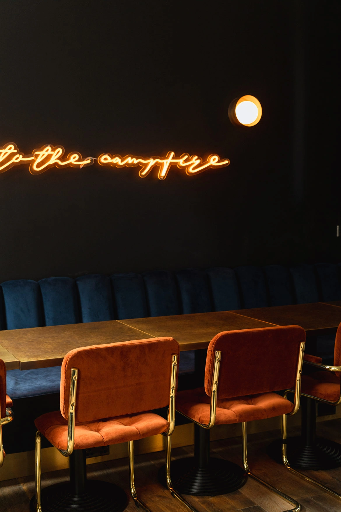
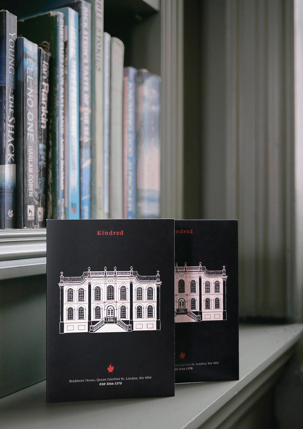
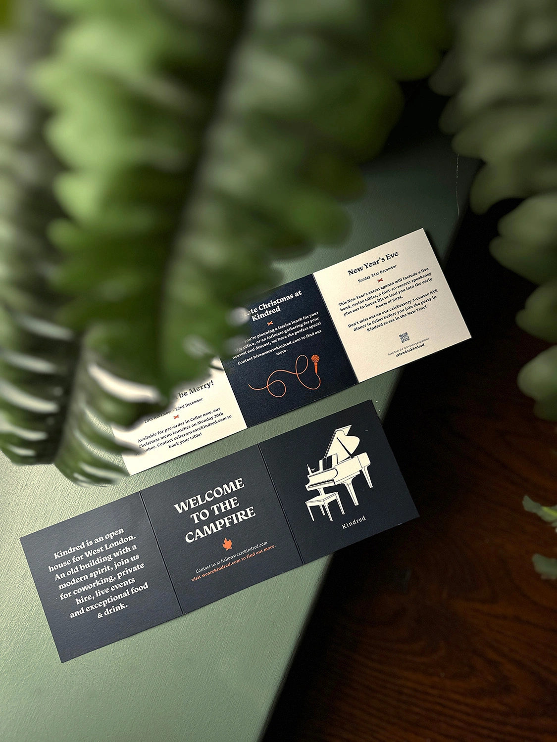
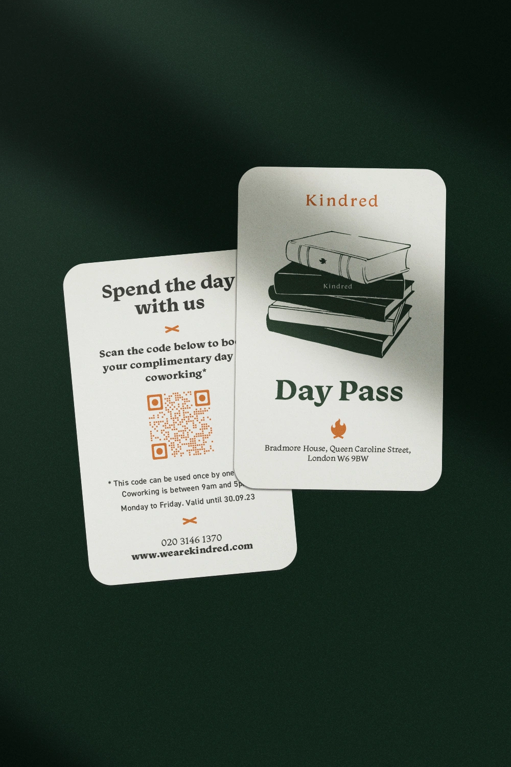
Following our interiors work, we were invited to refresh Kindred’s brand identity. Taking inspiration from the venue’s warmth and community ethos — and the original campfire metaphor at its heart — we reworked the logotype and flame mark to feel more refined and sophisticated. A new colour palette reflected tones from our interior styling: deep burgundy, heritage blue, leafy green and a vibrant orange accent.
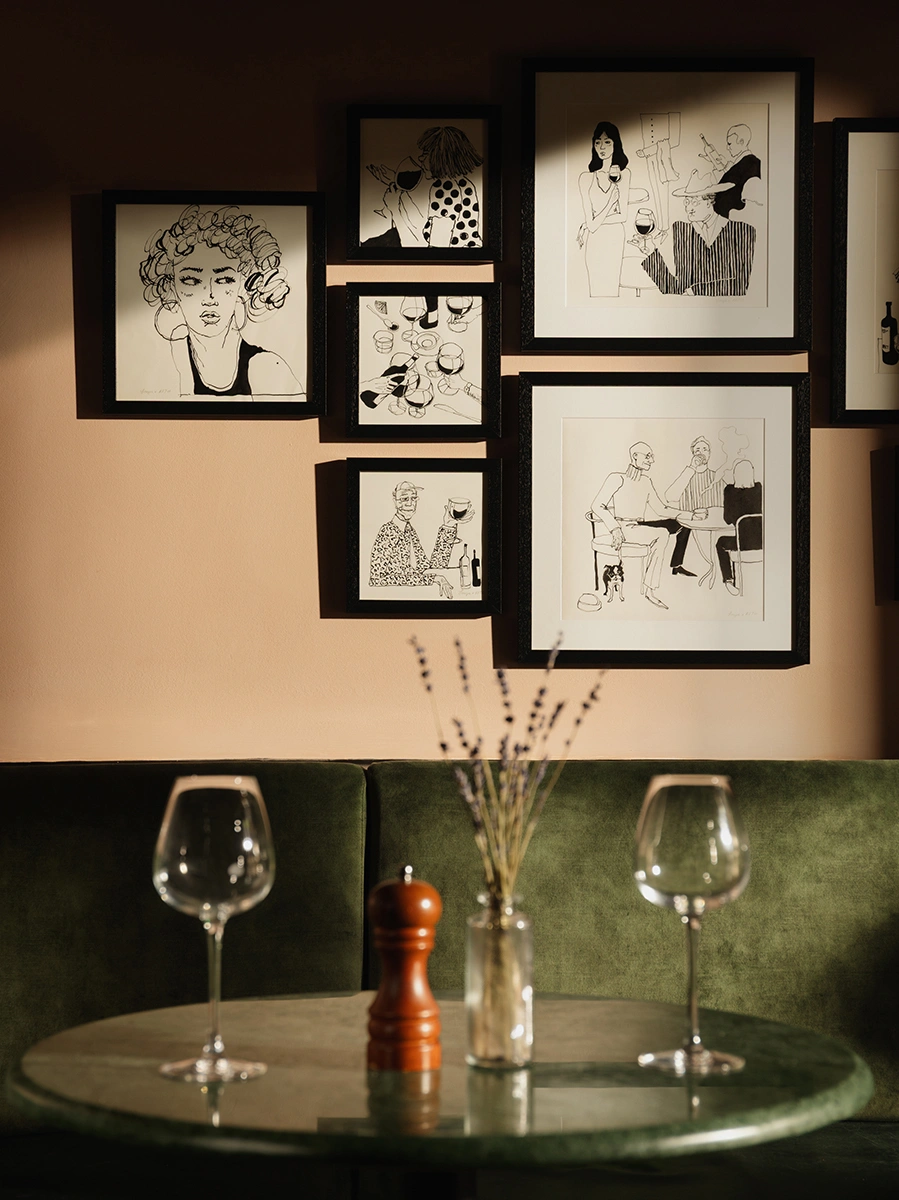
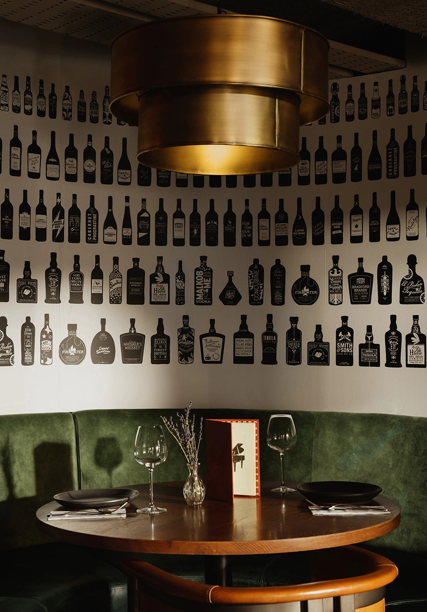
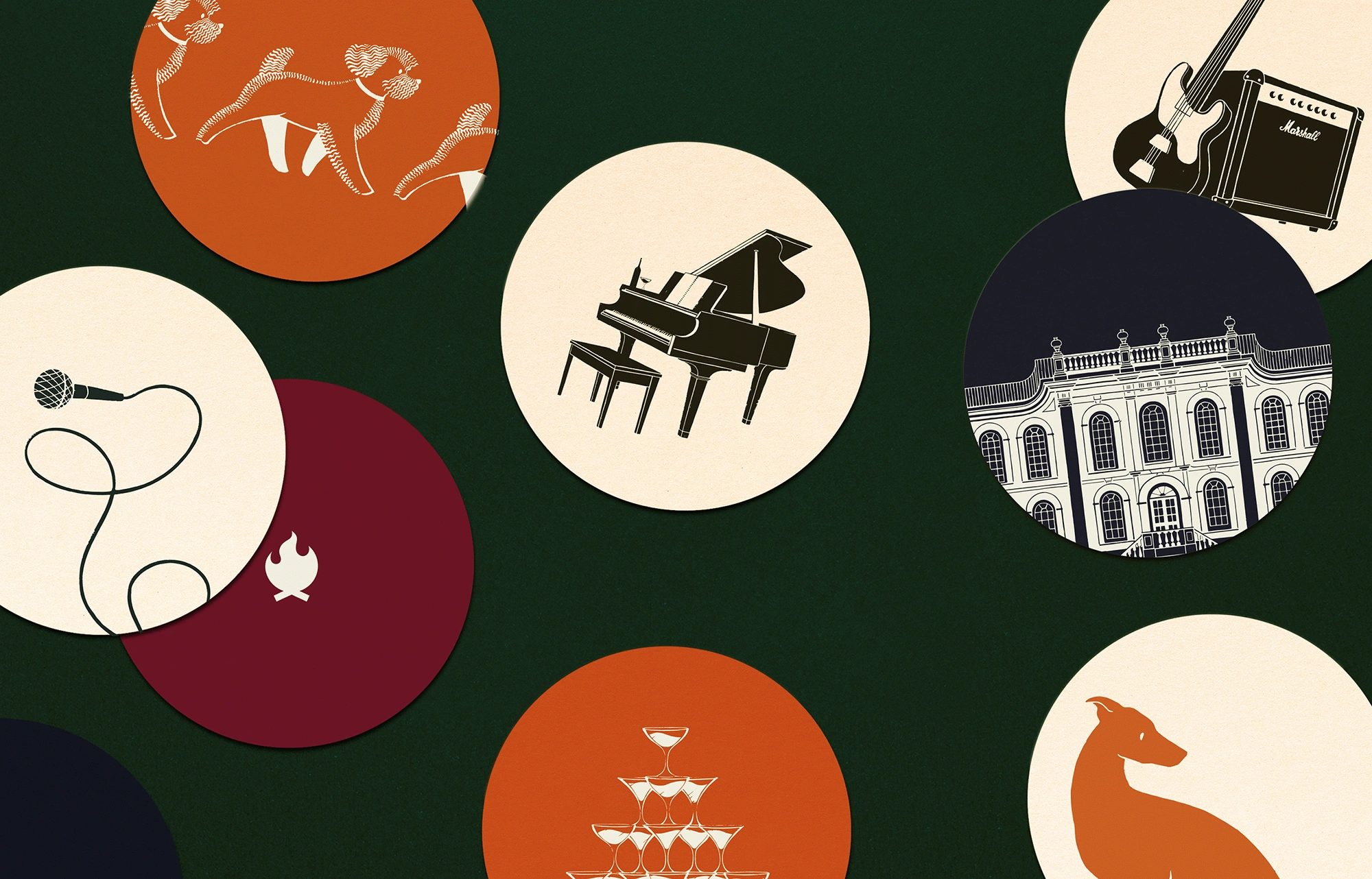
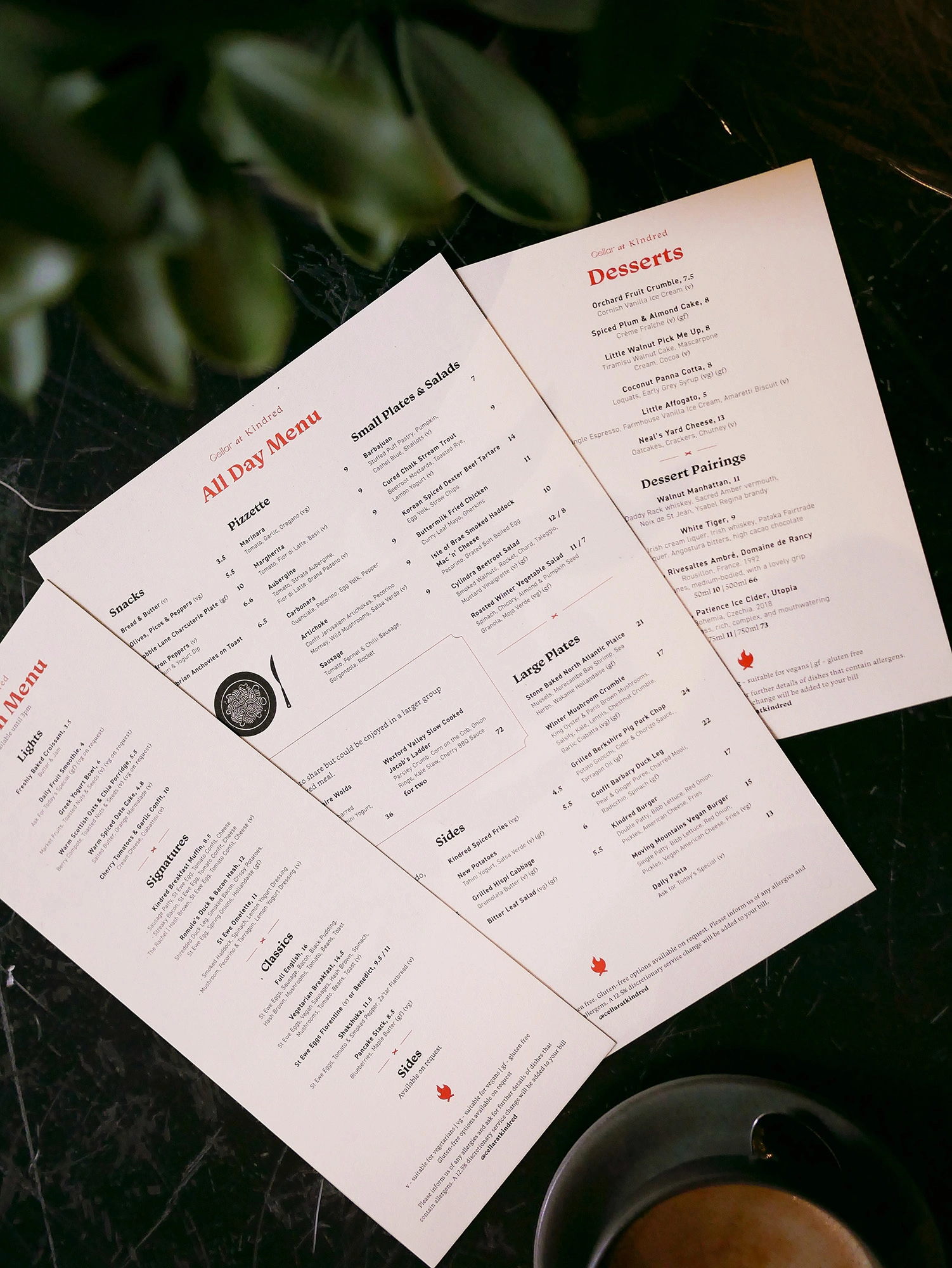
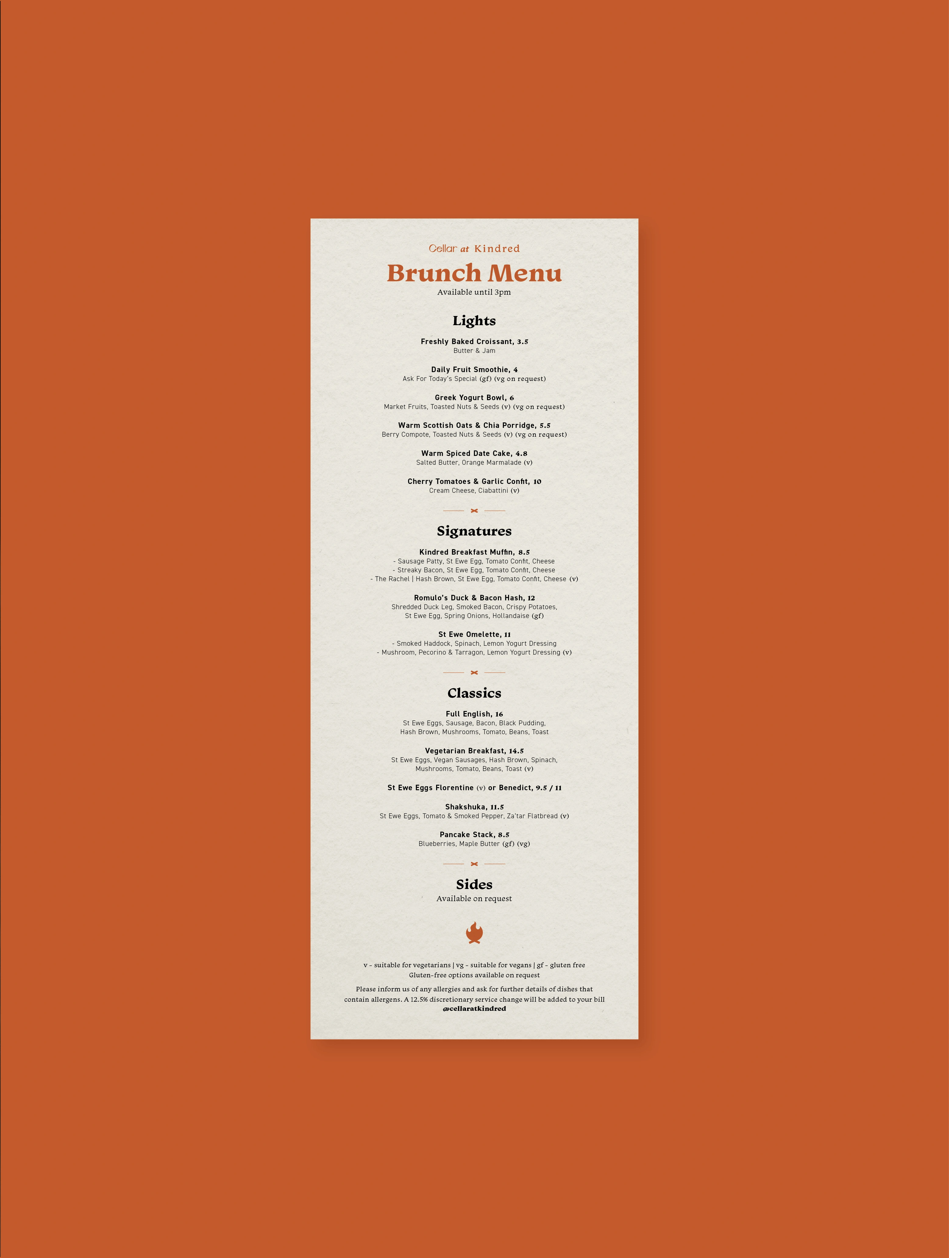
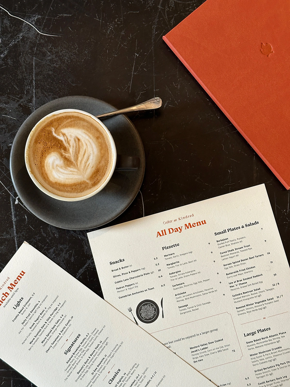
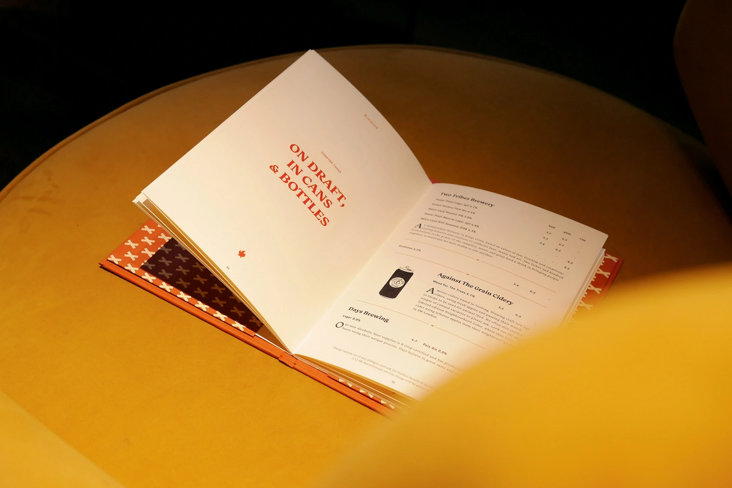
We then built out Kindred's brand world by way of a library of stylish illustrations that help bring to life all the things that make Kindred so special. A grand piano, branded drum kit and microphone on a looping cord to represent Kindred’s dynamic roster of live music events. Notebooks, coffee cups and canines to represent the venue’s dog-friendly co-working spaces. And a rich collection of food and drink-inspired illustrations showcasing Kindred’s fantastic F&B offering. Using these brand assets across a wealth of printed menus, posters and loyalty cards that can be found throughout the venue.


STORYTELLING
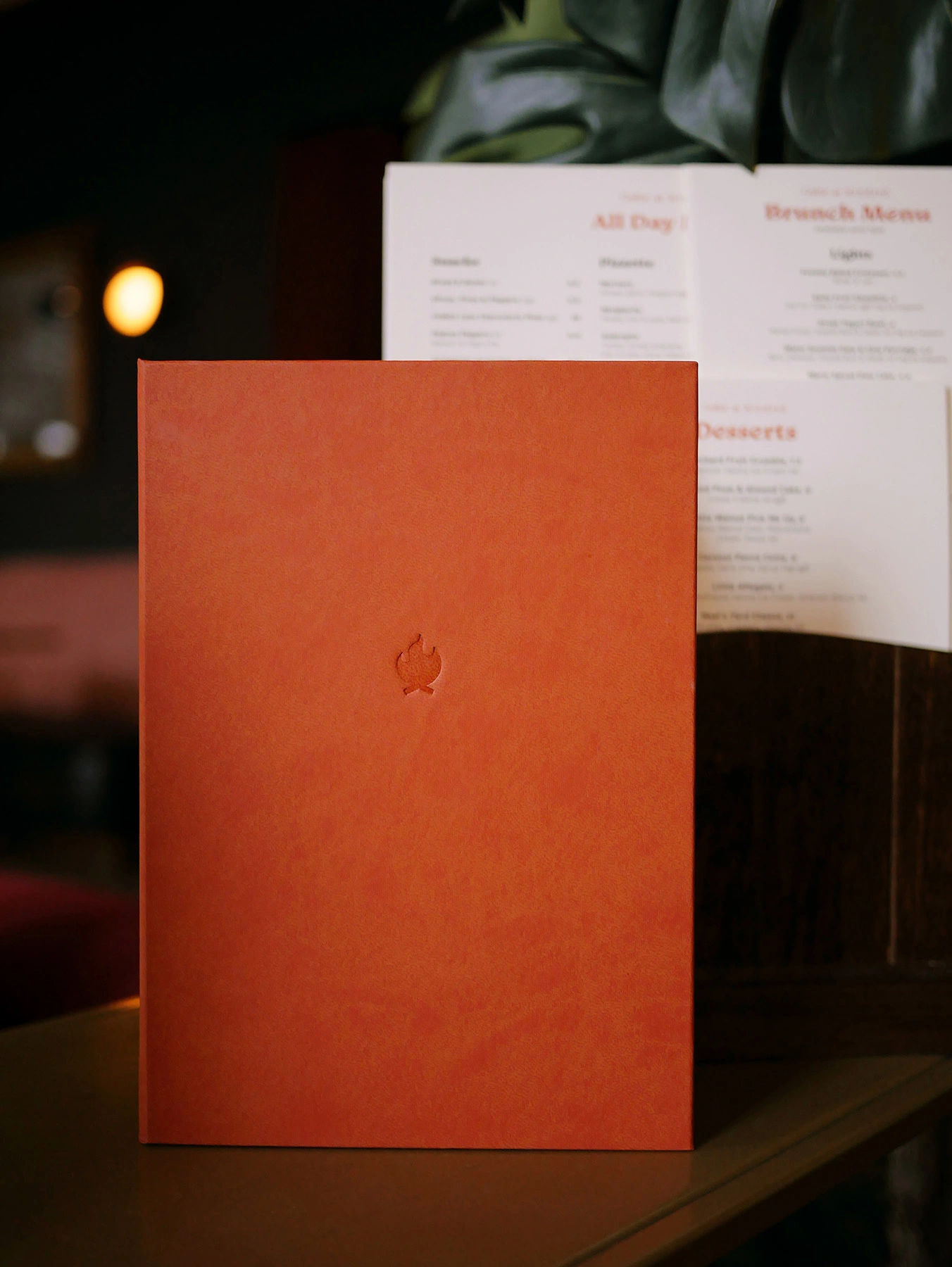
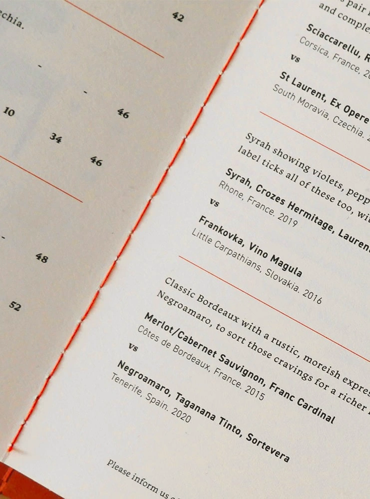
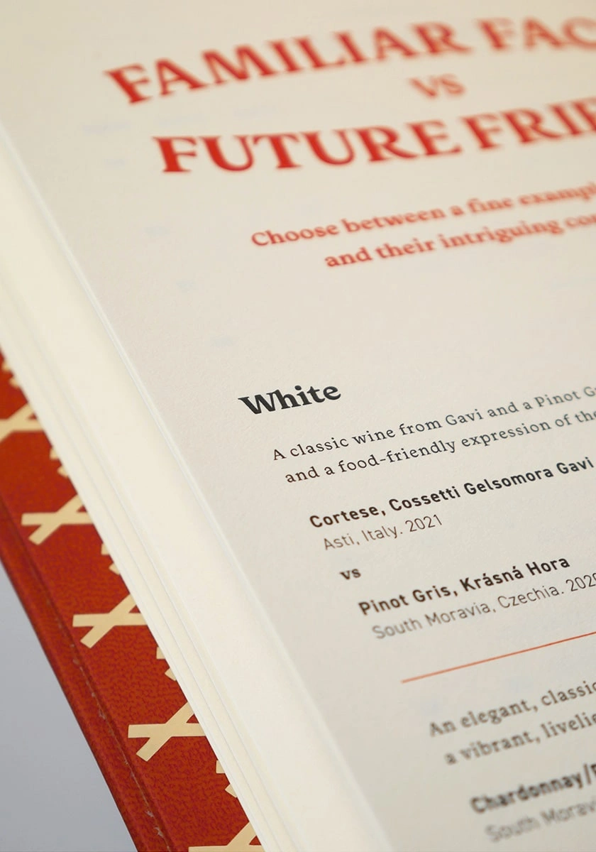
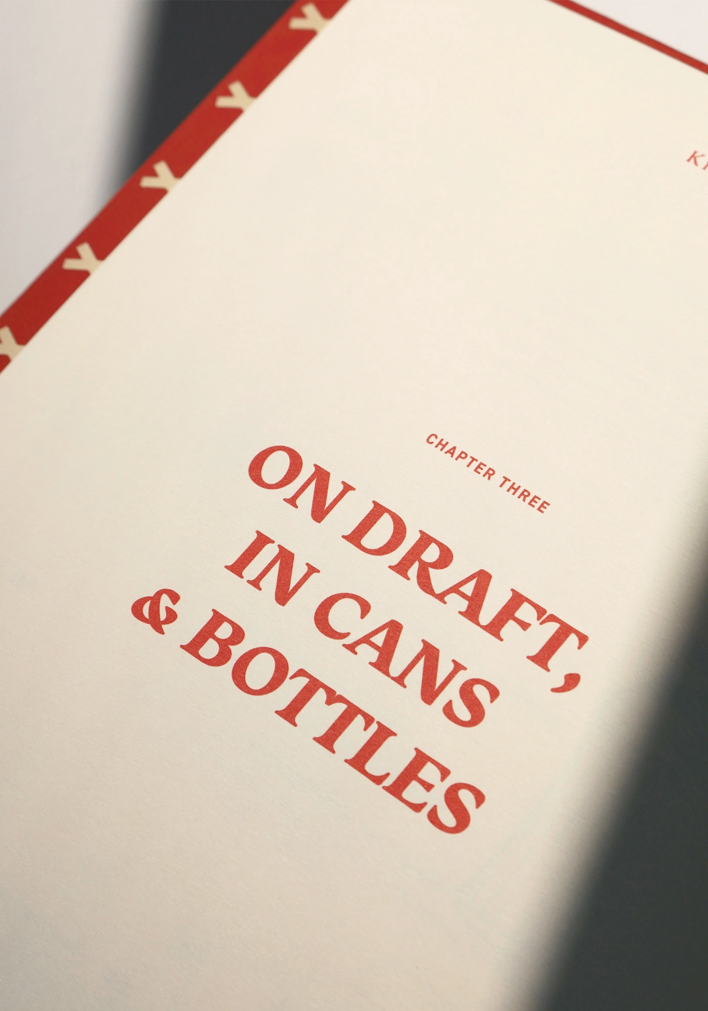
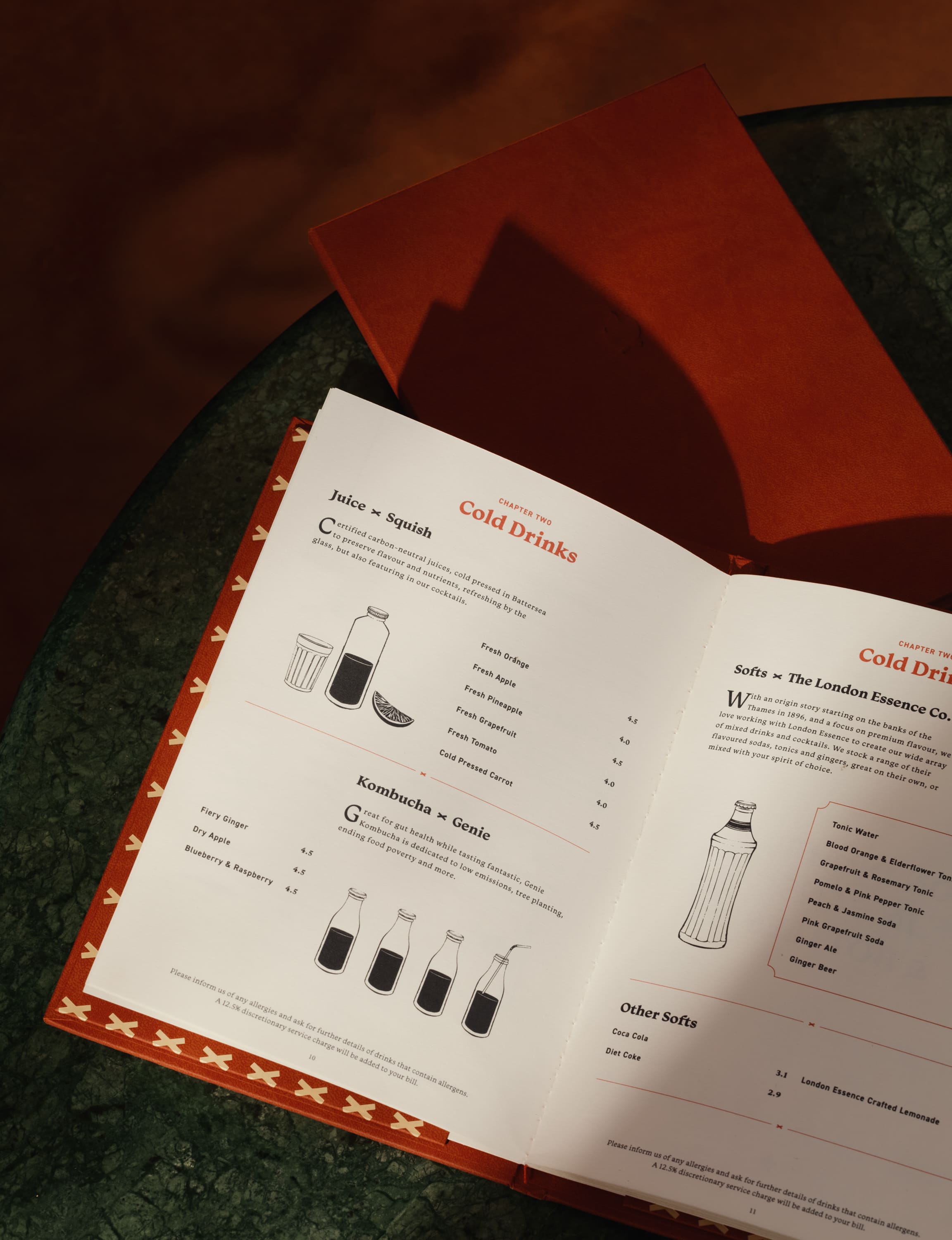
The centre piece of our brandwork is a stunning 40-page hardcover drinks book. This exquisite volume, bound in a tan-orange cover with Kindred's campfire logo subtly embossed, is printed on finely textured Fedrigoni paper and finished with matching orange stitching. The narrative explores the rich provenance of Kindred's independent London suppliers — artisans and family-run businesses — and bringing their unique craft to life. The tone is whimsically descriptive, enriched with our signature illustrations, inviting readers on a journey through the passionate makers behind these exceptional products. Enhancing the storytelling experience, the book is thoughtfully divided into chapters, with introductions and contents pages, and generous amounts of empty spaces that allows the content to breathe.
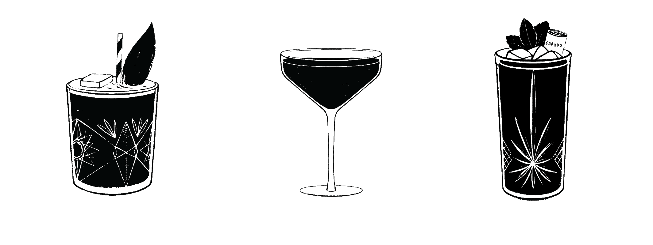
We developed a 'cocktail toolkit' to showcase Kindred's distinct cocktails. This versatile set includes illustrated components such as various glass types — from lowball and highball, to flutes and shot glasses — along with decorative embellishments like ice and fruit. Each element is designed individually, providing a flexible foundation to create new cocktail combinations for future editions of the book.
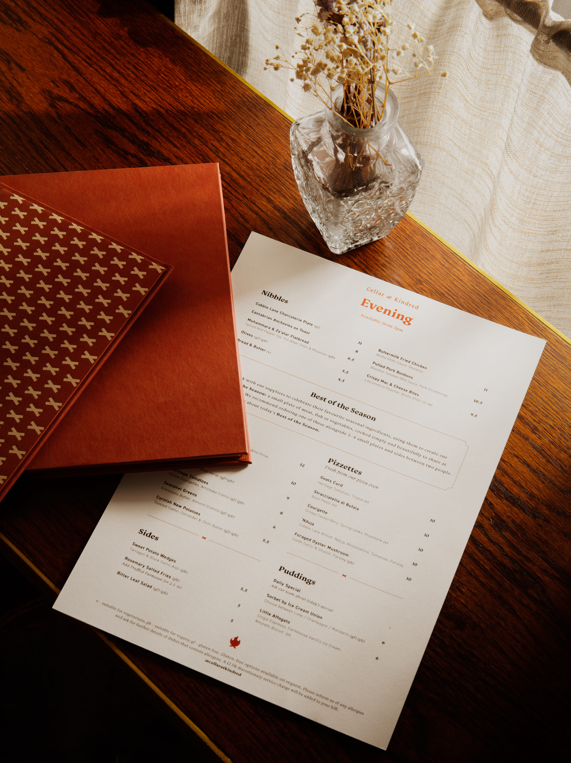
rhapsody in rhubarb
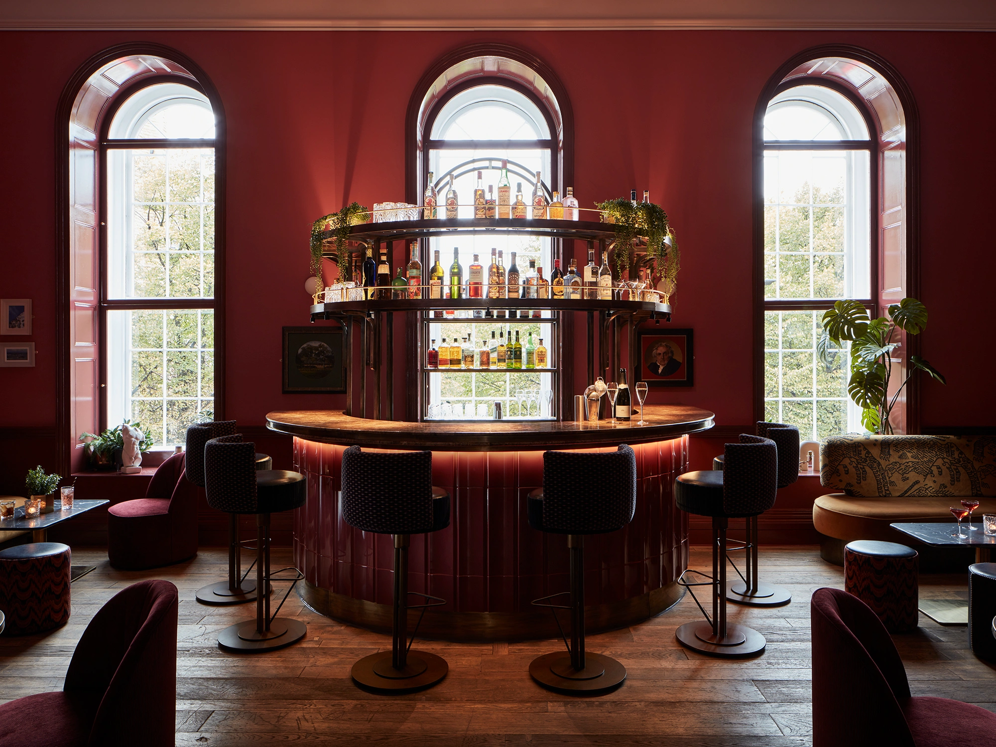
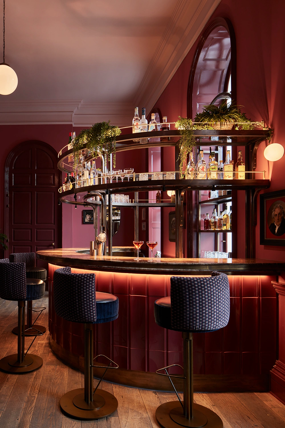
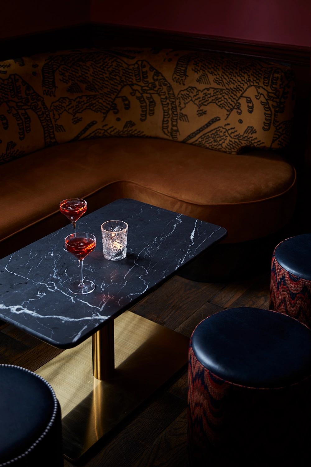
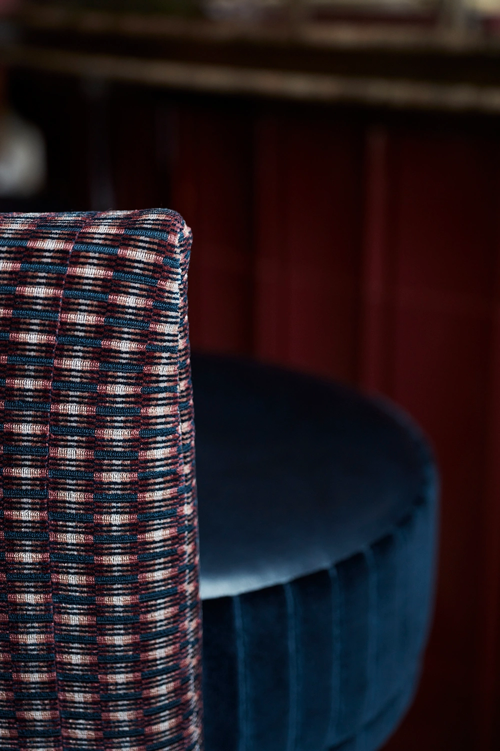
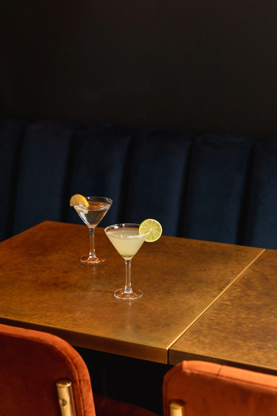
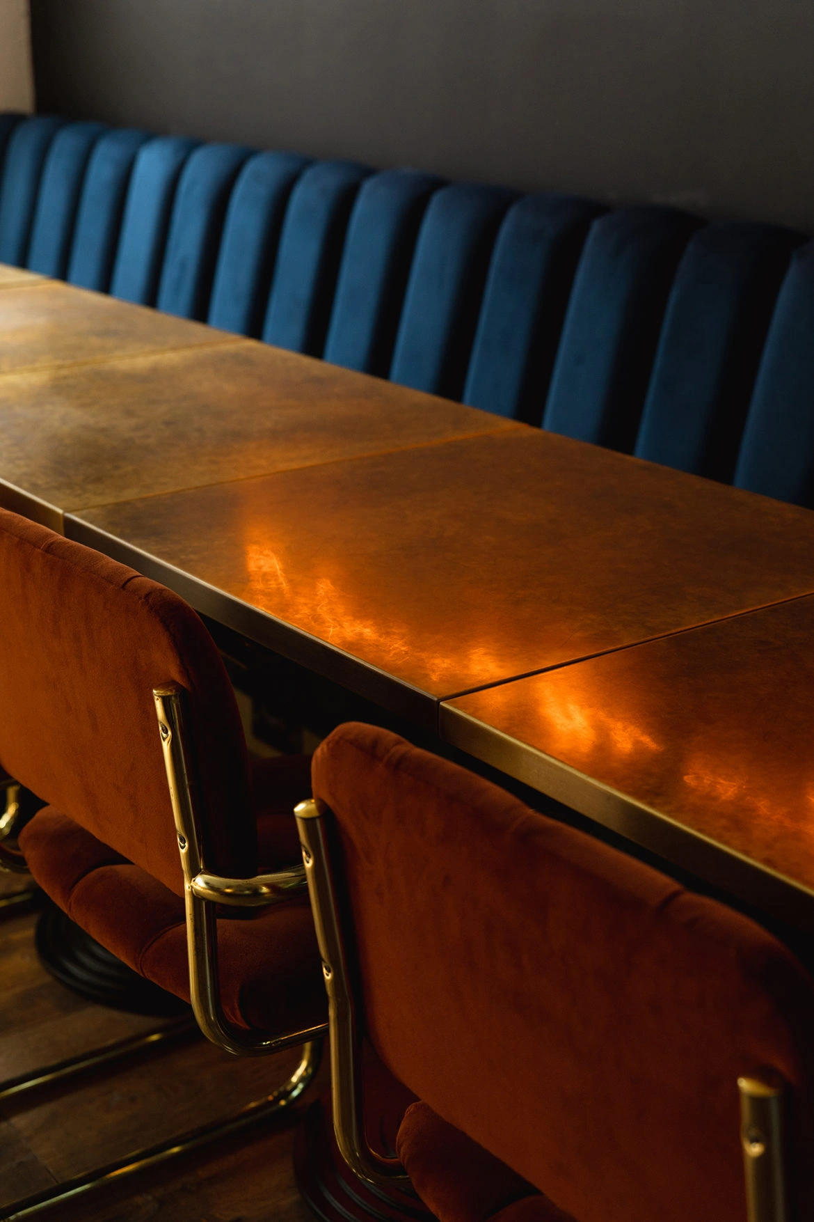
In our most recent phase of work, we added a destination cocktail bar on the top floor — a luxurious lounge in the most spectacular room in the building. We designed the horseshoe-shaped bar and metal gantry, fabricated by our long-time collaborators Rough Living. Finished in deep autumnal reds, antique brass, and a standout double-bullnose marble counter, it’s both centrepiece and sanctuary. Around the bar, we designed a curated set of low and lounge seating with richly textured velvets, leathers and refined weaves, finished with fluted brass detailing. The design layers up luxe materials with a playful, eclectic twist. Even the bathrooms bring the drama, finished in blush tones and zigzag tiles with pops of black and gold, art mirrors and flattering mood lighting.Kindred is a rich expression of our design philosophy — where branding and interiors are conceived hand-in-hand to create spaces that feel thoughtful, distinctive, and full of soul.