Morty & BOB's
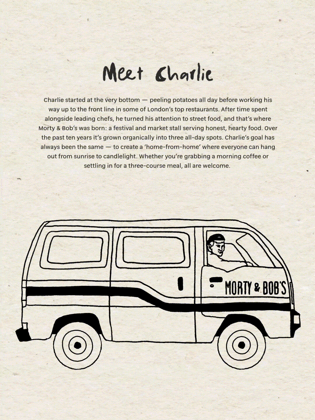
Morty & Bob's is a much-loved London eatery, known for its comforting food and laid-back energy – from its iconic grilled cheese to lively brunches and late-night cocktails. Working with founder Charlie, we refined the brand identity to be ready for future expansion, while protecting the warmth and personality that make it so special.
Have a look at the website over here.


We started by refining the wordmark and creating a new M&B logomark – a flexible, instantly recognisable shorthand that works across everything from signage to digital. The colour palette was thoughtfully evolved: we kept the classic black and white foundation, brightened the signature burgundy, and introduced mustard yellow and vibrant red as fresh accent colours, injecting warmth and energy without losing the brand's sophistication.


Meet Morty & Bob
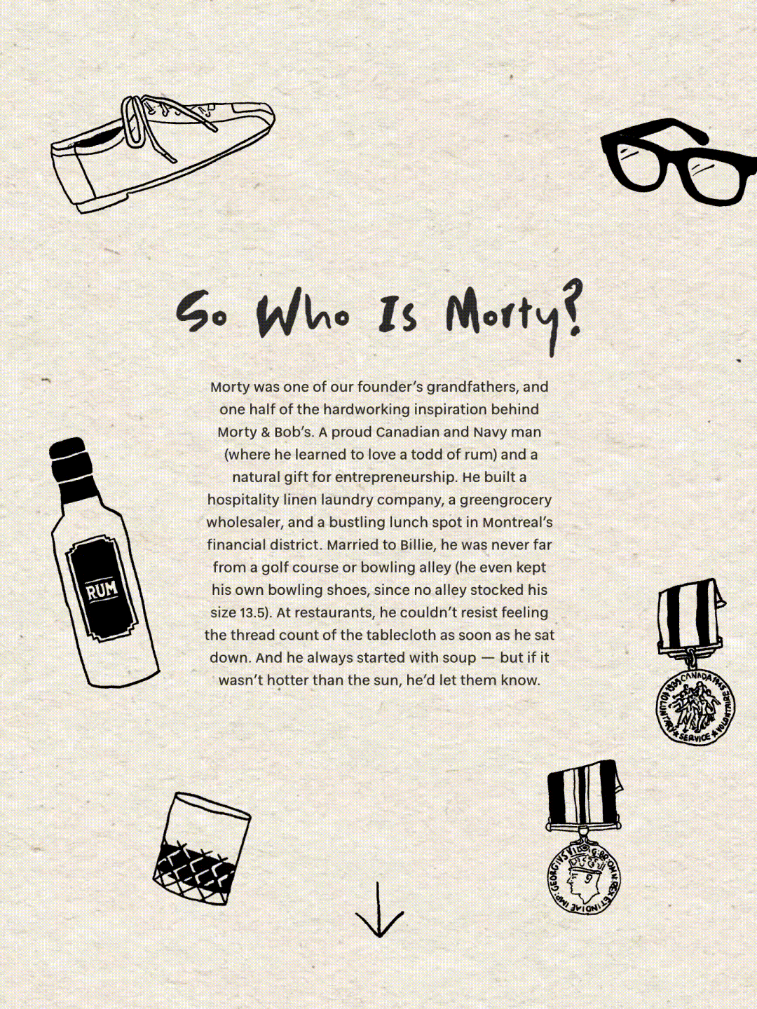
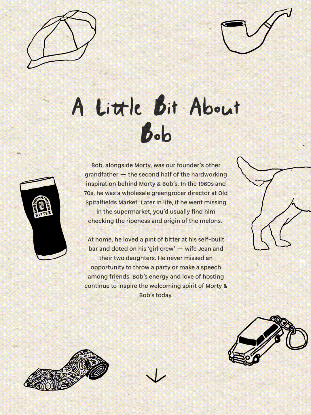
At the centre of this rebrand lay a deeper exploration of the brand's namesakes – the two grandfathers who inspired founder Charlie to build Morty & Bob's in the first place.
Morty was the entrepreneurial Navy man with an eye for quality, a discerning palate, and an infectious love of life. A Canadian who learned to love a tot of rum during his time at sea, he built hospitality businesses from the ground up and couldn't resist checking the thread count of a tablecloth the moment he sat down at a restaurant.
Bob was the gregarious greengrocer with an unmatched eye for detail – the kind of man who'd disappear into a supermarket to inspect the ripeness of melons, then throw an impromptu party and make a speech among friends.


A playful brand identity
Rather than create literal portraits, we developed a suite of hand-drawn illustrations that capture the essence of their personalities and passions. Morty's Navy medals and uniform. His beloved rum. His size 13.5 bowling shoes – kept because no alley stocked his size. Bob's flat cap and pipe. His faithful dog and his pint of bitter at his home bar. His paisley tie, sharp and characterful. Each object tells a story – not just of who they were, but of what they valued: quality, hospitality, and living well. These illustrations became the visual language of the rebrand, bringing Morty and Bob's characters to life across every touchpoint of the brand, reminding everyone who walks through the door of the values that built this place.

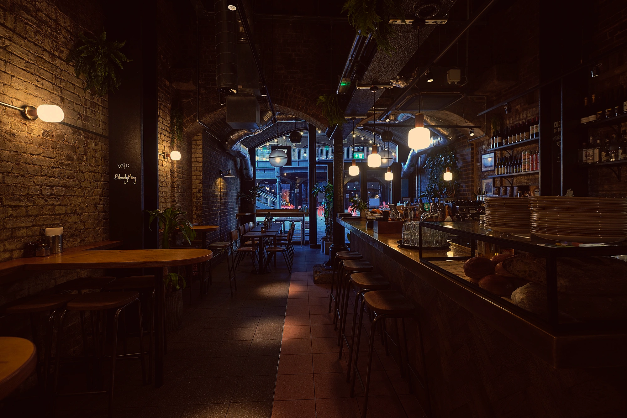
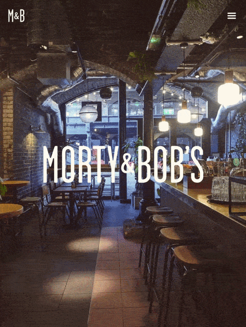
A redesigned website
We then designed and launched a new website, bringing the refreshed identity to life in the digital space. The site weaves together the brand story, menus and booking experience into one cohesive and characterful home for Morty & Bob’s online presence.
A redesigned website
We then designed and launched a new website, bringing the refreshed identity to life in the digital space. The site weaves together the brand story, menus and booking experience into one cohesive and characterful home for Morty & Bob’s online presence.
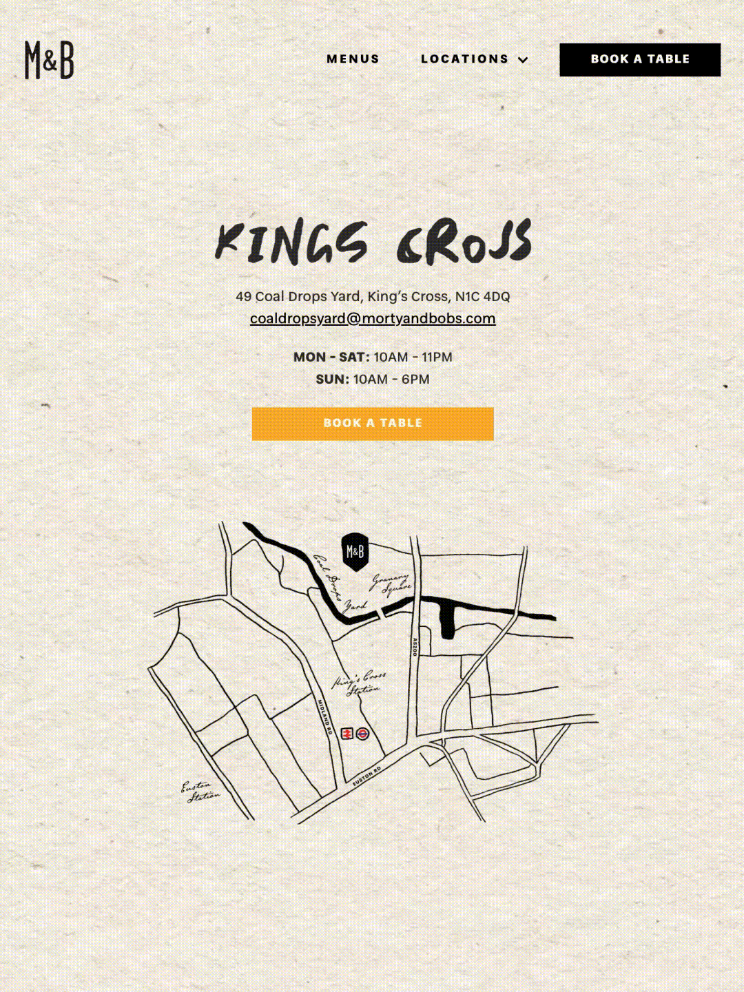
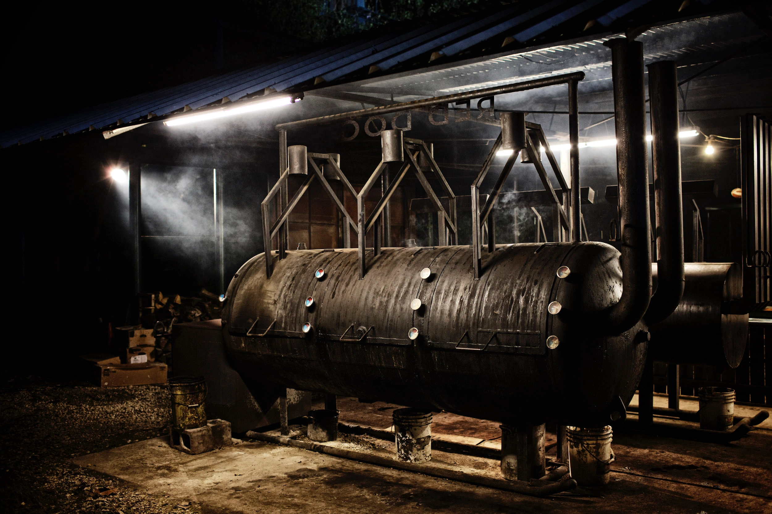
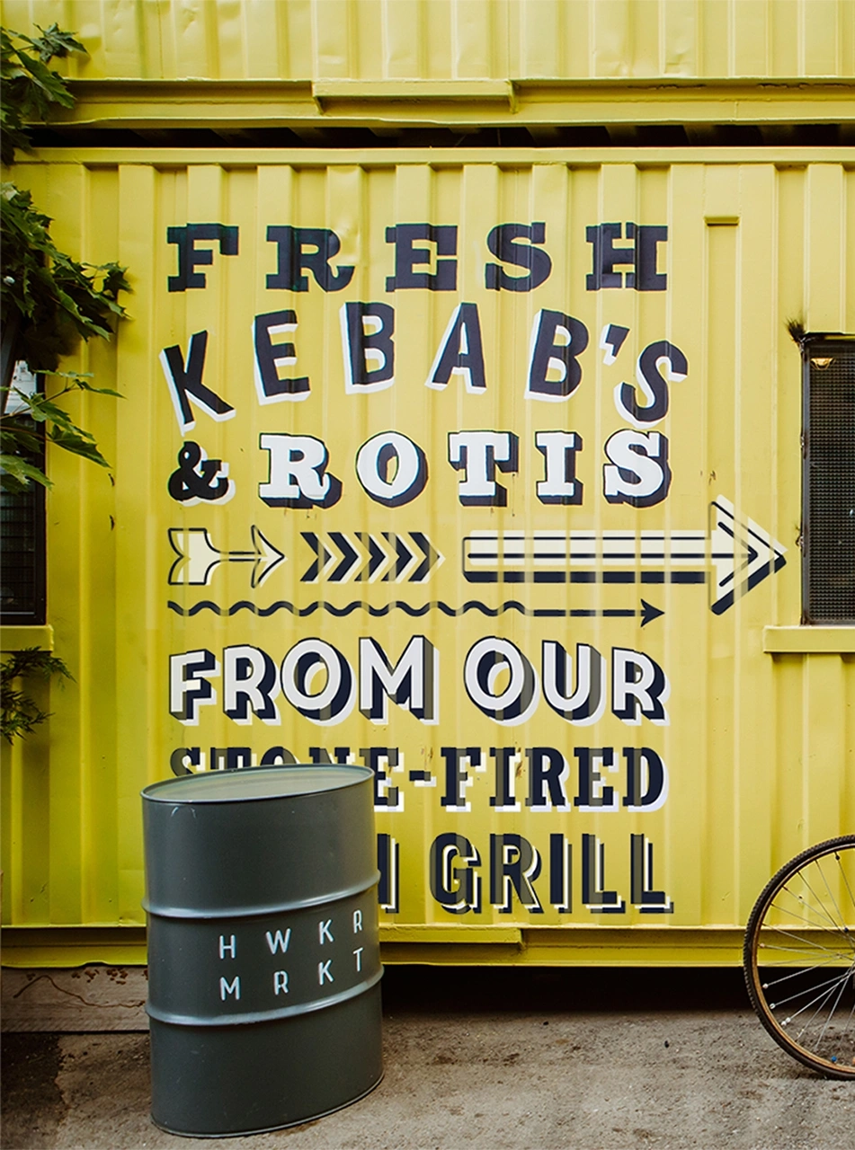
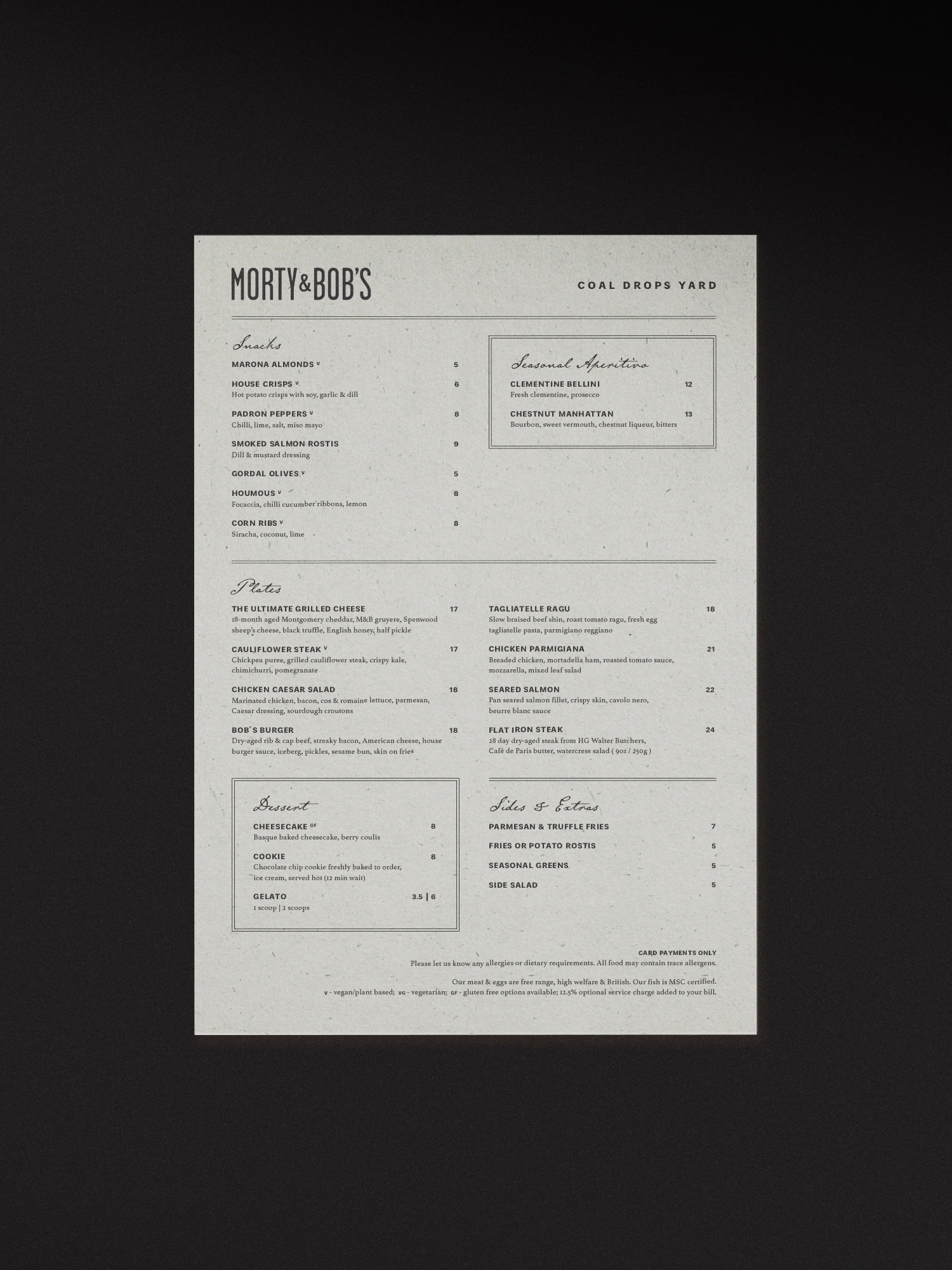
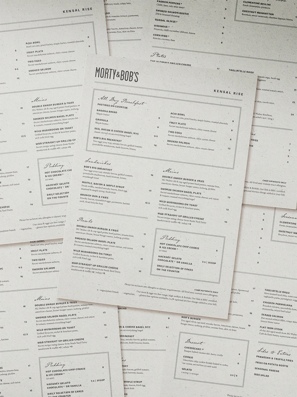
Three locations, one soul
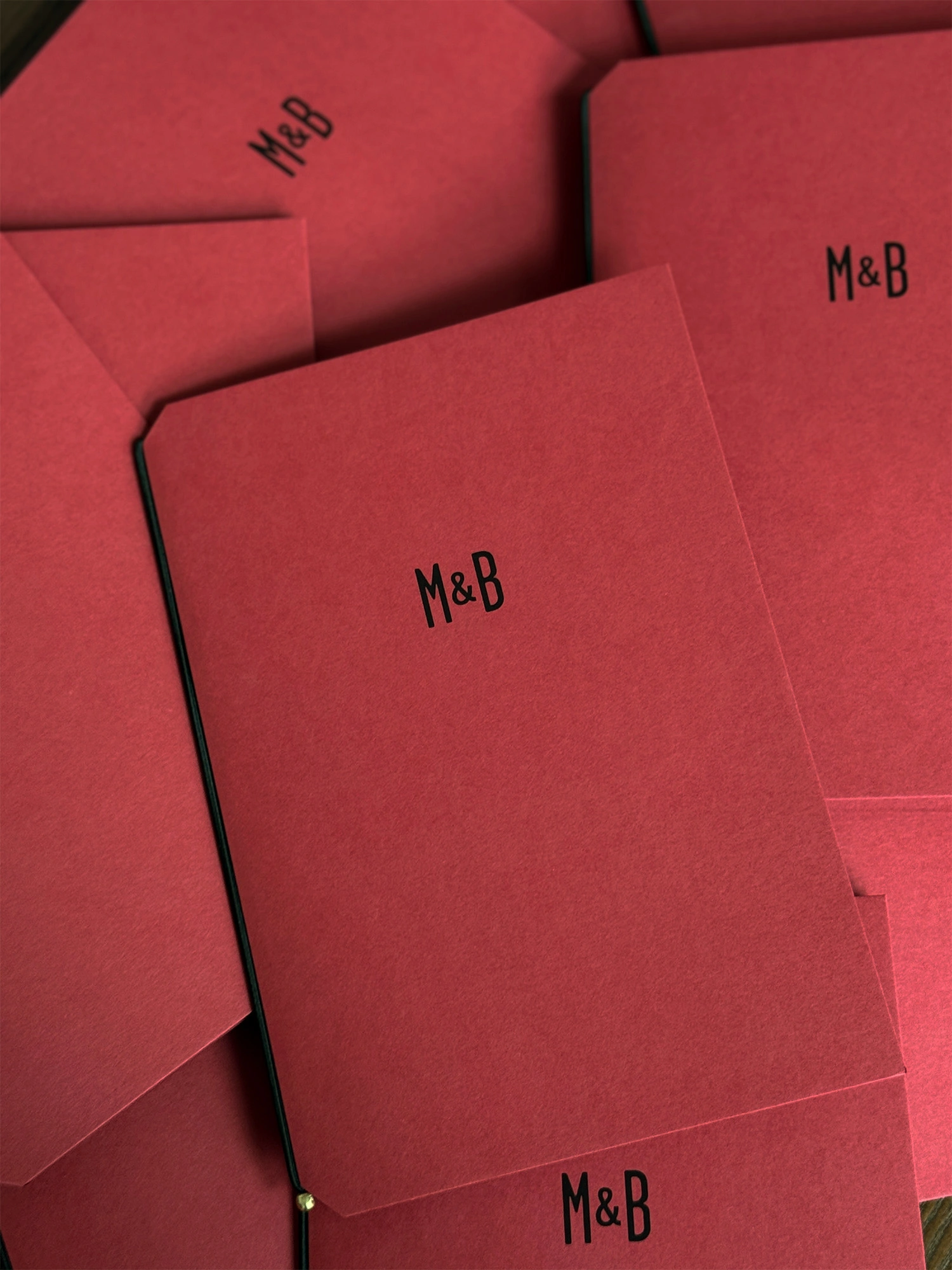
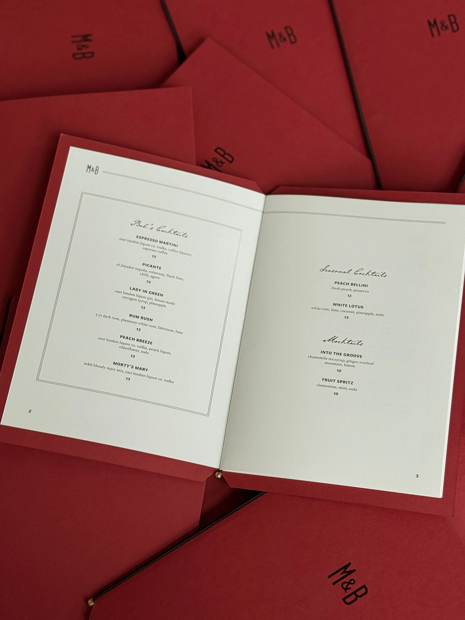
Finally, we developed menus tailored to each location's character. Kings Cross and Kensal Rise received an elevated, refined direction – with bespoke drinks booklets designed for Kings Cross's evening service. Westfield retained its fast-casual, playful spirit, honouring its grab-and-go roots while celebrating the brand's personality.
The result
From logo to illustration, menus to web – this rebrand brings renewed warmth, craft, and personality to a London favourite. Under Charlie's vision, Morty & Bob's continues to grow while staying true to its roots: honest food, genuine hospitality, and the enduring spirit of two remarkable men.