WOLVES OF TOKYO
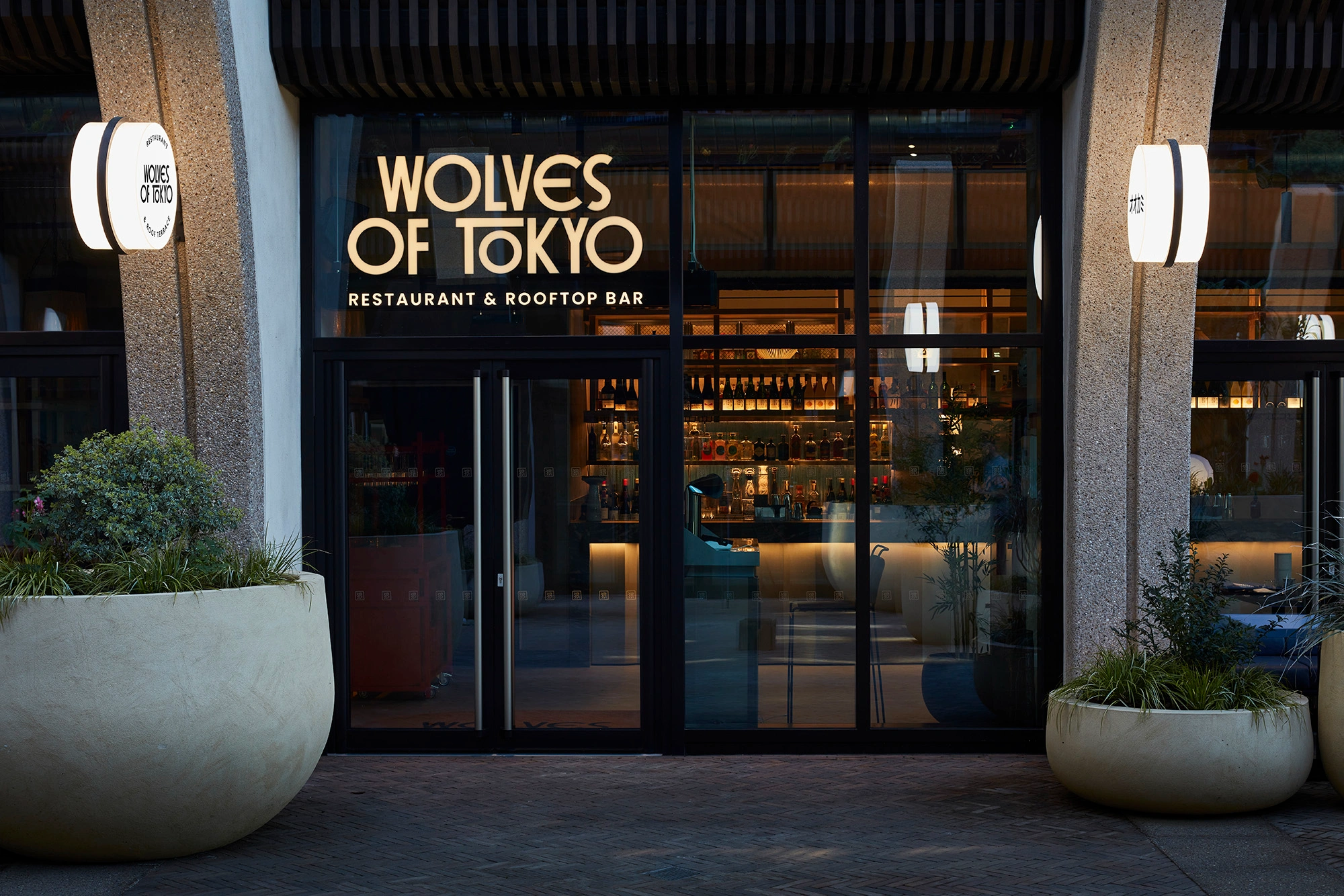
Above the rooftops of Kensington Olympia sits something entirely new. Wolves of Tokyo is a Japan-noir dining and drinking world — restaurant, cocktail bar, private dining apartment and rooftop destination rolled into one. We conceived it from scratch: the name, the brand, and every detail of the space.
THE BRIEF + SPACE
Our brief was to create the naming, branding and interior design of an achingly stylish Japanese restaurant and bar, offering authentic and traditional flavours of Japan. Picture fresh sushi and sashimi beautifully presented in cutting edge interiors, open from lunch onwards throughout the week as a highly sought-after new dining destination above the rooftops of Olympia. Inventive cocktails taking inspiration from Japanese culture and ingredients, premium Japanese whiskey, gin and sakes. Our brief: create two distinct destinations, connected by a single design narrative.

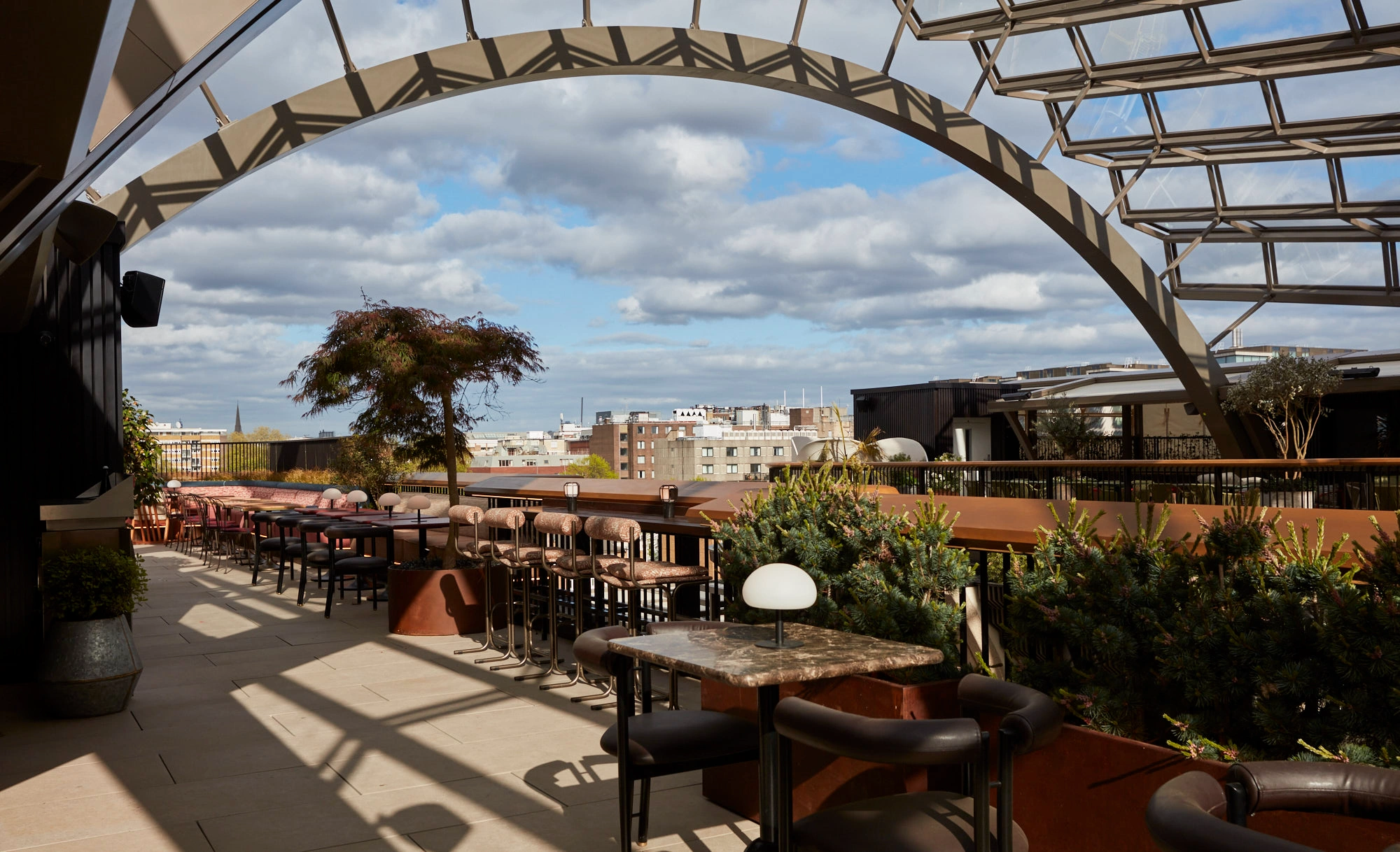
At the sky garden's ground level is the main Wolves of Tokyo buzzing restaurant with semi-private dining, expansive cocktail bar and generous sushi counter, as well as a much larger, standalone Private Dining 'apartment' – London's coolest new F&B hire space. The site gave us a super amazing ceiling height to play with — plus an entire roof terrace floor plate above, exactly the same footprint again. Set to become one of London's largest rooftop cocktail experiences, sitting beneath an iconic Heatherwick bronze canopy. A captivating oasis we designed inspired by the dynamic energy, vibrant culture, and excitement of Japan.
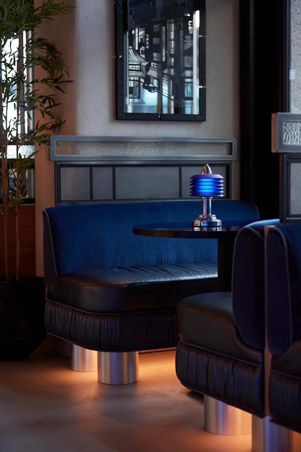
Perched overlooking Olympia, this elevated space promises an immersive experience, seamlessly blending Japanese aesthetics, mixology, and an atmosphere of celebration. We designed the space to pulse in ambiance shifts from a relaxed afternoon retreat to a pulsating evening hotspot, with live DJ performances curated to capture the essence of Tokyo's diverse music scene, transforming the rooftop into a dynamic social hub as the sun sets. Downstairs in Wolves, we notched the scheme down by night: with portable table lamps creating candlelight at every table, with chic glows of light underneath booths and banquettes, lending an almost electro-cinematic, filmic feel.


THE BRAND
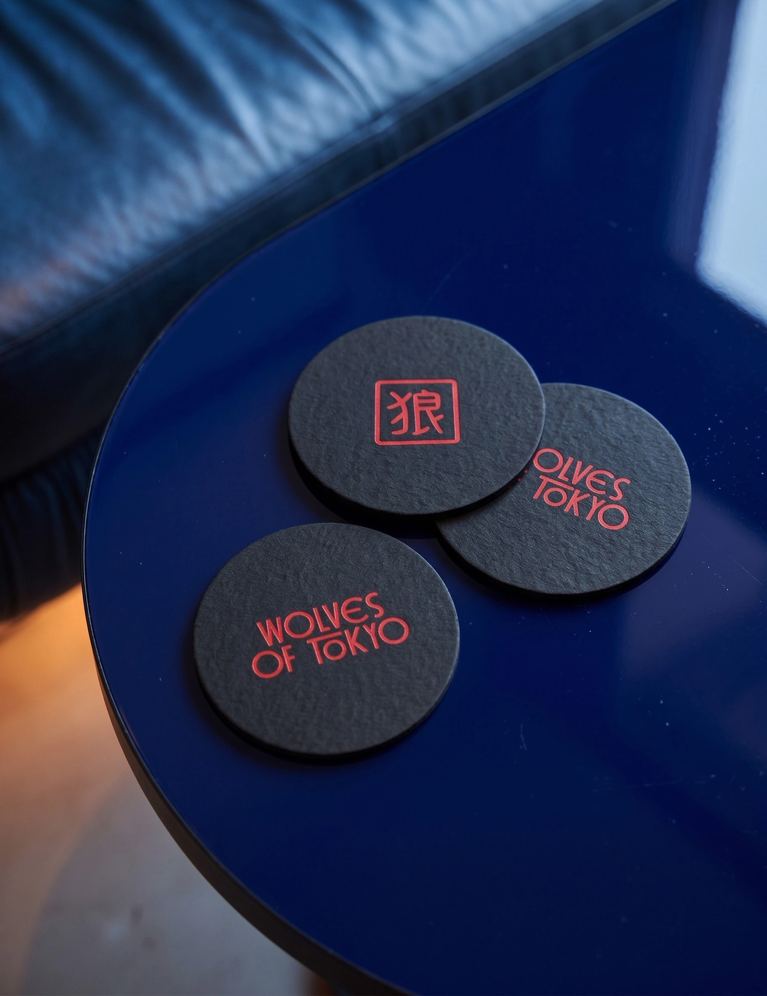
After aligning on a general direction with the client through cinematic moodboards — moody blues and rich reds, the neon underbelly of Tokyo, a world of Japan-noir — we embarked on a naming exercise. Diving deep into Japanese culture, idioms and the country's golden age of cinema, our branding team eventually landed on Wolves Of Tokyo. Dangerous and alluring in equal measure, it had exactly the right cinematic weight to it.
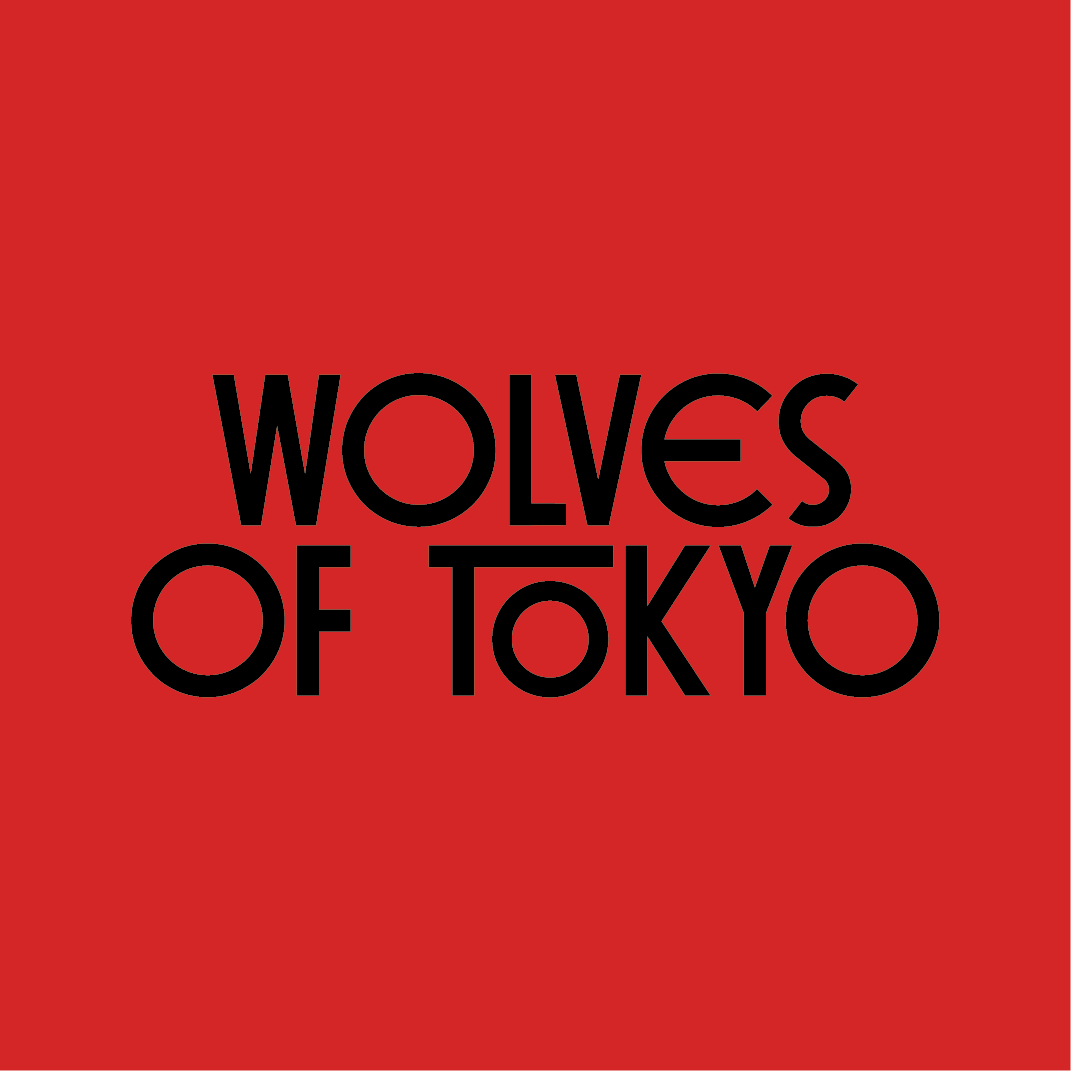
The brand evolved with a modern, handcrafted logotype with a subtle nod to a torii gate hidden in the letterforms.
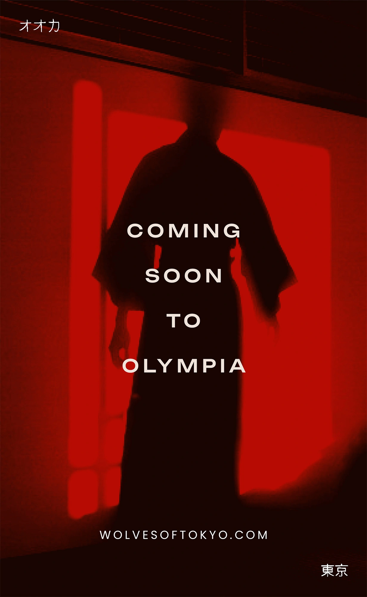
Our visual language draws from cinematic noir — shadowy, atmospheric imagery that feels like stills from a 1960s thriller. Window blind shadows became a key graphic motif, casting dramatic patterns and depth. We used this across social media for the pre-launch, building anticipation, and then brought it into the venue on custom lightboxes and as framed art pieces throughout the space.
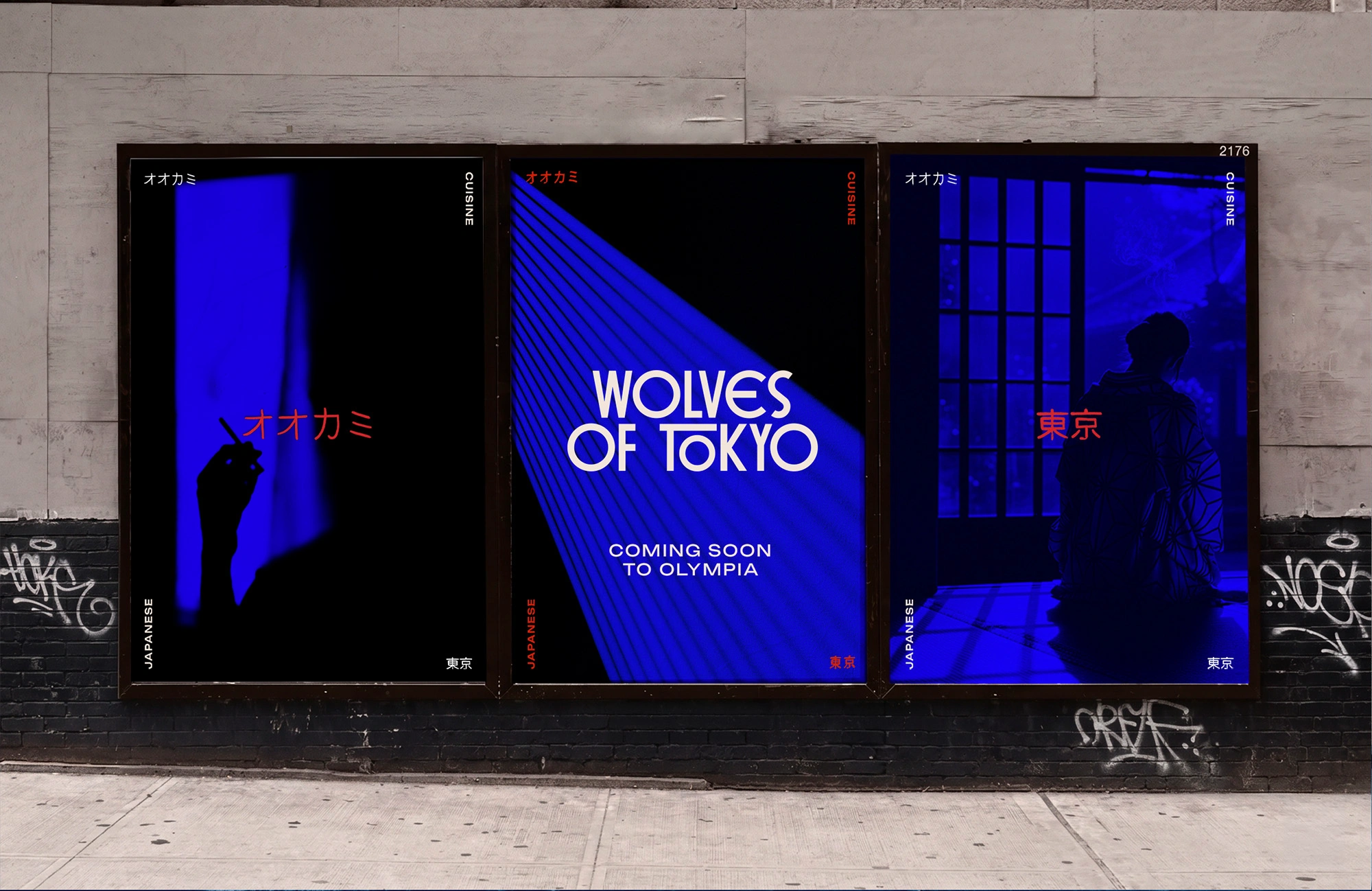


We juxtaposed its contemporary edge with fluid, handwritten Japanese lettering and a suite of traditional illustrations — sushi, koi carp, lotus flowers — rendered with an artisan roughness that feels hand-pressed rather than digital. Then came Lady Zee: a character we created whose private apartment doubles as the restaurant's main PDR, announced to guests by a softly glowing illustrated lightbox. The palette is bold and uncompromising, lacquer red and midnight blue as the lead colours, anchored by off-white cream and deep charcoal black.
'Diving deep into Japanese culture, idioms and the country's golden age of cinema, we eventually landed on Wolves of Tokyo – a bit dangerous and alluring in equal measure, with exactly the right cinematic weight. From there everything followed: the torii gate hidden in the logotype, Lady Zee as a character rather than just a room, the lacquer red against midnight blue. A brand that knows exactly what it is.' Chris Trotman, Founding Creative Director, Run for the Hills


THE INTERIORS
Step inside a film-set worthy Tokyo life. A smorgasbord of bright lights, cool city vibes. Super cool dining, karaoke craziness. A full throttle space we designed to transition with lighting through day & night — truly unforgettable.
'Wolves is a film-set kind of place — every one of our booths, every banquette and joinery detail coming from a place of design love, every choice of fabric, material or trim a considered, curated design moment. Immersive design is what we love, taking people on a journey from the moment they enter, playing with light and shade, for metamorphosis during day-to-night transitions.' Anna Burles, Founding Creative Director, Run for the Hills
Lady Zee's apartment sits on the ground floor in its own dedicated space — fashioned for group meetings, private hire, dinner celebrations and feel-good parties. An achingly cool setting we created, with a double-height gleaming stainless steel service bar, neon-hot colour change wine display and a state-of-the-art audio-visual system, transforming from sun-dappled daytime meetings and lunches into intimate dining as the sun sets. With hidden karaoke beckoning the night away.


Mirroring the cinematic weight of the brand, our interiors team developed an equally intoxicating schematic — taking the project from concept and spatial exploration through look and feel, schematic development and full tech design. We designed a huge collection of bespoke pieces from bar joinery and wait stations to unique lighting designs, FF&E, custom finishes and upholstery.

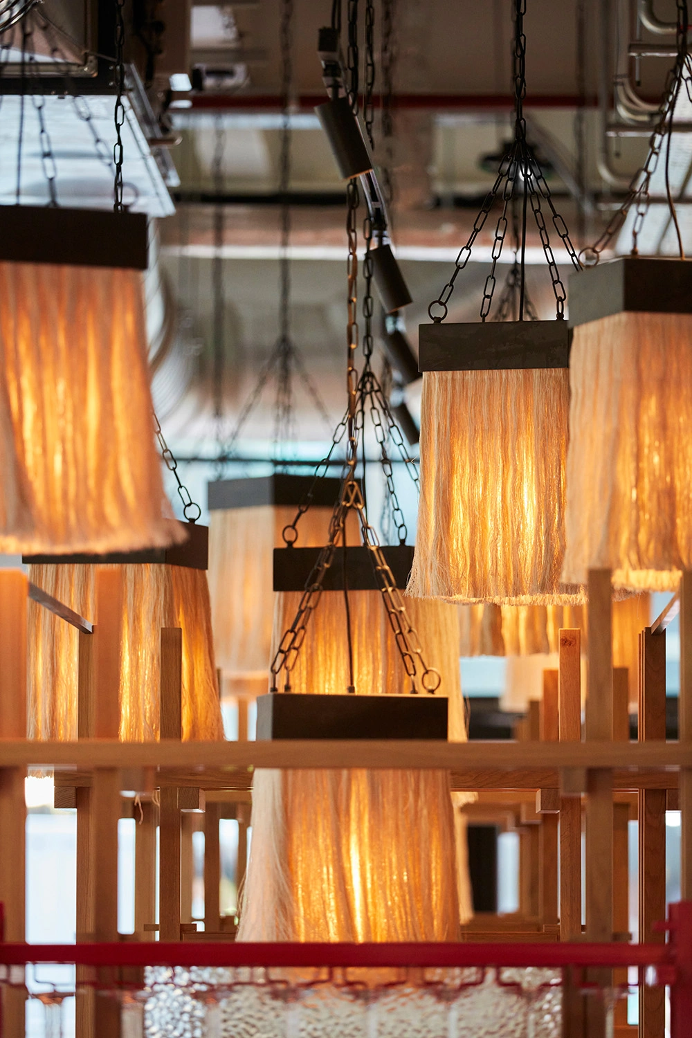
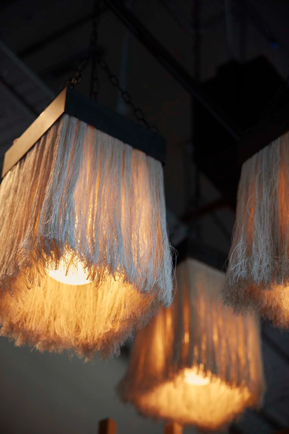

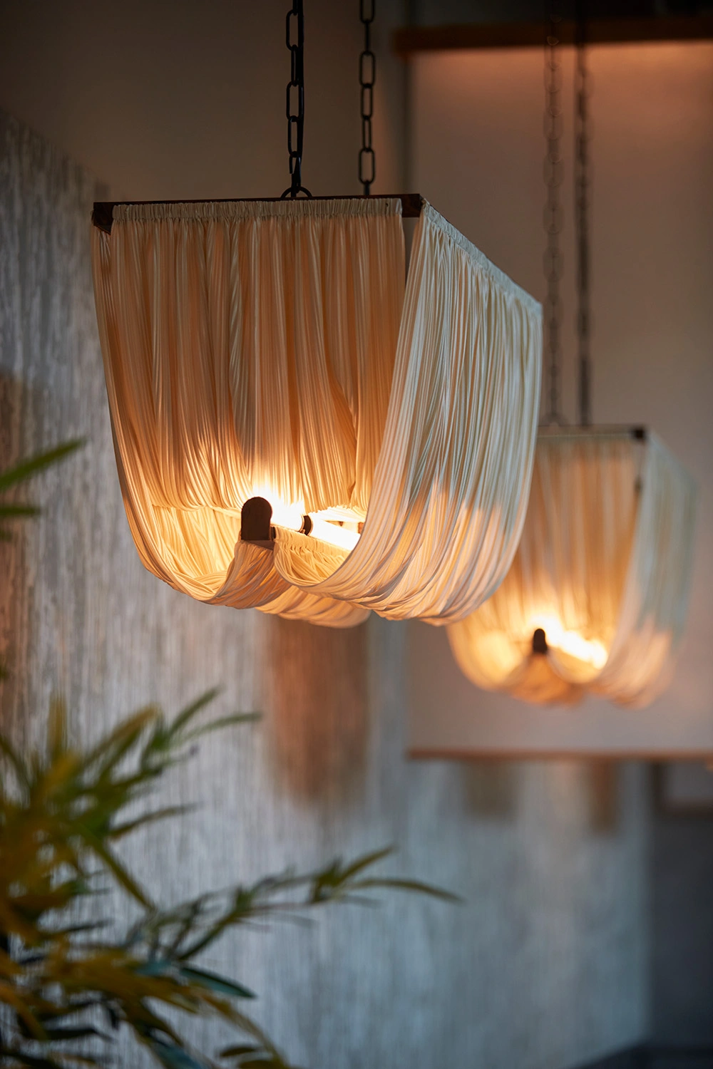
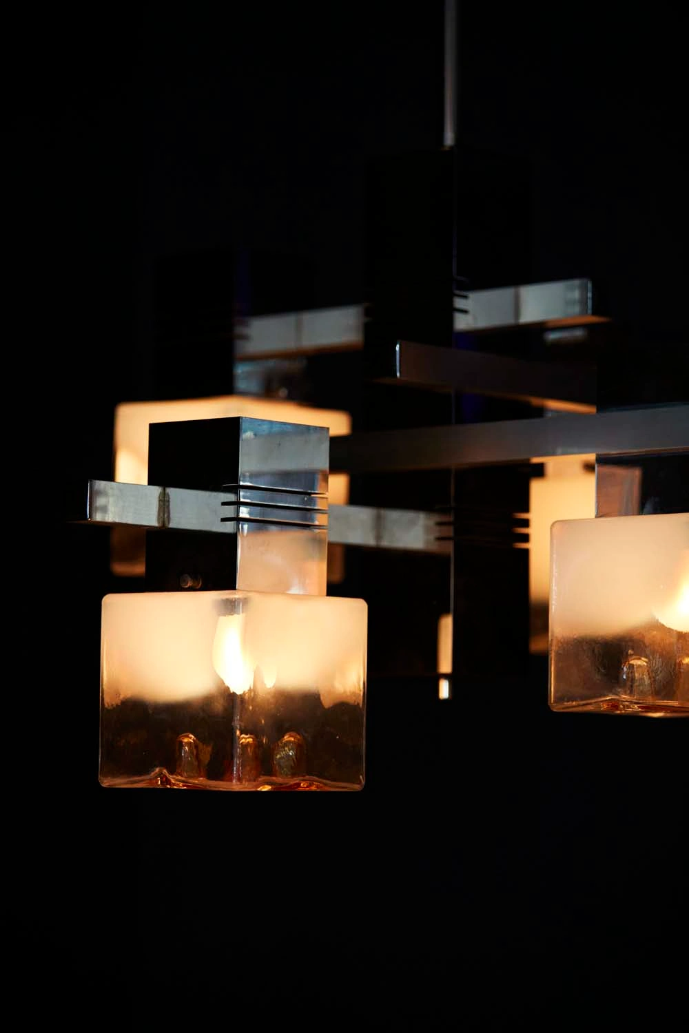
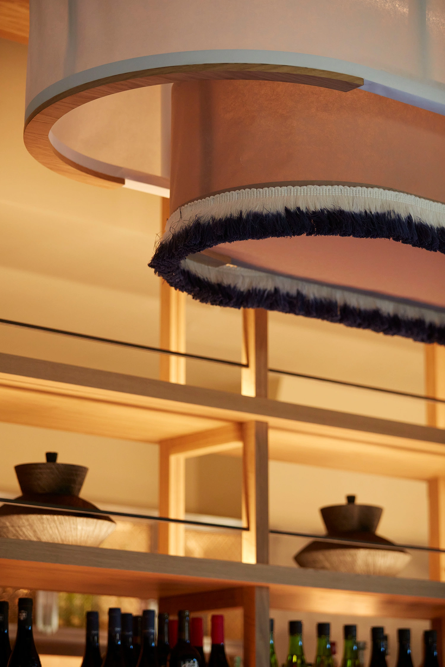
We layered the interior with bespoke Japanese tasselled lanterns and a hero gantry light installation crafted from rich paper, casting ambient pools of light through the space. Japanese dovetail wooden structured booths anchor the dining areas, complemented by a wooden Japanese style tasselled fabric gantry framing the room with sculptural detail.
A branded coir entrance mat welcomes guests into the space.

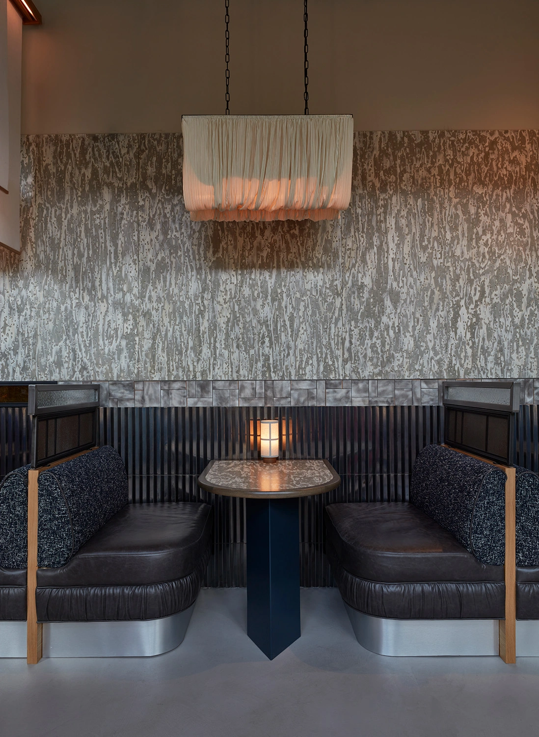

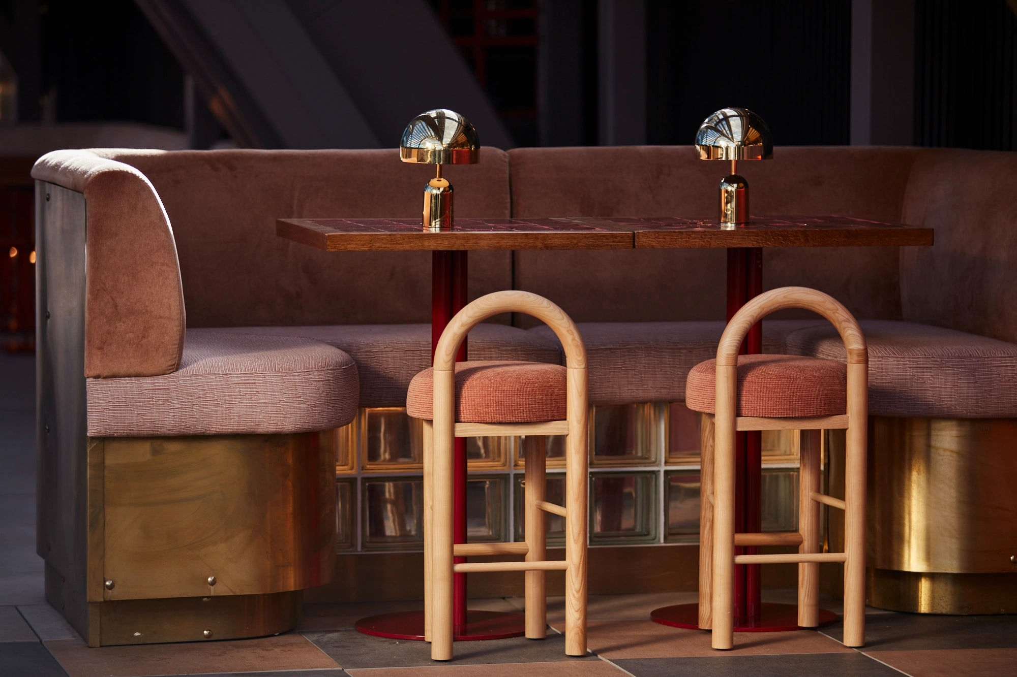
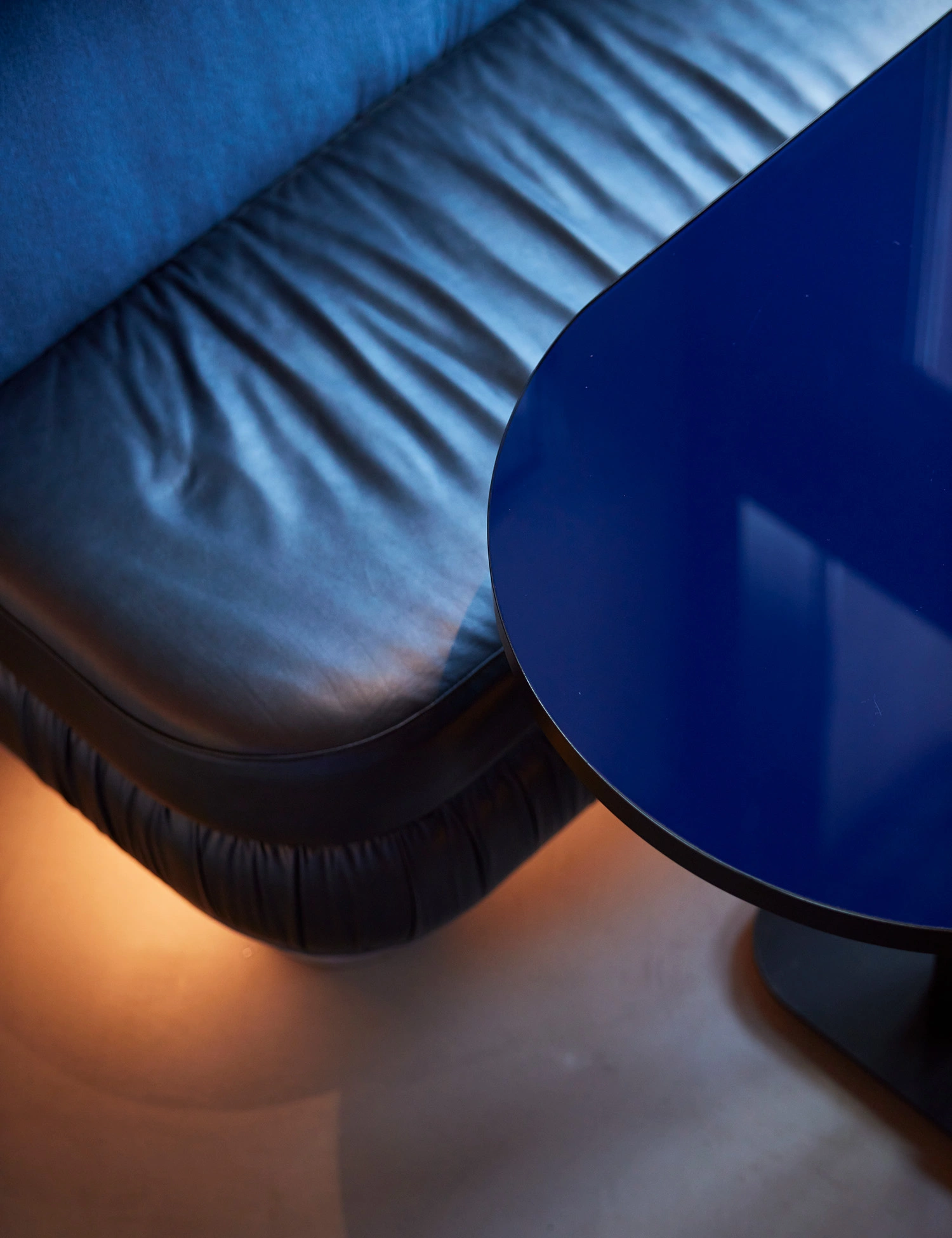
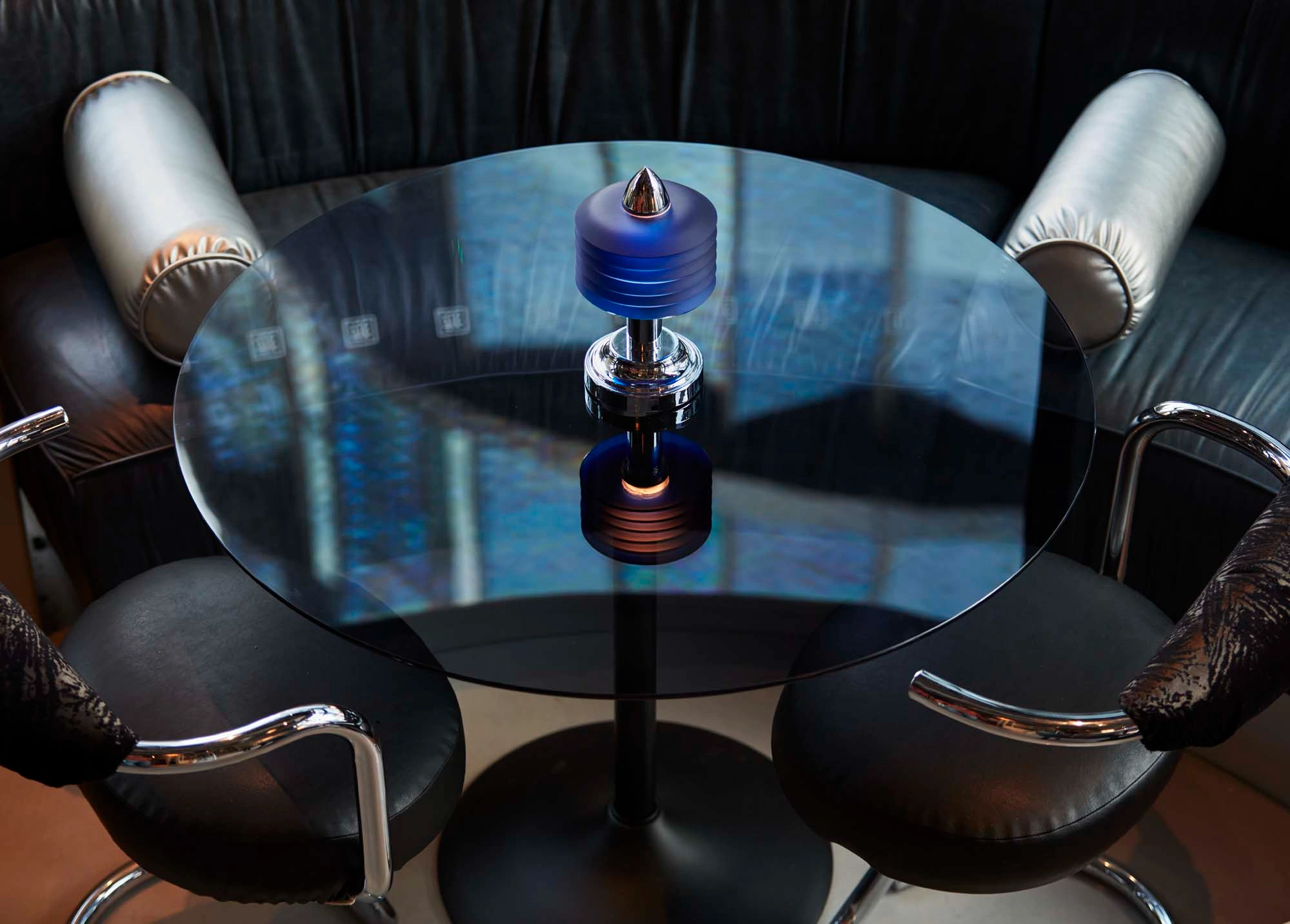
Deep indigo blue booth seating sits on chrome legs, whilst blue lacquered reflective tables catch and play with the light, shifting from mercurial magic by night to casual cool by day.


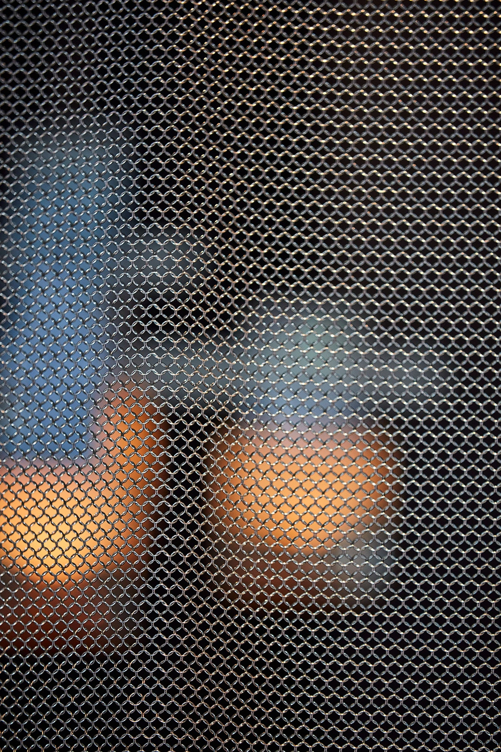
A semi-PDR features a striking mesh chainmail entrance that separates it from the main restaurant.
We used clever fitted seating and custom booth formations to maximise covers along the long, narrow ground floor whilst preserving open flow for diners and staff alike. The FF&E is a filmic smorgasbord: with 1970s-inspired chrome serpent chairs upholstered in rich dark velvets, smoked glass tables on chrome tulip bases, conical stainless legs, custom banquettes detailed with ruching, creased leather, metallic braid trims and silk brush fringe — every piece a work of designer art.


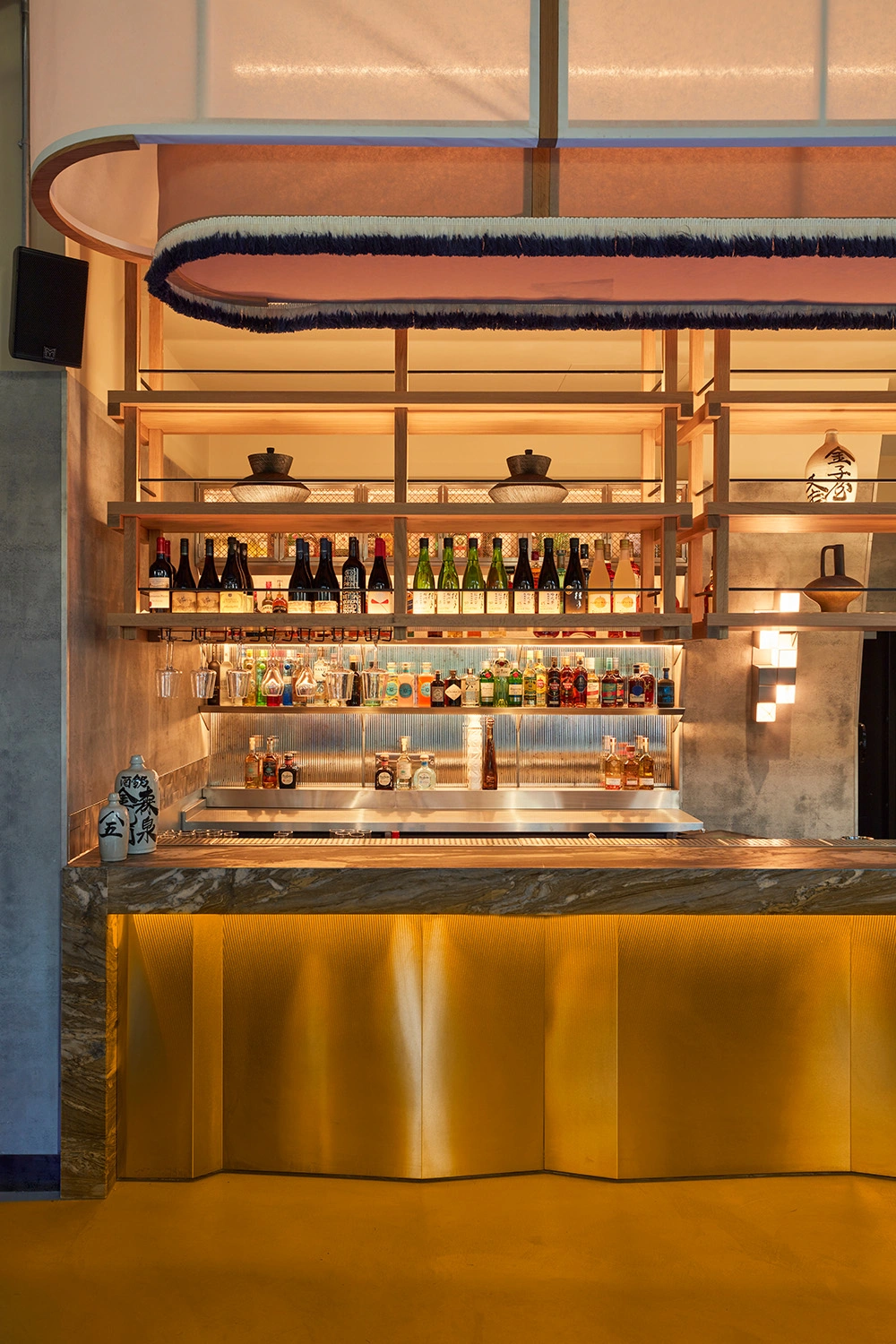
The bar and sushi counter are the beating heart of Wolves — washed in colour-change light, waterfall violet marble and gleaming steel. A celebration of raw finishes meeting traditional Japanese craft principles. The semi-open sushi kitchen forms a theatre in itself, with chefs at work becoming part of the experience. Above the counter, a timber-jointed gantry shelving with knotted detail glows softly down onto beautifully plated sushi, whilst an angular stainless back bar sparkles with integrated light over reeded antique mirrored tiles. Throughout the main bar, sushi counter and PDR joinery, a colour-change lighting system we designed morphs the mood from warm golden daylight through to electric blues, reds and hot neon pinks — completely transforming the atmosphere from day into night.


The WCs at Wolves of Tokyo are a visual feast we designed with dramatic tiling patterns in deep inky blues and ivory crackle glaze tiles, along with our bespoke designed asymmetric mirrors. We crafted the ceiling from a rippled polycarbonate with a light glow behind it to create an almost futuristic feel.


LIGHT PLAY, ART & STYLING
Light and texture does much of the storytelling throughout the space. Our custom designed lightboxes act like cinematic stills, glowing in deep reds and bruised blues, while others cast the warmer, more intimate flicker of candlelight. A Tokyo street scene we designed plays out as a triptych black decal across framed mirrors. A larger mirror piece with coloured acrylic blocks brings a contemporary edge.
We display our design team's art in a variety of ways: framed and hung on walls, propped on shelves, and suspended in unusual forms. Japanese twigs clustered in unusual vessels, curated and layered ceramics, vintage and new Japanese objects — arranged across gantry shelving and dining surfaces, creating moments of cultural discovery and narrative depth throughout the space. Vintage wood blocks, koi carp vases, and handcrafted brushes sit alongside modern pieces, each telling a story of tradition meeting contemporary cool.


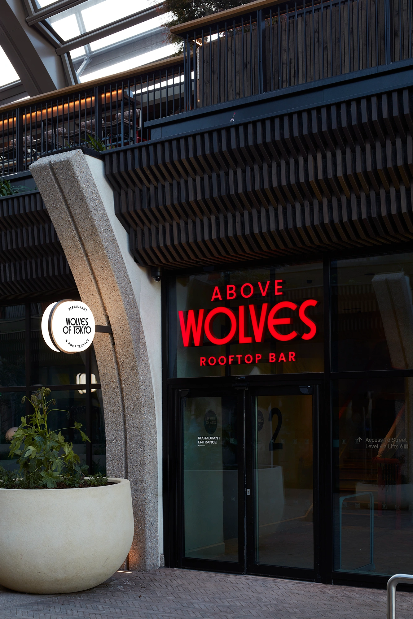
We also created a sub-brand for Above Wolves, the rooftop bar sitting above the restaurant, giving it its own identity while keeping it firmly within the world we'd built.
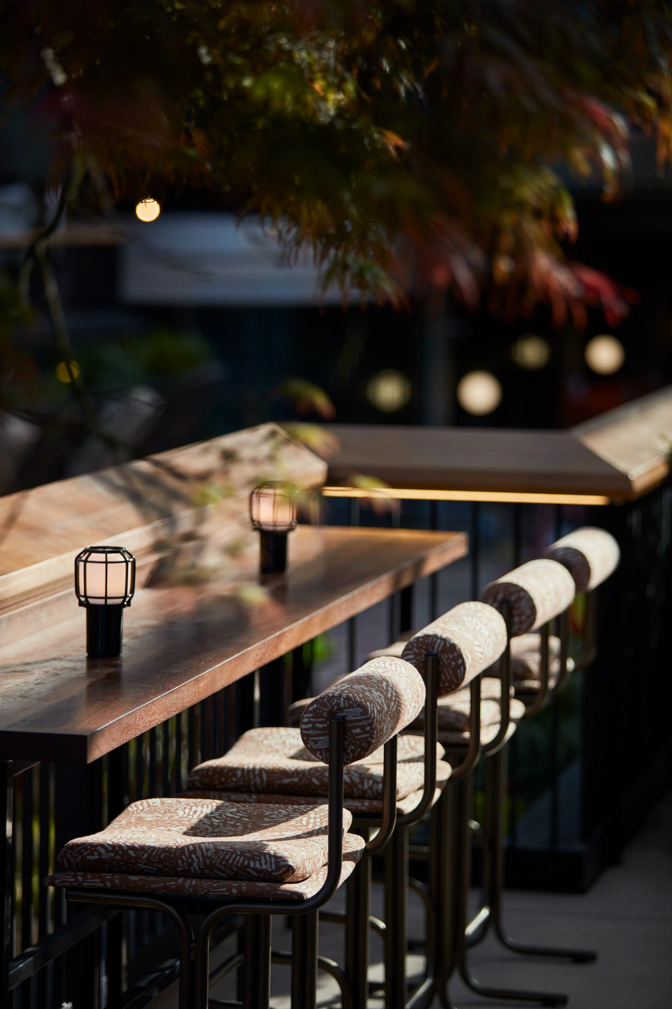
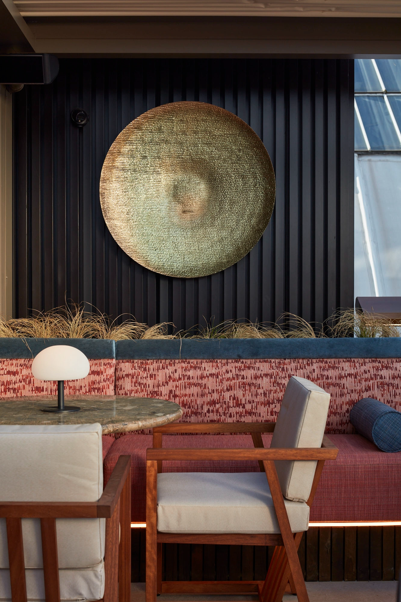
The roof terrace occupies the entire ground floor footprint again — a vast al fresco floor plate beneath the now-iconic Heatherwick bronze canopy, with retractable shade for the brightest sun and lightest showers. Where the ground floor is cool — chrome, indigo, concrete — we ran Above Wolves warm: dark reds, hammered gold, peach, coral, pink.
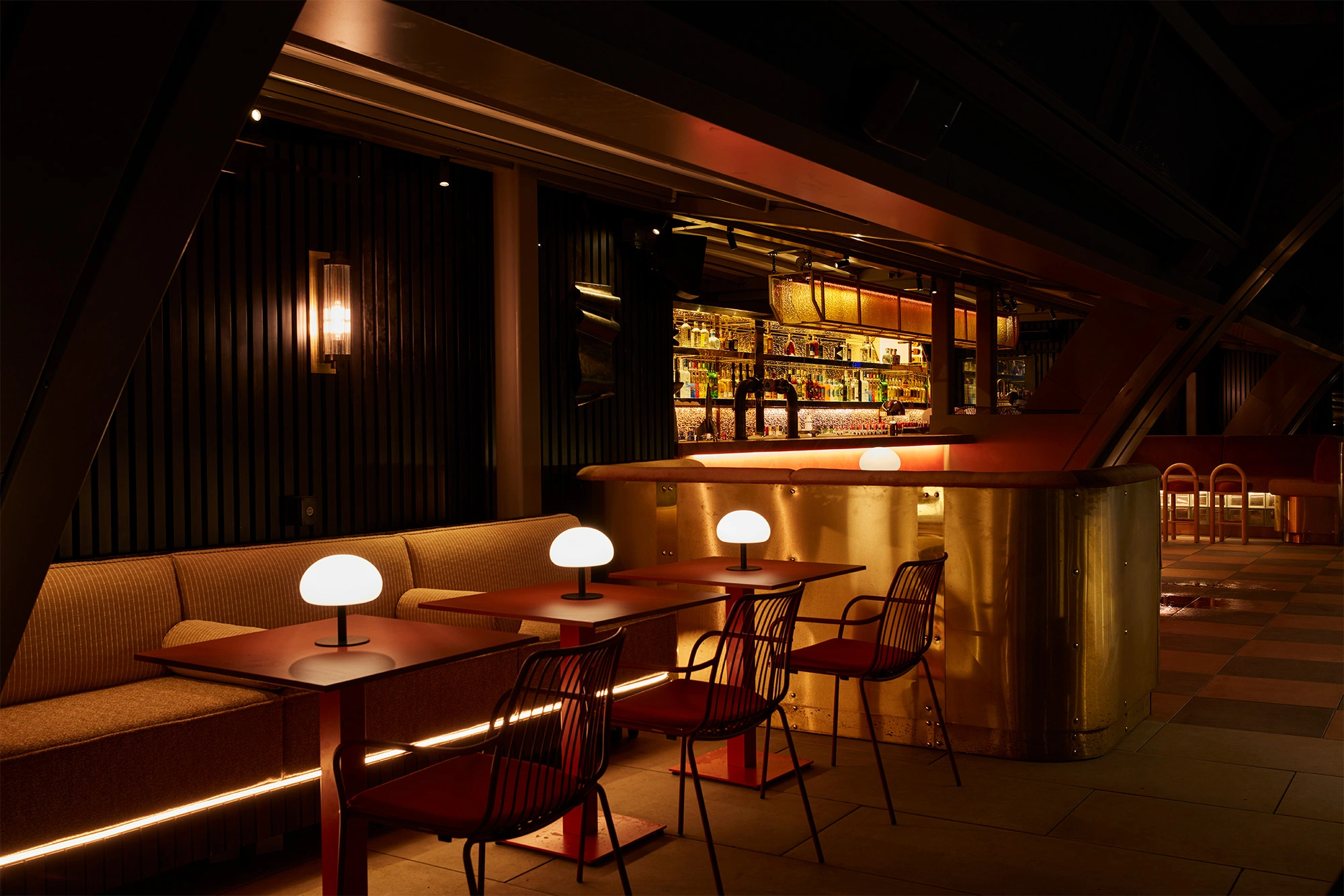


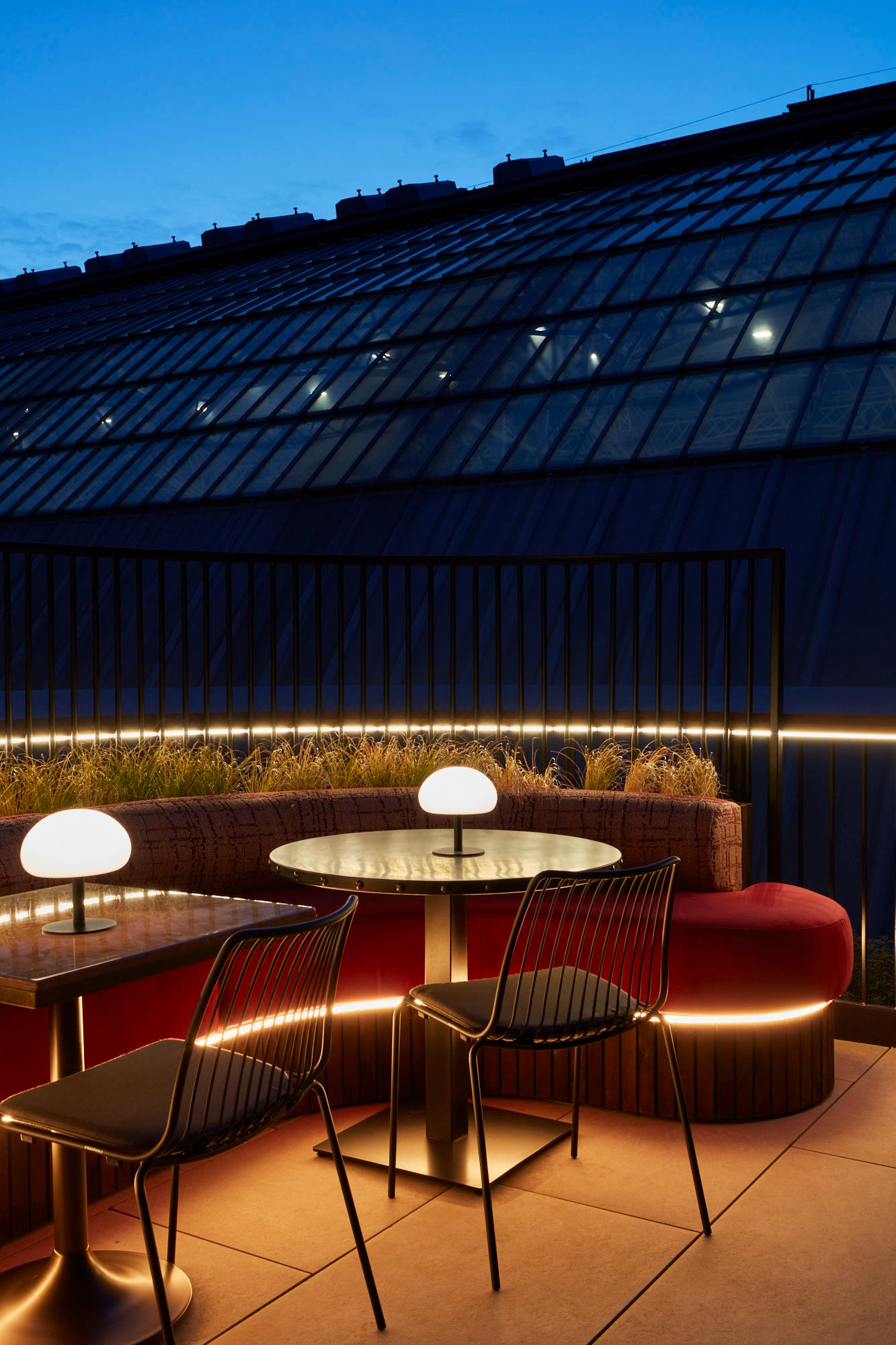
The dedicated rooftop cocktail bar we designed is a glamorous riot of mirrored finishes, hammered gold and a rosso-veined waterfall marble counter, with layer upon layer of highlight light effects glowing through the day and igniting after dark. We arranged custom-designed luxurious lounge-style banquettes, sofas and love seats for every kind of group — drinks, lunches, afternoon teas, dinners, cocktails, after-hours, nightcaps. Some of the feature banquettes glow from underneath, futuristic, with lighting set behind glass bricks and antique brass curved wrap-around. A dedicated DJ booth, magical layers of planting and candle-lit table lamps twinkling into dusk make this a true night-time destination.