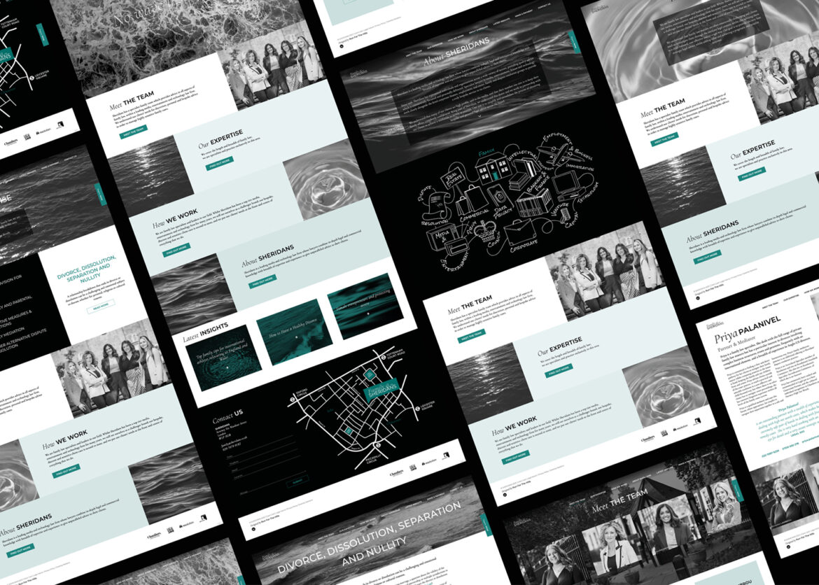
Another unconventional branding and website design project for Family Law—this time, an offshoot of the renowned firm Sheridans. Family@Sheridans. Since Sheridans’ main website features solely black-and-white photography, we wanted to maintain that visual language but in a more visually interesting and meaningful way. Water emerged as the perfect visual metaphor, symbolising shifting emotional states—calm waters for resolution, turbulent waves for upheaval—and the reassuring idea that the storm of divorce eventually passes.
Visit the site over here: https://www.familyatsheridans.co.uk/