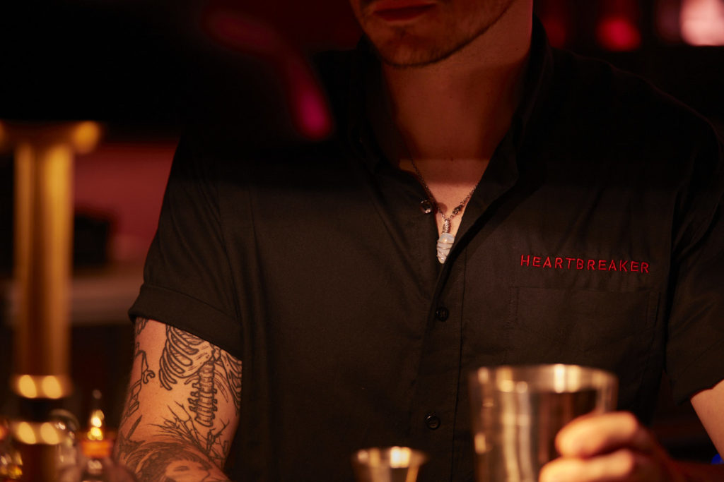
Into the noir…
Introducing a super-fly cocktail bar called Heartbreaker. The venue is newly launched in Worthing, the pretty seaside town in West Sussex being dubbed the new Brighton and it’s the brainchild of Ben Thompson, indie rock band Two Door Cinema Club’s drummer.
We don’t know where he finds the time, but in and around his music, and travelling the world gigging live, Ben’s been busy building a hospitality empire. He has two other stylish, successful sites, Manuka Bar and Jungle, so Heartbreaker is his third and most ambitious yet. Ben had been following Run For The Hills for a while and felt this new project was perfect for us. We in turn jumped at the chance to bring Ben’s vision to life: to create a world-class hot spot in the heart of the British coastline — to rival some of the coolest venues in London, New York and LA.
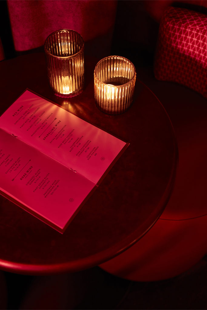
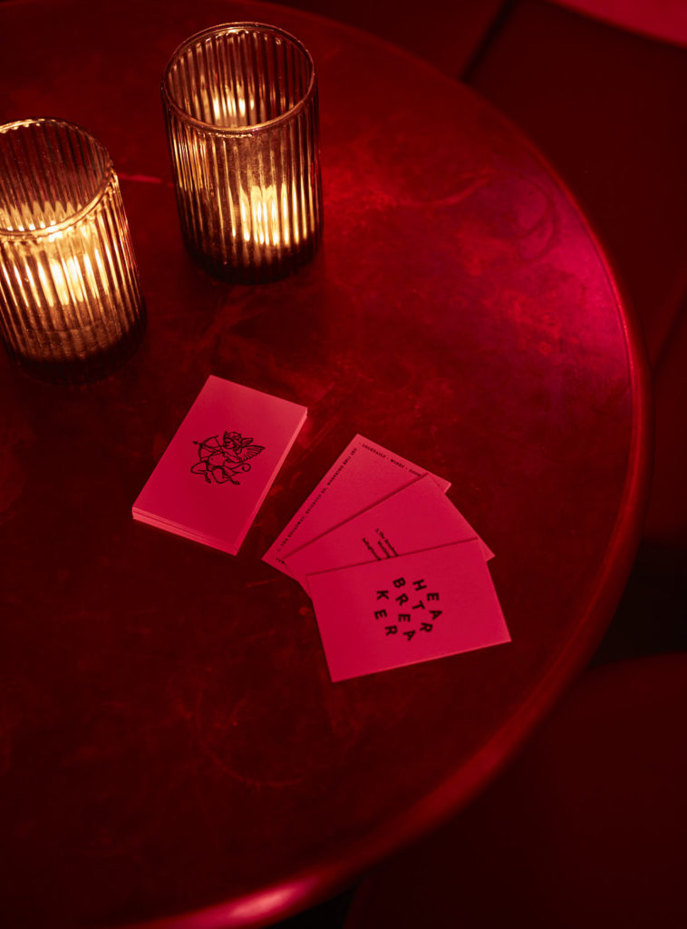
The project is a true collaboration between Run For The Hills’ branding and interiors teams; designing not just the inside of the bar, all the joineries, banquette seating, decorative lighting and furnishings. But also originating the brand, the logo, signage, wayfinding and drinks menu design.
Our branding team, under Founding Creative Director Chris Trotman, started by exploring trends in the global cocktail scene, exploring styles and moods with Client Ben to hone down the aspirations for the brand.

Fashioning the Identity
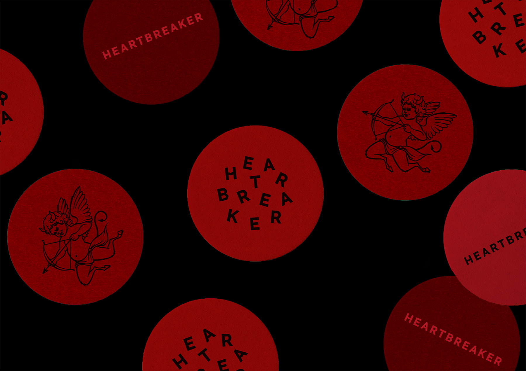
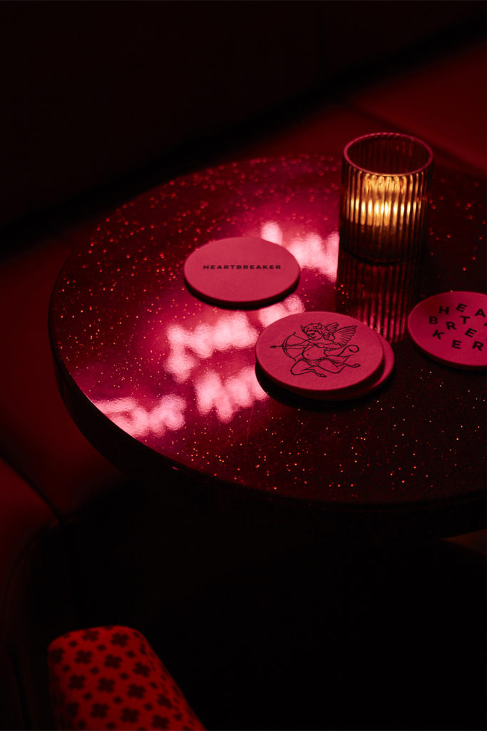
The team then set about designing a number of creative routes for the brand identity and logos, playing with typography, brand colour palette and illustration styles. A super cool direction emerged on both the branding and interiors side, which set the tone for the finessing of the brand and development of creative concepts for in-venue signage, wayfinding, drinks coaster, menu design and fun, theatrical touch points across the venue. The brand’s tone of voice is playful and sexy.
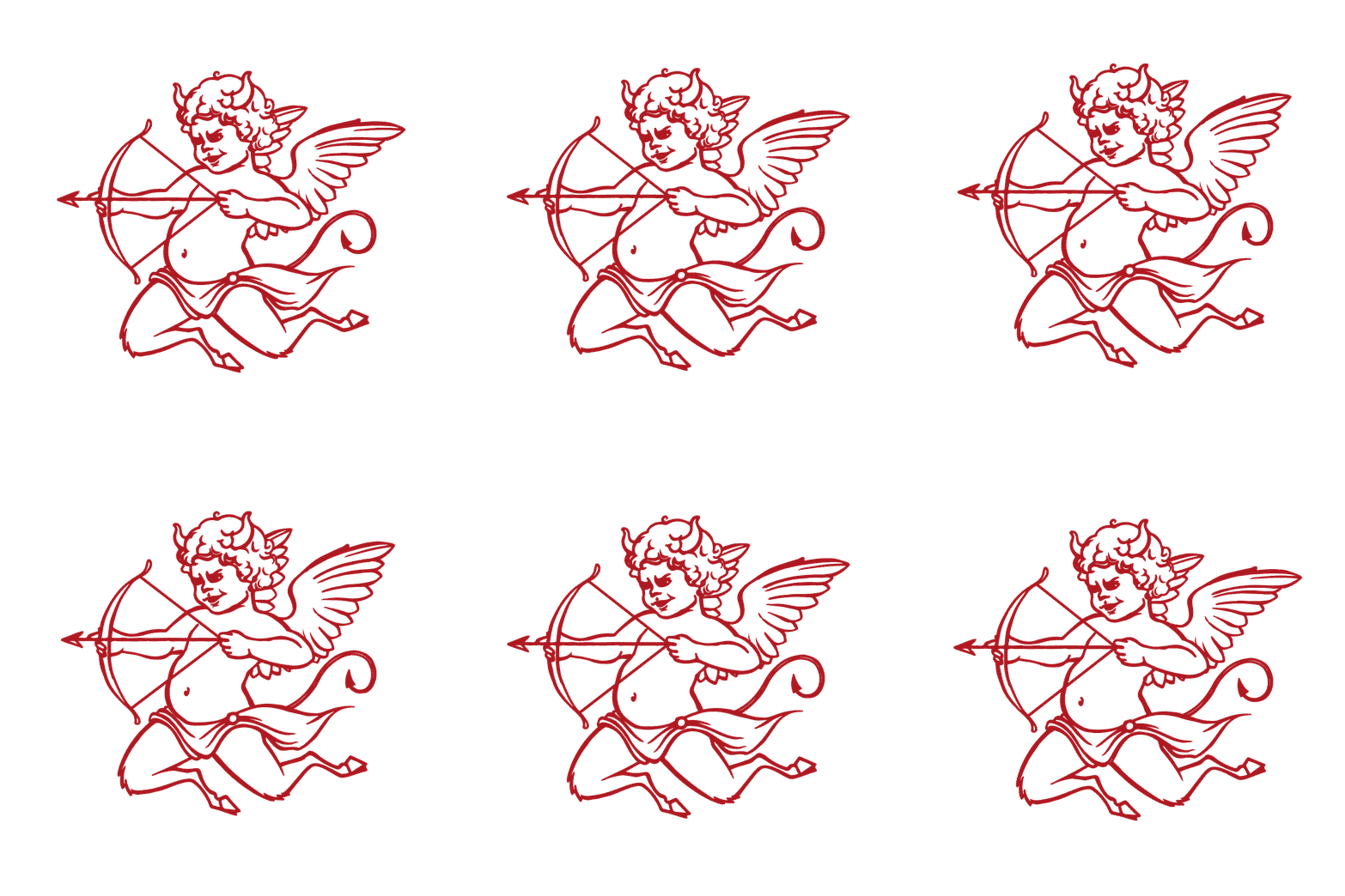
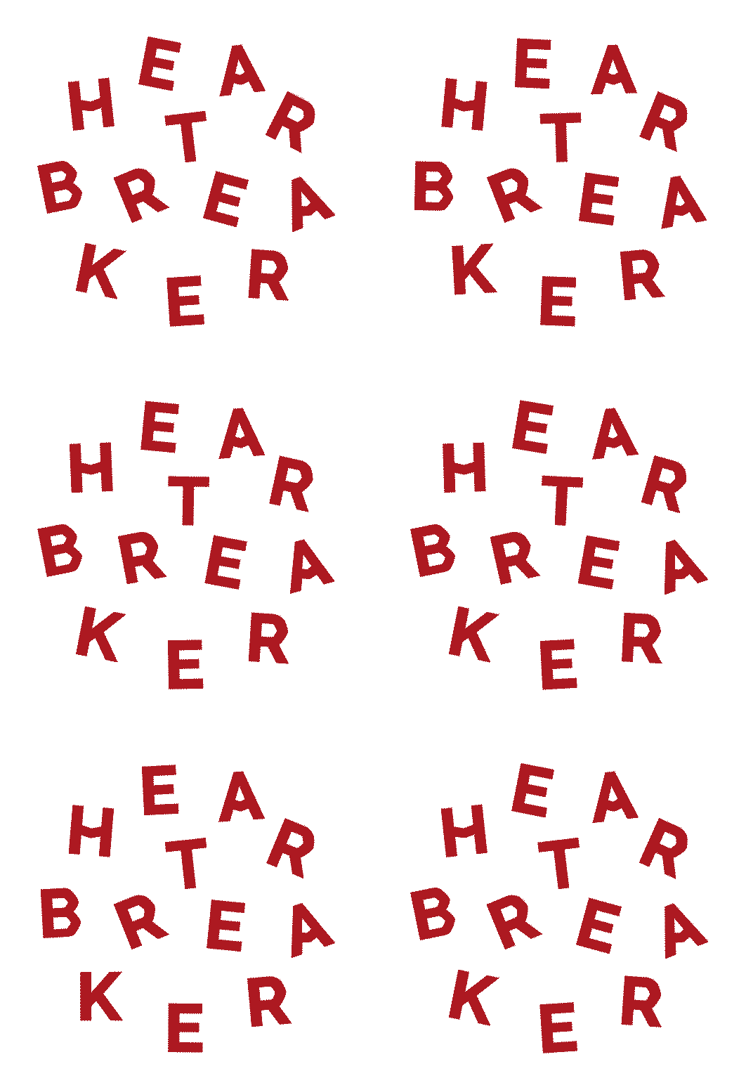
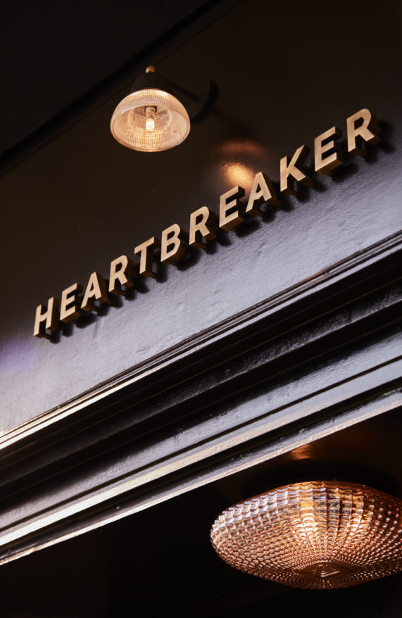
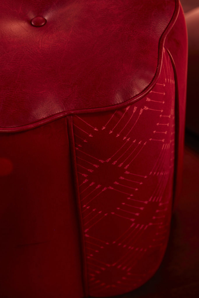
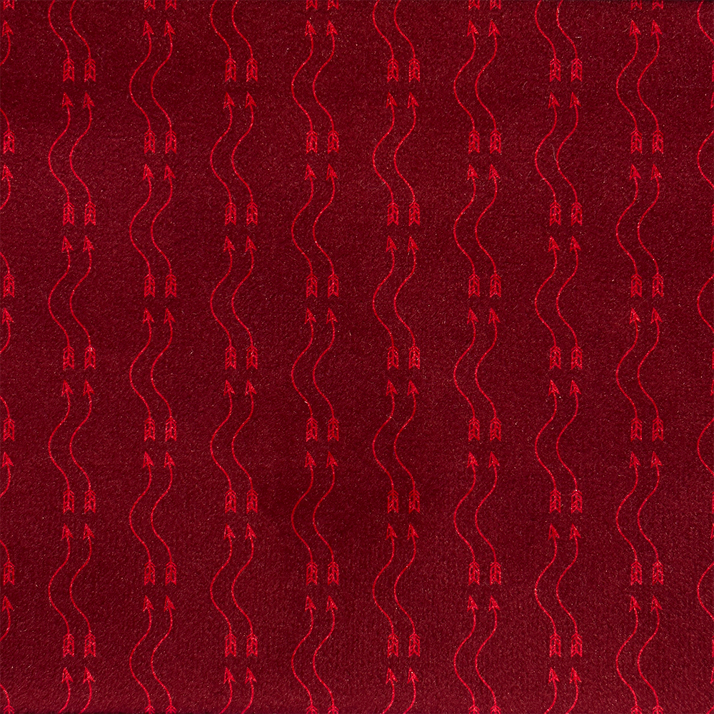
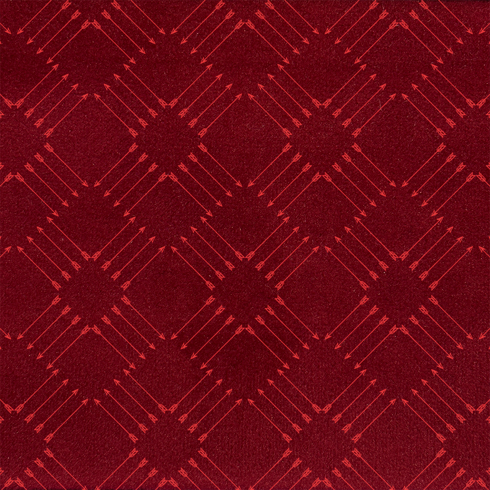
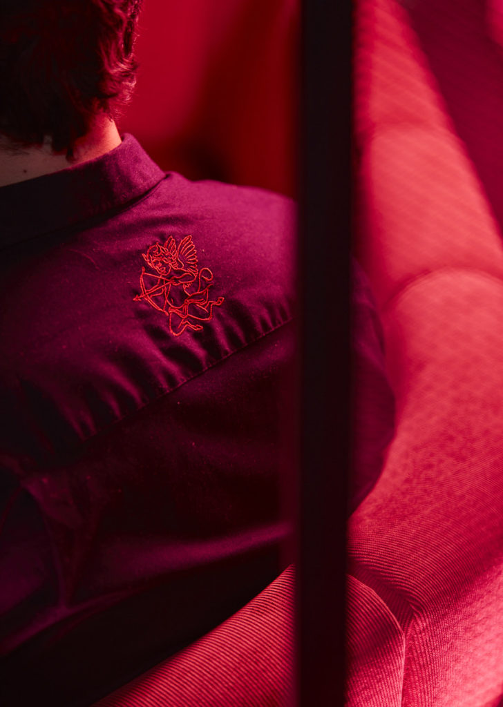
Chris Trotman says: “We wanted to create a character behind the name, and came up with this concept of a ‘bad cupid’, who rather than making people fall in love, goes around breaking hearts and mischievously pairing incompatible people. We created a Heartbreaker logotype in a broken lockup and various arrow patterns that are used on cushion fabrics. It’s a boldly seductive pink and red identity, perfectly complimenting the gorgeous interiors palette.’

Make an entrance
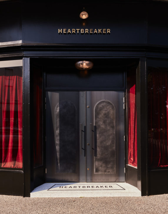
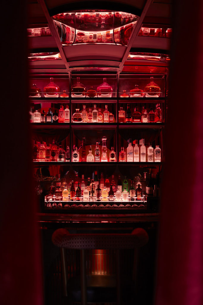
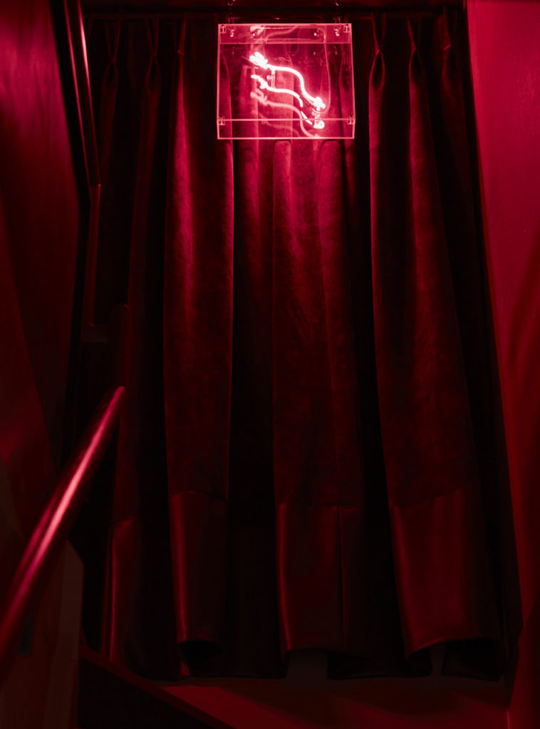
The new bar launched discreetly as all the best do. Guests approach a mysterious entrance, with minimal branding and super tight beams of light onto a statement door and bespoke mosaic tiled floor. Once inside, they pass through a thick velvet door curtain, and feel the full impact of the venue’s dark and moody vibes, with an uninterrupted view straight down the barrel of the venue’s hero cocktail bar.
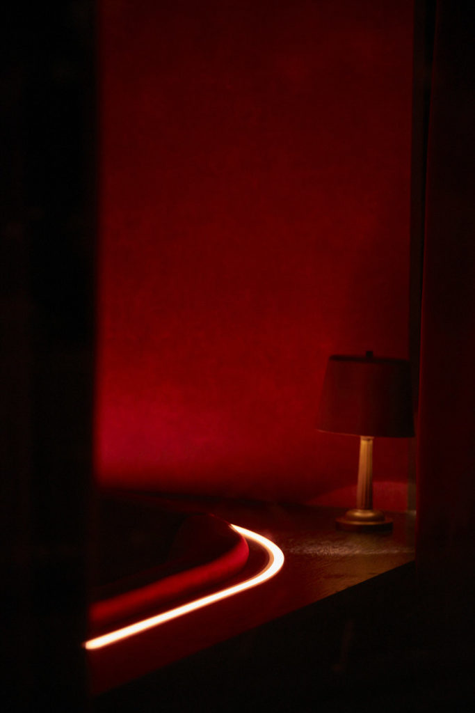
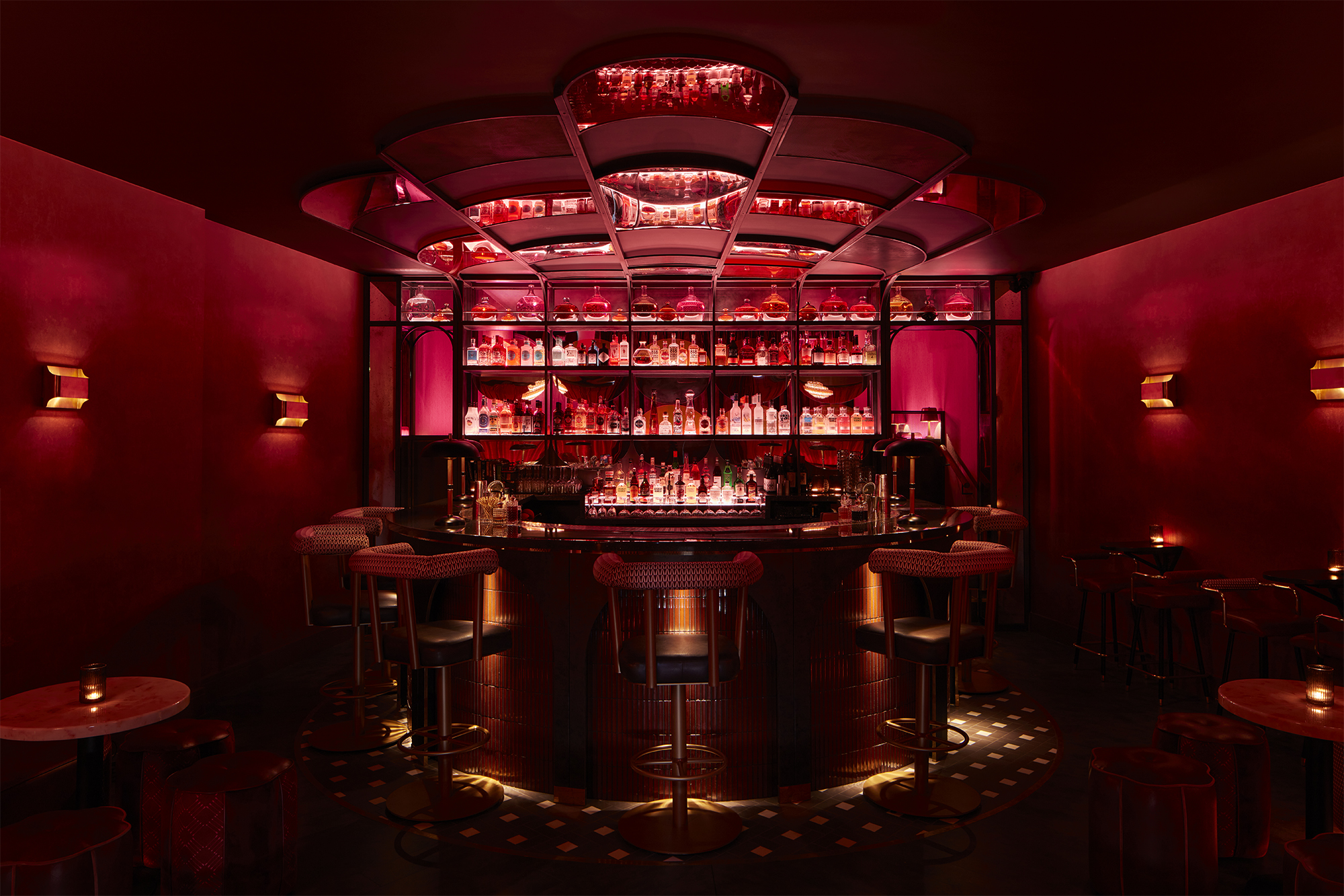
In terms of the interiors, Ben had given some of his favourite bar interior references from his globe-hopping lifestyle on the road with the band and it was clear he wanted a truly show-stopping design, nothing less. Which was music to our ears. With the aim of transporting Heartbreaker guests to an intoxicating, never seen before venue. The interiors team set about devising the design concept.
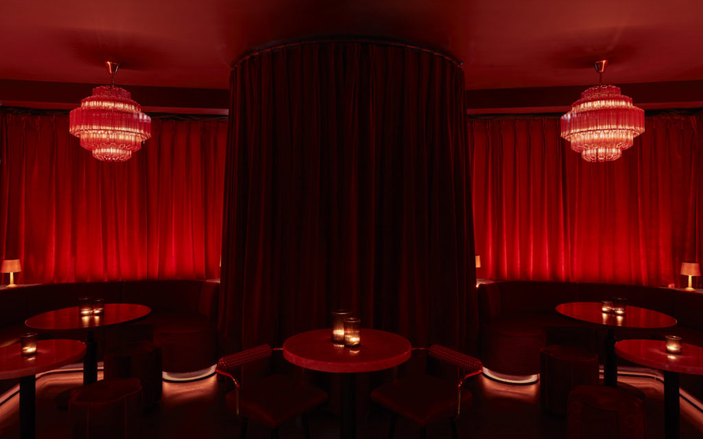
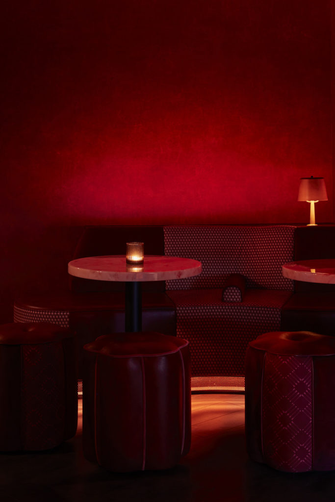
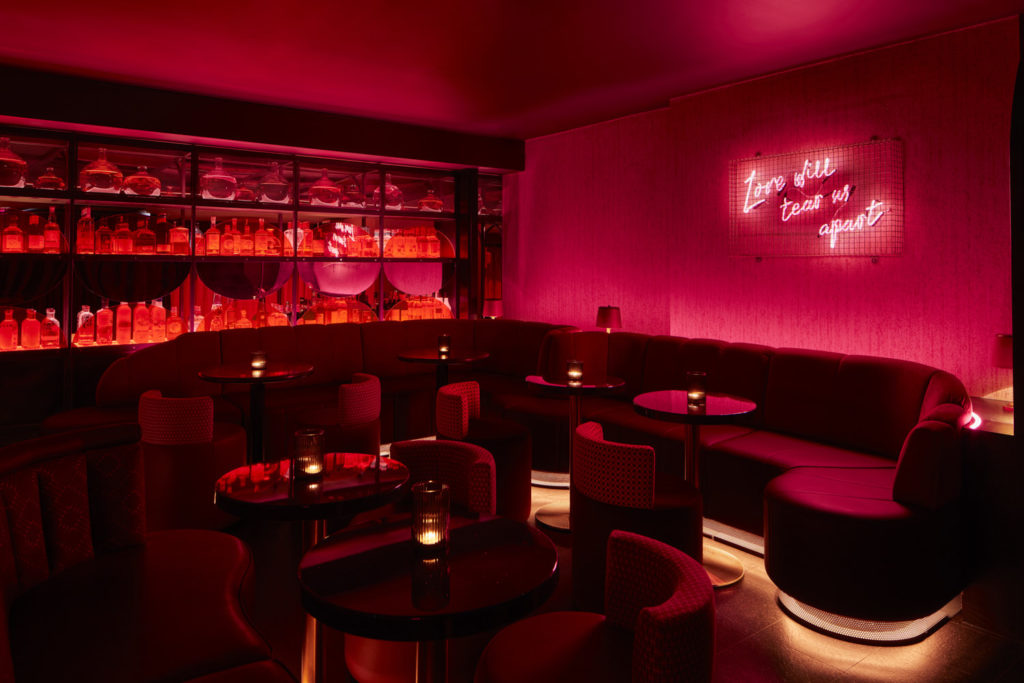
Founding Creative Director, Anna Burles says:“We had lots of fun with this one: a super-fly, ultra-glamorous night-owls-only bar for lounge lizards, hipsters and shakers. We dubbed our sketch scheme ‘Noir En Rose’ and proposed a bold clash of deep reds, clarets and dusky pinks within an atmospheric and luxurious drinking den meets cabaret lounge style setting. Inspired by the effortless speak-easies of New Orleans, NYC’s lower east side and dark and stormy hangouts across the world. But still cheeky and fun, not taking itself too seriously.”
Wow Factor Bar
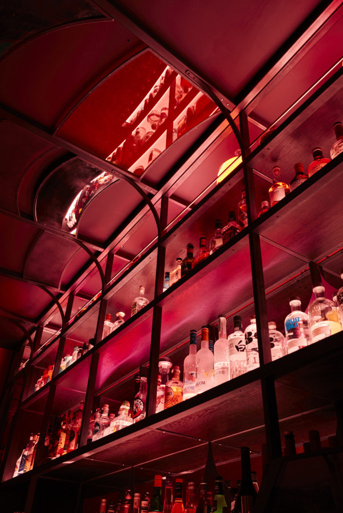
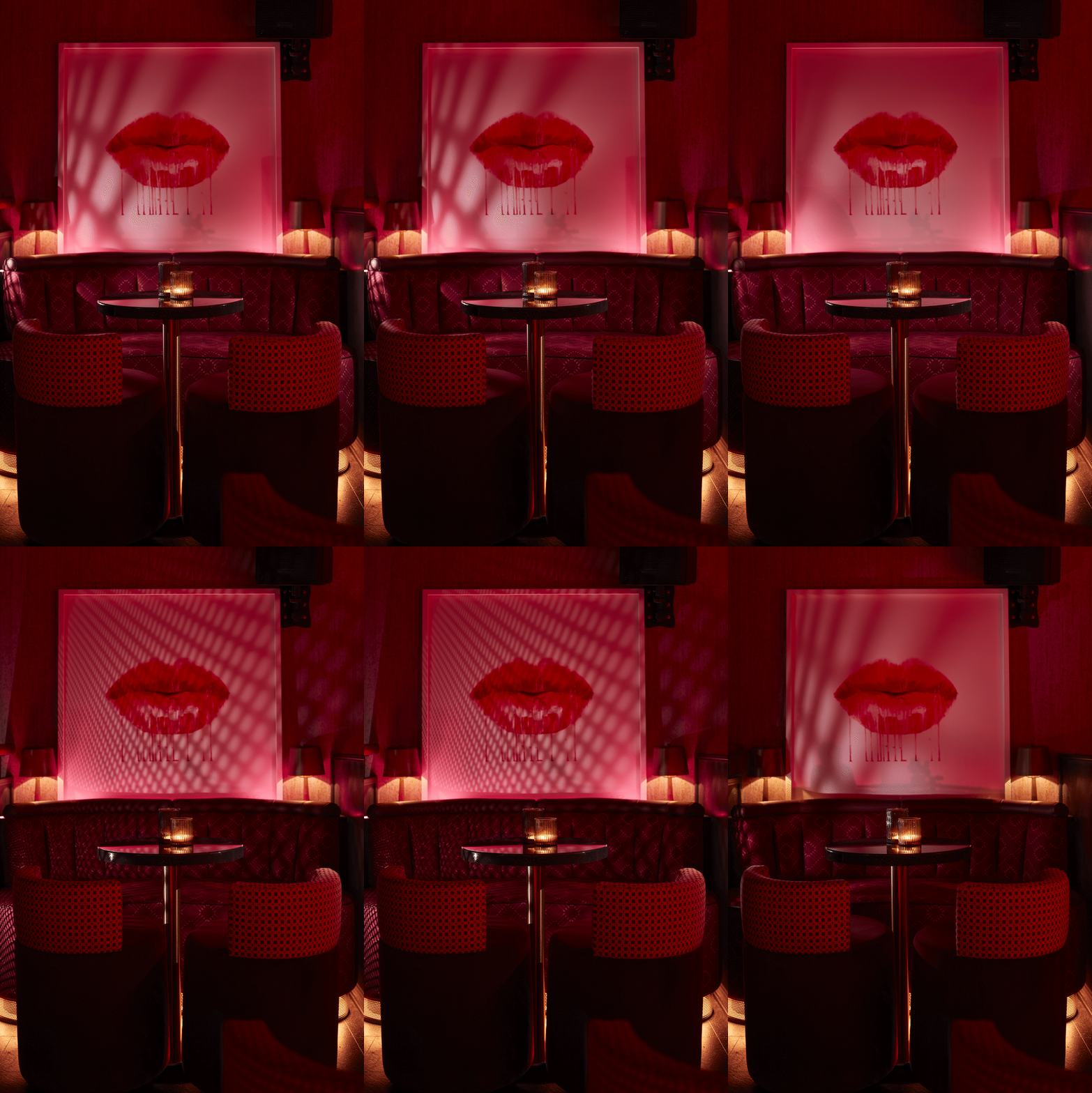
The show-stopping horse-shoe-shaped bar takes centre stage within the space, with a dramatic over-bar light installation designed by RFTH, in a mix of refracted light, antique mirror and mesh. The bar below is dressed in reflective materials and wrapped in layers of light; from soft washes across metallic tiles within the front bar arches to the glitter-fleck counter top and rear illumination of colourful apothecary glassware to the back bar. Light-sheet underlighting and soft glow projections on shelving makes the bottles and liquids glow beautifully. Whilst the black and brass mesh metalwork in the bar will casts dappled shadows across the textural walls and a hero over-bar structure.
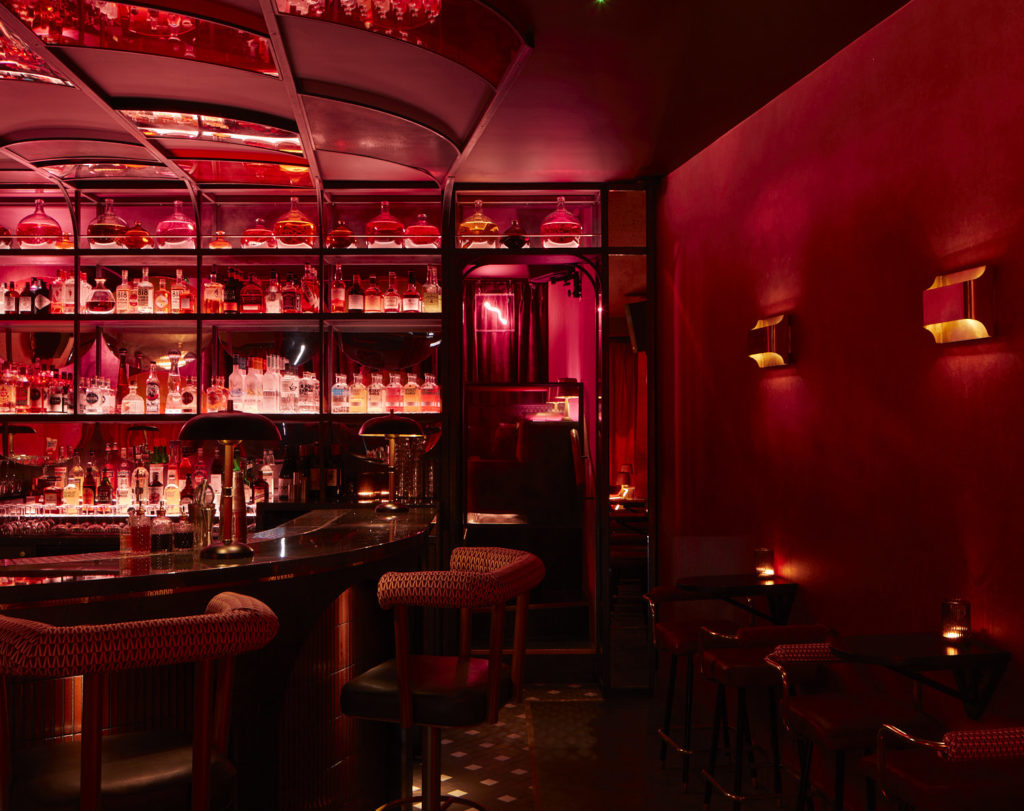
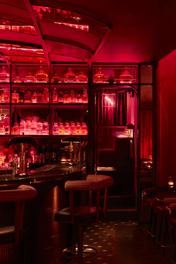
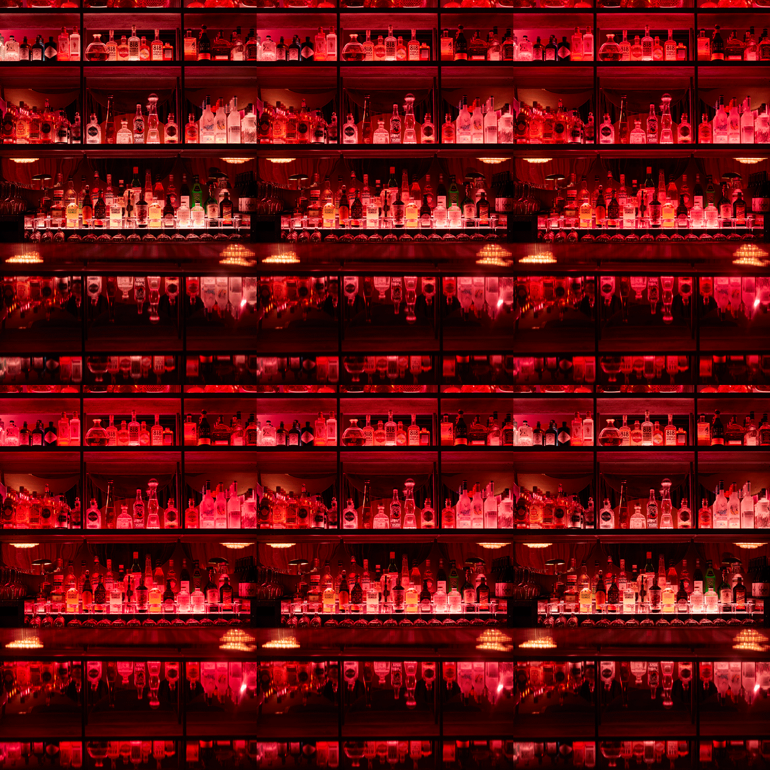
Light washes thick drapes lining the entrance walls and picks out the venue’s DJ booth. The specialist hero-bar joinery was fabricated by long-time RFTH collaborators Rough Living, who took Run For The Hills bar detailed bar design CAD drawings and added construction details, also co-ordinating with Nulty to integrate the light effects.
Light Play
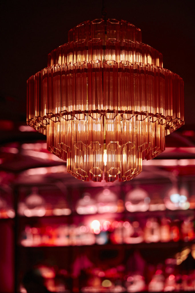
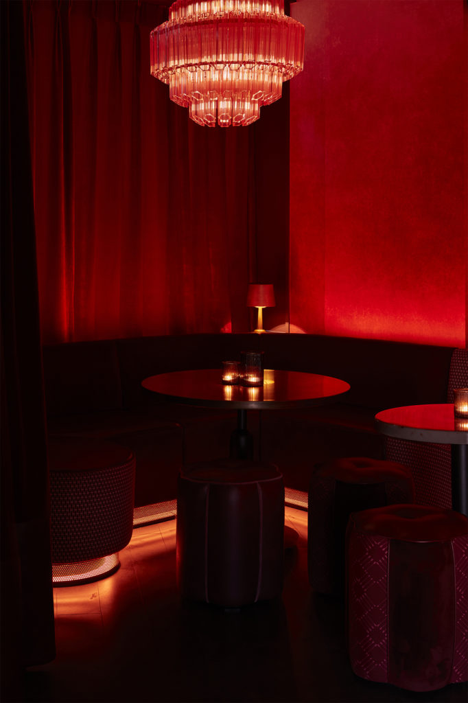
We collaborated closely with Lighting Designers Nulty on the project, handing over the original interiors lighting mood concept for Nulty’s design team to take it to developed design stage and beyond, setting lux levels and directing mood control systems. The final design is full of amazing light effects: both onto and above the bar, but also a gorgeous atmospheric glow-light underneath and behind velvet fixed seating around the perimeter of the bar. Highlight architectural lighting picks out hero furnishings and cross-lights some of the gorgeous Murano glass chandelier fittings within the space.
Finishes, Styling & FF&E
The venue’s materials palette is pure Pattern pop tiles surround the bar and walls and we designed a dusky ombre venetian plaster effect from deep berry through to blush. The venue features a mix of gorgeous cocktail lounge pieces, pleated banquettes, fringed pouffe stools, Heartbreaker’s sofa-style fixed seating and bar stools make a big statement, in a pattern clash cacophony of patterns in deep clarets, contrast pinks and accent neon coral tones. Some seating in block colours, others with panels in contrast patterns, trims, tasselling and tufting for an added lounge lizard touch.
Bespoke upholstery fabric design
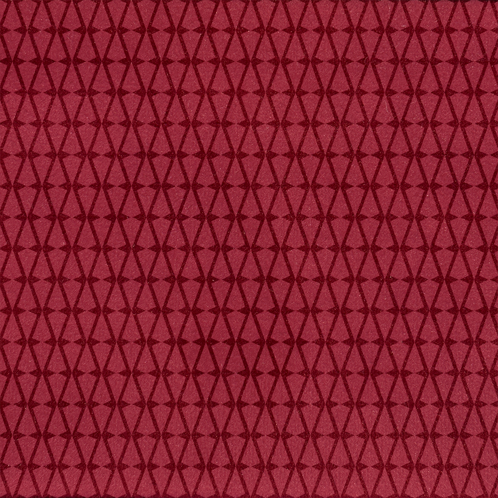
The patterned fabrics used in the scheme on banquettes, sofas and stools are largely designed by Run For The Hills, printed onto a super hard-wearing impervious velvet fabric for good times and hard partying. Patterns key into the brand’s visual identity, some featuring Bad Cupid’s arrows, and other subtle brand patterns, some springing off from the collection of brand illustrations created for the project and Heartbreaker’s website.
Luxe Detailing
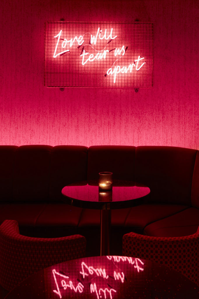
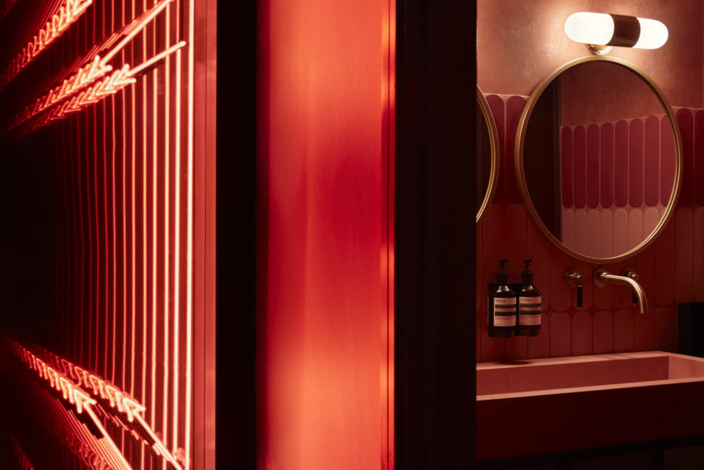
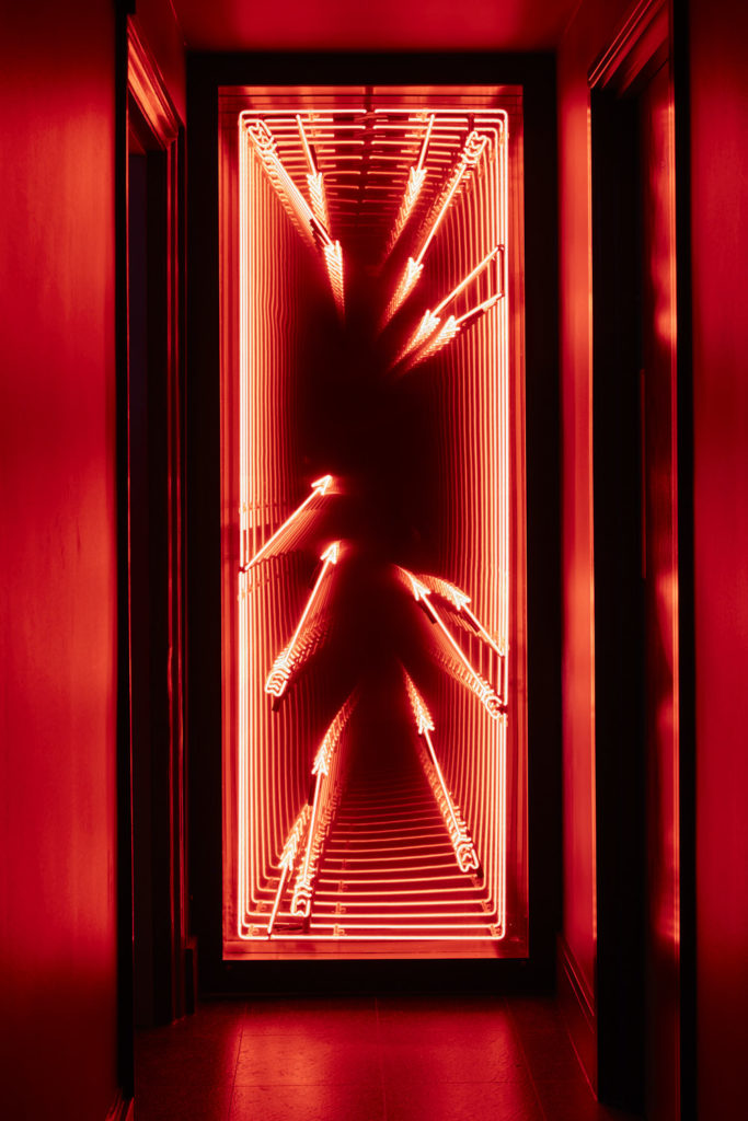
Cocktails will be served on reflective mirror tops, with others in antique brass and timber edged marbles in pinks, blushes and star-burst dark glitters. Glamorous pendants and table lamps include gorgeous pieces from Felix Lighting and vintage style Murano glass fittings from Pure White Lines. The studio’s graphics team also designed a series of neon “Love Will Tear Us Apart” light pieces, featuring song lyrics channelling the spirit of heartbreak. Another custom designed infinity mirror neon uses Heartbreaker arrows to add insta-wow factor across the venue, adding to the take no prisoners design scheme.
Insta-bathrooms
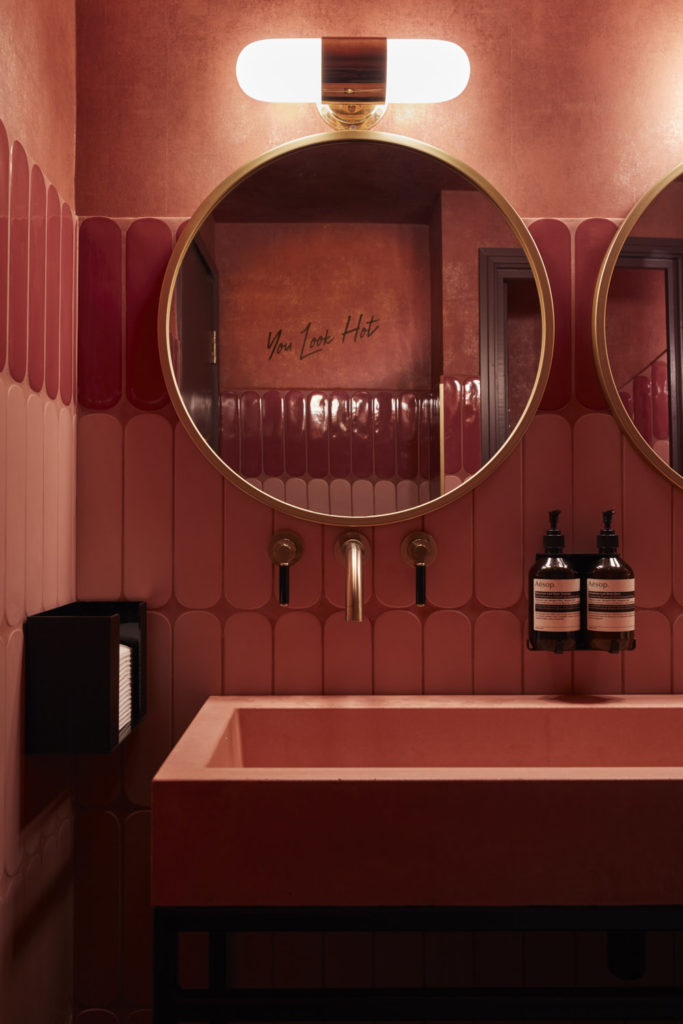
One of client Ben’s must-haves was washrooms to make eyes at. So the design team dialled up the drama, building suspense in the stairwell en-route to the washrooms with bold, dramatic wallpapers adorning the walls, gate-crashed by the graphics team’s full height infinity mirror. Once inside the bathrooms, guests are hit by an explosion, including pink sanitaryware and bold zig zag tile patterns in cherry and pink blush. Sinks pack a punch in black/gold veined marble, taps come in antique gold, walls are in dusky damsons Farrow & Ball Pelt no254 and Farrow & Ball Brinjal no.222. With flirty back-to-front messaging for mirror viewing and lighting set at just the right mood.
Heartbreaker’s website:
We also designed Heartbreaker’s new website:
www.heartbreakerbar.co.uk
A super slick Webflow site with an animated Bad Cupid. More coming soon as part of the launch campaign.
Heartbreaker is a true coming together of interior design and brand magic, graphic artistry and artful lighting.
See you at the bar!
