The Guildford Townhouse
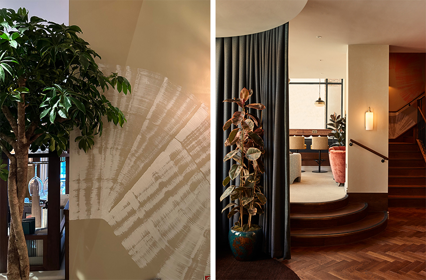
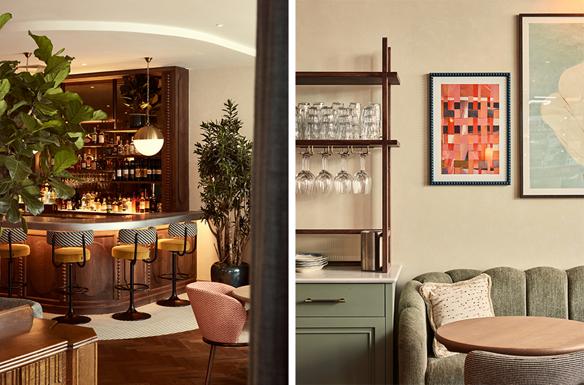
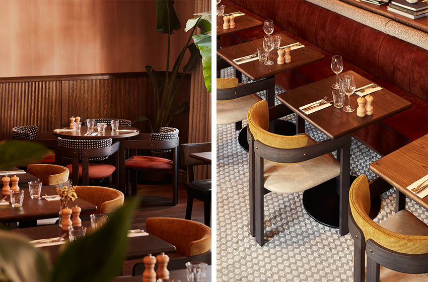
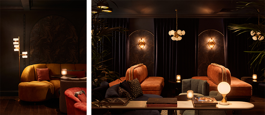
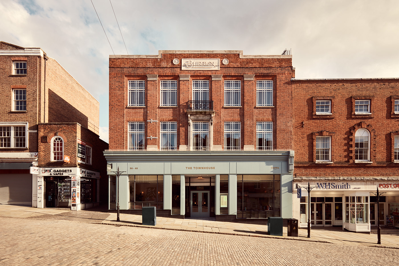
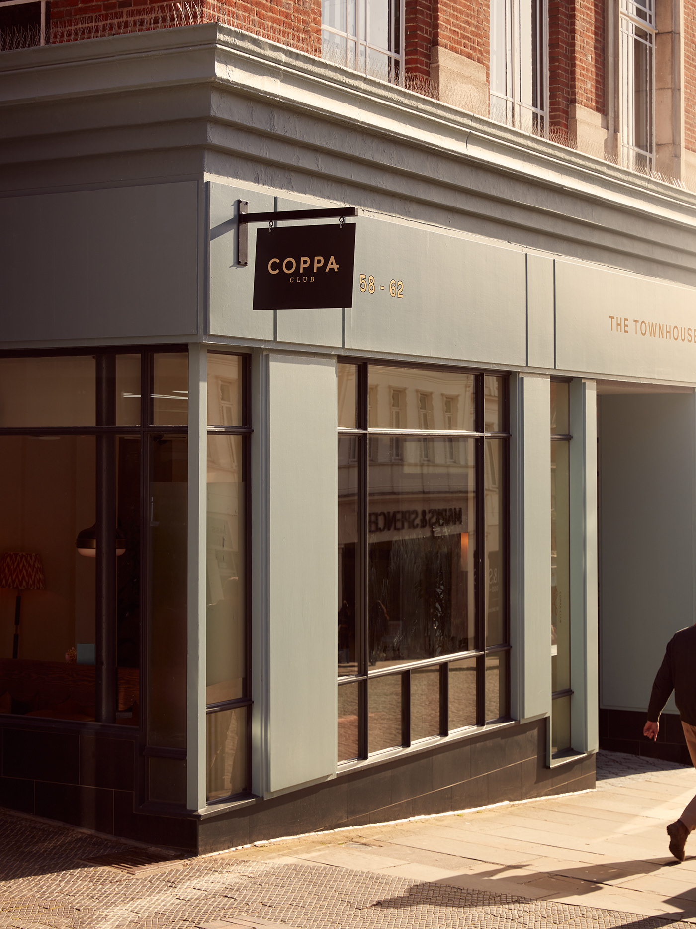
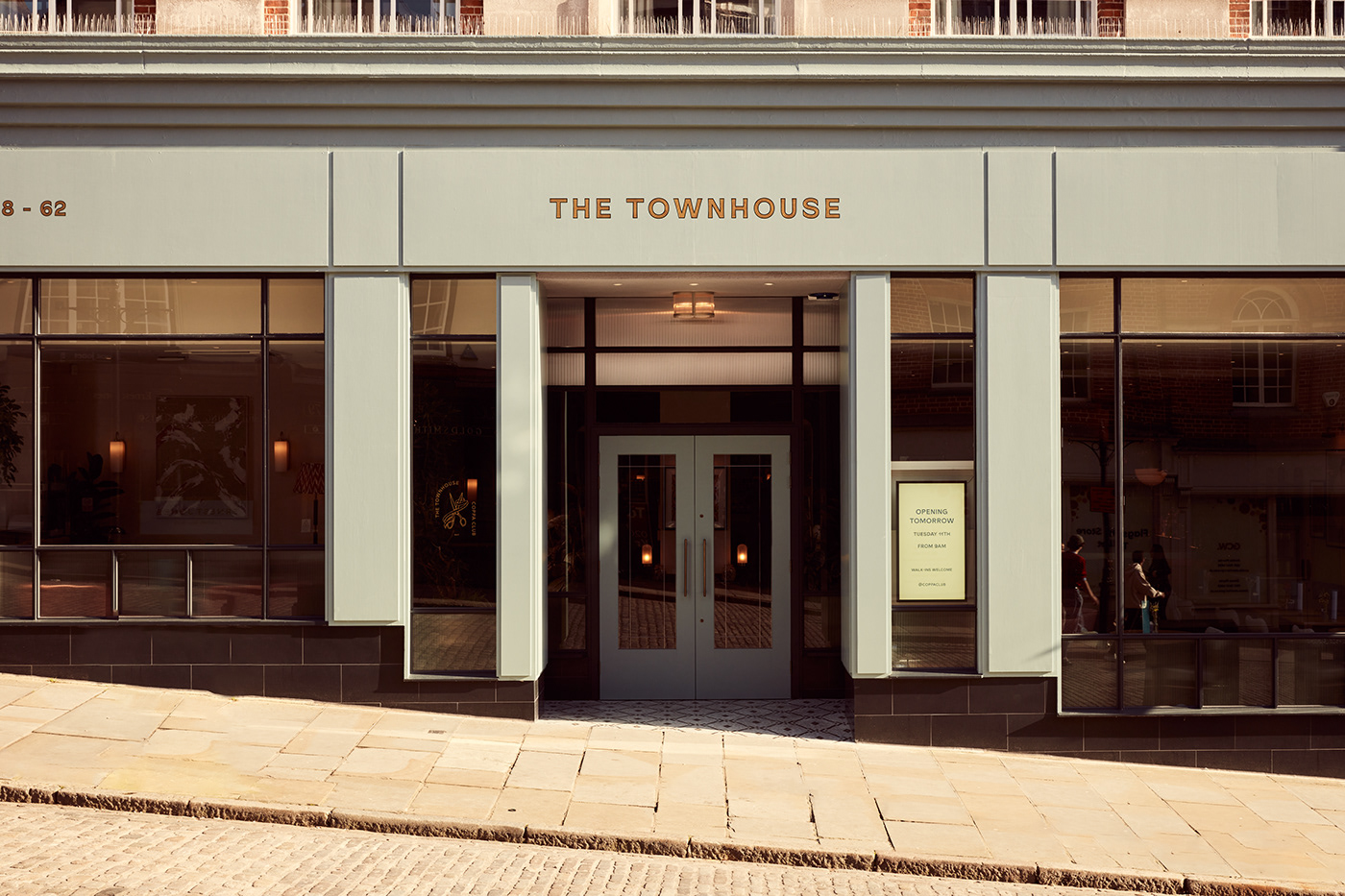
The Townhouse is located on a beautifully cobbled bustling high street in the centre of Guildford, in the iconic and locally-loved Burton’s building. Set across three floors, the layout is designed so that guests can settle in for the day enjoying a members club-mentality with all-day dining, co-working, drinking and socialising all under one roof. Coppa Club tasked Run For The Hills to use the expertise of both their Interior’s and Graphic’s team to create this wholistic dining experience that was considered at every level of detail. In this post, I will run through just how the Graphic’s team went about designing the branding and art.
The Logo
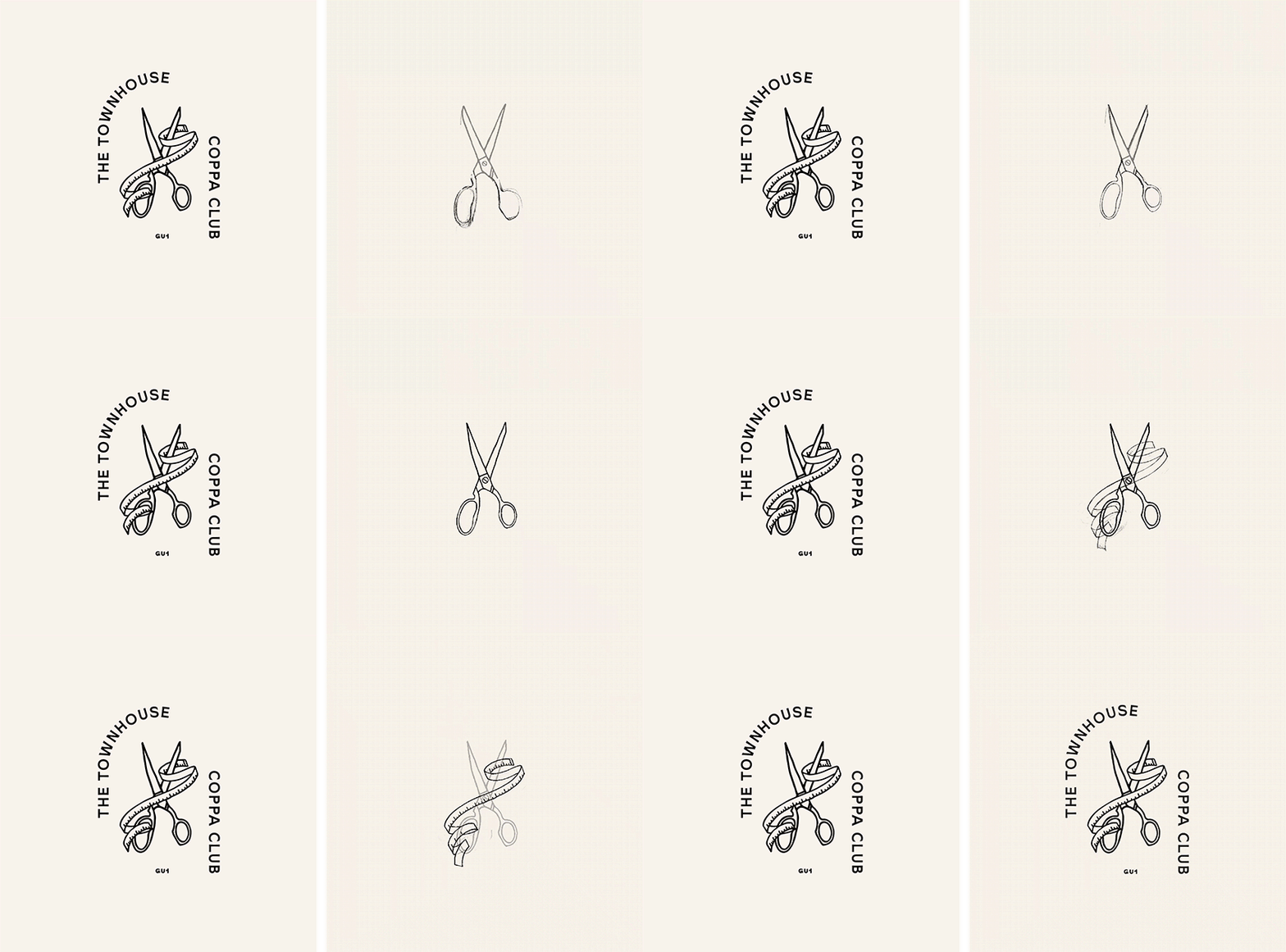
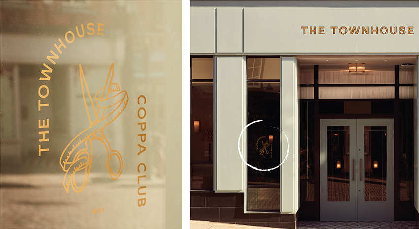
Every Coppa Club branch has its own unique illustrative logo lock-up, as per the brand guidelines developed by Without Studio. And so, for the Guildford Townhouse, we thought it only fitting to take inspiration from it’s tailoring heritage. Several ideas were mocked up to reference the architecture, such as the Juliet balconies, the cobble stones, and the decorative elements on the facade, however, we settled on a pair of tailor’s scissors intertwined within sewing tape, as it was not only simpler and more satisfying aesthetically, but it also sat nicely within the family of Coppa Club logos.
This logo was initially drawn in Procreate before being perfected in Adobe Illustrator, and can be found on window decals, projecting signs, the website, social media and printed collateral, such as the menus.
The Mural
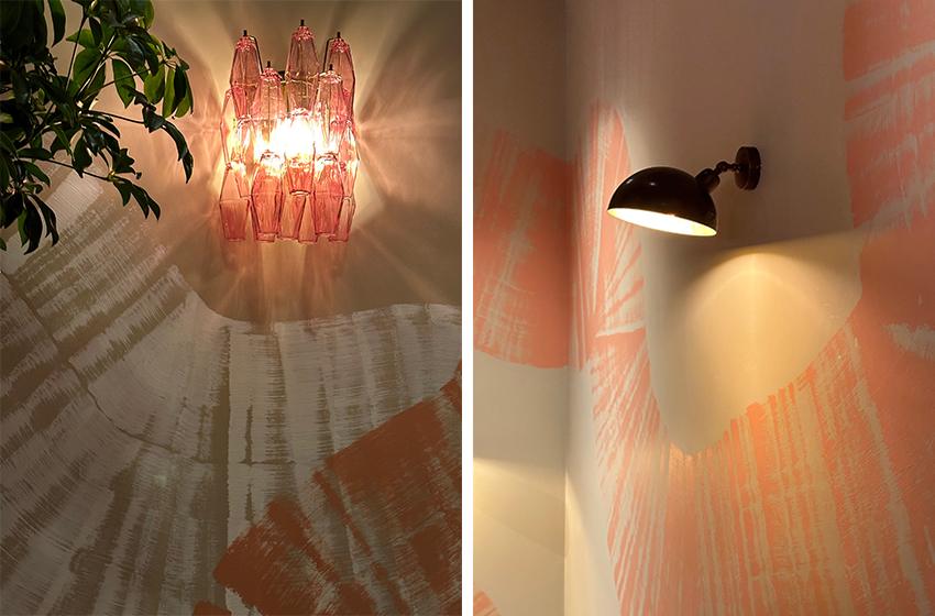
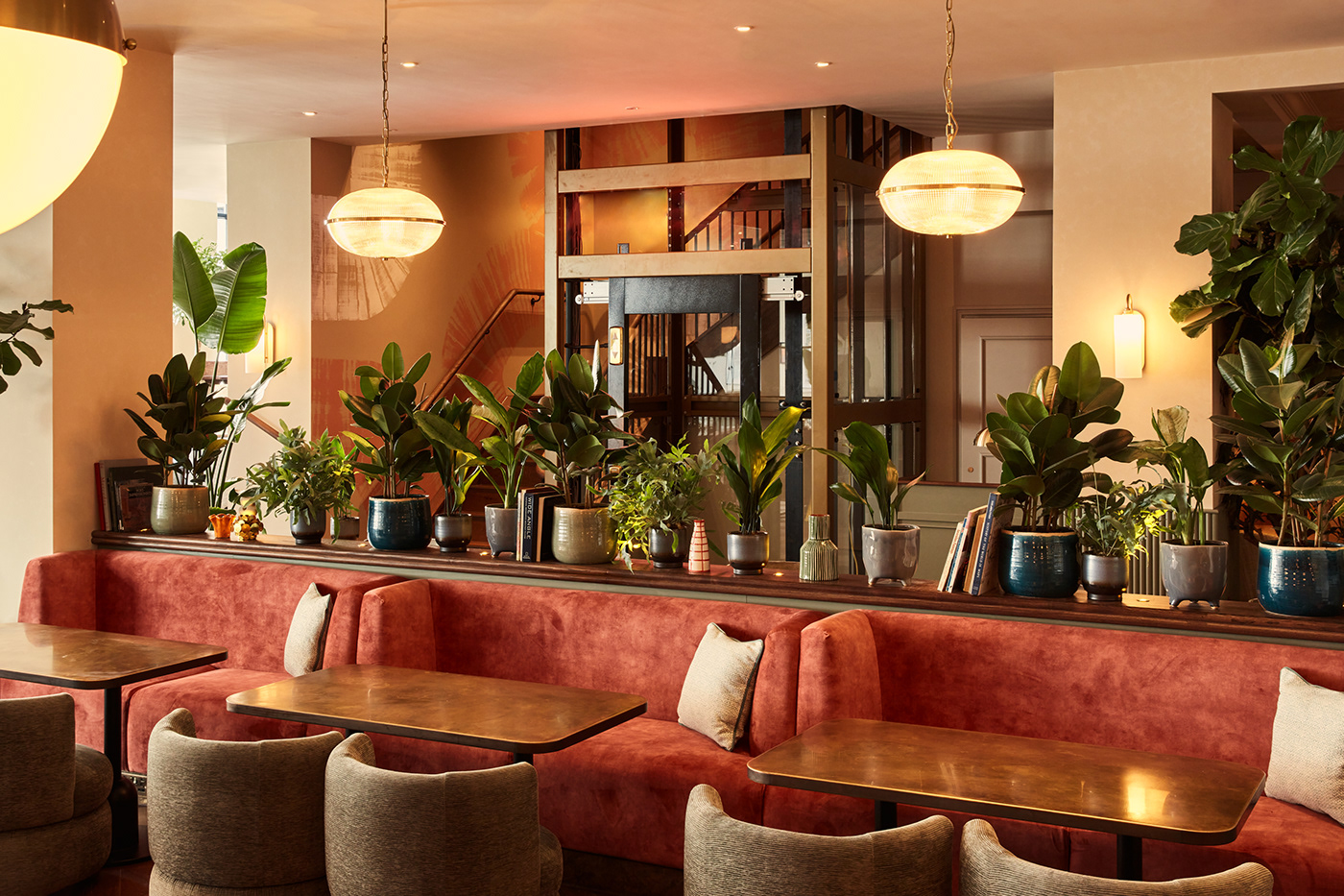
Commissioned to create a bespoke hand painted mural for the stairwell, we designed an abstract piece that weaves its way up the three distinct floors of the venue. Since this was a collaborative project, colour and composition of the mural were considered in a way that complements the furniture and finishes of the interior, whilst also being bold enough to stand out as an art piece in it’s own right. Starting on the ground floor, neutral tones gradually rise to the club lounge on the second floor where the colour deepens with a peachy pink, followed by lively rich blue accents that are introduced before your arrival at the ambient cocktail bar.

The Mega-Brush
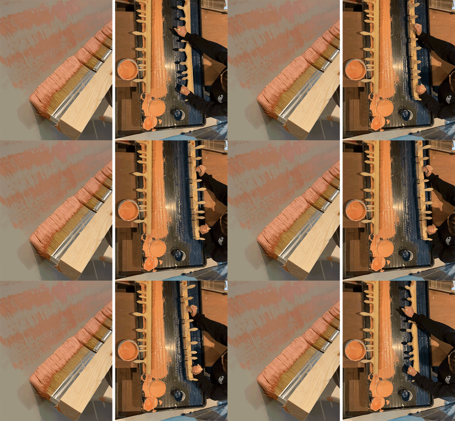
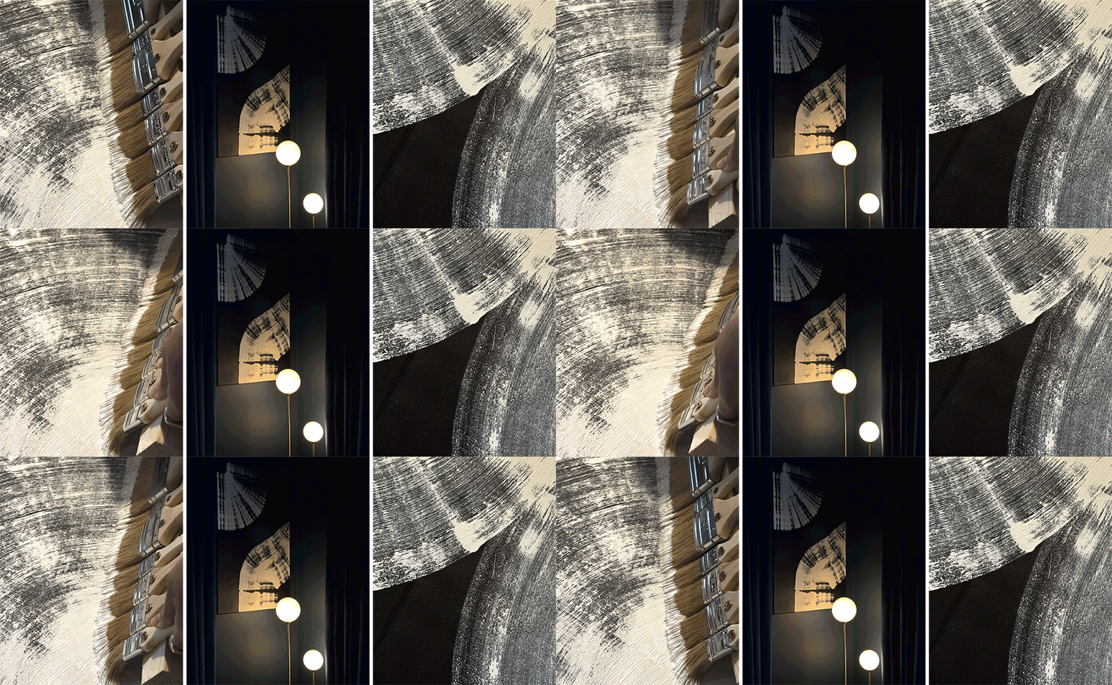
In order to paint the mural, we constructed our very own brush, which we fondly referred to as “The Mega-Brush”. This brush was comprised of several different size brushes nailed to a meter long piece of plywood. We then made an additional two brushes so that we could paint multiple sections of the stairwell in one day, rather than having to sit and watch the paint dry…
Wrap it up
This weaving pattern not only deepens in colour, but also density. On the ground floor, waves are more spread out, to match the morning cafe atmosphere, but become more tightly packed as you rise, leaving next to no exposed wall as you approach to the cocktail bar; signalling moving into the night. Centrally to this piece is a glass elevator that takes you between the floors, encircling you in the mural as you rise.
The Art
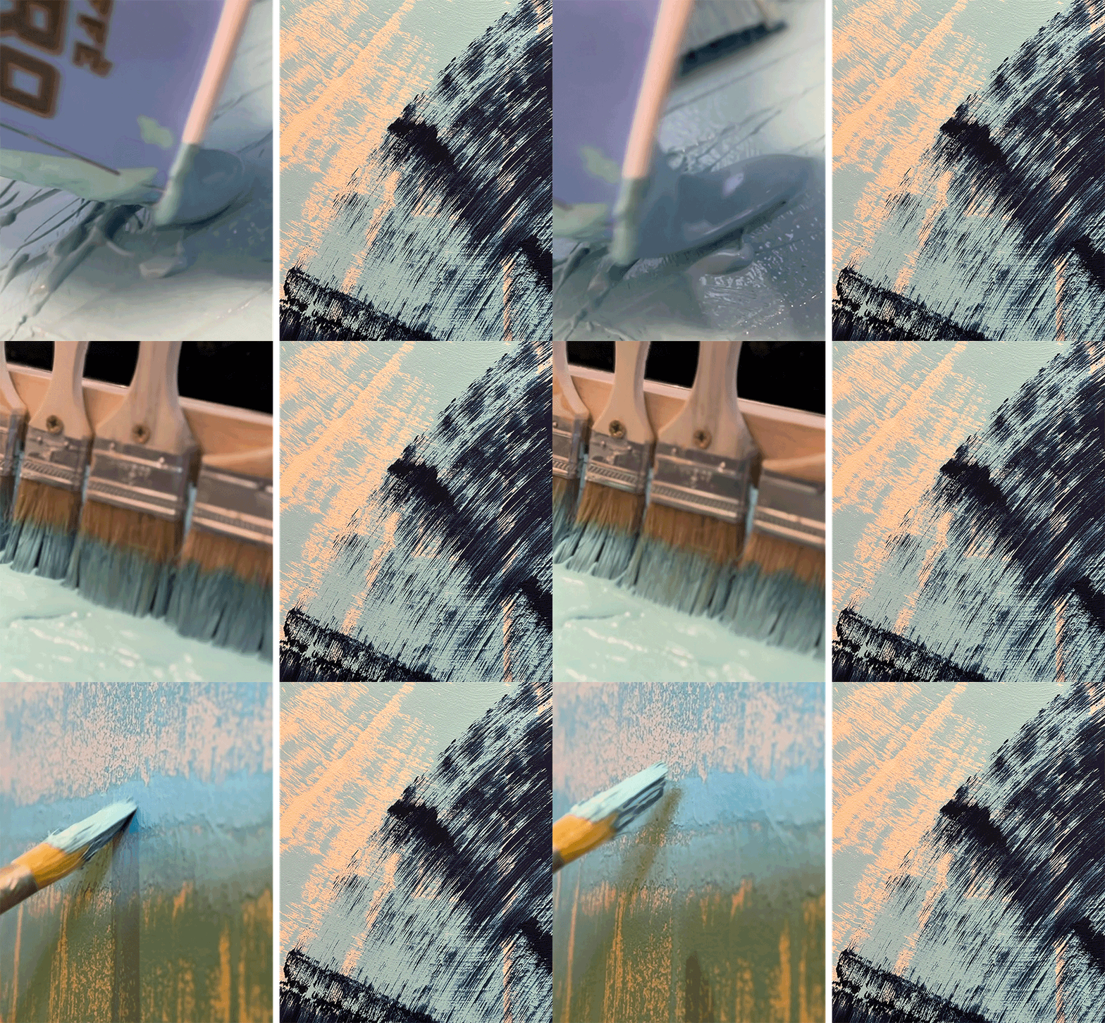
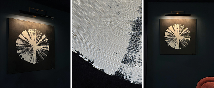
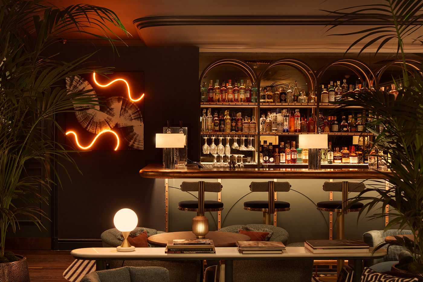
Drawing inspiration from the mural, we designed several pieces of art using “Mini-Mega-Brushes” on canvas. We used Titanium White acrylic on a very dark midnight blue background, made from mixing Mars Black with Prussian Blue, so that the bright white would appear to pop from the walls.

A touch of neon
For la pièce de résistance, we added a vibrant glow of amber neon to add a dramatic touch to the top floor bar area. We began designing with a couple of hand-drawn sketches before mocking up our designs in Adobe Illustrator, which you can see a sample of below.
Interiors by Run For The Hills
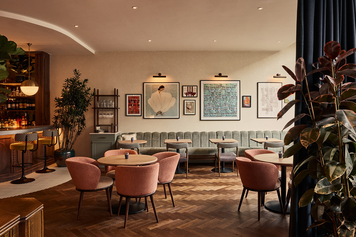
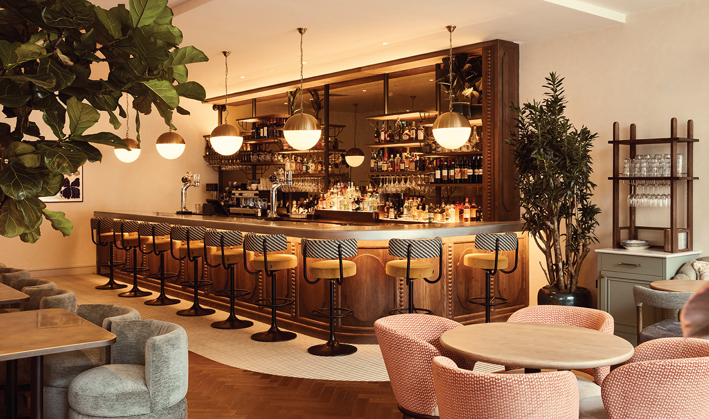
The middle floor features a brasserie and private dining space, with the brasserie open for all-day dining options, serving everything from brunch and lunch through to late-night dining. Open based banquette seating with contrasting rugs and a central antique brass chandelier creates a homely and relaxed feeling to the brasserie floor. The central stone fireplace is framed by a warm timber-stained bookcase with subtle vintage detailing and a vibrant patterned inset wallpaper. Relaxed yet refined furniture is upholstered in a combination of poppy and textural fabrics which is echoed in the bespoke artwork colour palette creating a friendly and informal experience.

- AI
- Animation
- Art
- art deco
- Awards
- bar design
- branding
- coffee
- Custom Neon
- Exhibition
- Graphic Design
- great spaces
- hospitality
- hotel
- illustration
- Images
- images that make you stop
- In Conversation with...
- In Venue Graphics
- Inspiration
- interior design
- jobs
- Lighting Installations
- Limited Edition Art Prints
- maps
- miscellany
- Nature
- Neon
- New work
- Opinion Piece
- Our Process
- photoshoot
- Press Coverage
- product design
- residential design
- restaurant design
- shop
- sourcing
- styling
- Taxidermy
- tee shirt design
- The Other Art Fair
- The Studio
- Travels to remember
- Uncategorized
- Video
- Wallpaper
- website design
- window decals
- workspace

