
Concept Design Only
Initial Directions
We’re usually commissioned to concept and install our restaurant design projects, taking care of the technical planning, materials and finishes, FF&E sourcing, procurement, build design co-ordination and final styling. But this F&B project was different, for us to deliver an initial concept only, which the Client would then run with, doing his own selection of FF&E, handling all procurement, pre-production and overseeing the build and final styling himself.
Look and Feel
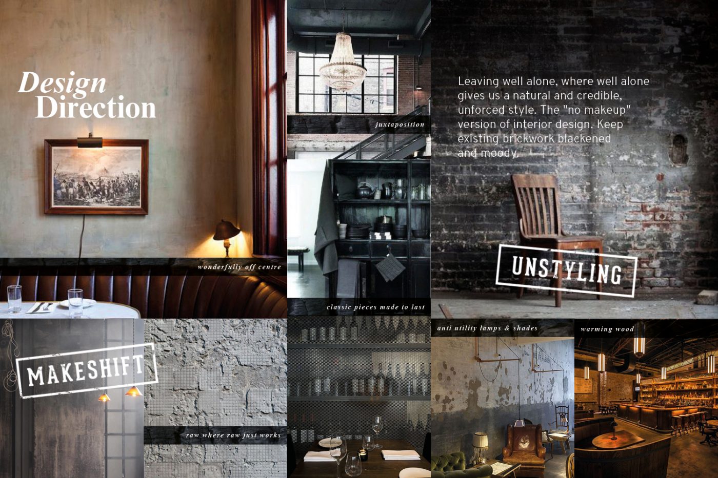
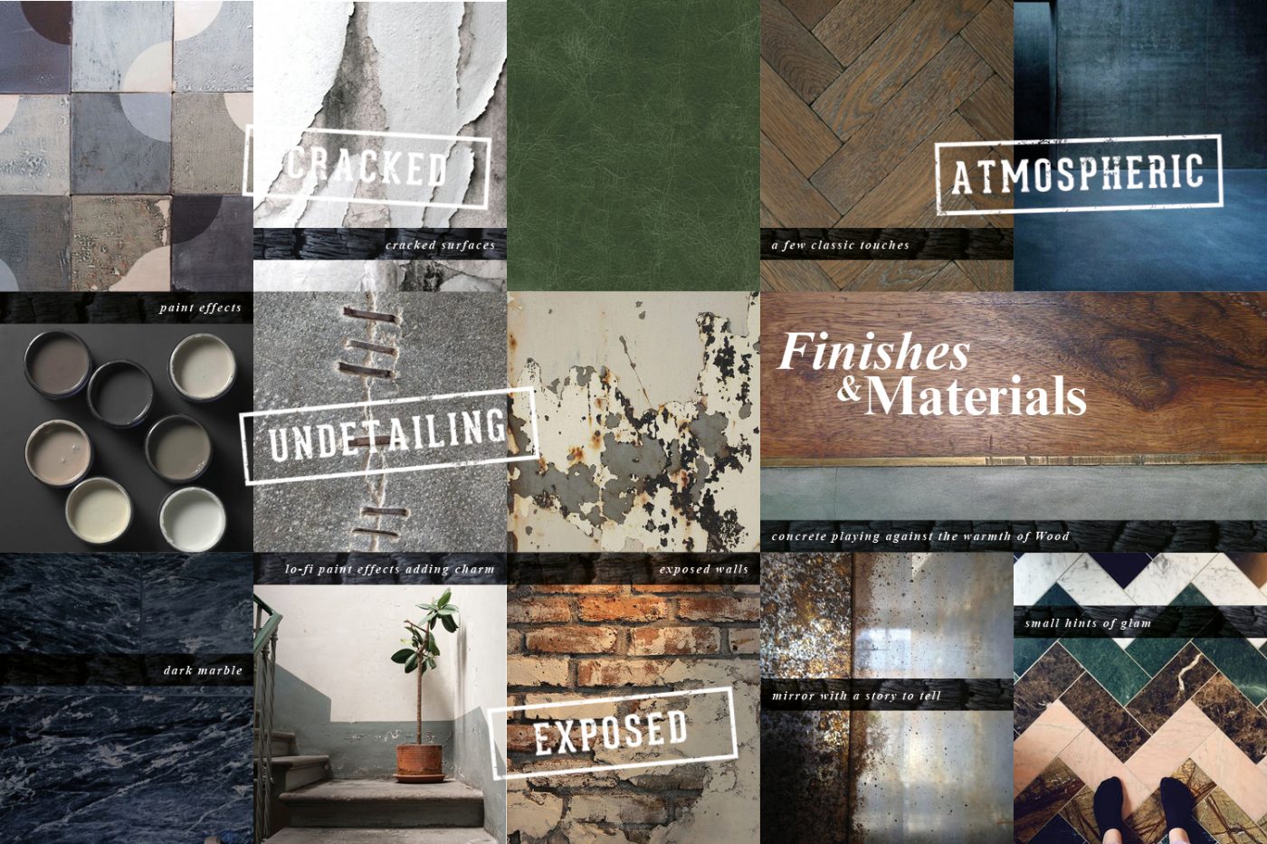
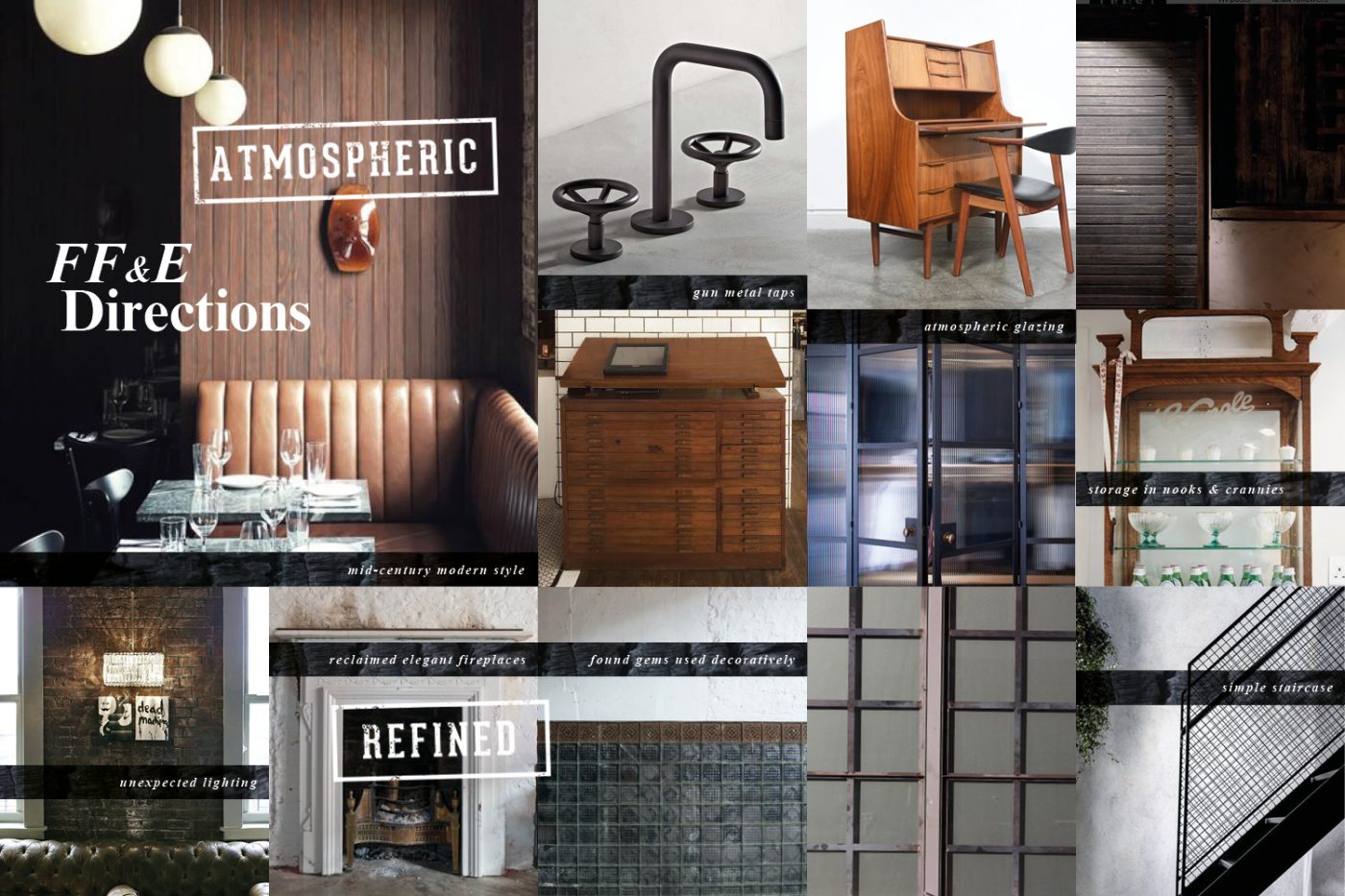
A few pages, here, from our original creative direction presentation, setting out the look and feel, materials and finishes, colour palette and FF&E furniture and lighting directions that we were setting for the Client to then run with. Once we’d handed these over, the Client took over and did his own selection of FF&E and worked directly with the Contractors to direct the final look and feel of the restaurant.
CAD Planning
We developed a number of routes before finalising the GA layout plan, which balanced diner comfort at the same time as delivering a healthy number of covers, making the most of the space creatively and commercially. Our layout design also showed off the space’s best bits, whilst carefully considering how it would be used day to day. Technical design drawings were also created for Licensing, Planning, Exterior Signage, Staircase design, WCs and Bar design.
Our Bar Design
The most central part of our Design Concept was the creative and technical design of the main bar, which greets customers as they descend the stairs. The Client’s first Soho venue, which he’d designed himself, had a small bar and this time he wanted a really standout bar for venue two. With space for customers wanting a spot of cocktailing, but also as a comfortable holding space for diners waiting for their table.
Our original design has been brought to life fairly closely in the Client fit out, and we’re happy our mosaic tile into concrete floor detailing around the bar also made the final cut.

Our Graphics Work
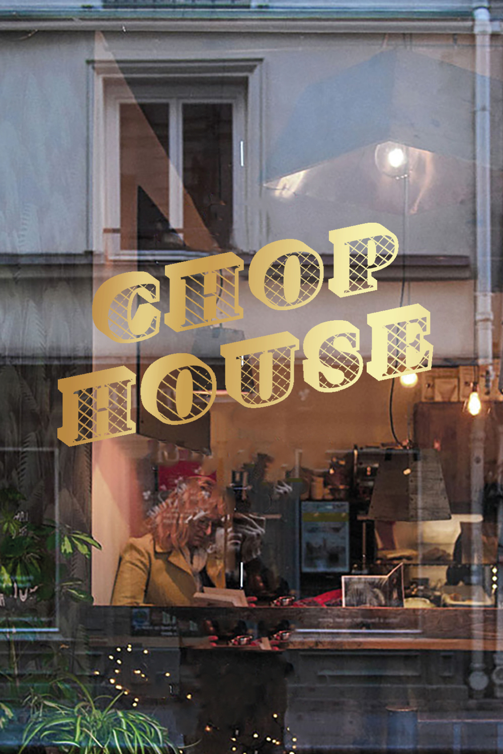
As part of our joint interiors and branding concept design, we proposed a suite of creative assets which could be used as decals or hand-painted to walls, ceilings and other surfaces. Seen here are some of our gold foil cross hatched decal designs. None of the graphics actually got used in the Client’s final design. But we still love them!
Handing over the concept design ideas to the Client for him to take the project forward himself, choosing which elements to use. So in this case, we weren’t involved in the production, specification or installation of any of the design concepts, which we would usually handle from start to finish.
We Love a Chalkboard
We love a chalkboard. But it’s really important how they’re done.
Blacklock’s first restaurant in Soho, which we hadn’t been involved with, had lots of writings in chalk and lipstick on mirrors and walls. And it was something the Client wanted to retain in the new space. So we kept them in our initial concept design but stylised them to be more edgy and proposed that one of our artists could hand paint them in situ to make them feel lo-fi and casual, but artistically done.
Our CGI Renders
The final part of our Concept Design deliverables, to help the Client and Contractor visualise things was to visualise our interior design and graphics ideas and directions. So we took our CAD GA floor plan and modelled that up in 3D, adding our proposed materials, finishes and styles of furniture and lighting, setting the mood and look and feel that we proposed the Contractor and Client followed during the build, fit out, sourcing and final styling phase. Within the CGIs, we also included proposals for styles of chalk writing and creative brand graphics.
Our 3D Visuals
In this CGI view, we visualised a gorgeous mix of green, white and black marble topped tables encircled with an antique brass trim. With an old school black board with our hand-painted graphics turning day to night and giving the option of different creative brand messages.
Now complete, the Concept Design Tool Kit was delivered to the Client and Contractor for them to take forward. The Client handled their own sourcing and procurement and directed the build, decorative scheme and final installation.

