Human First
branding for family law
We created a complete brand world for a forward-thinking family law practice with a human-first approach. From identity and website to print and digital assets, every touchpoint was designed to balance warmth with professionalism — cutting through the corporate noise of the sector. As the firm evolved and merged with a larger partner, we revisited the brand to reflect this new chapter, blending heritage and heart in a confident rebrand.
Have a look at the website over here.
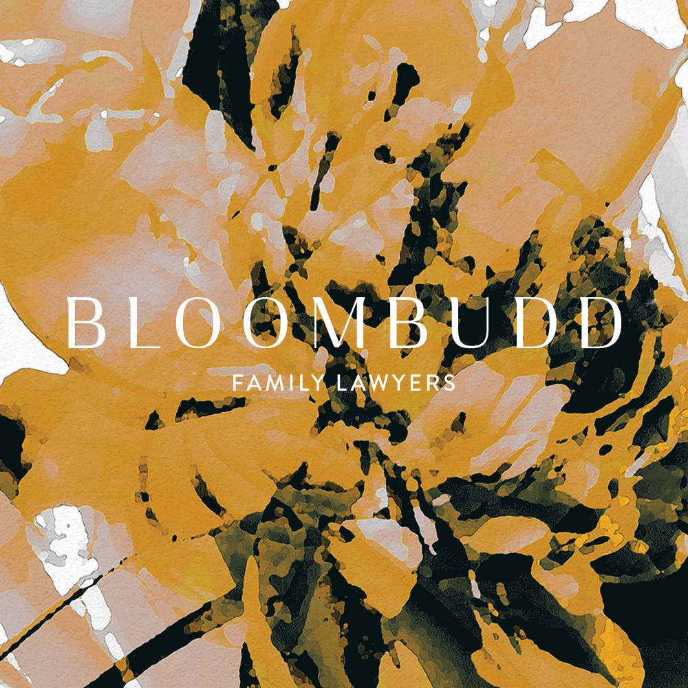
We created a complete brand world for Bloombudd, a new family law firm with a fresh perspective and an energetic, determined team at its heart. Our work spanned the full branding suite — from the logo and website to stationery, social assets and templates — all crafted to reflect the warmth and professionalism of the firm’s founders.
From the outset, we knew we wanted to take a different approach. Legal branding is often cold and corporate, packed with jargon and lacking personality. But Bloombudd was never going to be a typical law firm. Theirs is a more human approach — friendly, approachable, and full of heart — and the identity needed to communicate that from the very first touchpoint.
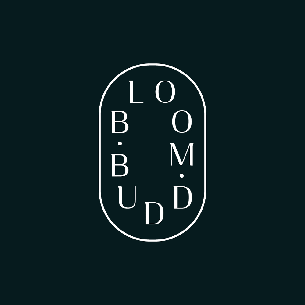
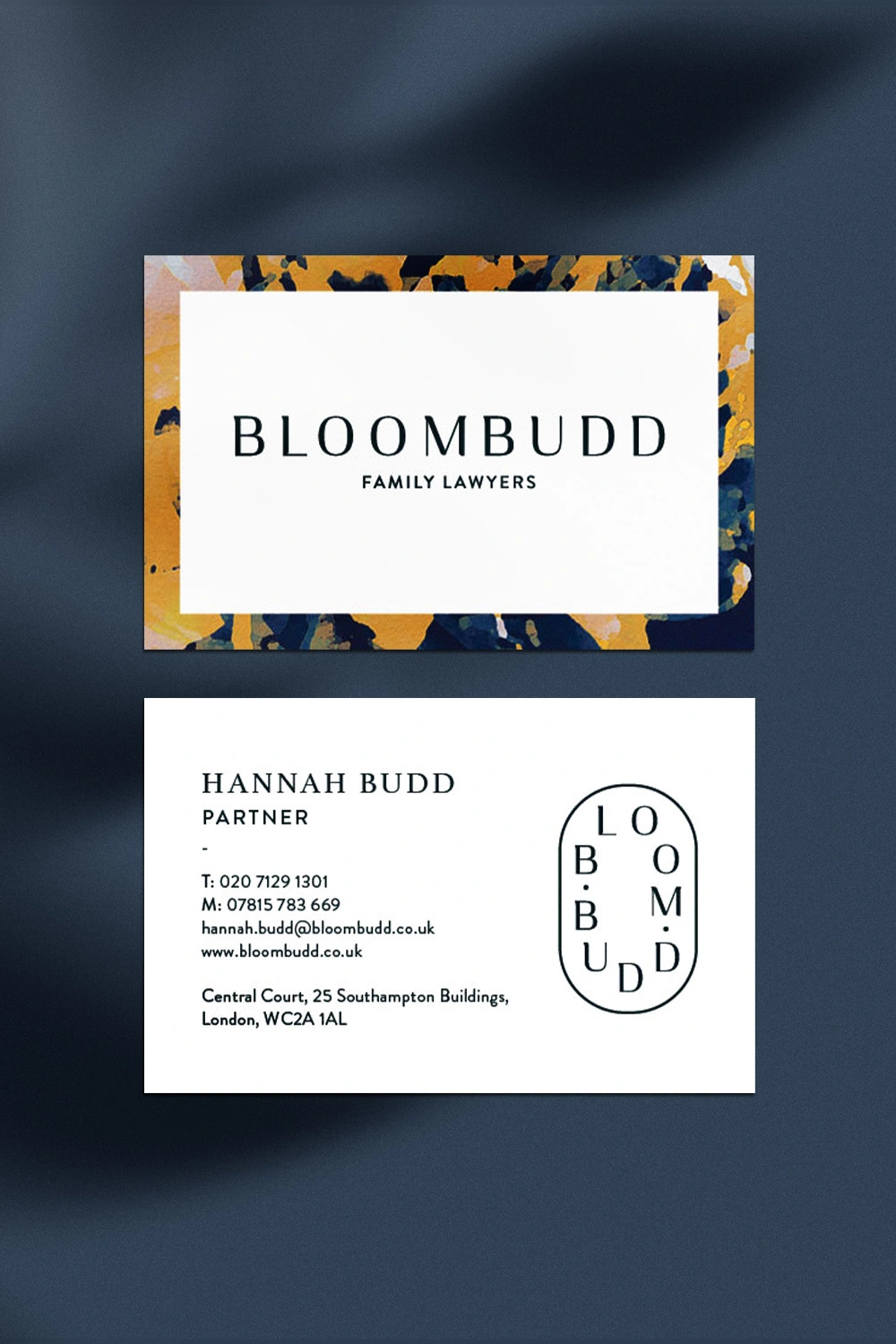
We designed a bespoke, elegant logotype: refined and sophisticated, with subtle serif quirks to bring character and charm. Paired with a lozenge-shaped logomark, the identity system flexes across print and digital with ease — from embossed letterheads and business cards to digital stamps and social avatars.
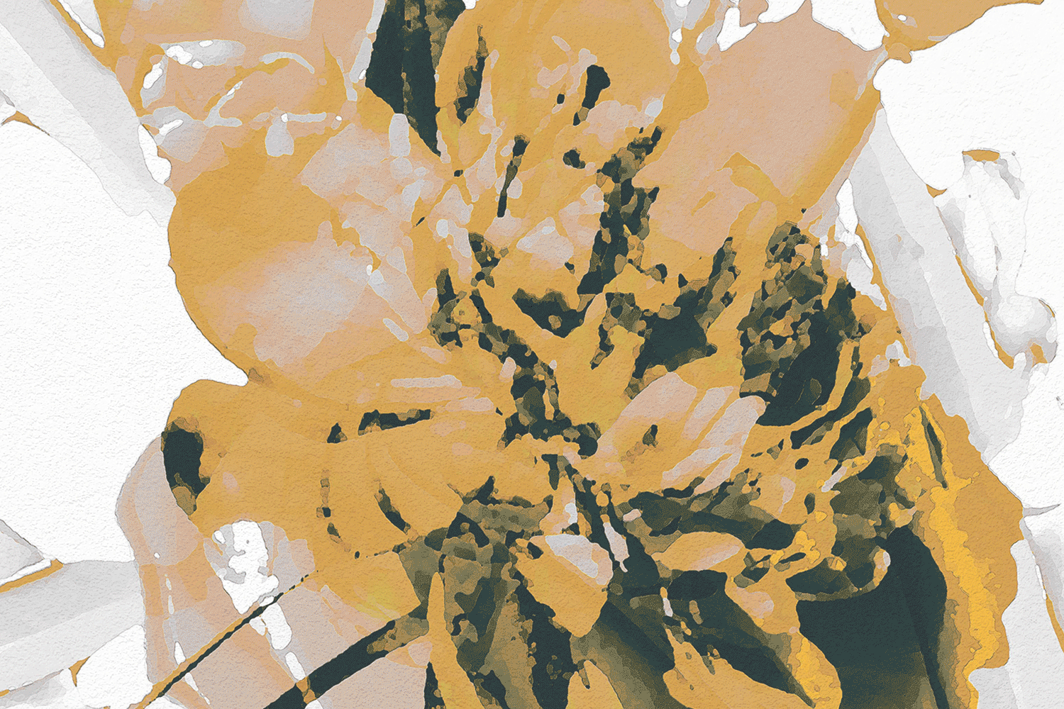
The brand colour palette is equally considered. Deep navy signals trust, experience and calm — while vibrant yellow brings energy, optimism and a feeling of hope. Together, they strike a perfect balance between reassurance and positivity. Exactly the tone needed when navigating something as complex and emotional as family law.
The finished website is clean, clear and beautifully styled. Easy to navigate, gently reassuring, and full of warmth — a true breath of fresh air in the legal world.
After the successful launch of Bloombudd and its warm, human-centred brand, the firm quickly gained recognition as a refreshing force in the family law sector. With its elegant identity, calm tone of voice and client-first approach, it stood out immediately in a sea of corporate sameness — and grew rapidly as a result.
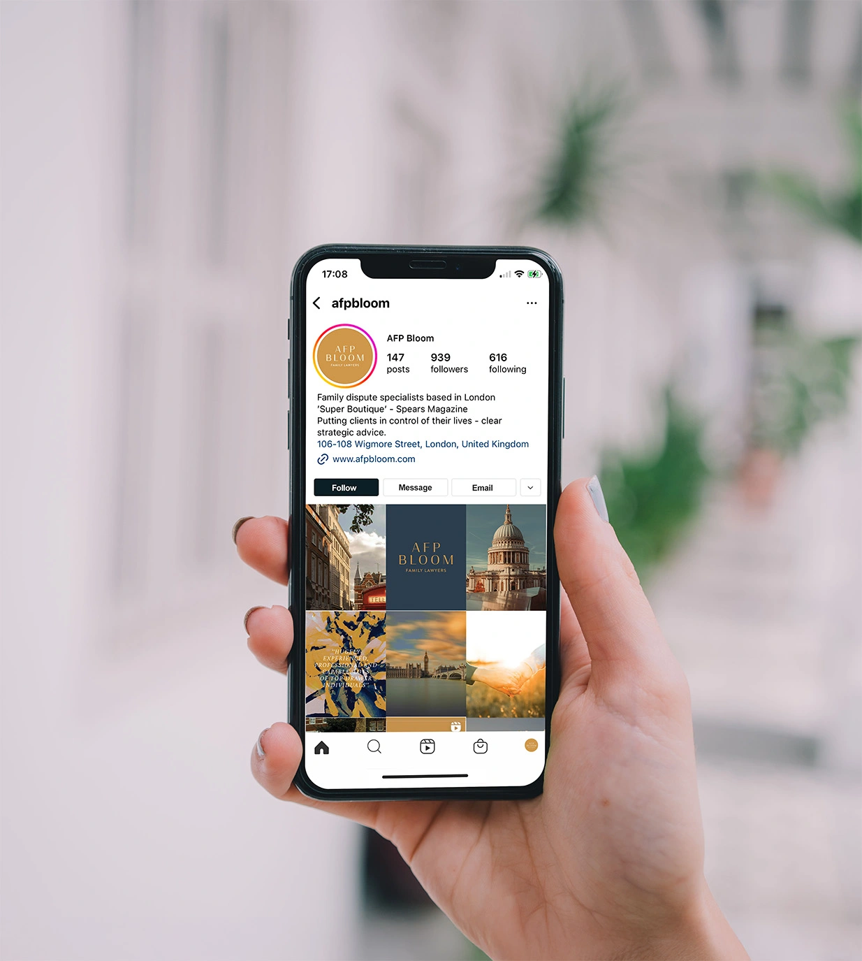
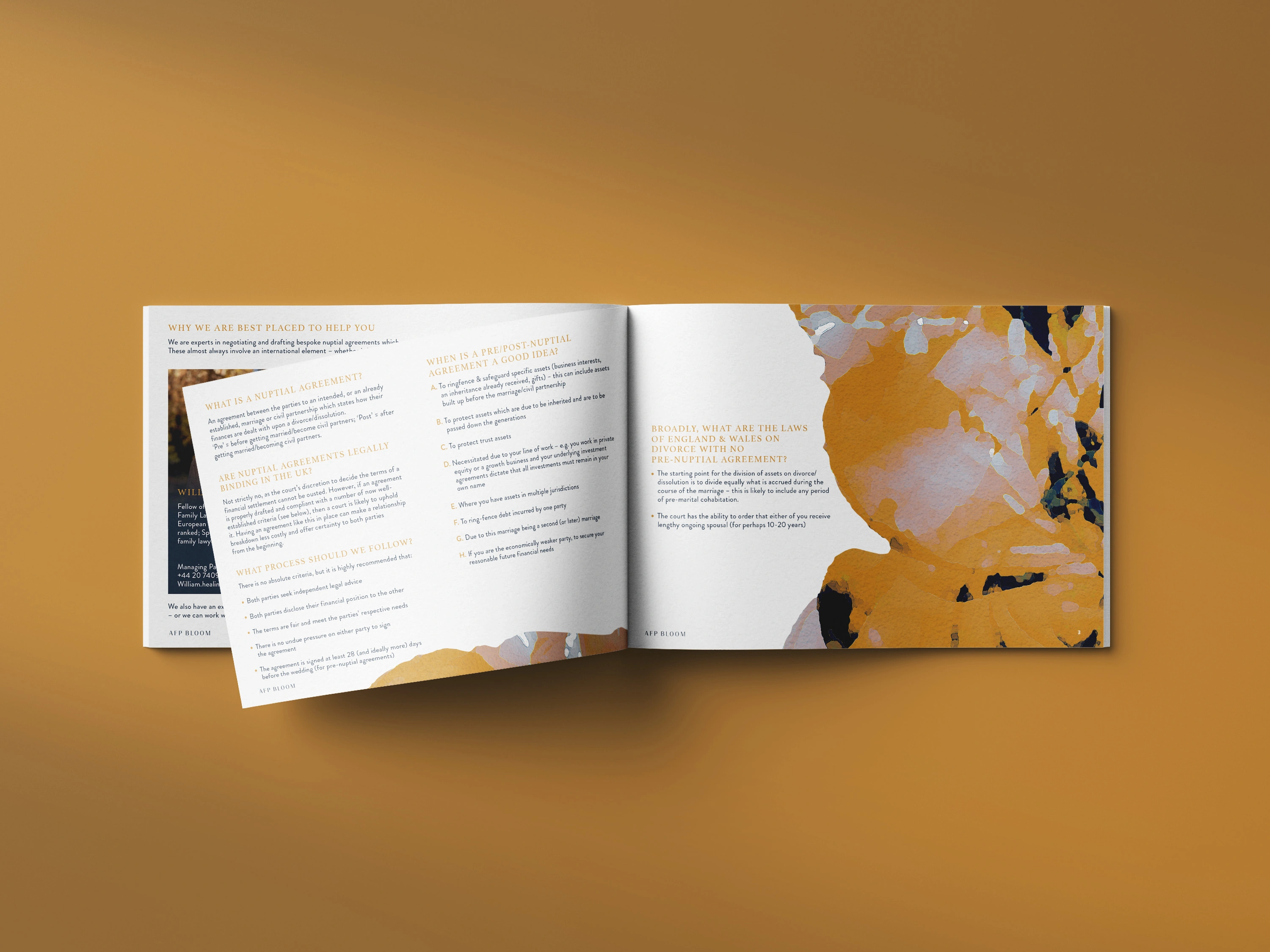
A few years on, Bloombudd joined forces with another established practice, AFP Law, to form a new powerhouse in the legal space: AFP Bloom. With this merger came a new chapter — and a brand evolution.
We were brought back in to help write the next stage of the visual story. The rebrand needed to reflect the combined legacy and energy of both firms. We reworked the existing identity, introducing AFP’s classic blue into the Bloombudd colour palette and developing a refined suite of logos for the new name. The result feels contemporary and professional, retaining the warmth and clarity of the original Bloombudd brand while acknowledging the heritage and strength of the AFP name.