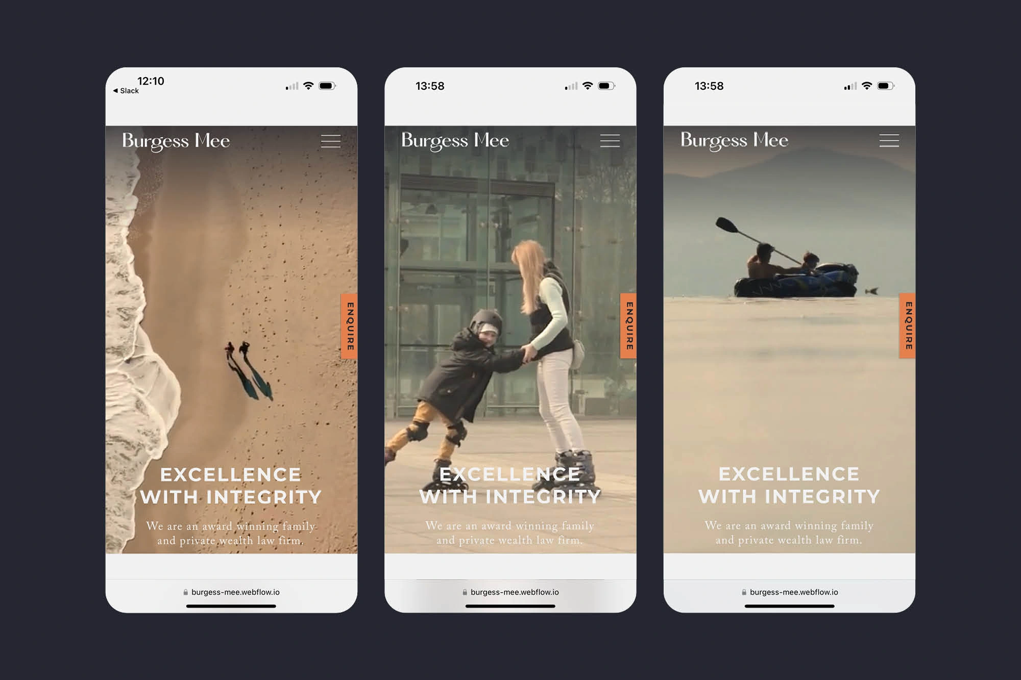
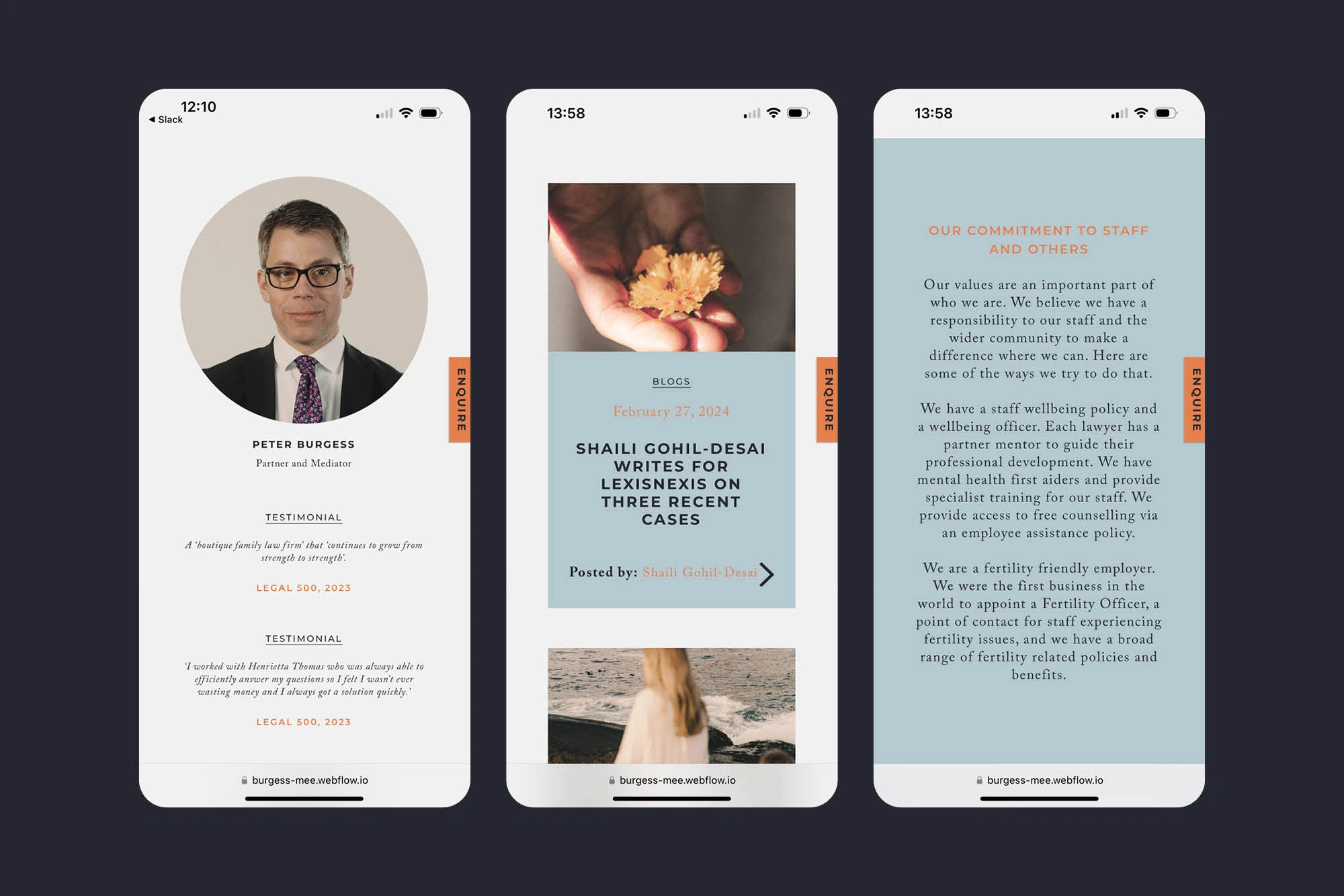
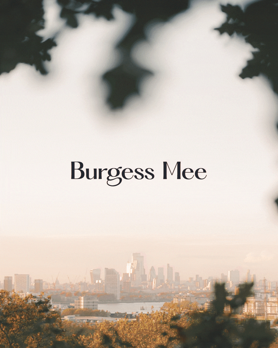
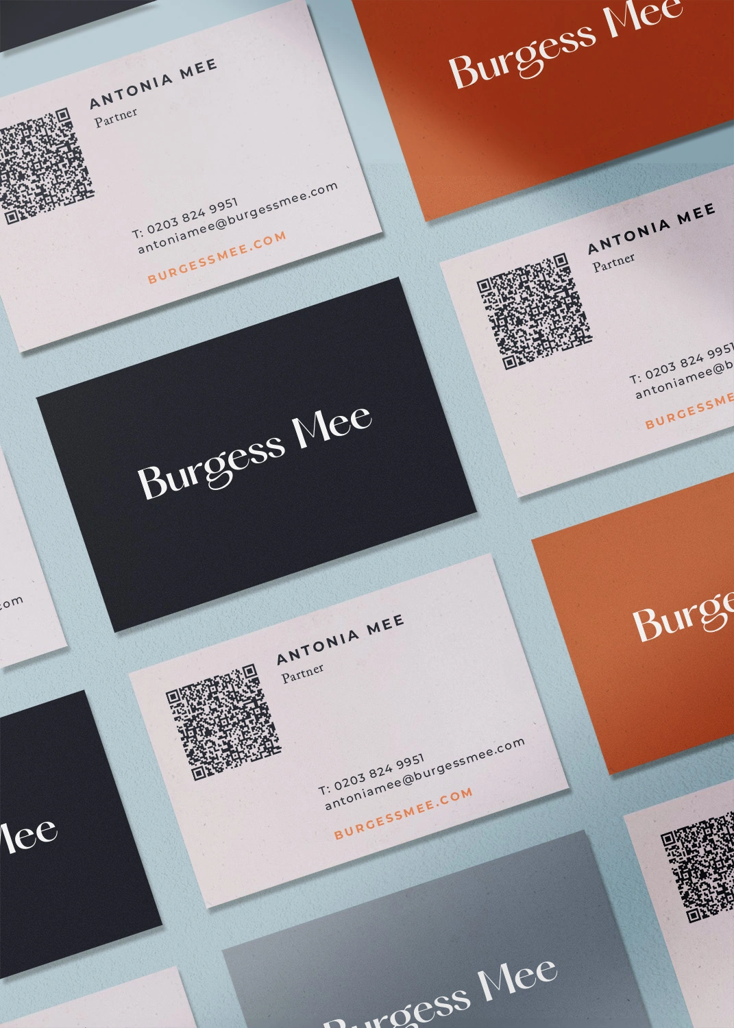
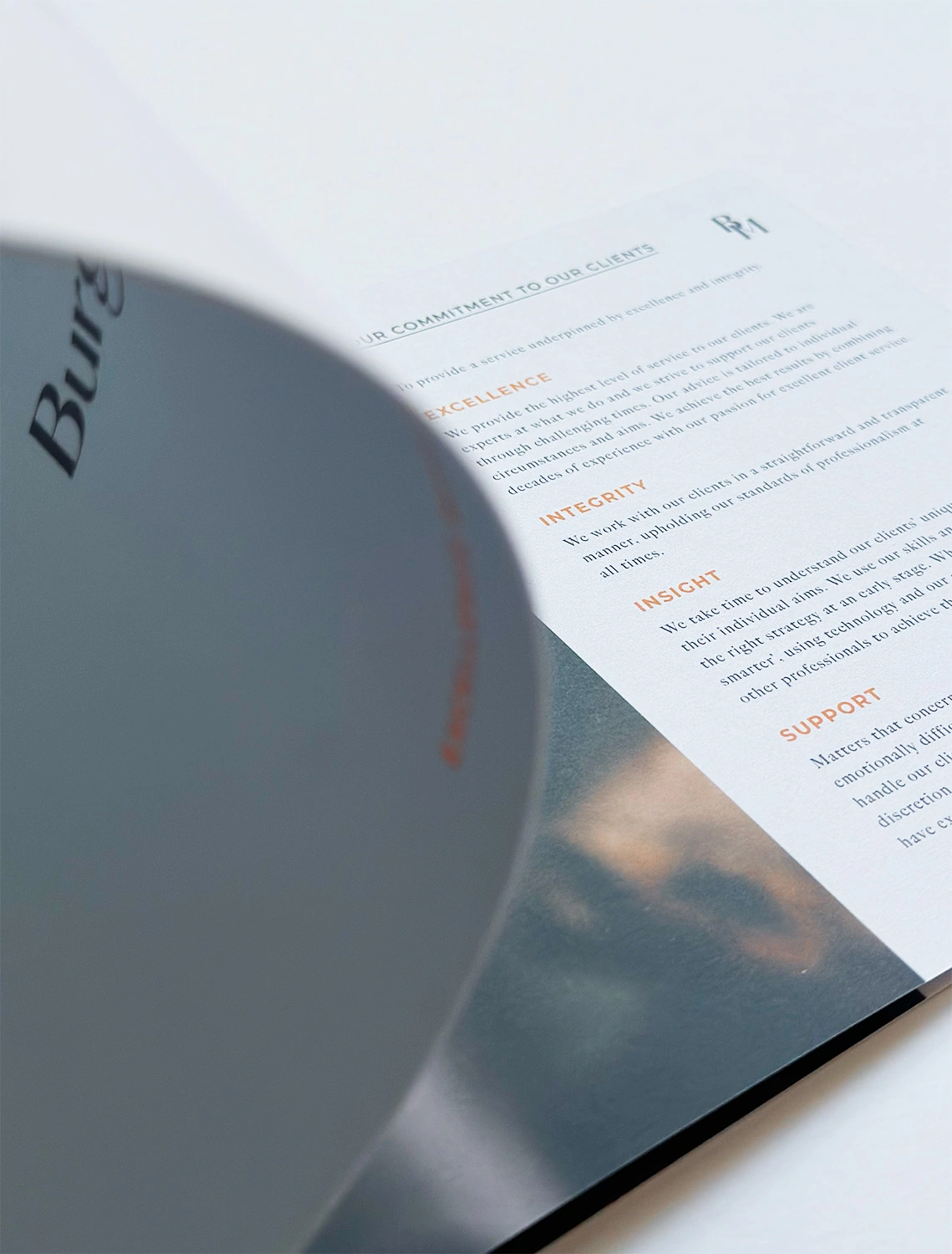
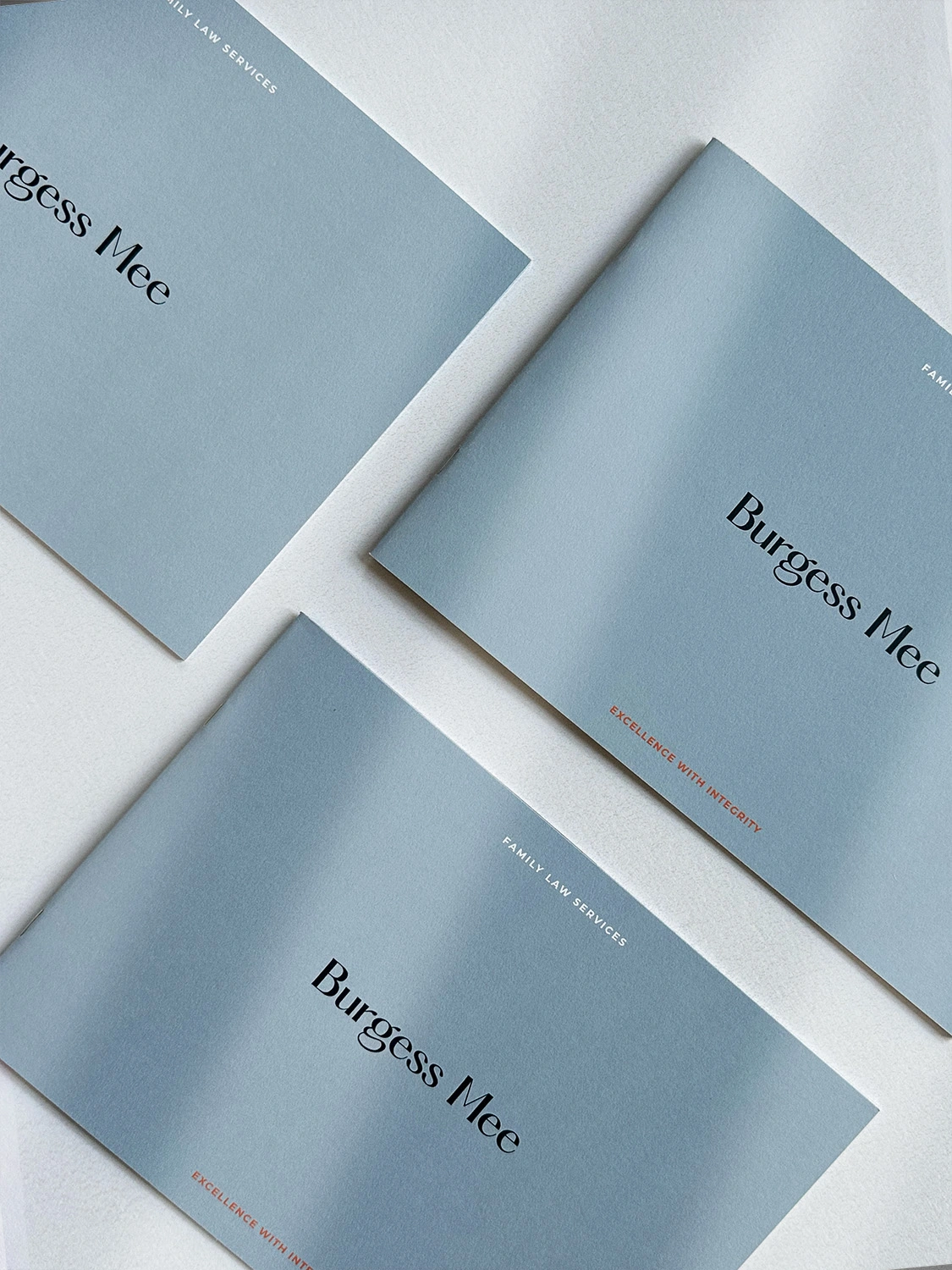
Discover more

Burgess Mee Logo Navy
Gif showing different photography and burgess mee logo on top in navy

Family Law Branding

Branding in the legal industry can be a bit corporate and stuffy, with an overuse of the colour blue as a means to appear trust­wor­thy, estab­lished and con­ser­v­a­tive (but which often comes across as cold and corporate) and a heavy use of stock pho­tog­ra­phy and video footage of obvious law tropes like scales, law courts and city skylines.

For Burgess Mee’s new brand identity and website we wanted to do something less cynical, more thought­ful and warmer.

Family Law specif­i­cal­ly needs to have a human touch. We intro­duced a stylish new logotype and a calming muted colour palette with a pop of orange. This perfectly com­pli­ments the atmos­pher­ic, nostalgic imagery and video that are scattered through­out the website. We also applied this warmer, more human photo grade to the new por­trai­ture shots we took of the team. Burgess Mee are a serious, estab­lished law firm — clearly a safe pair of hands — but the new brand also shows their more approach­able human side too.

Burgess Mee website on 3 iphone screens with video stills of people showing
burgess me illustrated map for wayfinding in navy, pale blue, white and orange
three iphone screens showing burgess mee website and branding
Burgess Mee business cards in navy, cream and orange with logo and logomark