Family Law Branding
Branding in the legal industry can be a bit corporate and stuffy, with an overuse of the colour blue as a means to appear trustworthy, established and conservative (but which often comes across as cold and corporate) and a heavy use of stock photography and video footage of obvious law tropes like scales, law courts and city skylines.
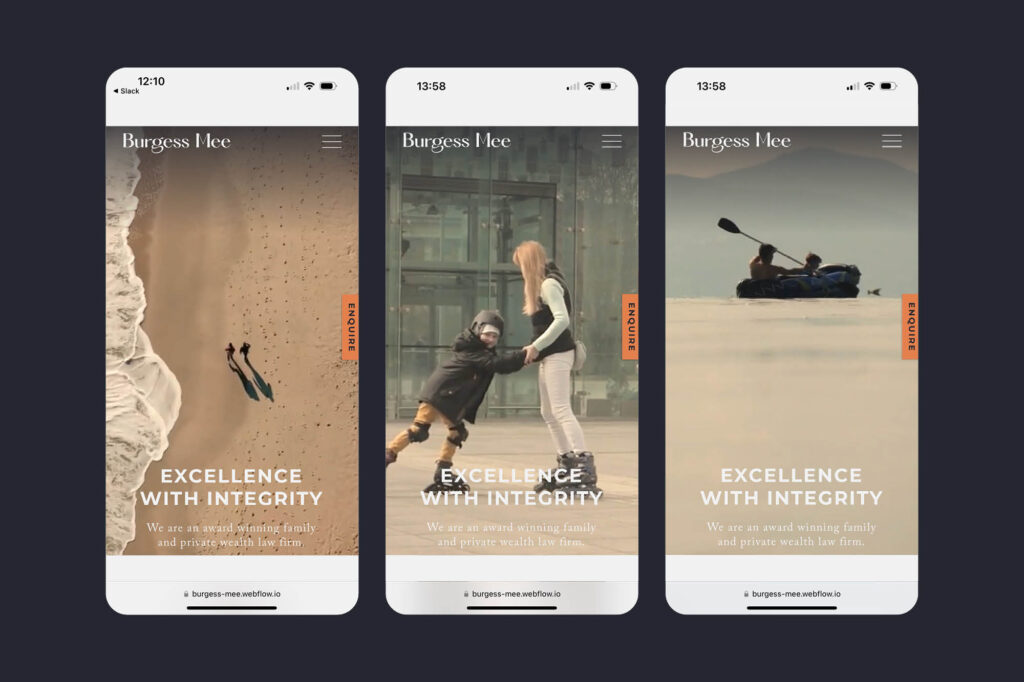
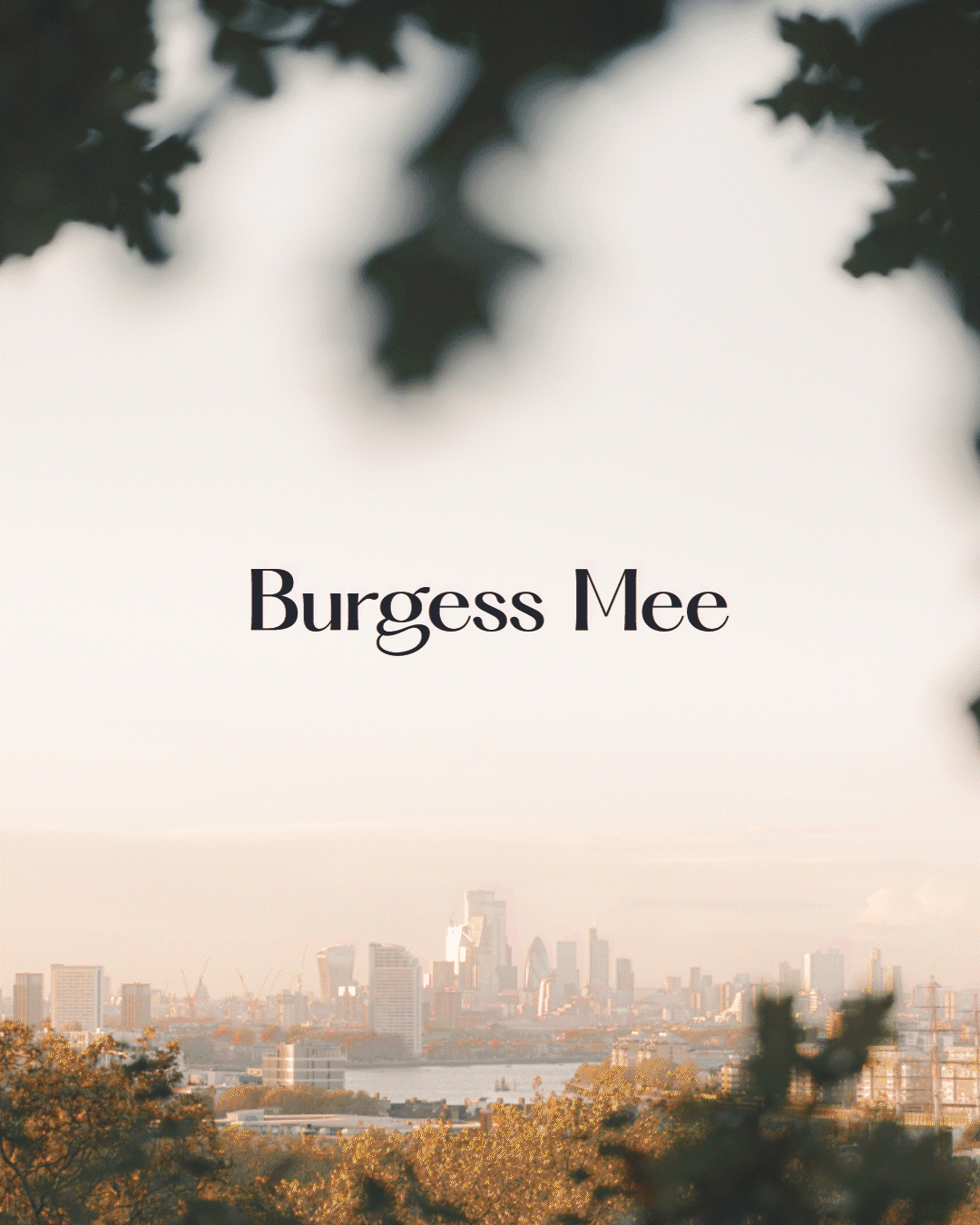
For Burgess Mee’s new brand identity and website we wanted to do something less cynical, more thoughtful and warmer.
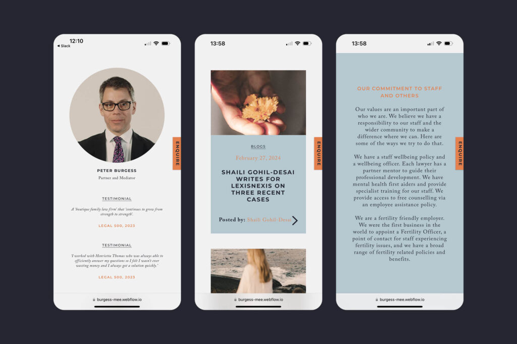
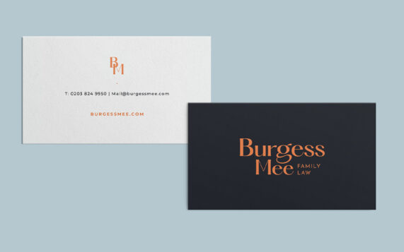
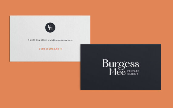
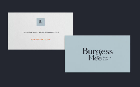
Family Law specifically needs to have a human touch. We introduced a stylish new logotype and a calming muted colour palette with a pop of orange. This perfectly compliments the atmospheric, nostalgic imagery and video that are scattered throughout the website. We also applied this warmer, more human photo grade to the new portraiture shots we took of the team. Burgess Mee are a serious, established law firm — clearly a safe pair of hands — but the new brand also shows their more approachable human side too.