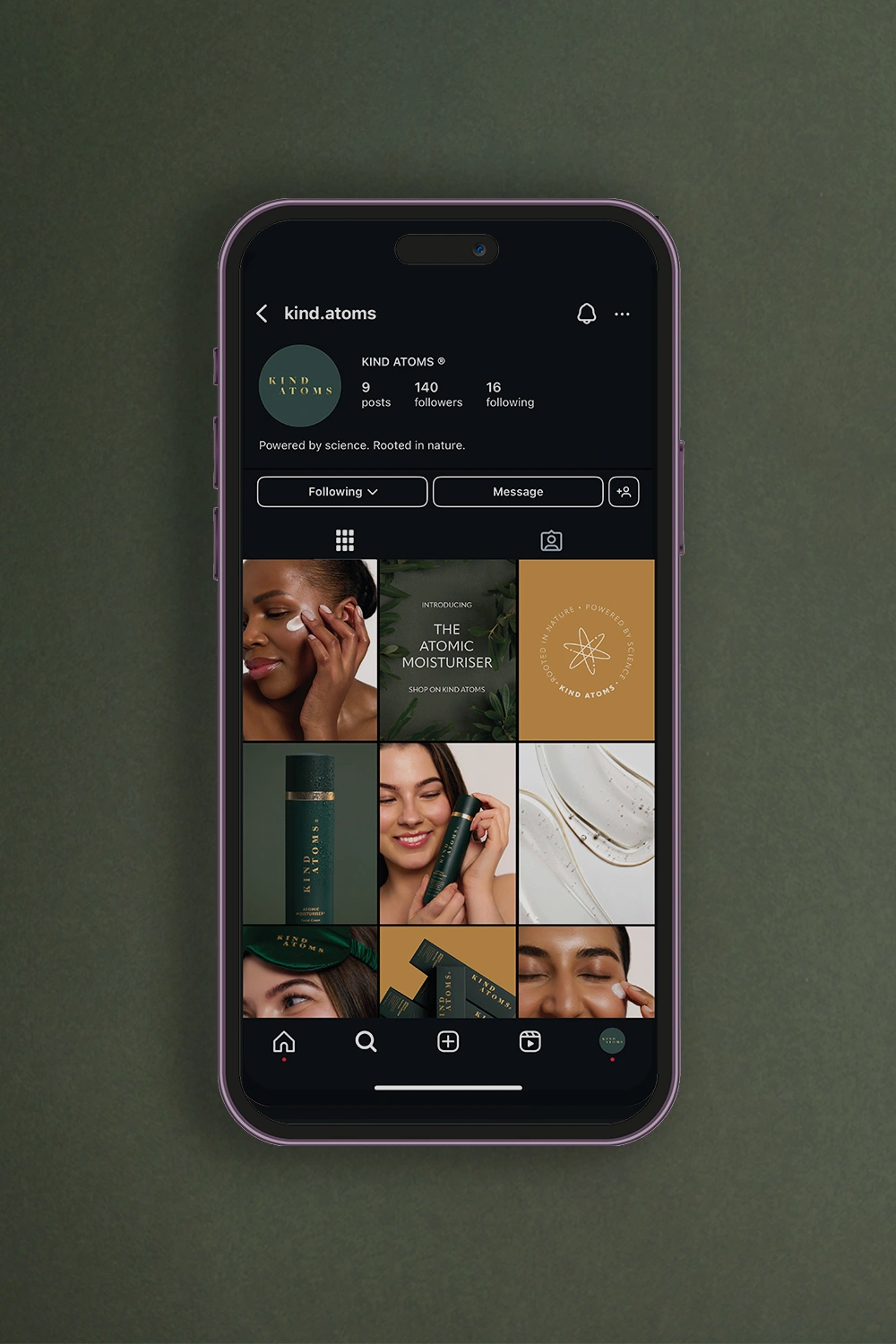
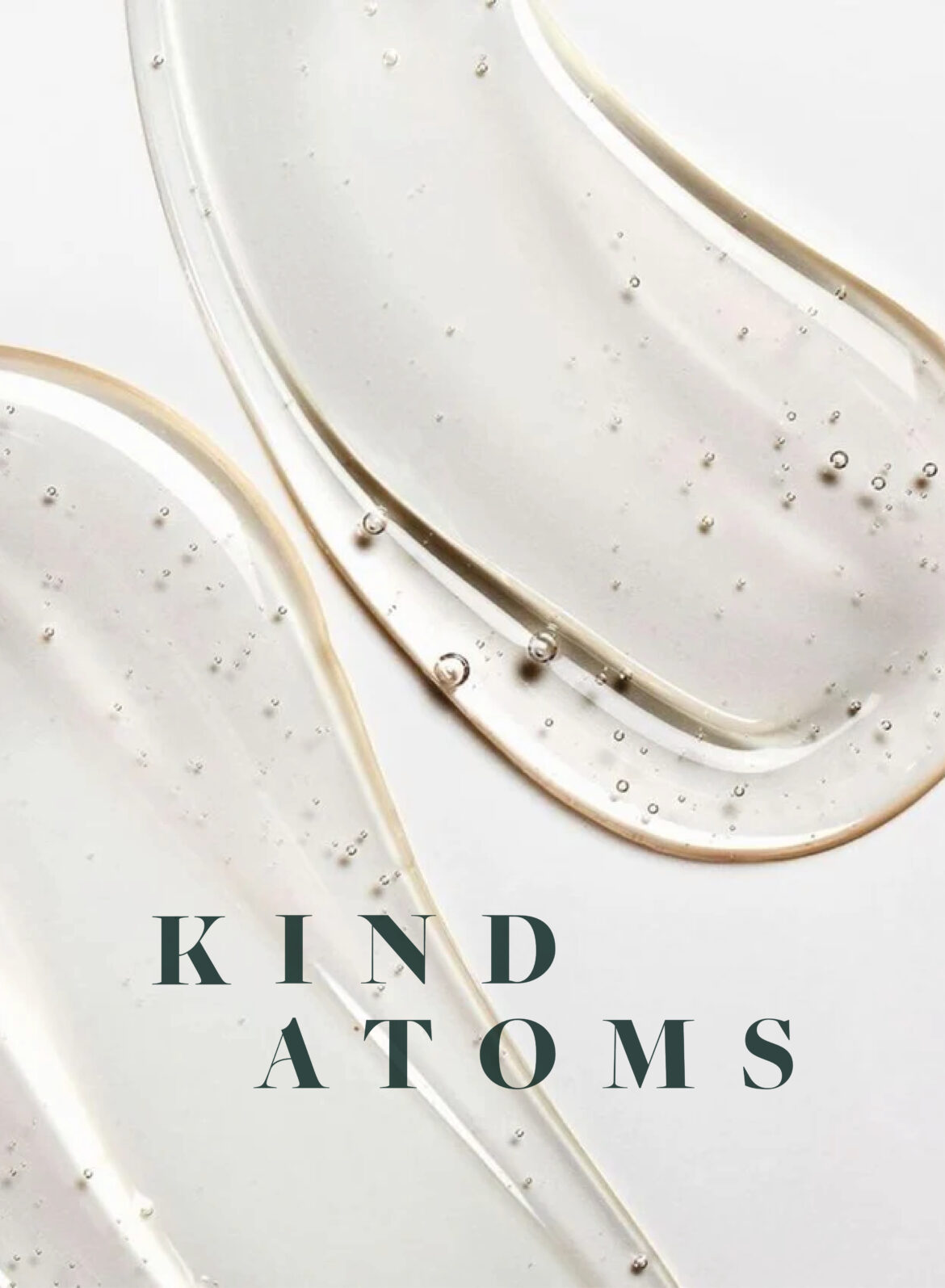
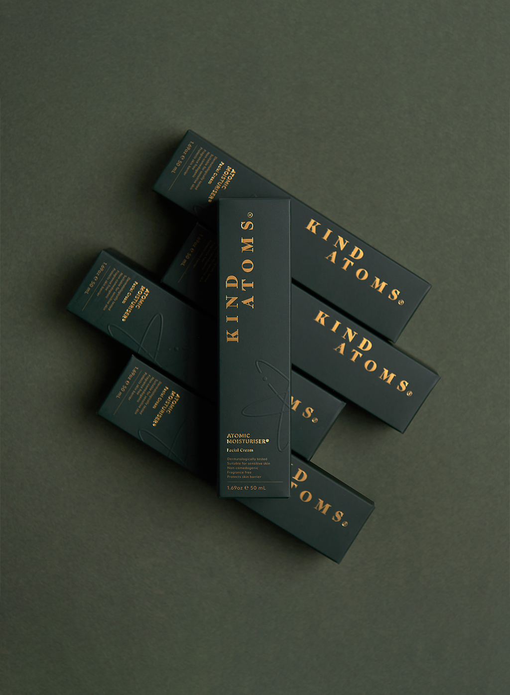
The Birth of Kind Atoms

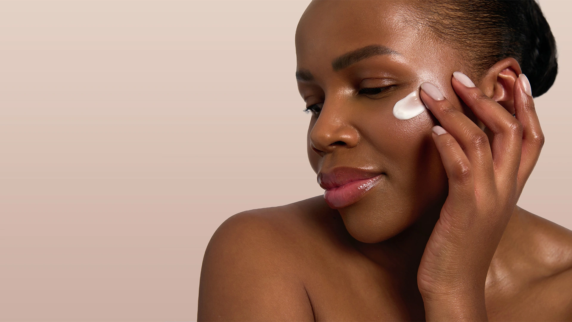
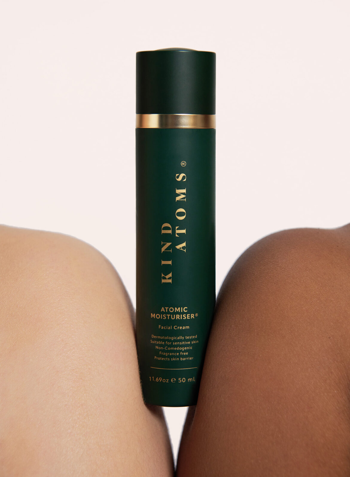
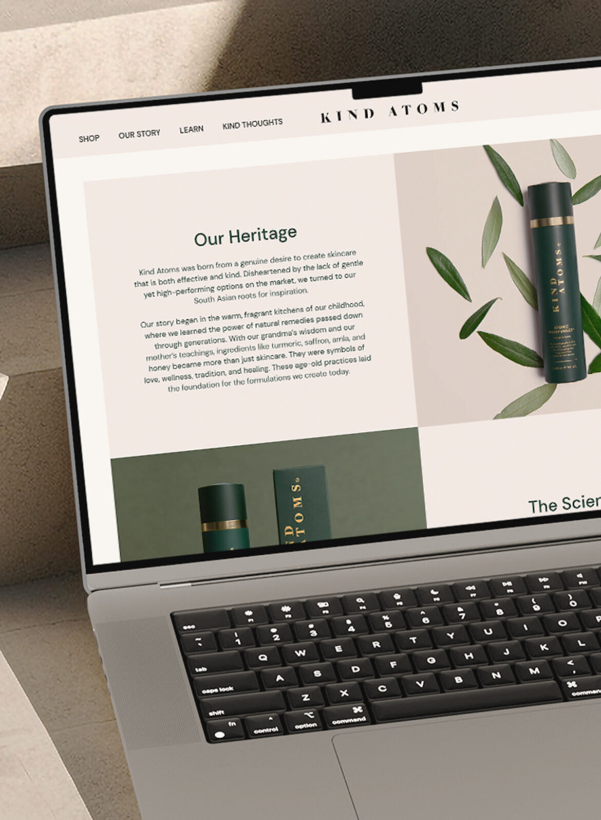
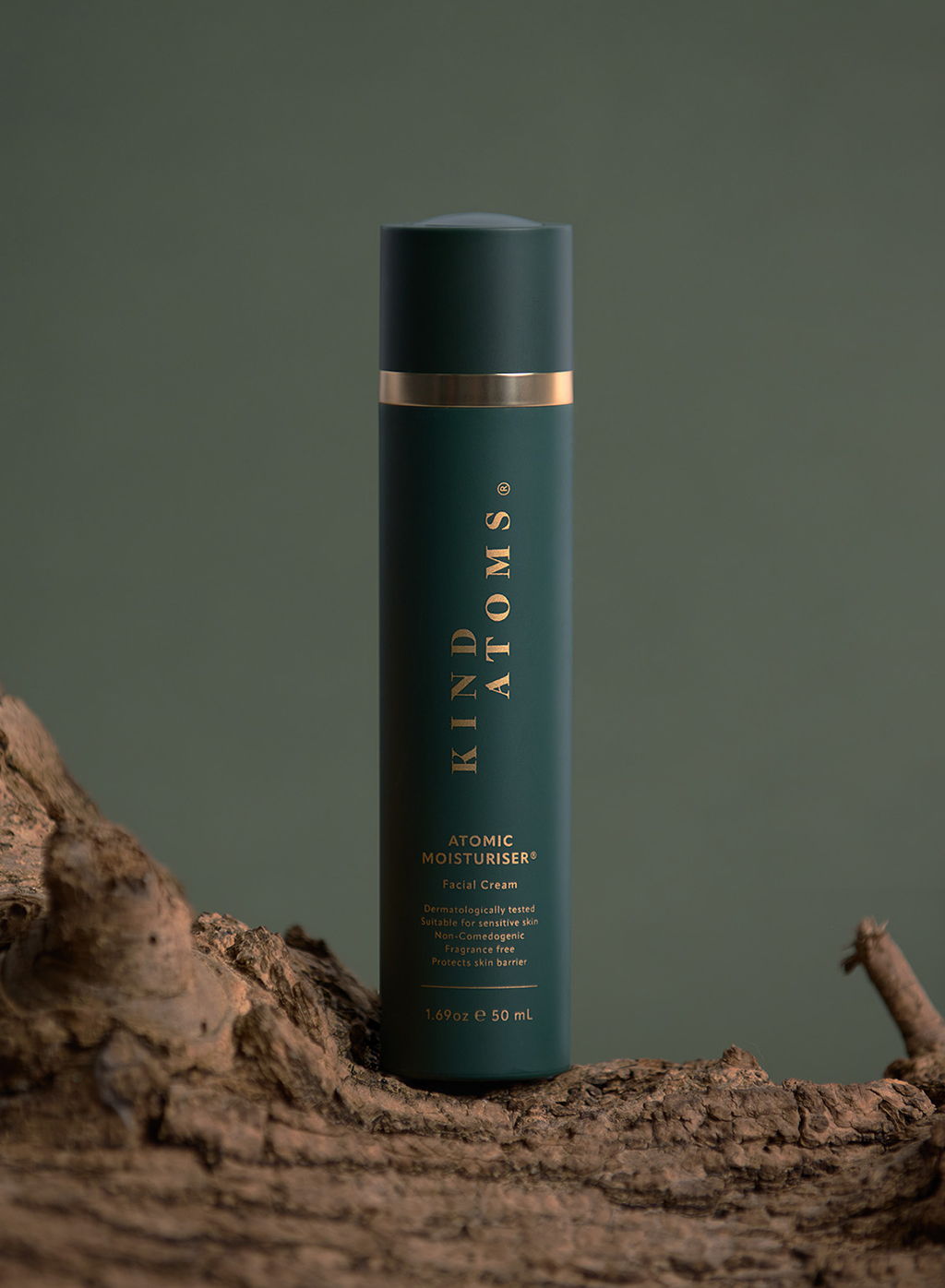
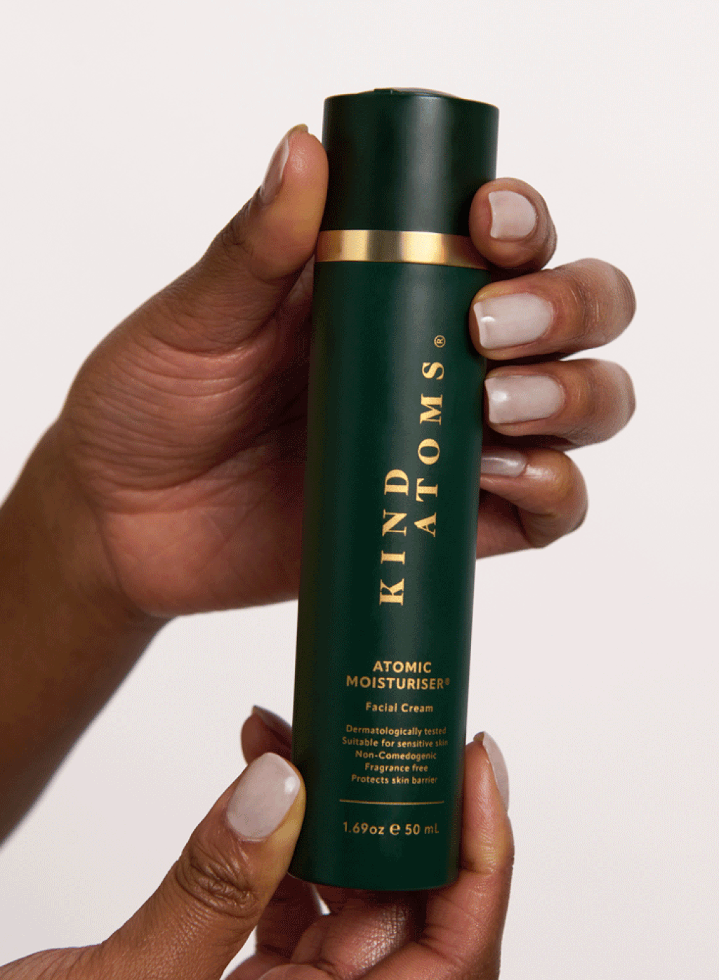
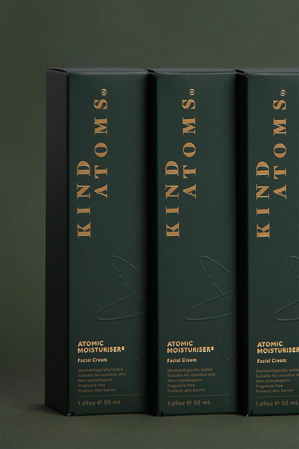
Kind Atoms was born from a genuine desire to create skincare that is both effective and kind. Disheartened by the lack of gentle yet effective options on the market, the founders turned to their South Asian heritage for inspiration — recalling the fragrant kitchens of their childhood, where generations passed down the secrets of turmeric, saffron, amla, and honey as natural remedies.

By blending these time-honoured beauty rituals with cutting-edge science, they created a brand that respects tradition while embracing innovation. With backgrounds in chemistry and healthcare, their in-house scientists ensure that every product is scientifically backed, effective, and safe for even the most sensitive skin.

Crafting kinder skincare

To bring Kind Atoms to life, the founders partnered with Run For The Hills to create a distinctive brand identity, packaging, and visual direction for their launch collection.

We designed a bespoke serif logotype and an elliptical atomic logomark, symbolising the seamless fusion of nature and science. A rich, sophisticated colour palette—mustard yellow, deep green, cream, and charcoal black—adds warmth and depth to the brand’s aesthetic.

For their debut product, The Atomic Moisturiser, we designed a sleek matte green bottle with a unique twist mechanism, detailed with gold lettering for a refined, luxurious feel. It is housed in a matching green box, embossed with the atomic logo and finished with elegant gold typography — ensuring a premium unboxing experience.

For the product shoot, we embraced the brand’s connection to nature, foraging wood stumps and bark from our local park, and sourcing olive branches from our garden. Products were styled against curated coloured paper backdrops, complementing the brand’s earthy yet modern aesthetic. Models were given a natural ‘no-makeup makeup’ look, set against neutral backgrounds to enhance the brand’s effortless, understated elegance.

To showcase the brand’s story and products, we built Kind Atoms’ Shopify website, integrating parallax layers of our photography with ample negative space. The result is a visually immersive, minimalist, and engaging digital experience — designed to let the brand and its first product shine.

image of skincare model with a dab of moisturizer overlaid with the logo mark
Skincare-bottles-stylishly-placed-on-textured-surface
stylishly designed business cards for a skincare brand scattered on a table
Skincare website page opened on a laptop screen
Stylish Skincare brand logo mark animation
model wearing a stylish sleeping eye mask
Stylish skincare bottle placed on a wooden log
Skincare bottle open and closing in a stylish way
stylish packaging for skincare cream placed one on top of each other
Models photoshoot for a skincare brand with logo branding
olive leaves and branches with logo mark roundel
Stylish skincare website scroll on an iPhone
male model using moisturizer, pumping it into backside of hand
Skincare icons for a beauty brand
moisturiser bottle on top of olive leaves
social media mockup of an instagram page of a skincare brand
Social Media Instagram Story mockup
Stylish Swirl Animation of a logo mark for a skincare brand