Another new restaurant design opening, this time in the heart of Soho. Scarlett Green draws upon Melbourne and Sydney F&B culture to deliver an all-day cafe, bar and restaurant, with a laid-back glamorous vibe.
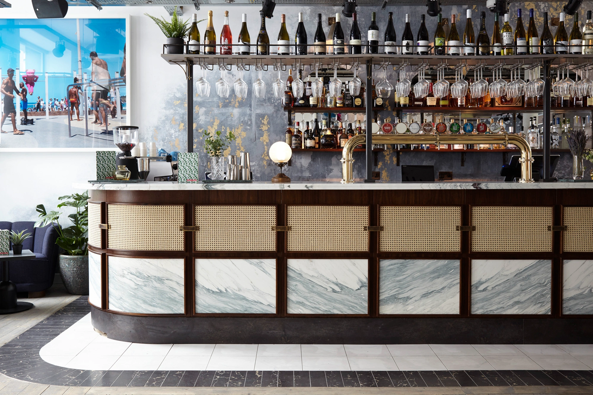
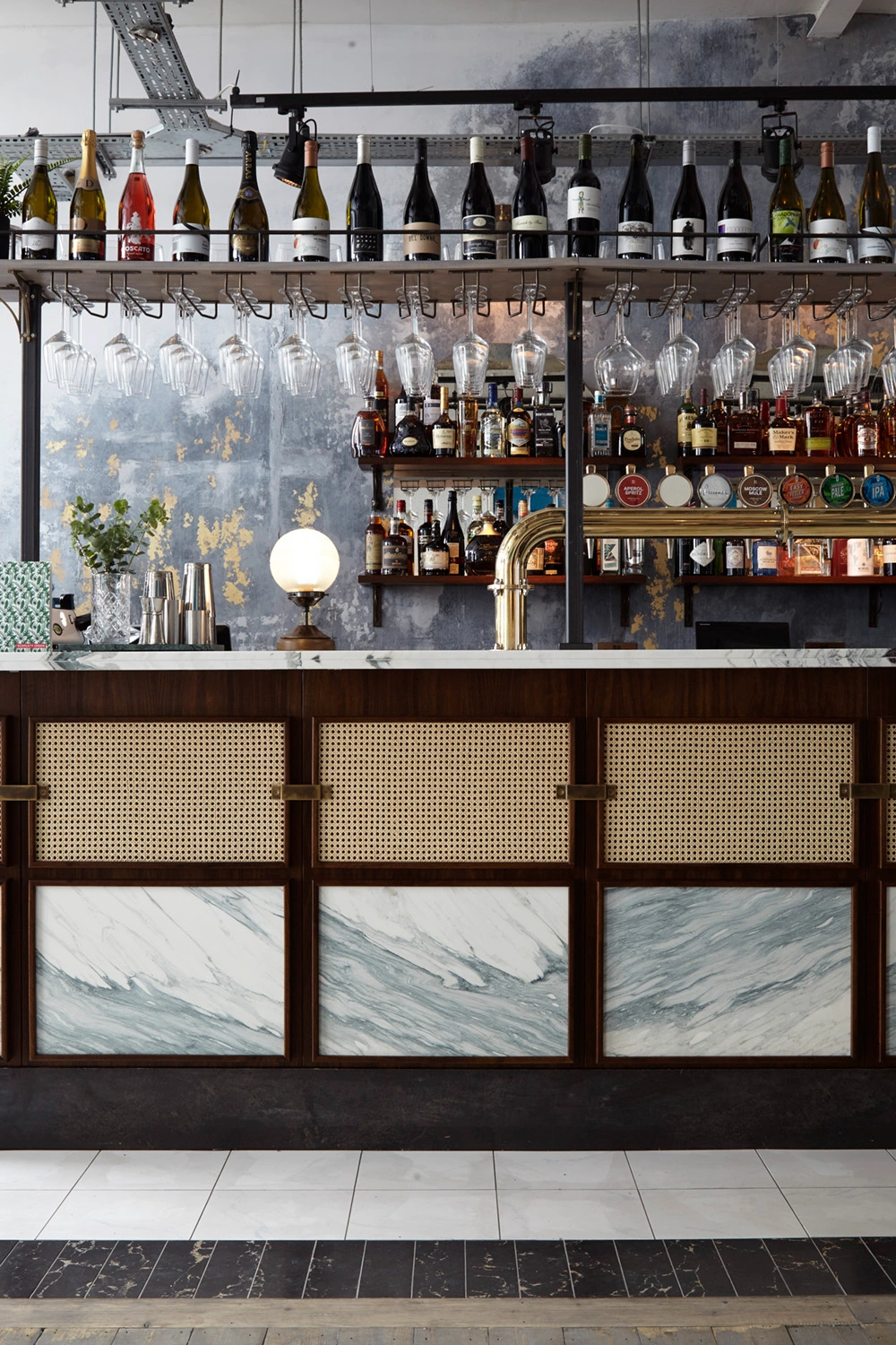
The bar and restaurant are set over two floors across an expansive 4,000 sq ft of space. The design is bright and airy on the light-filled ground floor. Our bar design features a mix of brass, rattan, walnut, black and white marble. Elegant and fresh, with deco-curved mirrors shaping the simple back bar shelving.
The bar serves up flat whites, breakfast and smoothies from 7am and the kitchen offers brunch, lunch and daytime dishes, before the evening service of sharing plates from a Josper grill.
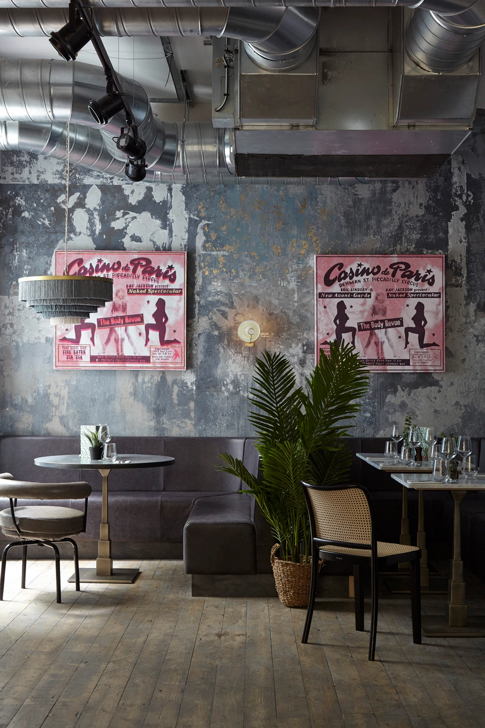
Our distressed wall design went through rounds of prototyping and sampling to get just the right mash-up-layered feel. On site, it was hand-applied by a team of specialist decorators across four days during the install. Crafted from a mix of paint, sand, plaster and sections of torn wallpaper.
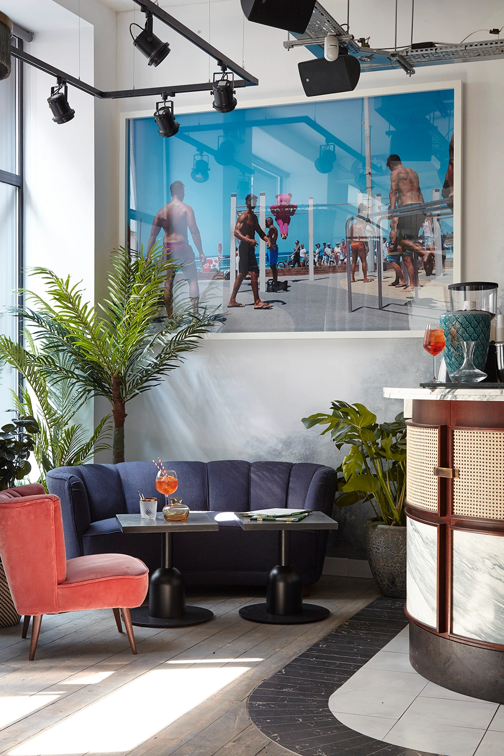
We got to have lots of fun with fabrics and colour in Scarlett. Filling the ground floor with armchairs in a mix of velvet and corduroy, coral, red, and soft pink cocktail stools. Which we either tasseled or set upon a solid retro brass base. The bar stools and vintage Art Deco sofas are upholstered in tone on tone denim shades from light to dark, same with the front of the greet station.
Aged zinc and marble table tops are paired with House of Hackney fabric clad 70s style cantilevers.
Towards the rear of the main ground floor space, the styling plays more with light and shade lower east side vibes, giving a nod towards the glam-meets-grunge look and feel of the basement restaurant. Our specialist decorative wall finish in the cozy nook next to the atrium turns duskier, setting off some of the Clients’ colour pop artworks, commissioned from street artist Shuby.
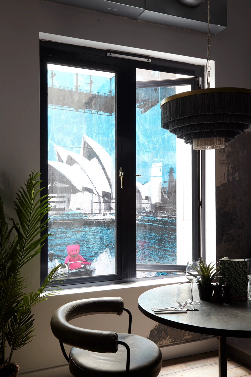
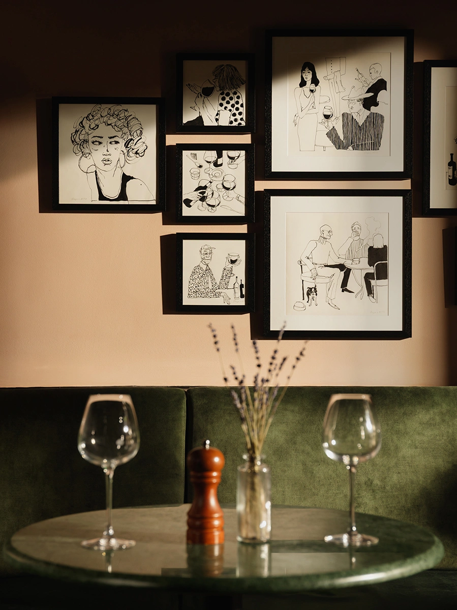
Both floors house lots of artworks from the Clients’ private collection, many commissioned specially for the space. Seen beyond the window is one of LUAP’s “Pink Bear” mixed media art pieces, custom created by the artist, impressively stretching the full height of the atrium. We don’t envy the installation team 🙂
In the evening the whole place shifts up a gear into a buzzing late night bar and restaurant with cocktails and live acoustic sets and DJs from 4pm.
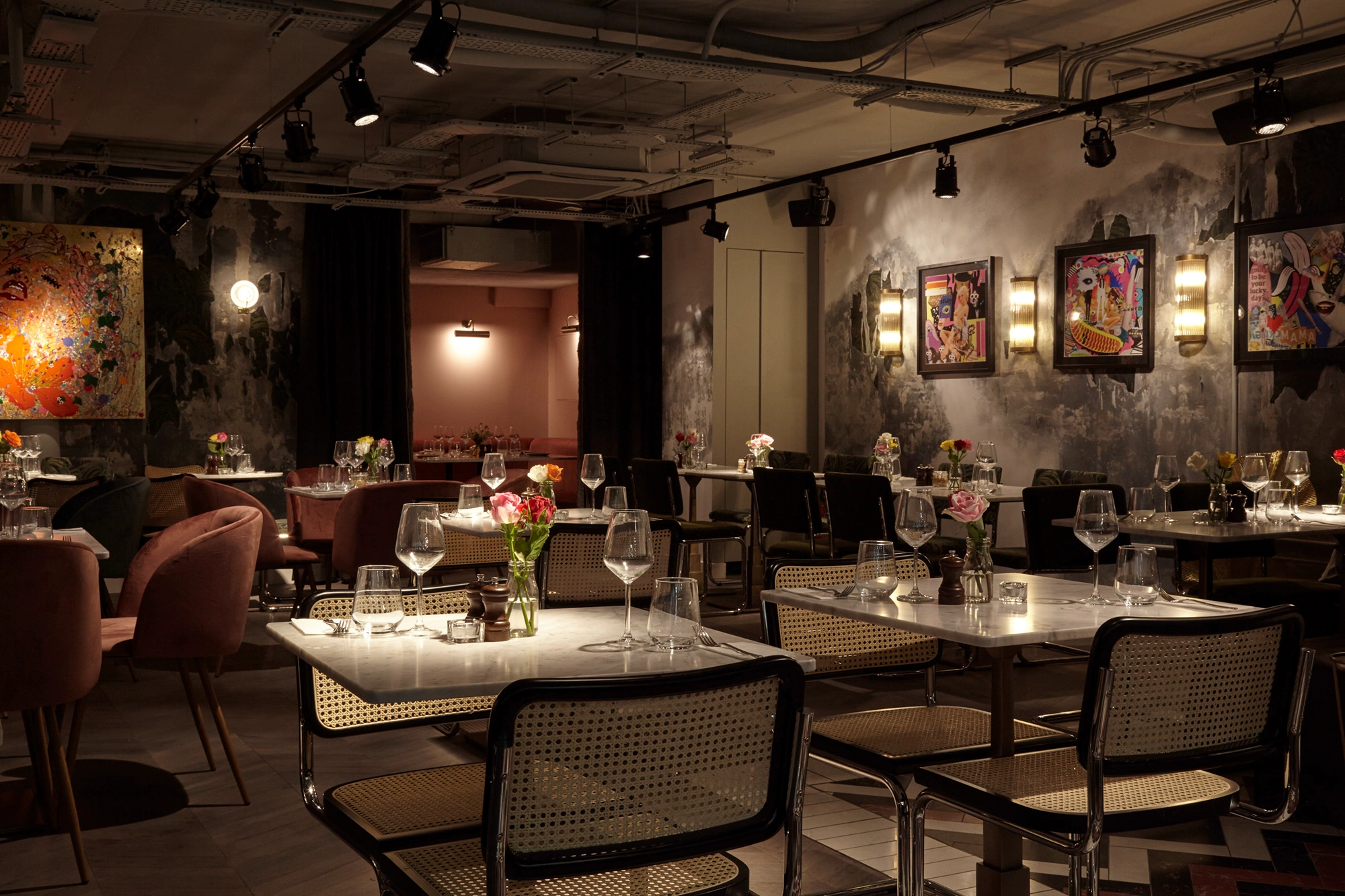
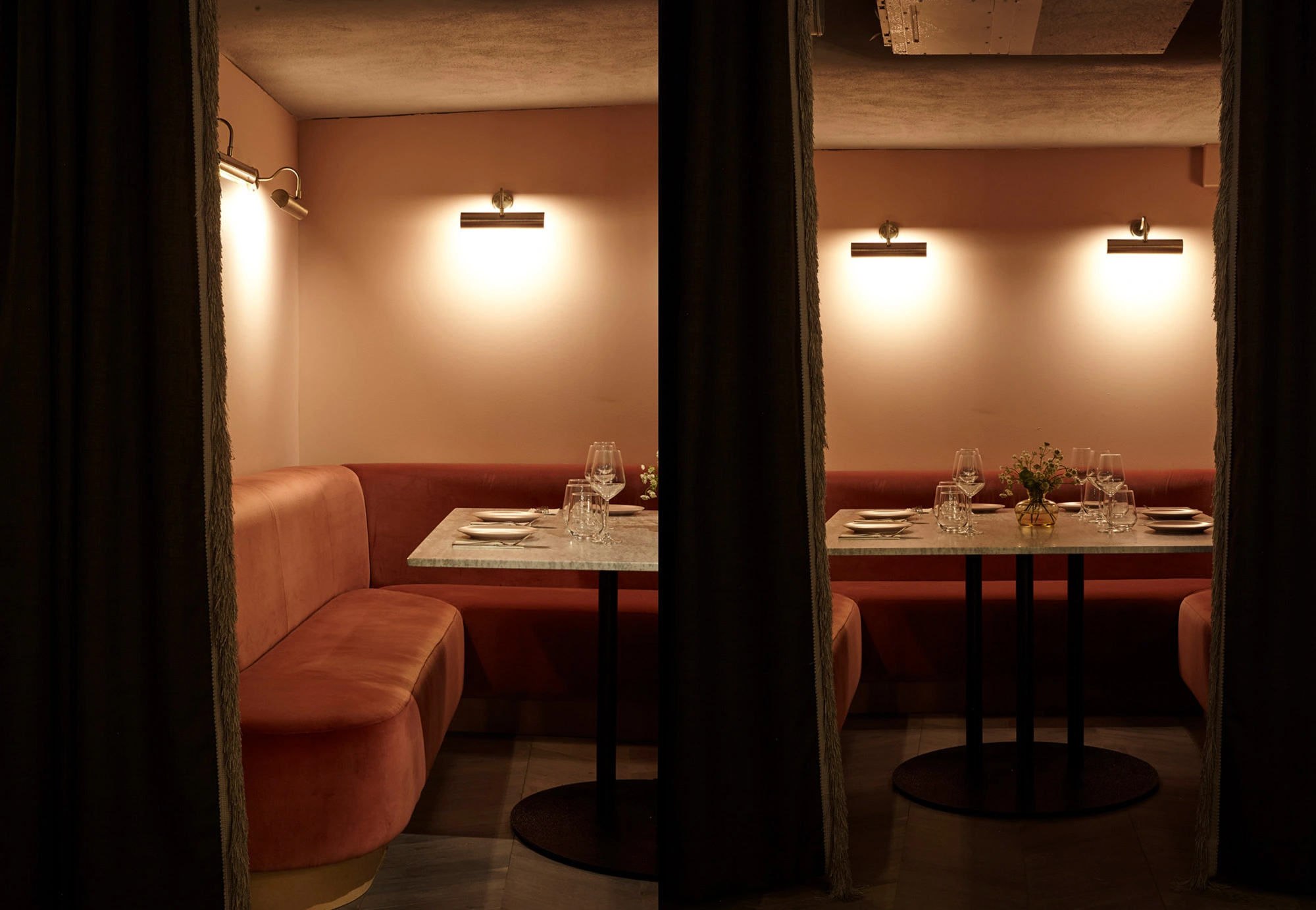
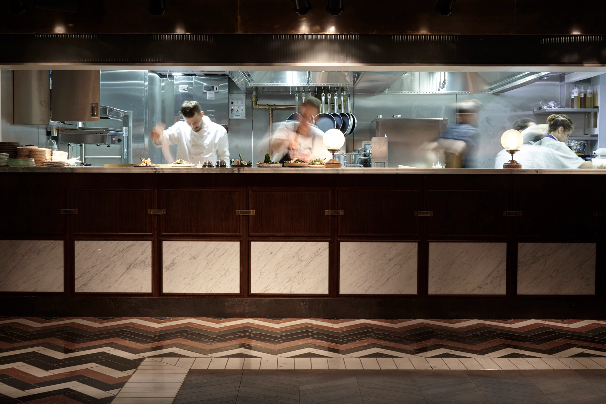
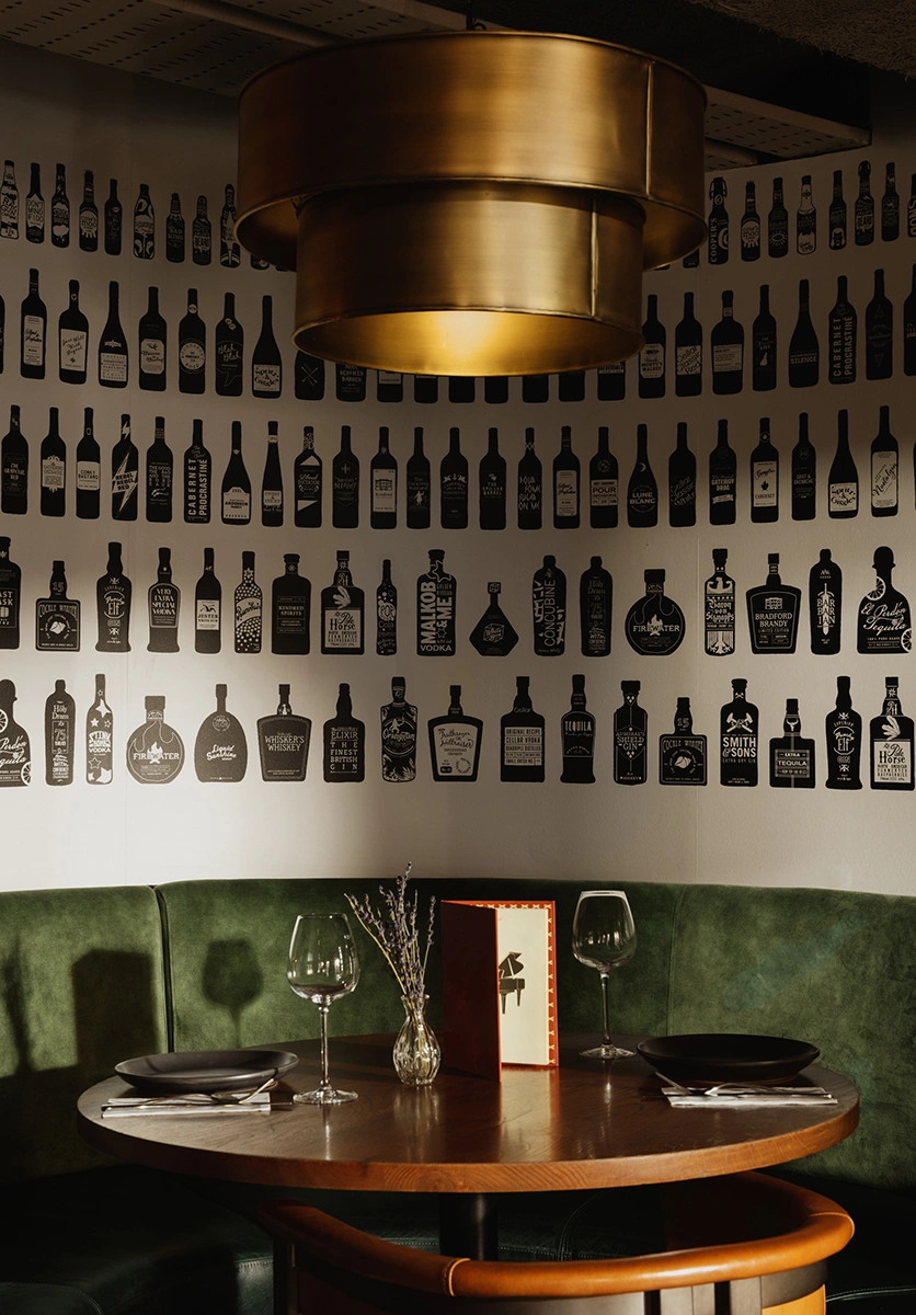
Our basement design notches down, creating a moody and glamorous, low-light restaurant feel with a cool mix of pattern clash upholstery and heavily patinated walls. The high ceilings keep things feeling airy and the open kitchen gives a sense of theatre and a secondary basement bar keeps diners sated with cocktails and a huge Australian wine list. Tables are a mix of two-man-intimate-couples-dining and larger sharing tables.
Run For The Hills is a London-based creative design house that exists in the space where branding and interiors meet.
If you have an interesting project or commission you want to discuss, email us at sayhello@runforthehills.com.
View our recent awards here.
Join our private email club if you want to receive our occasional newsletter, with the info on our latest projects, events and launches, and what’s been happening in our studio: