Discover more

Temper, a restau­rant group with venues in Soho, the City, and Covent Garden, is a unique whole-animal barbecue concept. Over six months, our graphics team col­lab­o­rat­ed closely with Neil Rankin and Temper co-founder Sam Lee to craft their branding design.

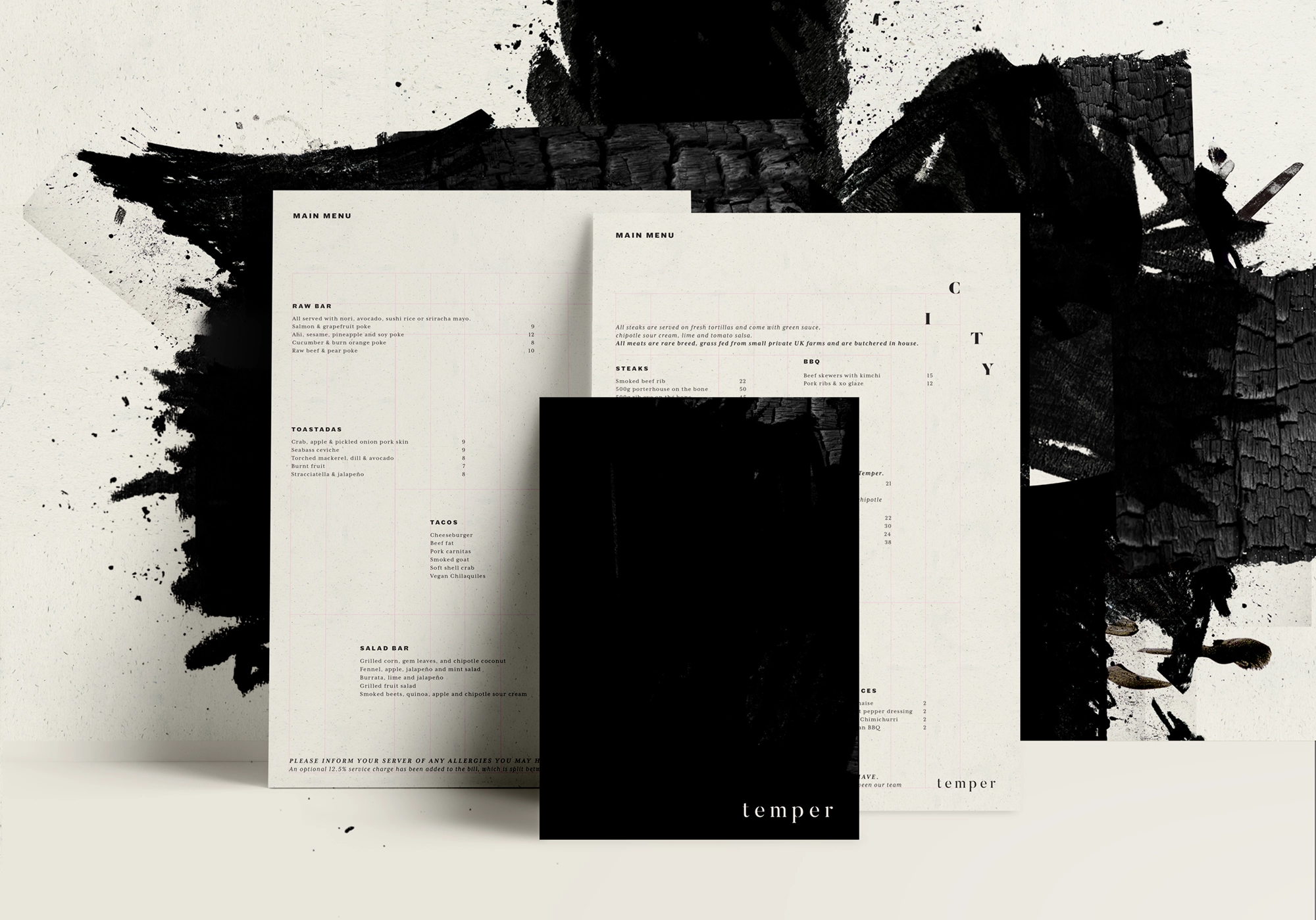
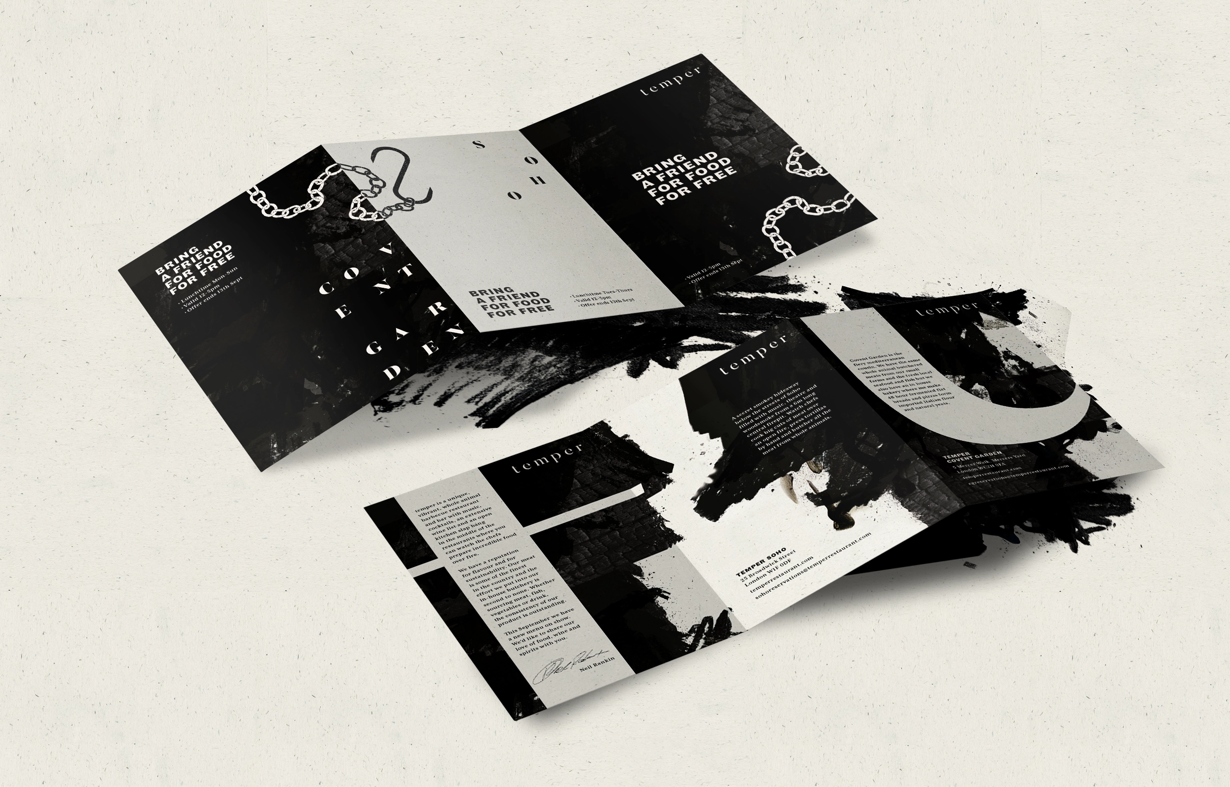
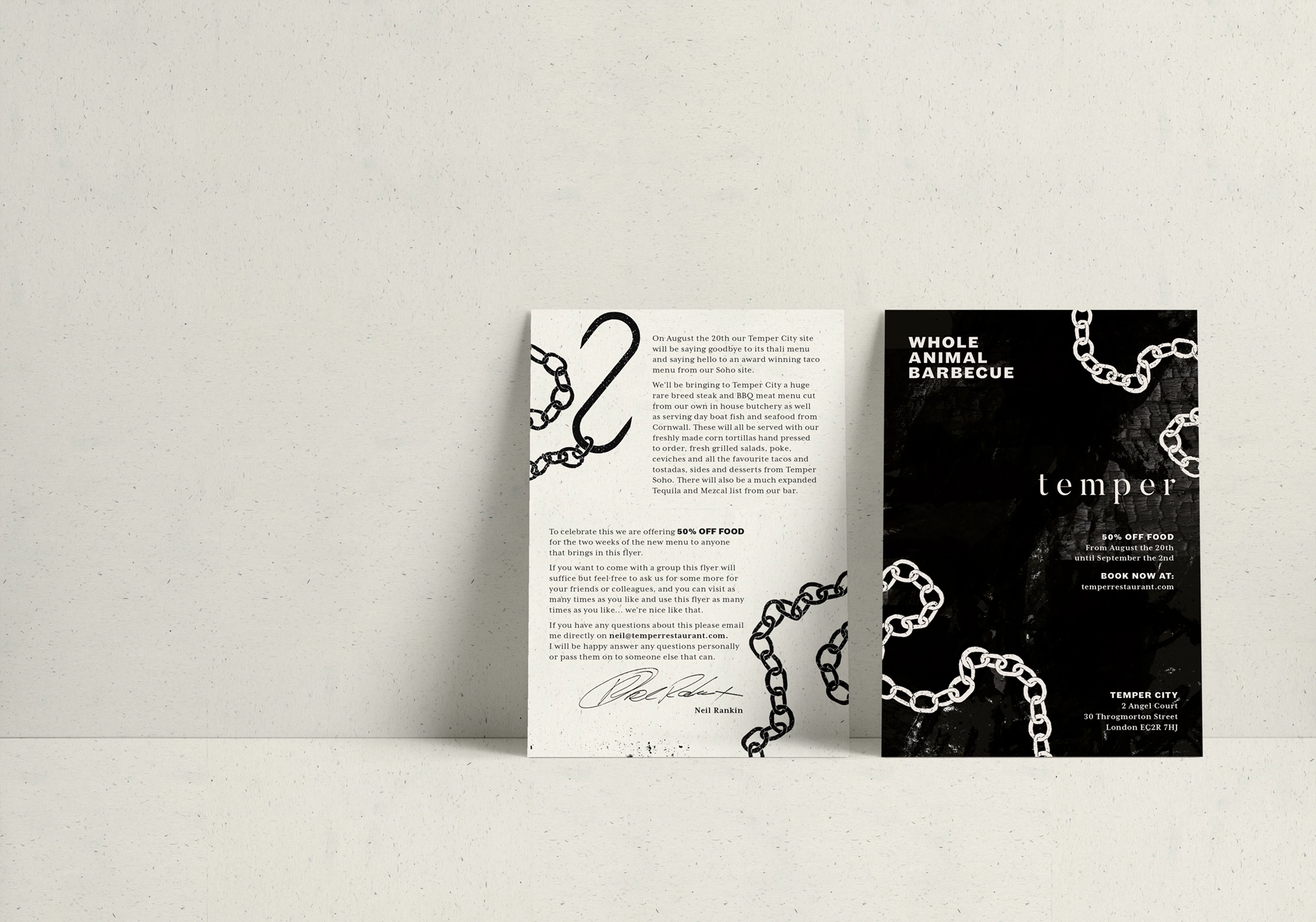
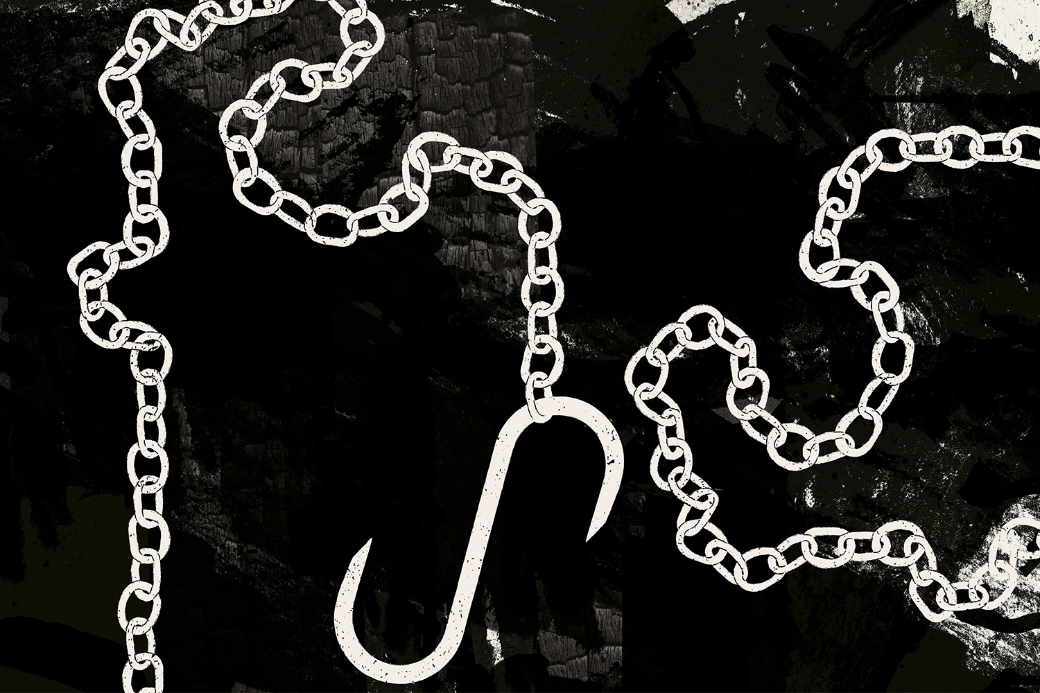
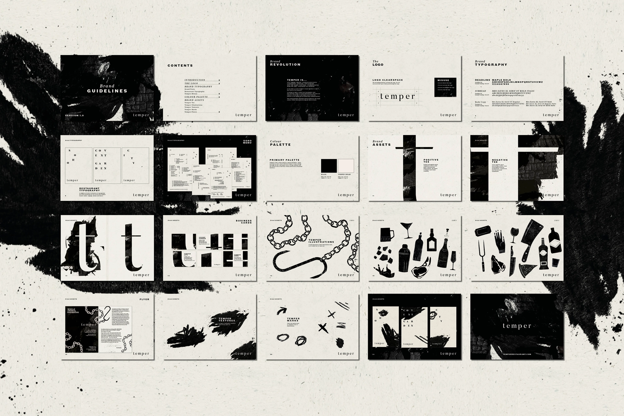
Our design team set out to create a bold, edgier typo­graph­ic style, incor­po­rat­ing etched illus­tra­tions and charcoal textures. This slightly off-kilter typog­ra­phy became the cor­ner­stone of the final graphic identity.

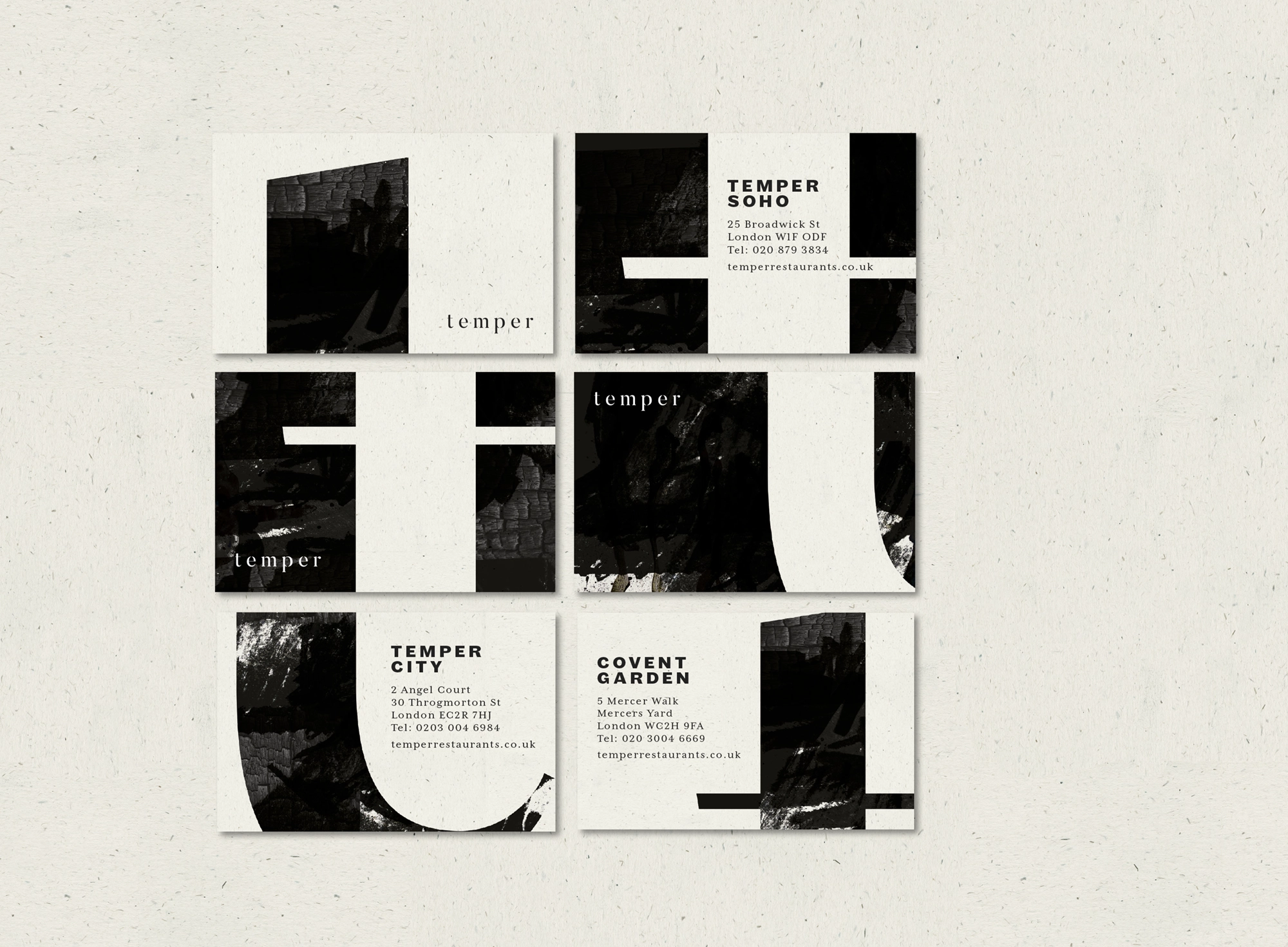
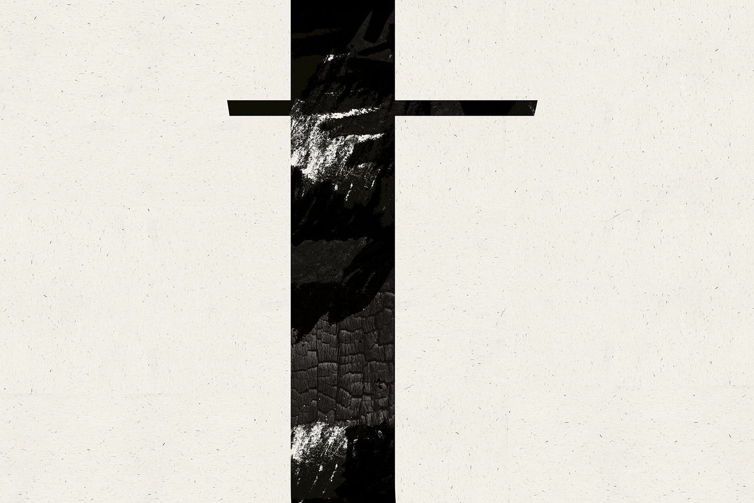
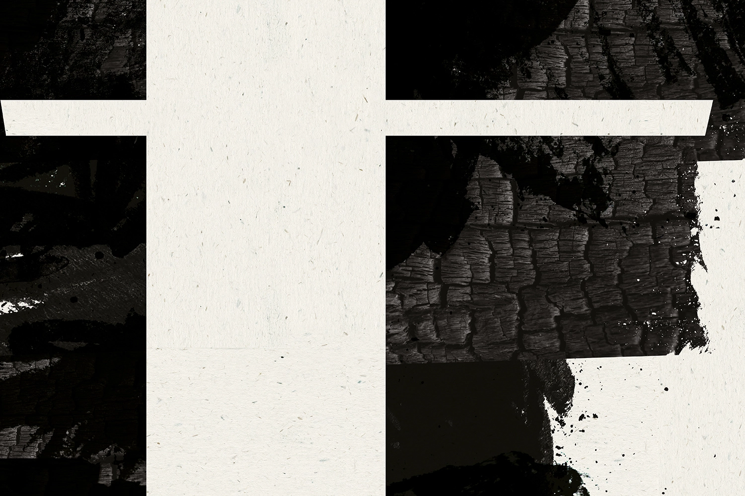
Central to Temper’s new branding is a focus on dis­tressed and burnt textures, playful exper­i­men­ta­tion with positive and negative space, and striking, artistic cropping of highly textural back­grounds. The typog­ra­phy, though carefully con­sid­ered, was designed to feel thor­ough­ly unstruc­tured, forming a visual tone of voice that defines Temper’s brand evolution.

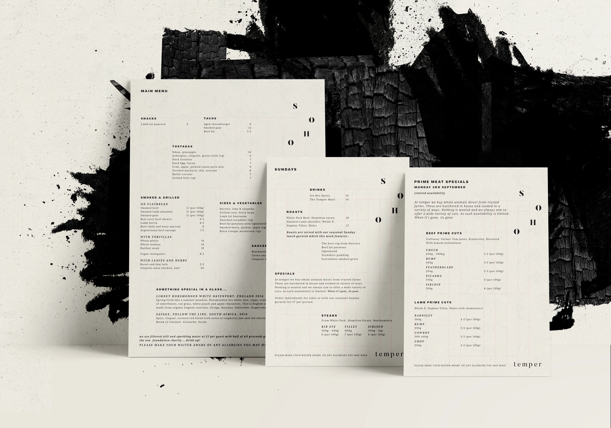
For each of the three restau­rants, our designers developed a distinct typo­graph­ic identity, applied across all brand elements, including online presence, signage, menus, and flyers. To maintain the playful asymmetry of the concept, we designed physical menus with an inten­tion­al lack of symmetry, printed on a range of recycled craft papers. This allows the in-house team to easily adapt the menus to their fre­quent­ly changing food offerings.

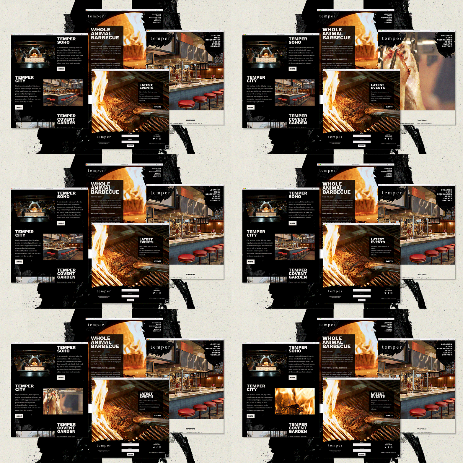
Rankin’s tattooed arm takes centre stage in a stop frame animation kind of way and the new website created by Run For The Hills is full of quirky animation. The site also heralds the culinary heroics of the whole Temper kitchen and front of house team, and tells tales of some of Temper’s much-loved suppliers.

Chris Trotman, Creative Director of Run For The Hills, comments: “The real jewel in the crown of the whole rebrand­ing project is Temper’s shiny new website. We used a pre­dom­i­nant­ly inky colour scheme with charcoal textures, befitting of the restaurant’s fire pit concept. To express the down-to-earth qualities of the brand we devised animated retro-style tele­vi­sion sets and record players as nav­i­ga­tion tools. There’s lots of quick, stop-frame ani­ma­tions to add extra punch­i­ness.”

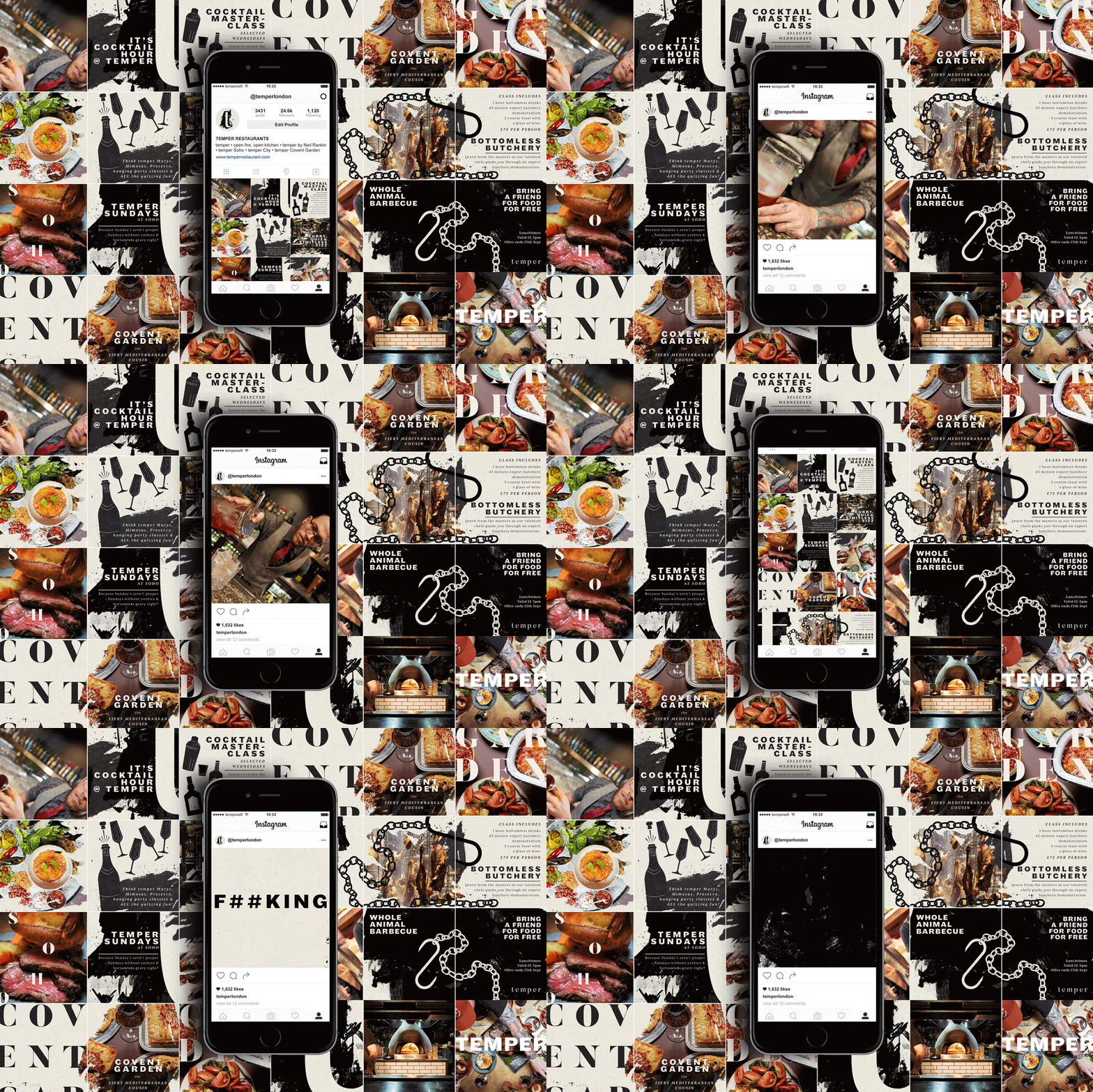
To herald the new branding and visual identity, Run For The Hills did a mash up style take over of Temper’s Instagram, curating a feed filled with insta-squares featuring favourite new creations, illus­tra­tions and brand assets, shot through with lashings of attitude and whole Temper cool.