DOH
vegan as hell, sweet as sin
Doh is a cookie brand that happens to be vegan. We rebranded it with a cheeky new tone of voice and a range of slice-and-bake packaging that puts the indulgence first.


Doh started with a small, familiar frustration. Founder Phoebe Middleton, a Le Cordon Bleu-trained pastry chef, wanted a good cookie without the weighing, the mess and the washing up, and without resorting to a delivery app. So she made dough that lives in the fridge or freezer and can be sliced, baked and eaten in about ten minutes. It was plant-based from the start, not as a positioning exercise but because that is how she cooks.
What the brand didn't have was a look to match. The old identity led with the free-froms - gluten-free, dairy-free, refined sugar-free, vegan. All true, all worth saying, but stacked up front they framed a very good cookie as a list of things it was missing. Our job was to build an identity that leads with the good bit.
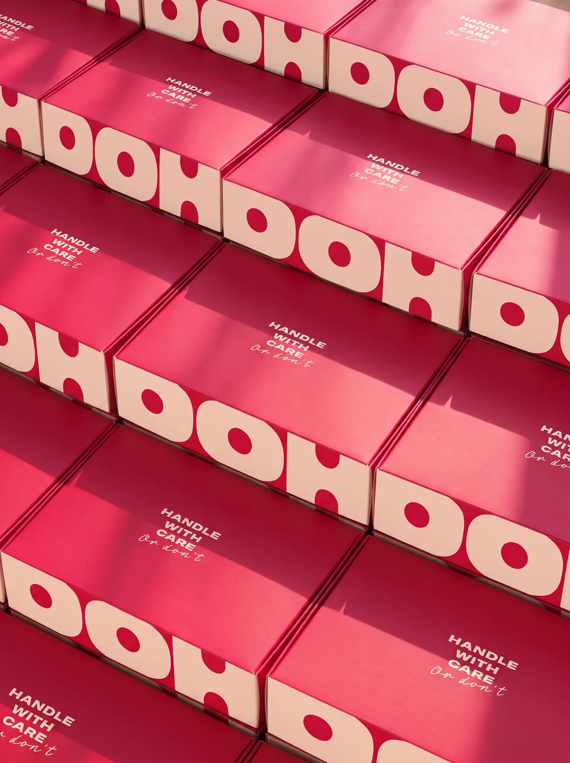
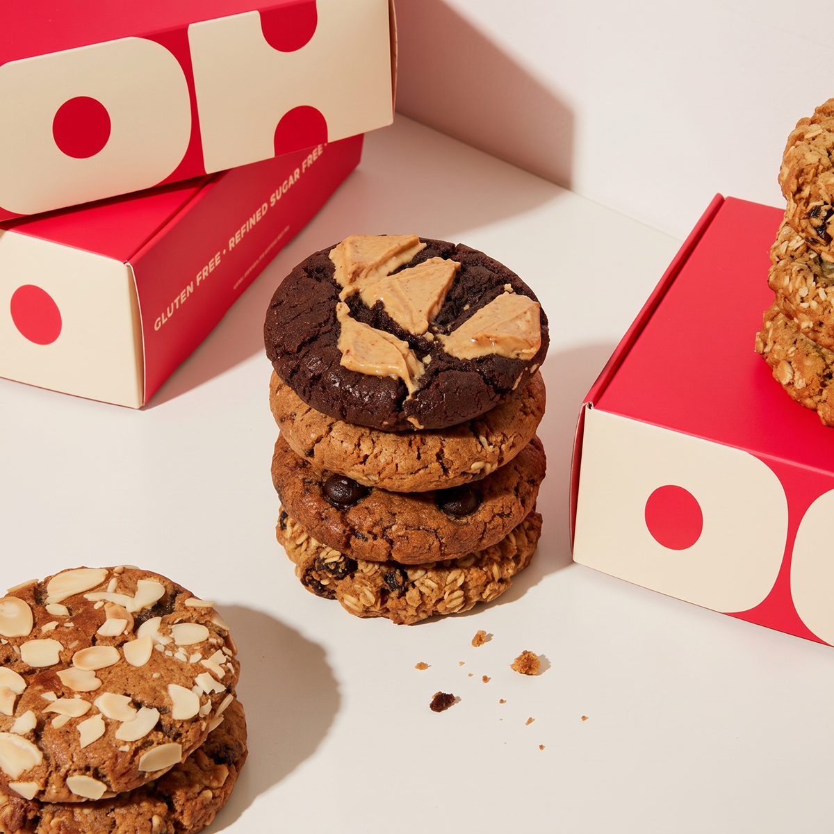
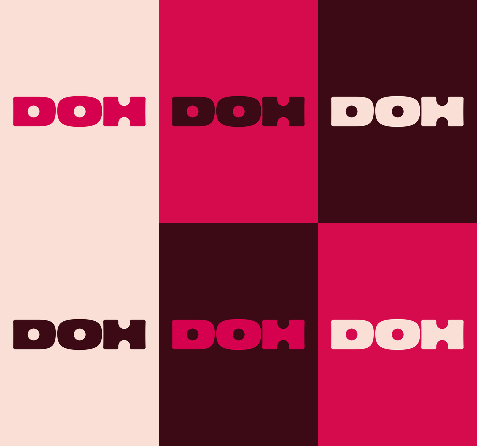
Doh is a great name. It's short, it's a pun and it's the sound you make when you've eaten four of them. So the logotype had to be as unfussy and physical as the product, and we drew it like dough. It's squishy, with soft shoulders and letter forms that look pressed rather than drawn. The counters in the D and the O are punched clean through, the way a cutter goes through dough, and the H takes the same bite out of its centre. Blown up huge it fills a box lid or a shop wall. Shrunk down, it still reads on a business card.

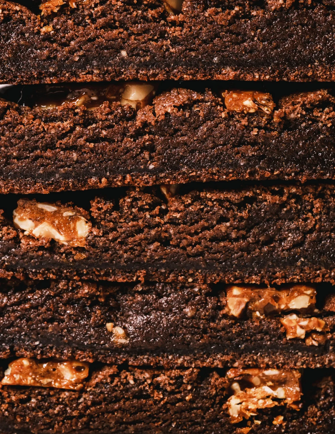
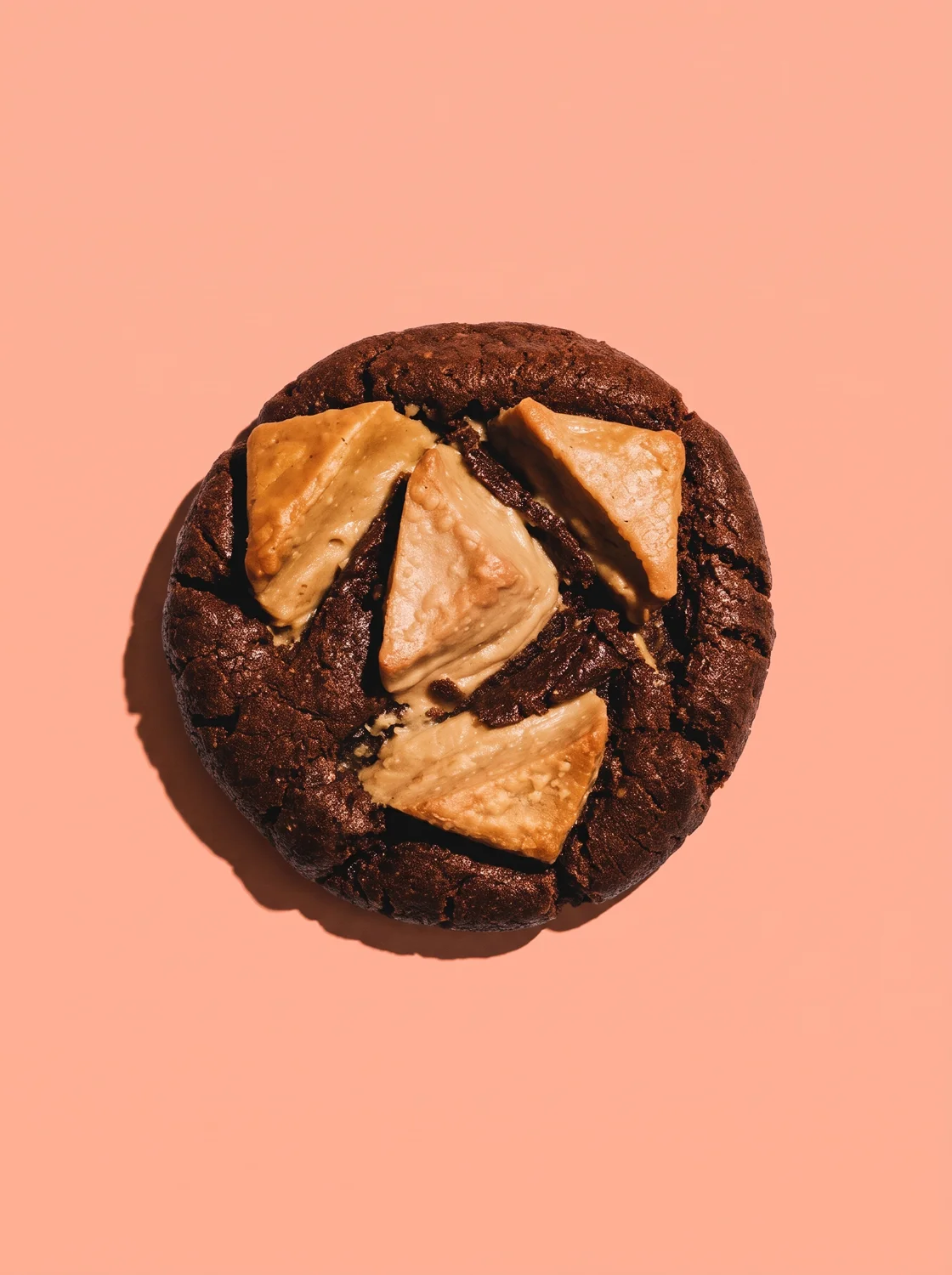

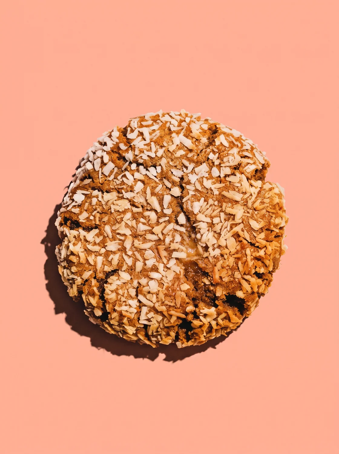
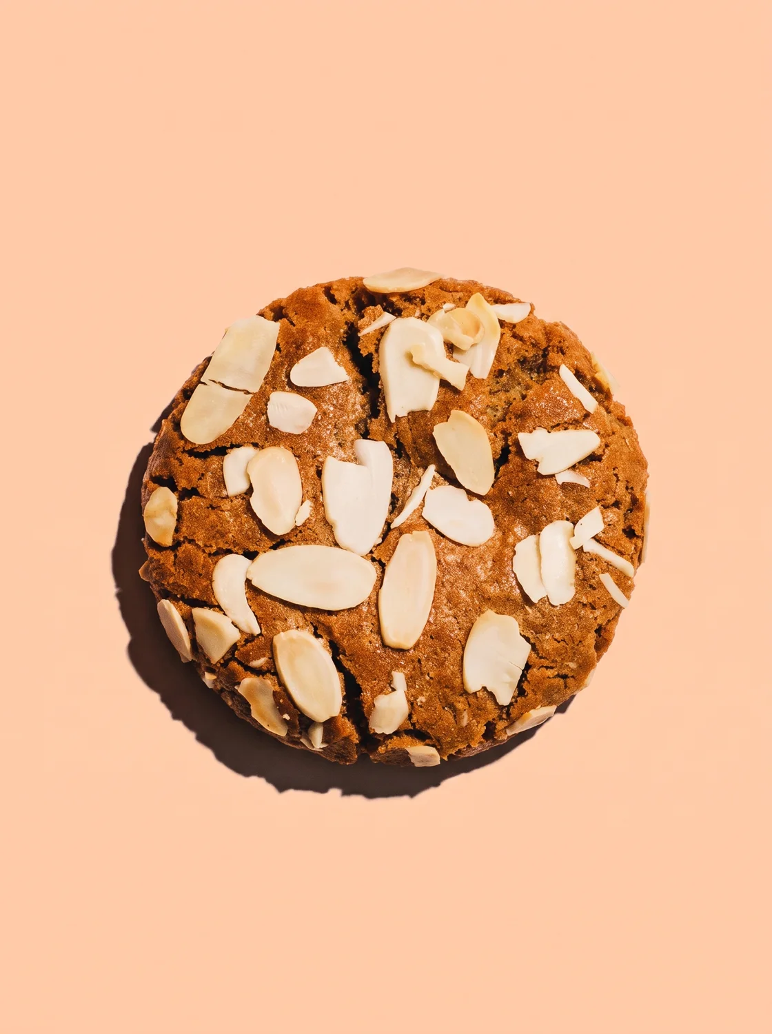
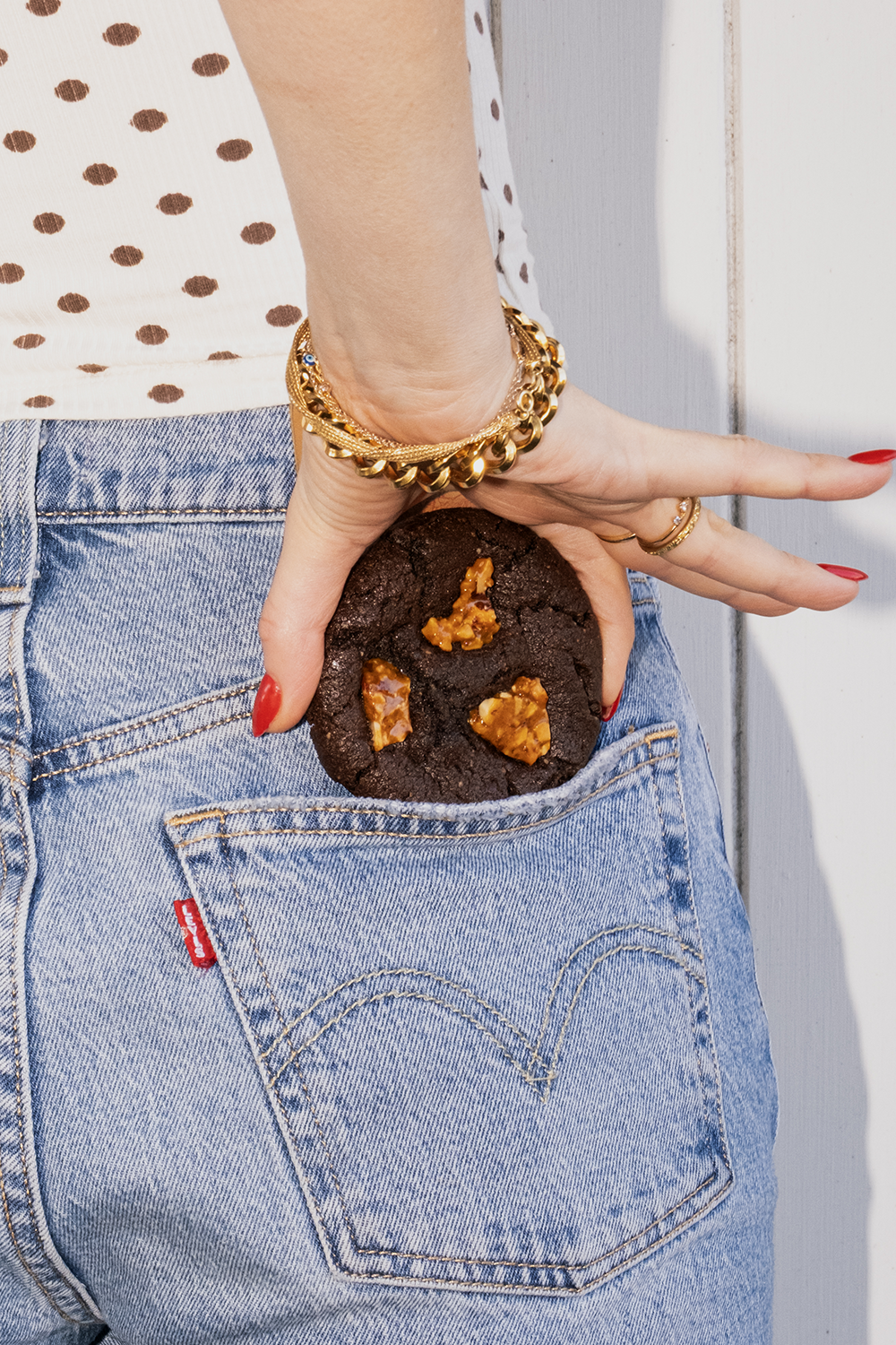
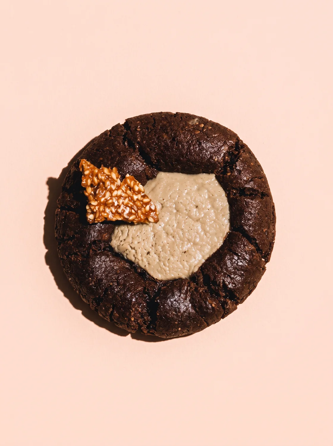
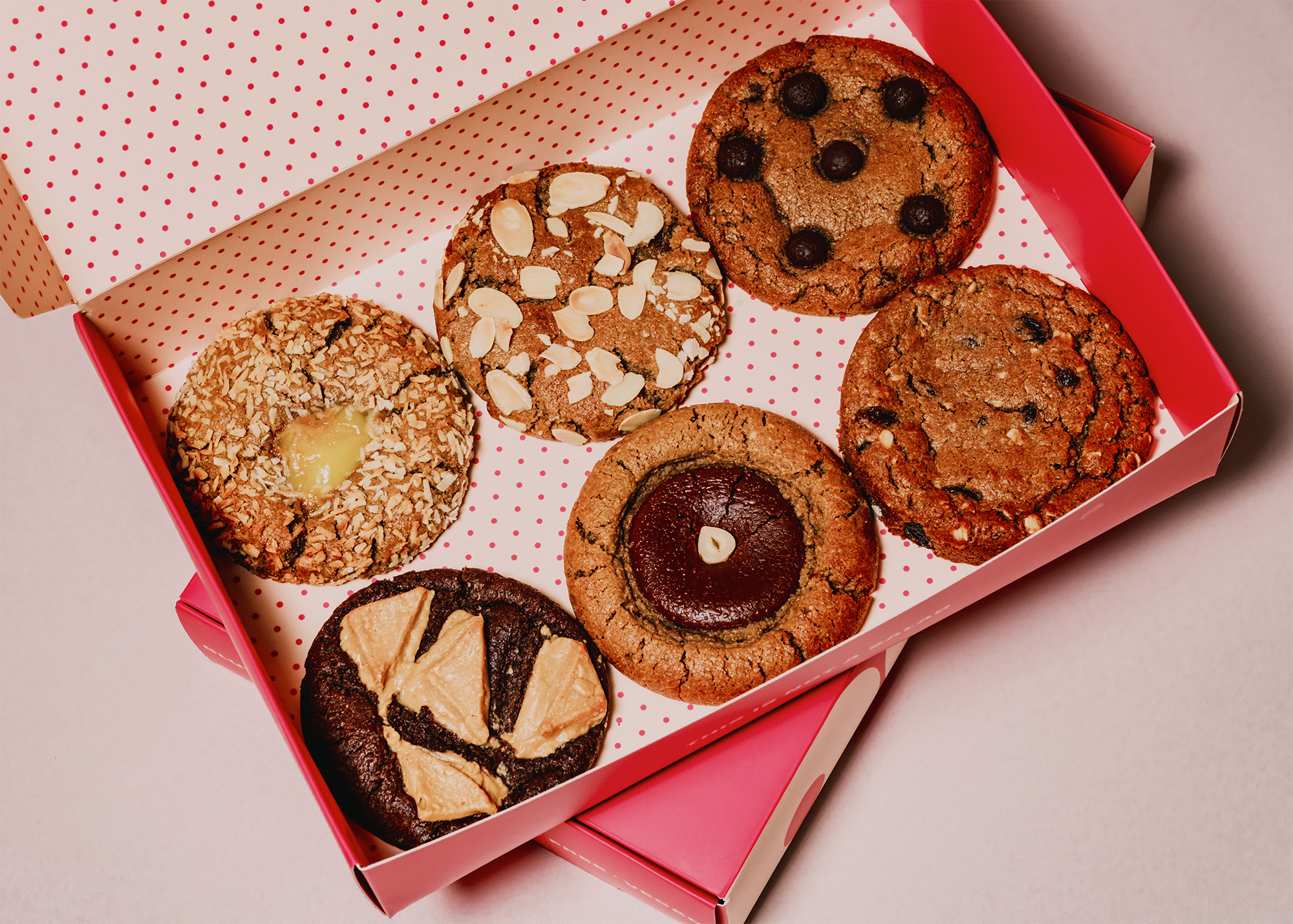
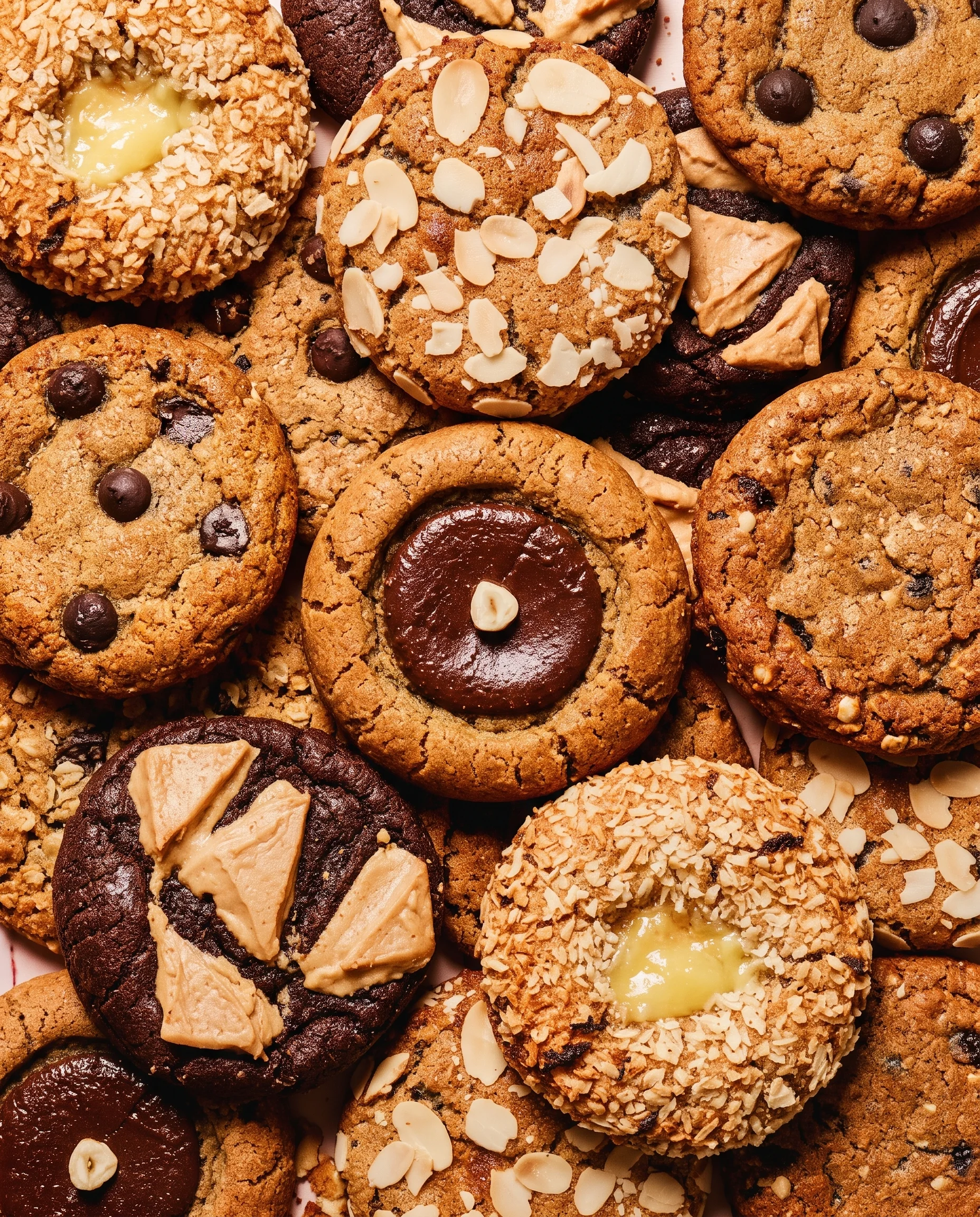
The palette comes straight from the product: deep chocolate browns, whipped cream and a punchy pink that carries the brand across every touch point. The photography celebrates the mess rather than styling it out. Gooey stretches, unbothered crumbs, moments mid-bite, a cookie balanced on the rim of a coffee cup and dunked. It's a deliberate swerve away from the neat, pale, wellness-adjacent look that plant-based food so often gets dressed in.
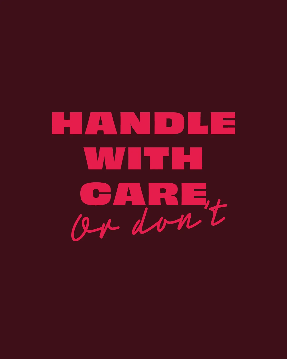
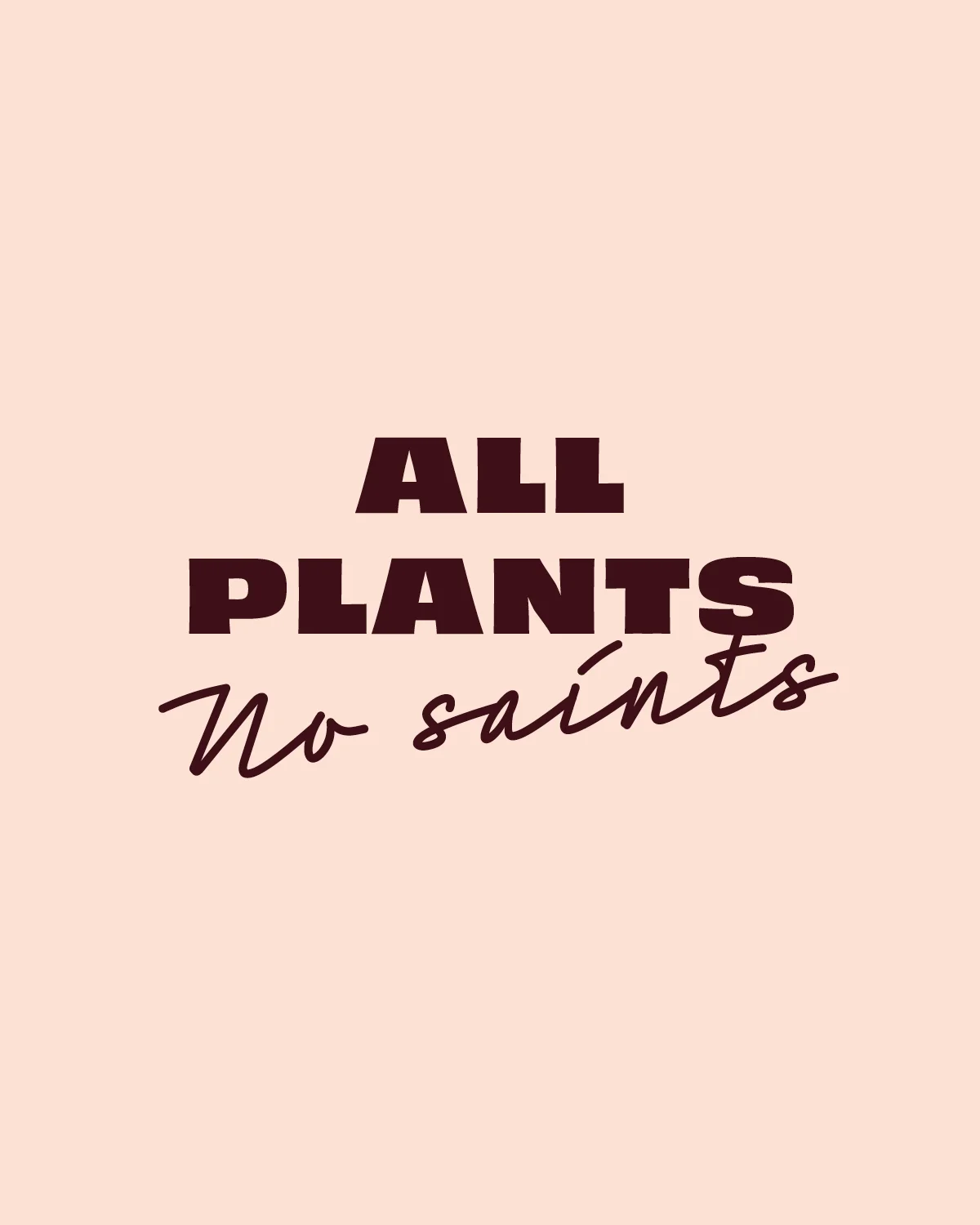
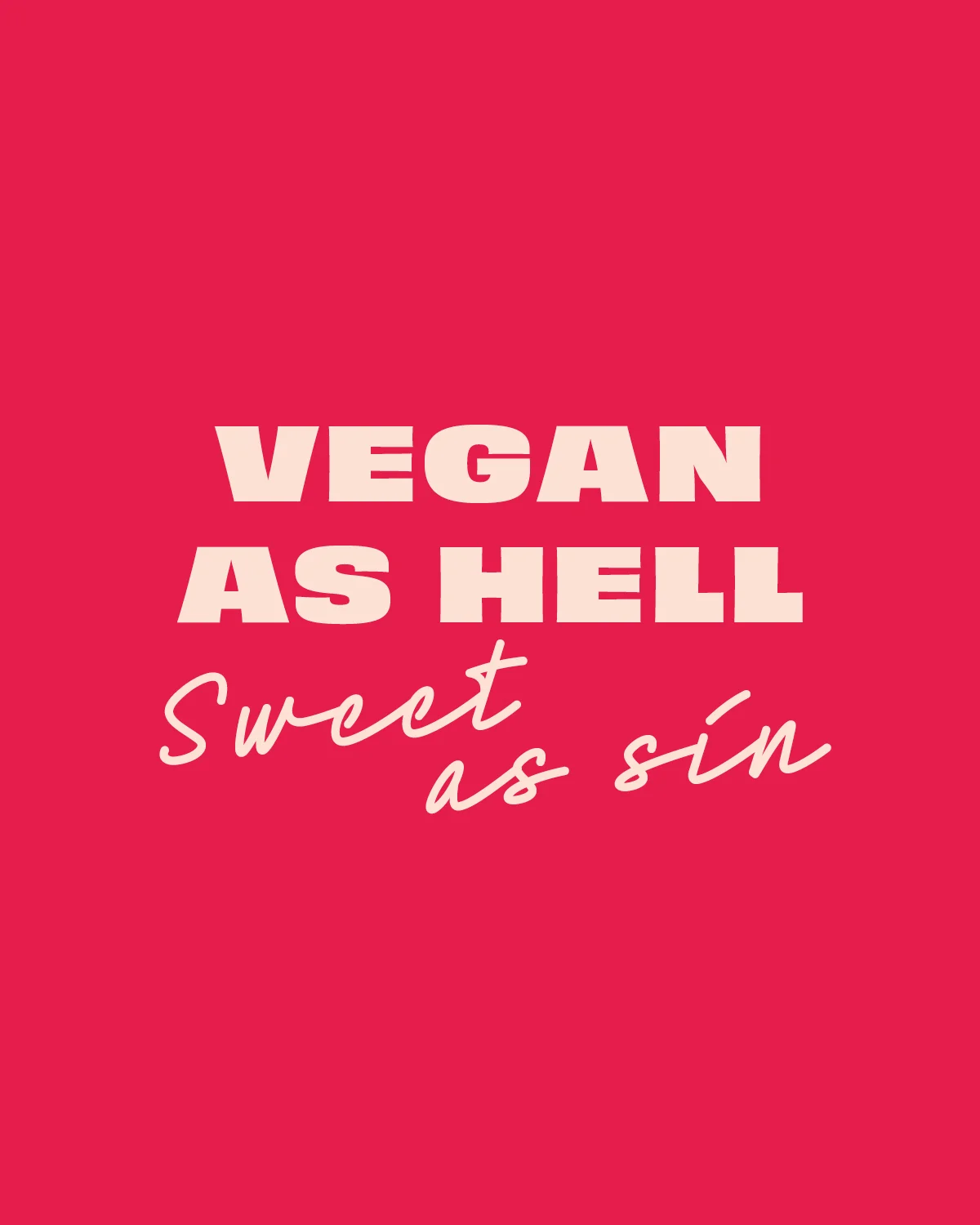

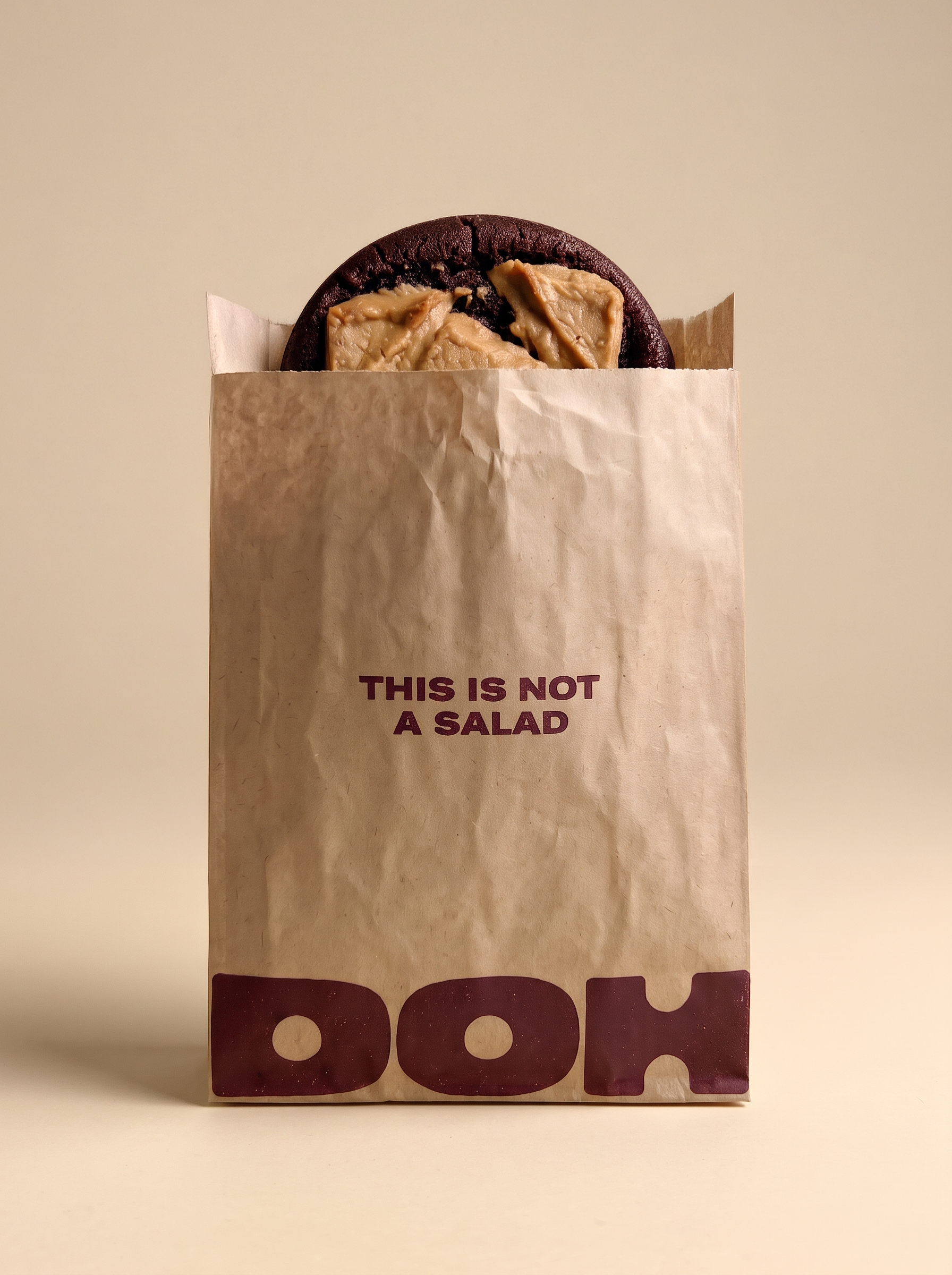
The old brand spent its words explaining what Doh wasn’t. The new tone of voice spends them on the good bit. It is cheeky and directive, written in short, bossy lines that talk to you like a friend egging you on rather than a label reassuring you.
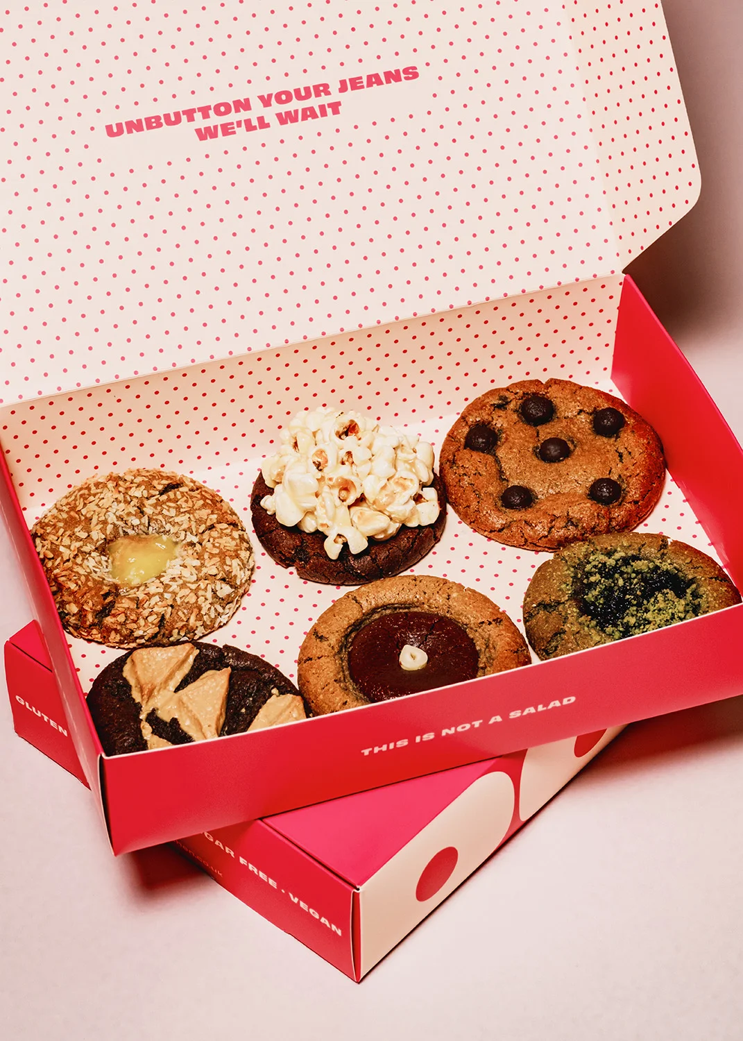
And it turns up where you least expect it. A few lines sit on the front of the pack, but the best are tucked inside lids and along the bottoms of boxes, so the jokes keep coming the further you get into the cookies. Opening the box becomes part of the fun.
It gives Doh a confident edge without any smugness, and it does the heavy lifting that a health claim used to do. The brand tells you how to behave and then makes it clear it does not mind if you ignore it.
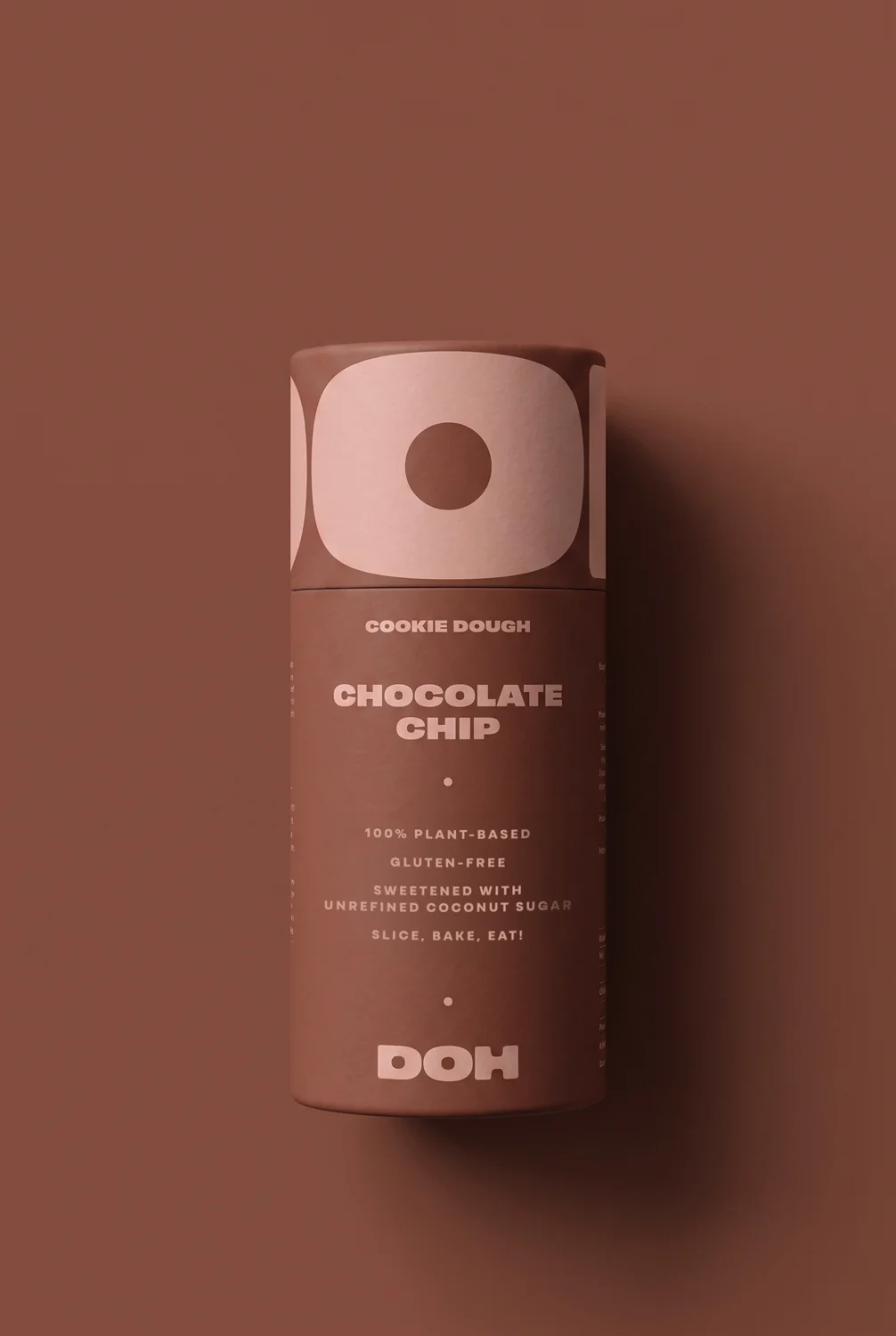
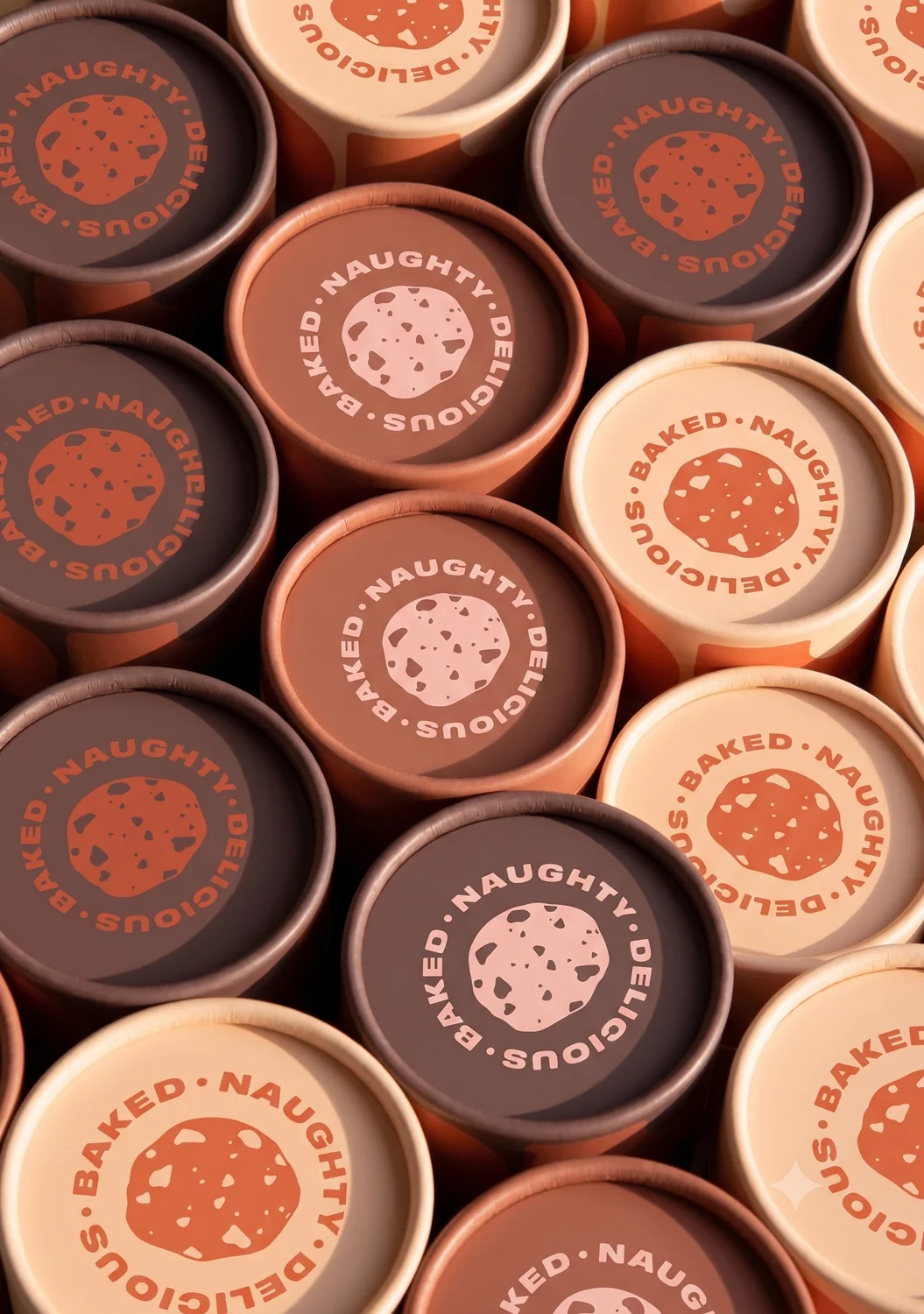
The centrepiece is the cookie dough packaging. Doh's dough comes as a log, so we packaged it as one: a rigid cardboard tube you open, slice from and put back in the fridge.
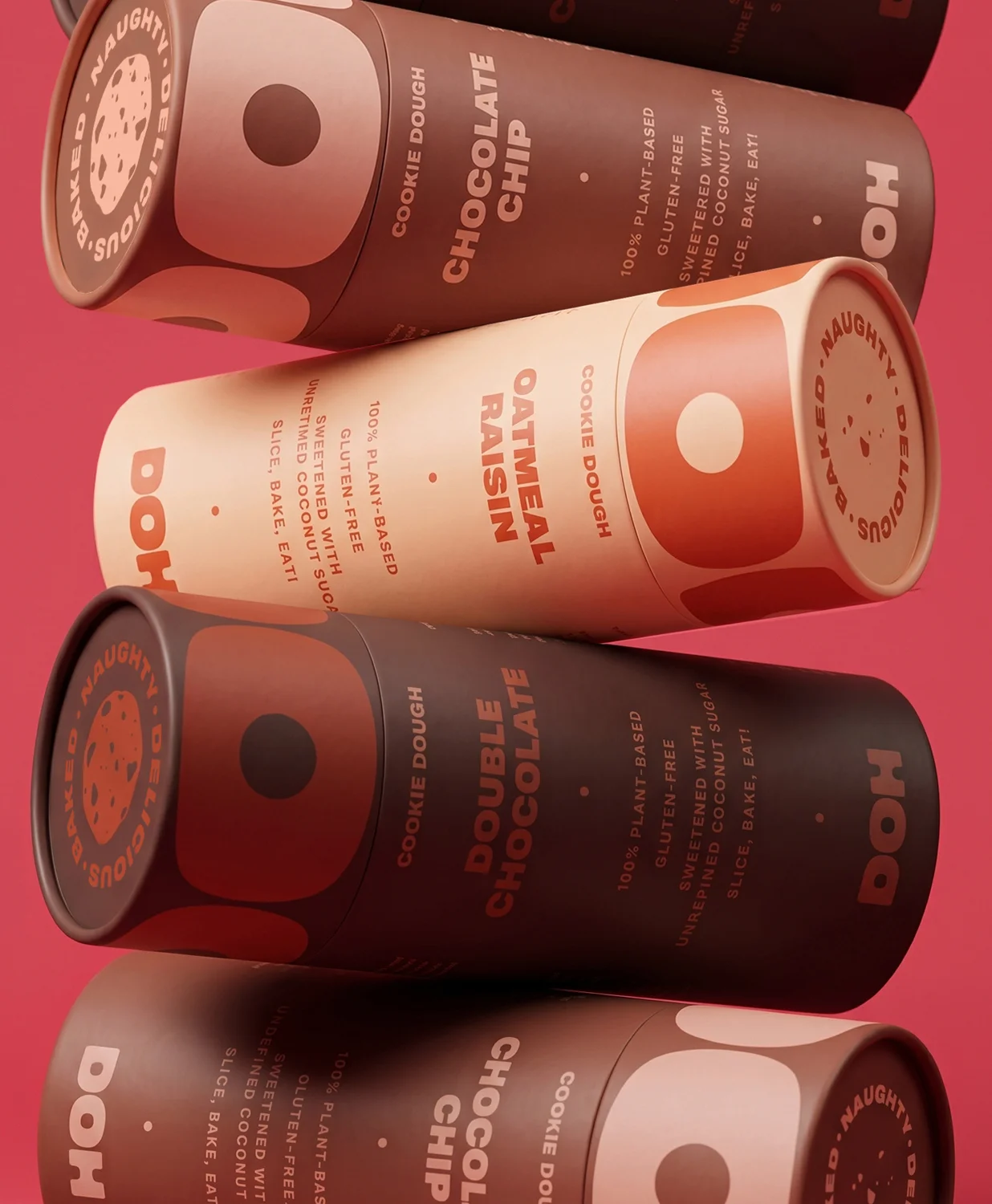
Each flavour takes its own colourway from the palette. Chocolate Chip in deep cocoa brown, Double Chocolate darker still, Oatmeal Raisin in warm cream and terracotta. An oversized crop of the logotype wraps right around the lid, so the brand reads even when all you can see is the top of the tube. The flavour name runs up the side in tight capitals, with the ingredients beneath and the instruction under that: slice, bake, eat. On every lid sits our cookie roundel, a circular BAKED, NAUGHTY, DELICIOUS stamp with an illustrated cookie at its centre.
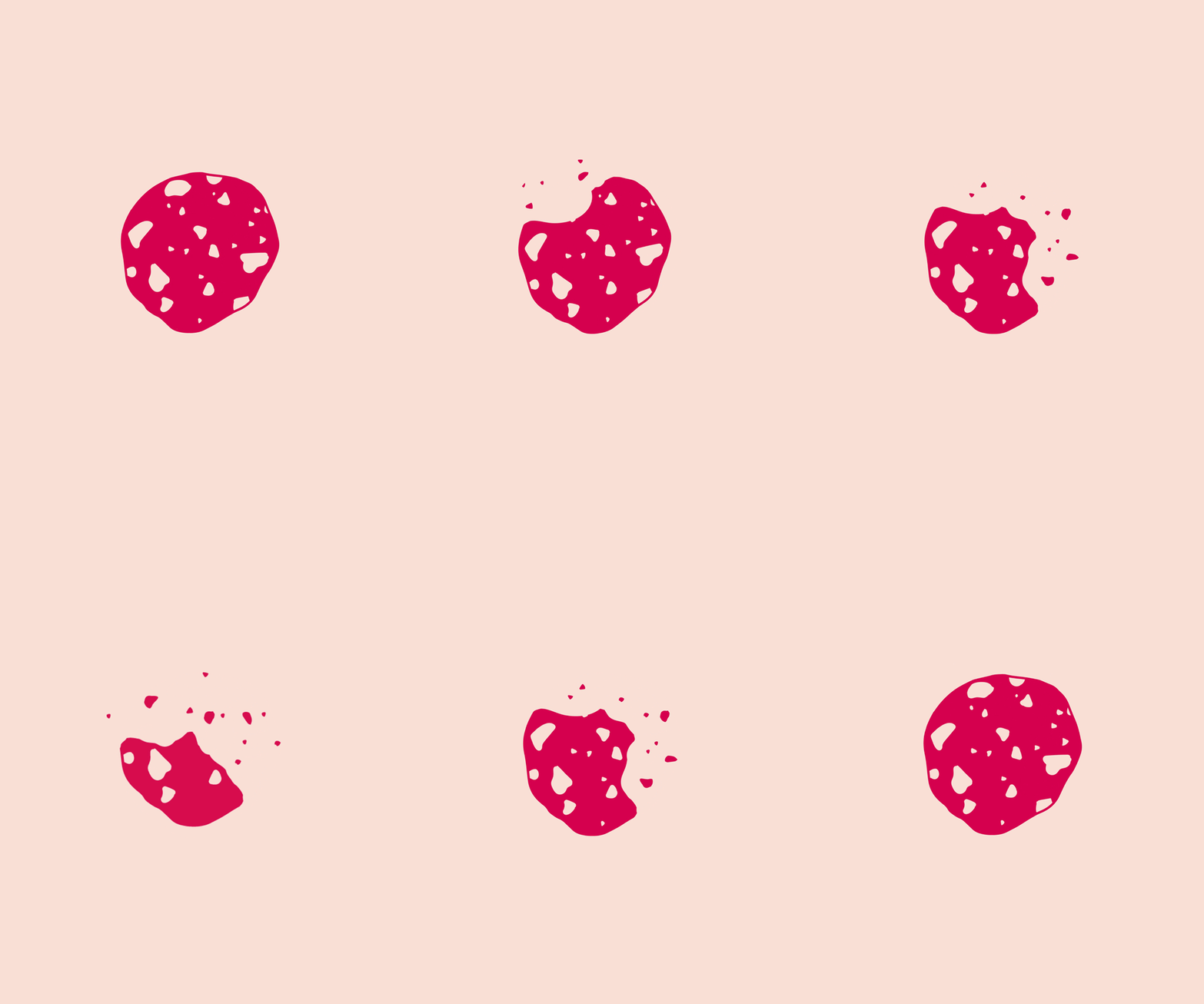

Each flavour takes its own colourway from the palette. Chocolate Chip in deep cocoa brown, Double Chocolate darker still, Oatmeal Raisin in warm cream and terracotta. An oversized crop of the logotype wraps right around the lid, so the brand reads even when all you can see is the top of the tube. The flavour name runs up the side in tight capitals, with the ingredients beneath and the instruction under that: slice, bake, eat. On every lid sits our cookie roundel, a circular BAKED, NAUGHTY, DELICIOUS stamp with an illustrated cookie at its centre.