
JUNO
Juno is a new Italian restaurant and bar at Olympia, and the largest Italian restaurant in the UK. We designed all of it: the name, theidentity, the interiors, the furniture, the lighting and the art. It occupies a Grade II listed hall and calls itself a House of Celebration, which is a promise we had to design our way into - a room that works as well for a long lunch as it does for a late night.


QUEEN OF THE GODS, QUEEN OF OLYMPIA
Our client, Incipio Group, liked the idea of the restaurant being a name. So we started with a lot of reading. Italian idioms and sayings. Italian art, film and music. Food and drink, obviously. Common and uncommon Italian words and what they actually translate to. Ancient Rome and everything that came after it. Then we cross-referenced the long list against Italian restaurants in hospitality hotspots worldwide, to be certain ours was genuinely its own.
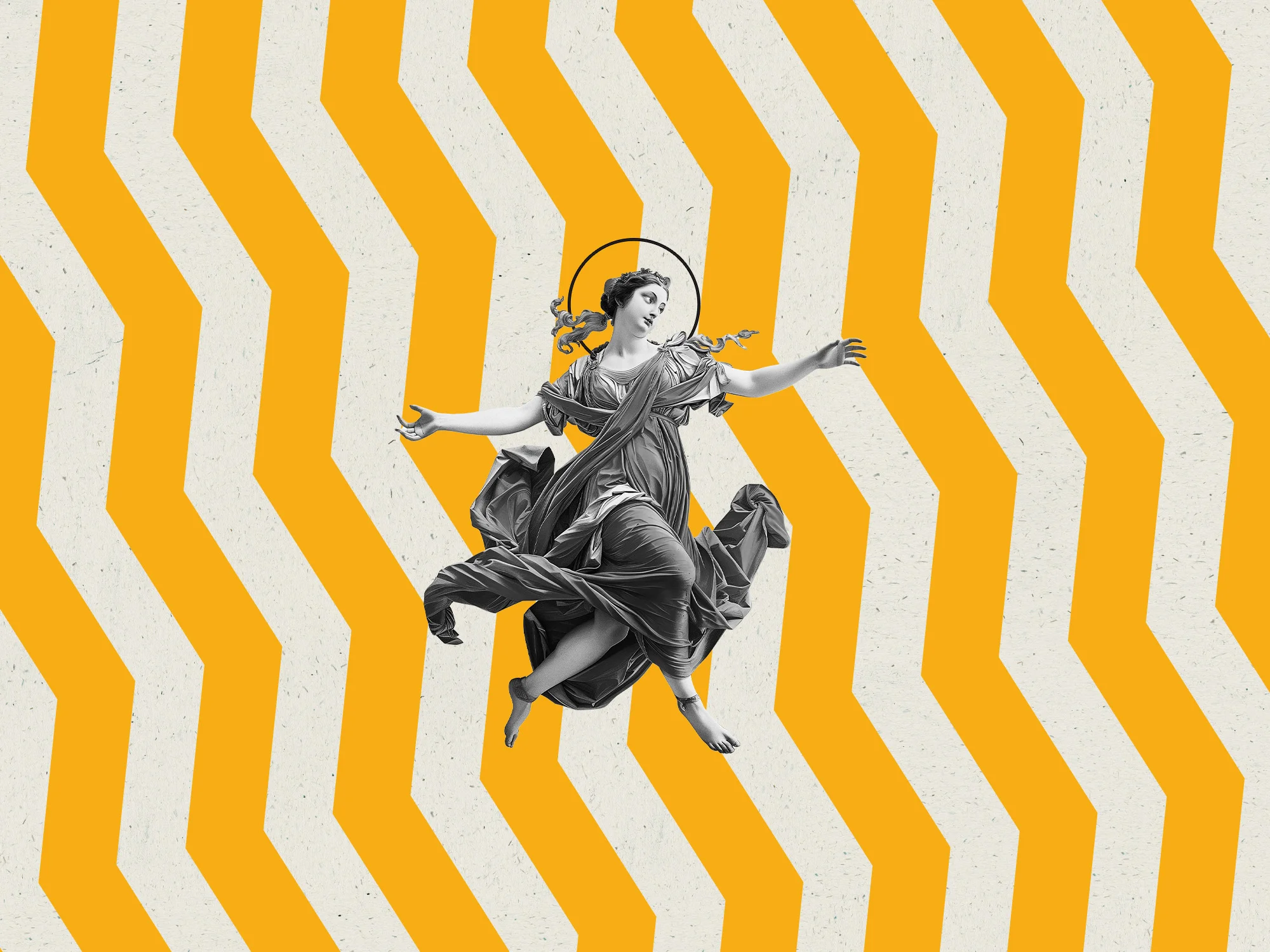
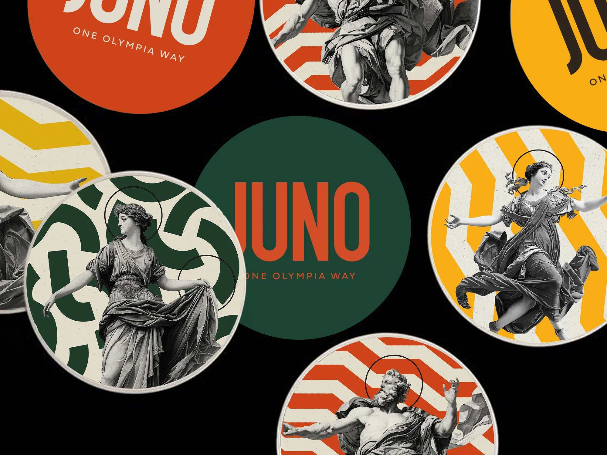
Juno came out of that. Queen of the Roman Gods, wife and sister to Jupiter. Protector, goddess of marriage, and as Juno Lucina the one who brings children into the light. Short, confident, easy to say, and rich pickings for the brand world that followed.

CROSSING THE THRESHOLD
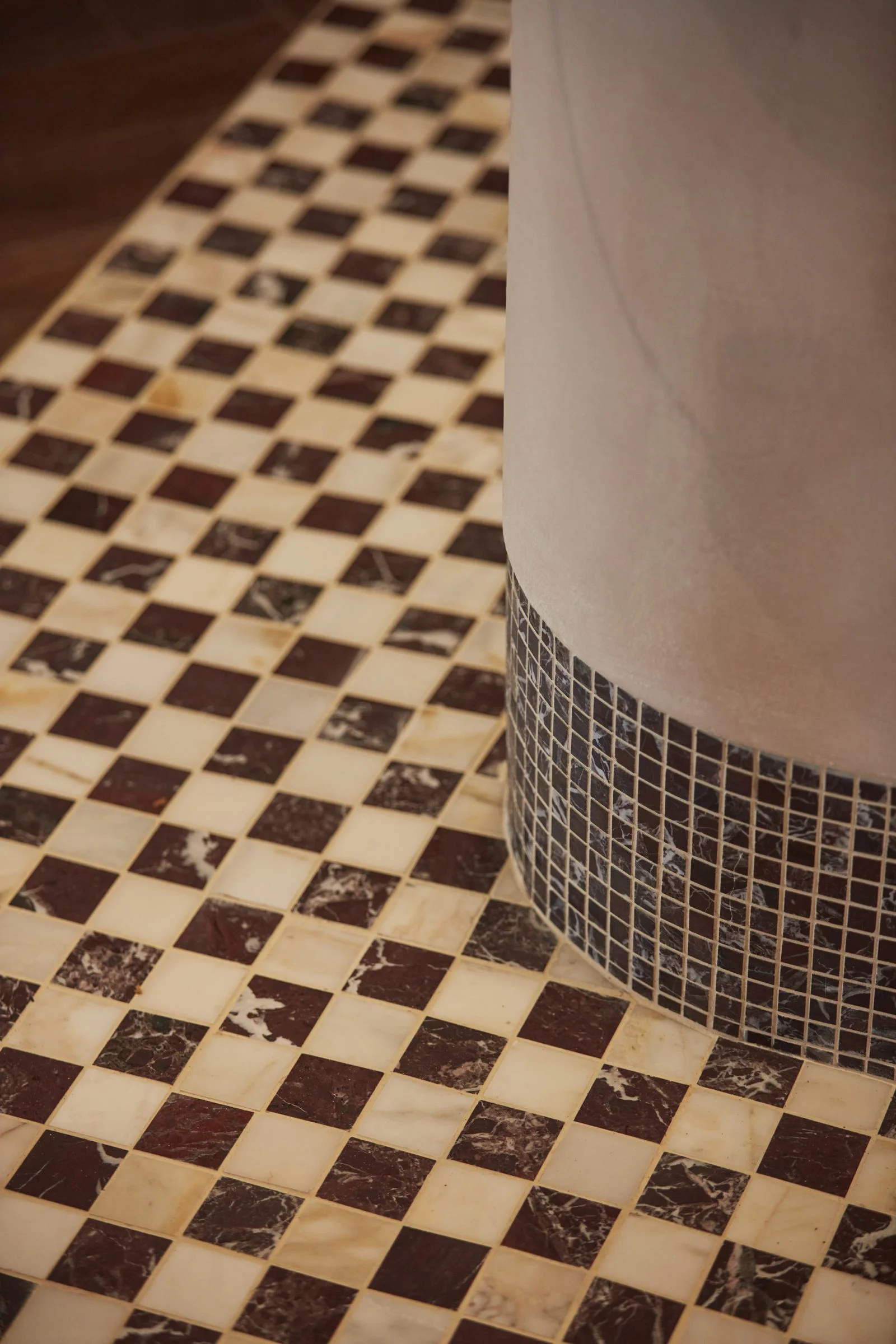
The logomark is the first thing you walk over. At Olympia's heritage corner entrance on Hammersmith Road, guests cross a large Palladiana terrazzo floor with JUNO picked out in a circular gold mosaic underfoot, into a triple-height atrium of timber panelling, polished plaster and chequered marble. Oversized planting softens the architecture, while a red Murano chandelier and a velvet curtain with a black and white zigzag skirt set the scene.
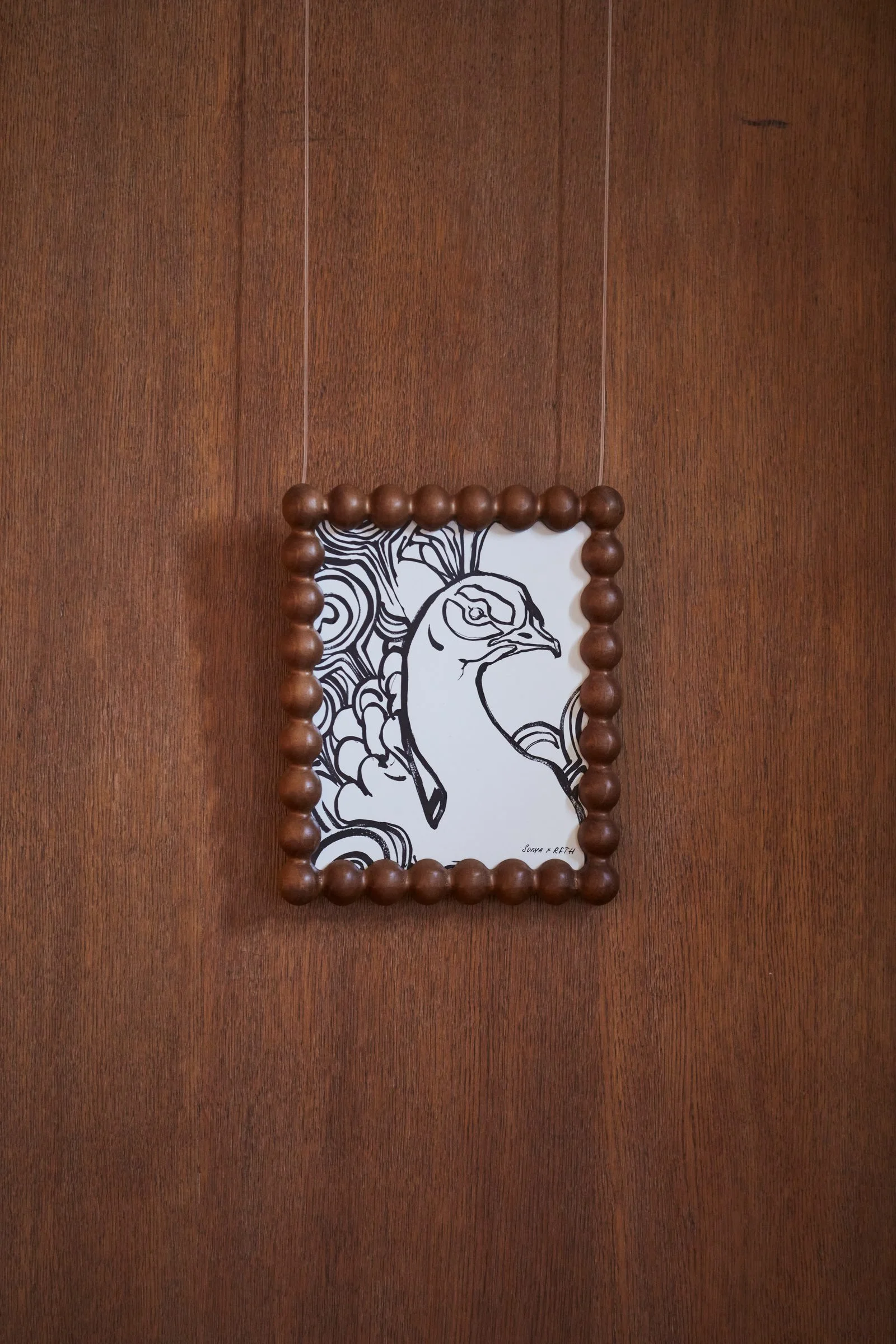
Beside the fringed host station, our artwork of Juno in a peacock-feathered gown sits in a vintage timber frame, the first glimpse of the mythology before the dining room reveals itself.

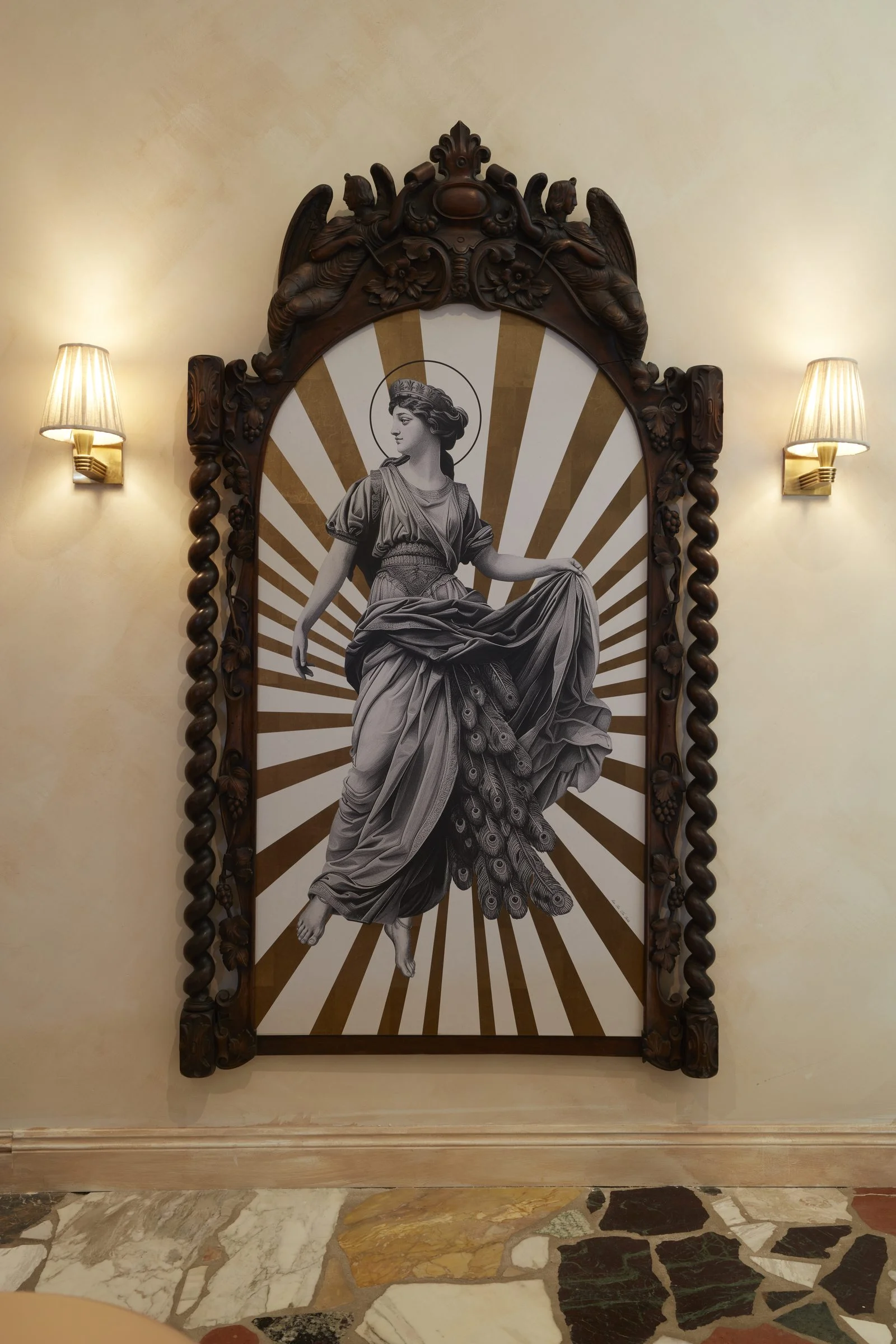

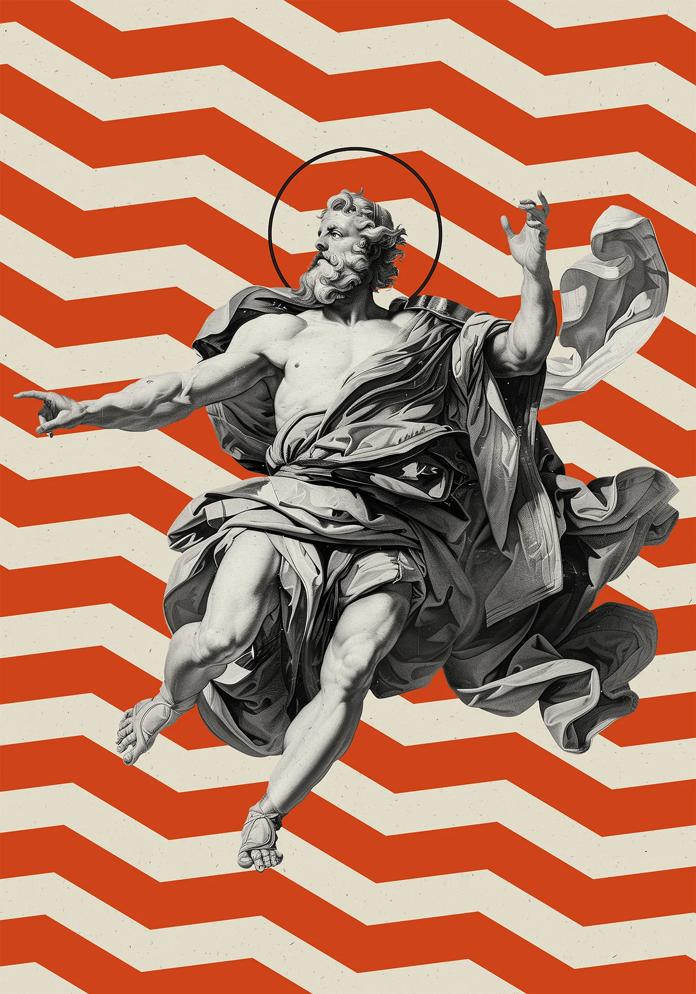
We took the two greatest eras of Italian history and put them in the same room: gods of the Roman Empire, painted with the eye of the Renaissance.
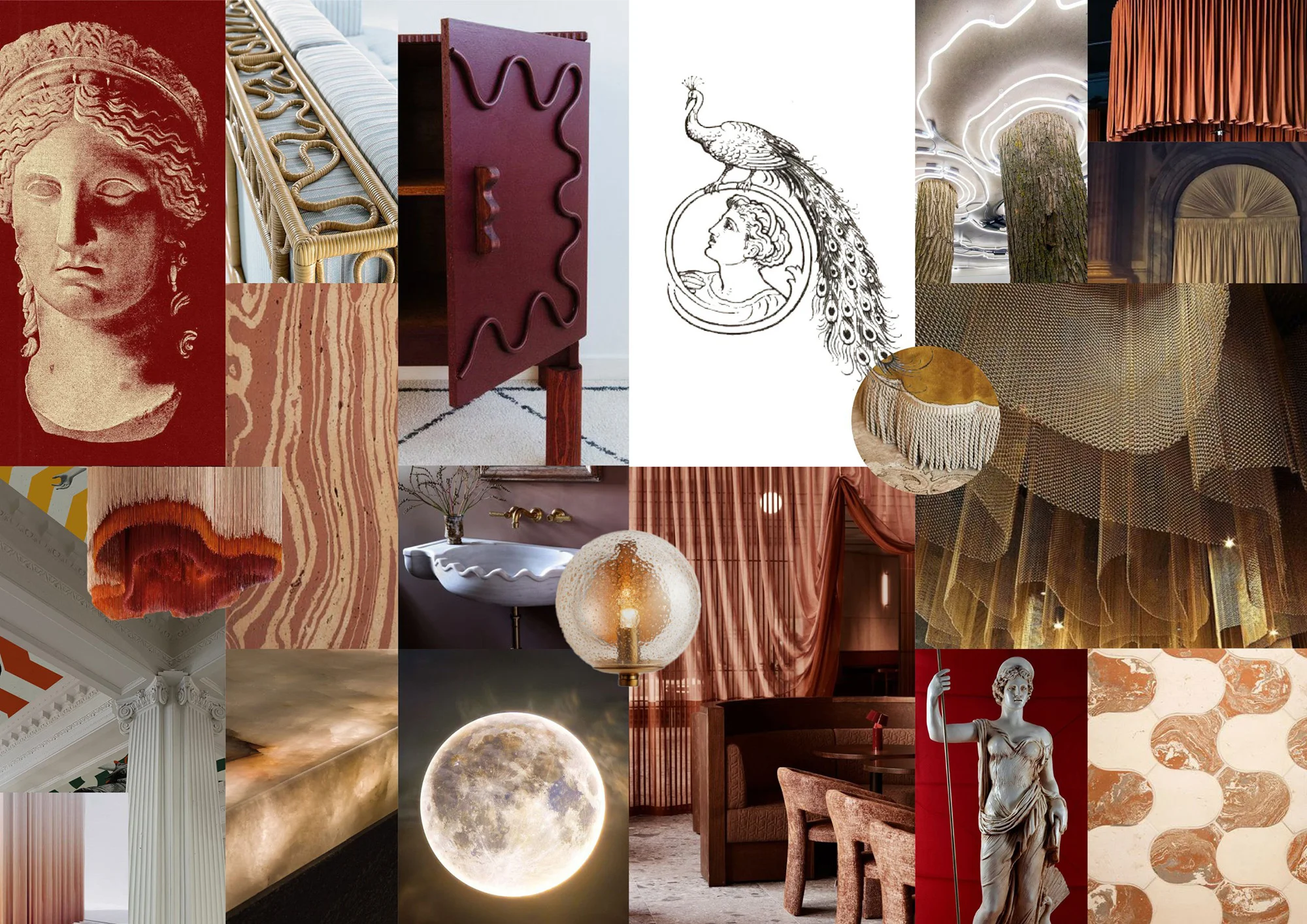
Juno's sacred animal is the peacock, and it became the thread running through everything. In classical art the eyes in its tail belong to hundred-eyed Argus, placed there by the goddess herself, a symbol loaded with beauty, watchfulness and theatre that could move freely between branding, art and interior detail. We rendered the brand world in a Renaissance painterly style that gives the identity depth and a sense of age, then pulled it into the present with bold colours, geometric patterns drawn from the shapes of pasta, and a sans serif logomark that keeps the whole thing sharp.


TAMING A TITANIC ROOM
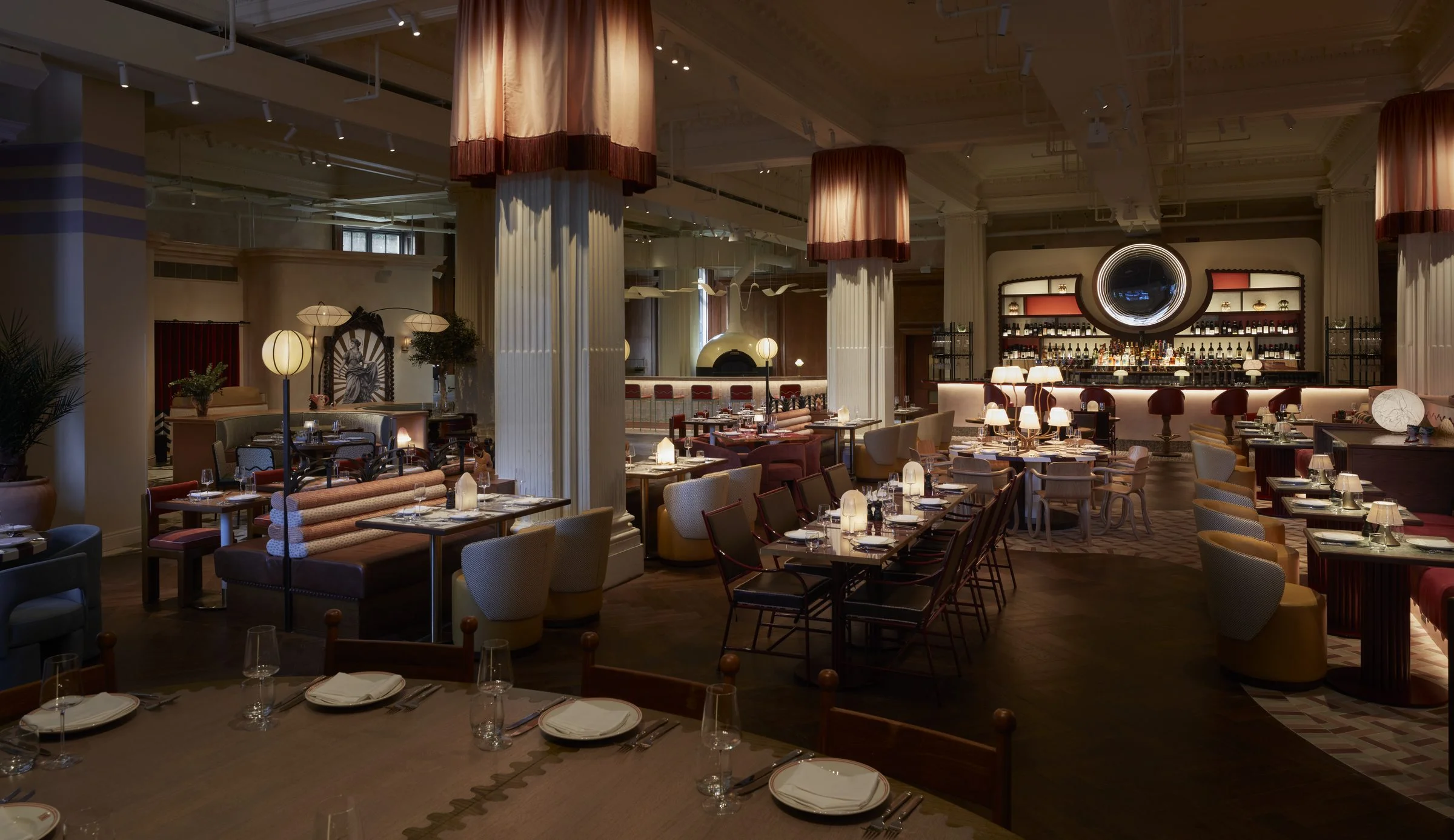
Then the room itself. Grade II listed and vast, with four heritage columns at its heart, original panelling, Crittall-style windows and decorative ceiling details. We treated all of it as the foundation of the scheme rather than a set of obstacles, an aged canvas to layer the building's next chapter onto.
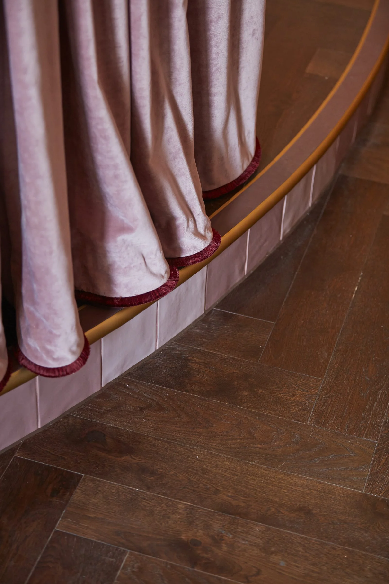
The scale was exciting. The challenge was making Juno feel intimate as well as spectacular. The four columns are draped in silk and luminous ombre velvet with delicate silk fringes at the hem, hung from frameworks suspended off existing structural pegs so the historic fabric is barely touched. The drapery softens the columns, brings the sightline down, and conceals the Greek Revival capitals so Juno's Italian mythology comes to thefore.
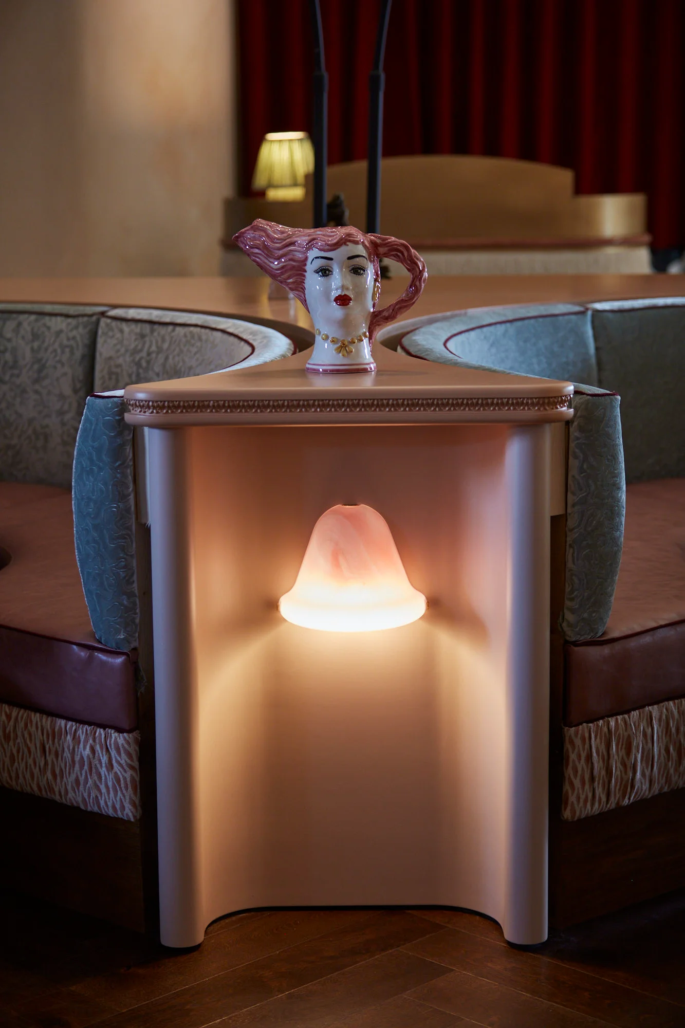
Screens, curtains, lighting, shifts in flooring and carefully grouped furniture create pockets of intimacy inside the titanic hall. More than eighteen floor finishes bring character underfoot, sweeping curves and tiled banquette borders define the dining zones, and dusty pink banquettes wrap around two of the columns, turning their scale into an asset. They are tall enough to cocoon a table during a quiet service.
THE STAGE
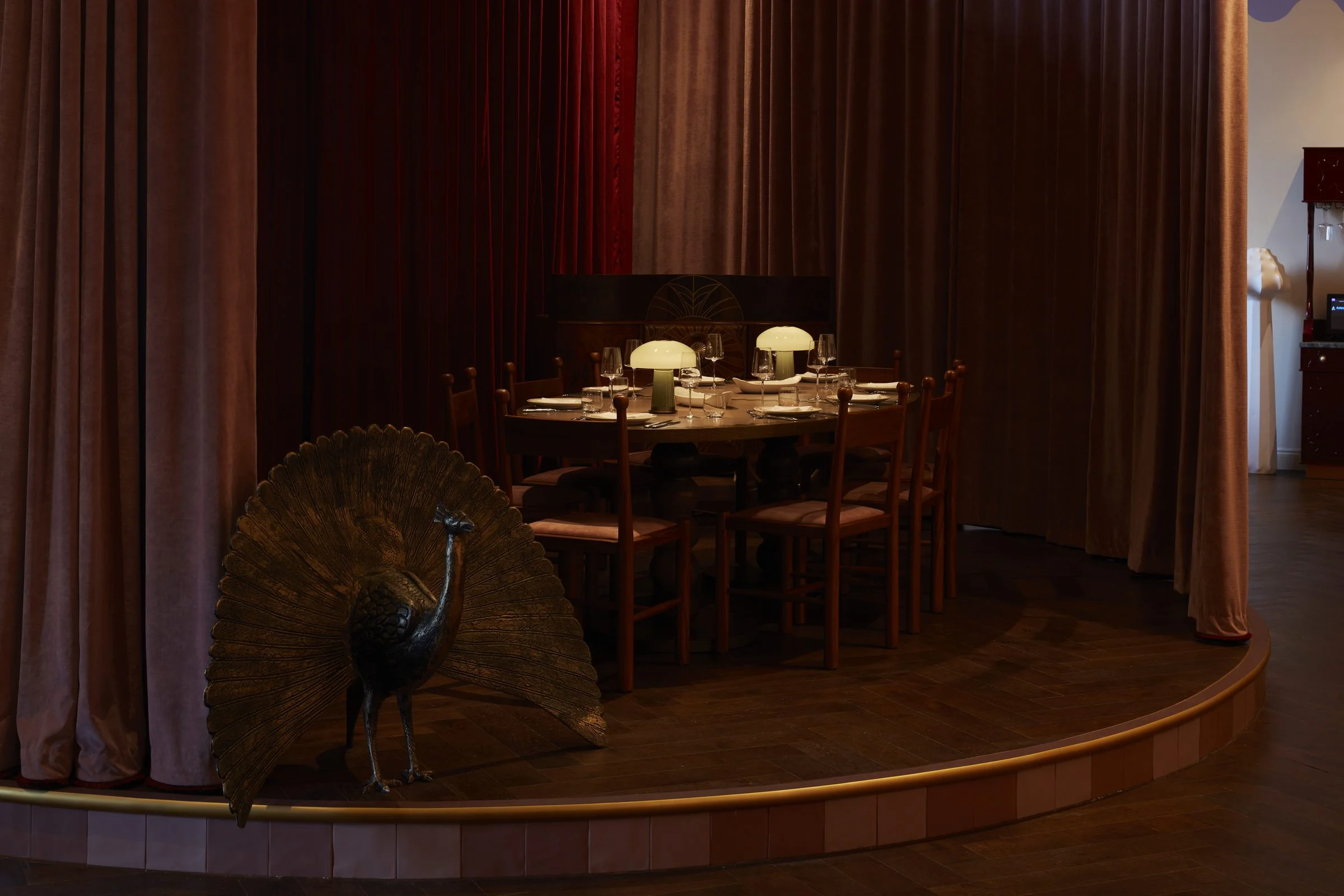
Opposite the bar, a raised semicircular stage adds another layer of theatre. Dusky pink and claret velvet curtains frame a custom deco-inspired DJ booth, and the stage itself converts into a semi-private dining room. Performance informed the planning from the outset, with views choreographed across the restaurant so the entertainment feels integral rather than incidental. Almost every seat feels like the best seat in the house.

NONNA'S PASTA RACK
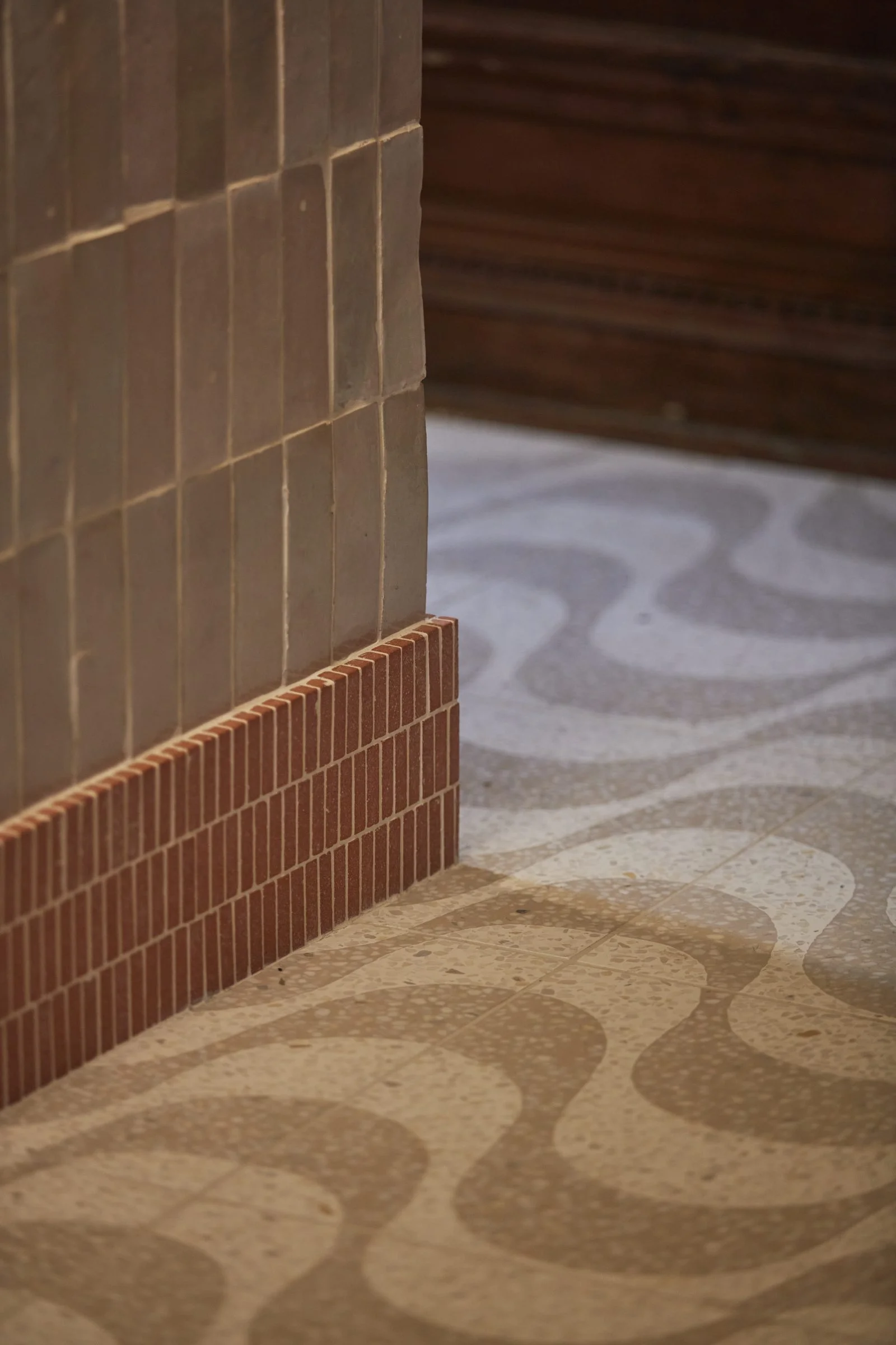
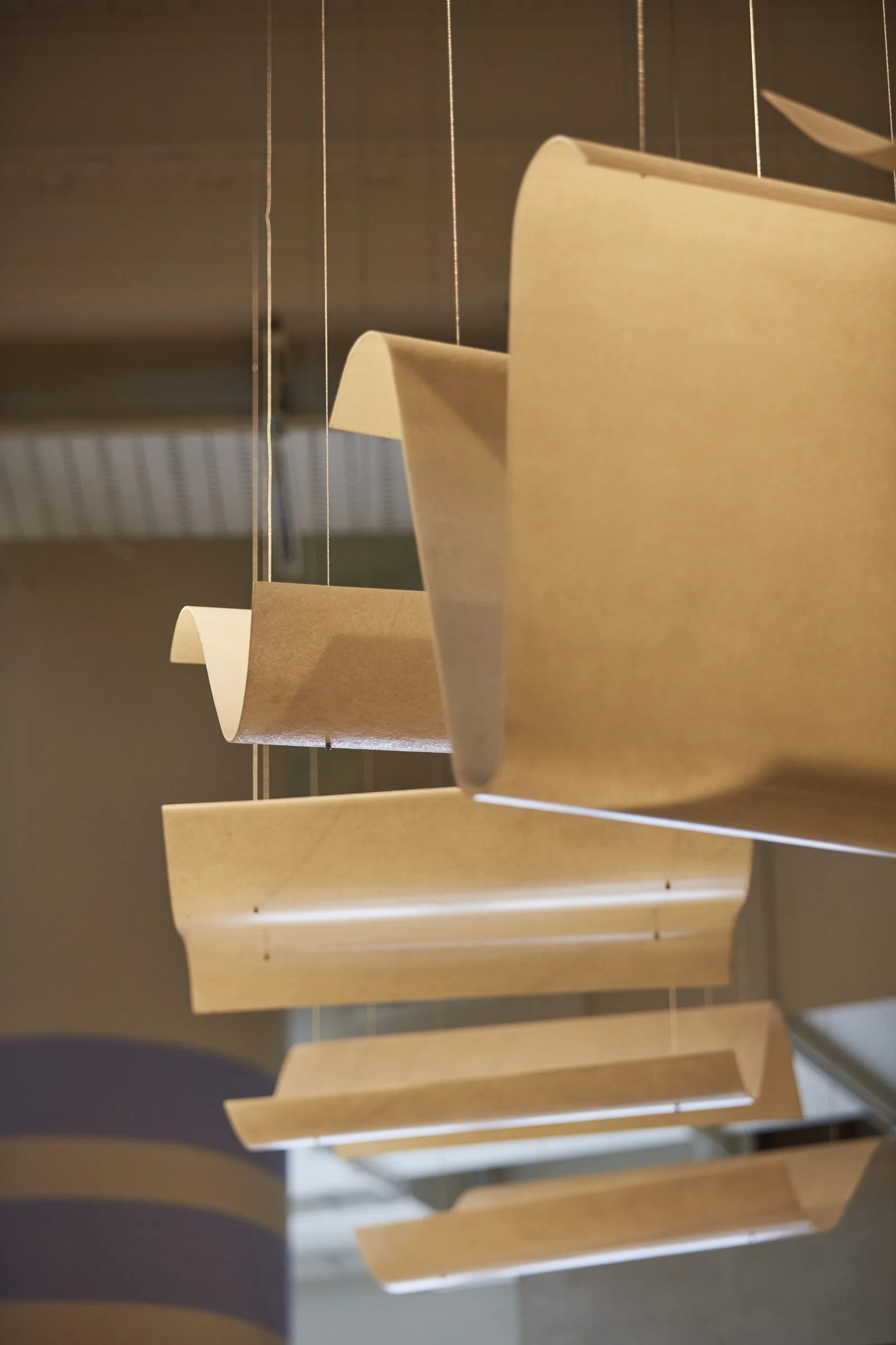
At the pizza kitchen and dining counter we took a familiar piece of Italian domestic life and made an art installation of it. Inspired by Nonna's pasta drying rack, sculptural ceramic sheets of lasagne float above the pizza oven as though hung out to dry. Glazed tiles, terracotta, wavy detailing and a rippling encaustic floor carry the pasta geometry below.



THE BAR
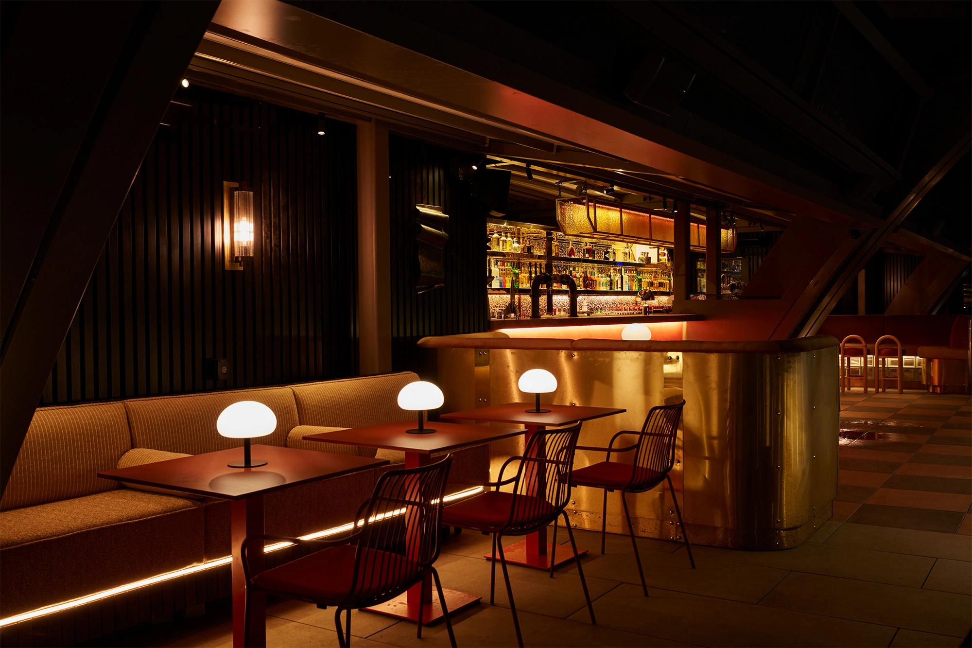
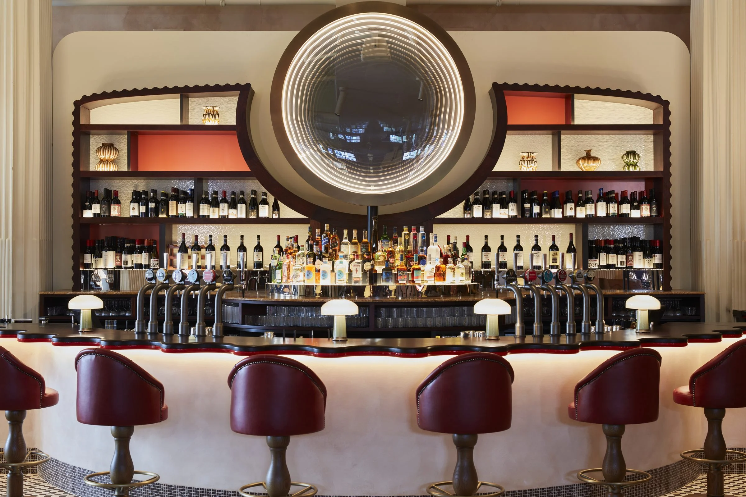
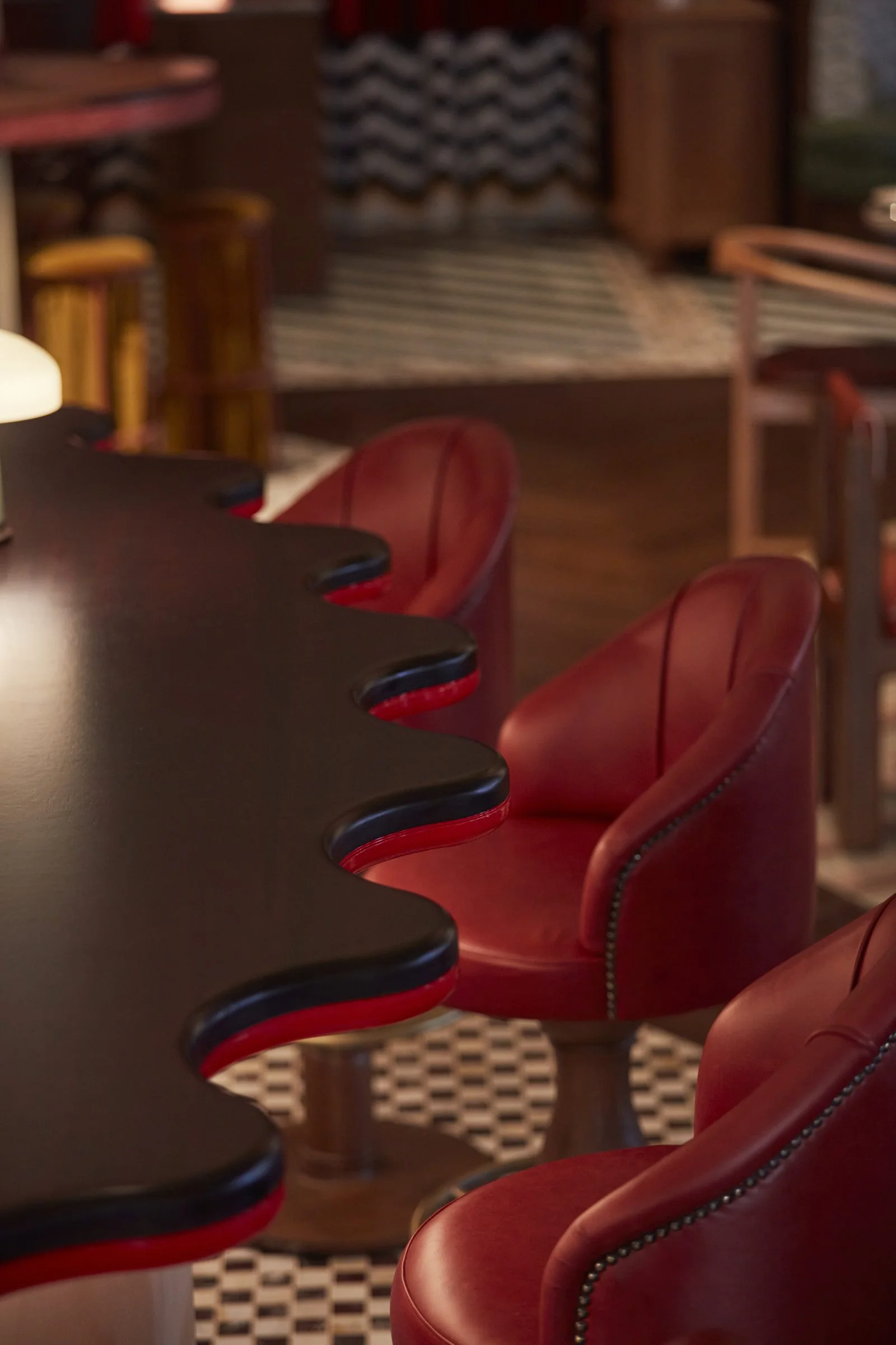
At the heart of the restaurant, between two recessed columns, the cocktail bar works as both anchor and theatre. Undulating joinery meets deco-influenced metal work, and a circular infinity mirror sends rings of golden light deep into the reflection, a nod to Juno Lucina and her association with bringing things into the light. The bar distils the whole project into one moment: mythology translated into light, graphic curves given physical form.


A PLAYFUL PATCHWORK
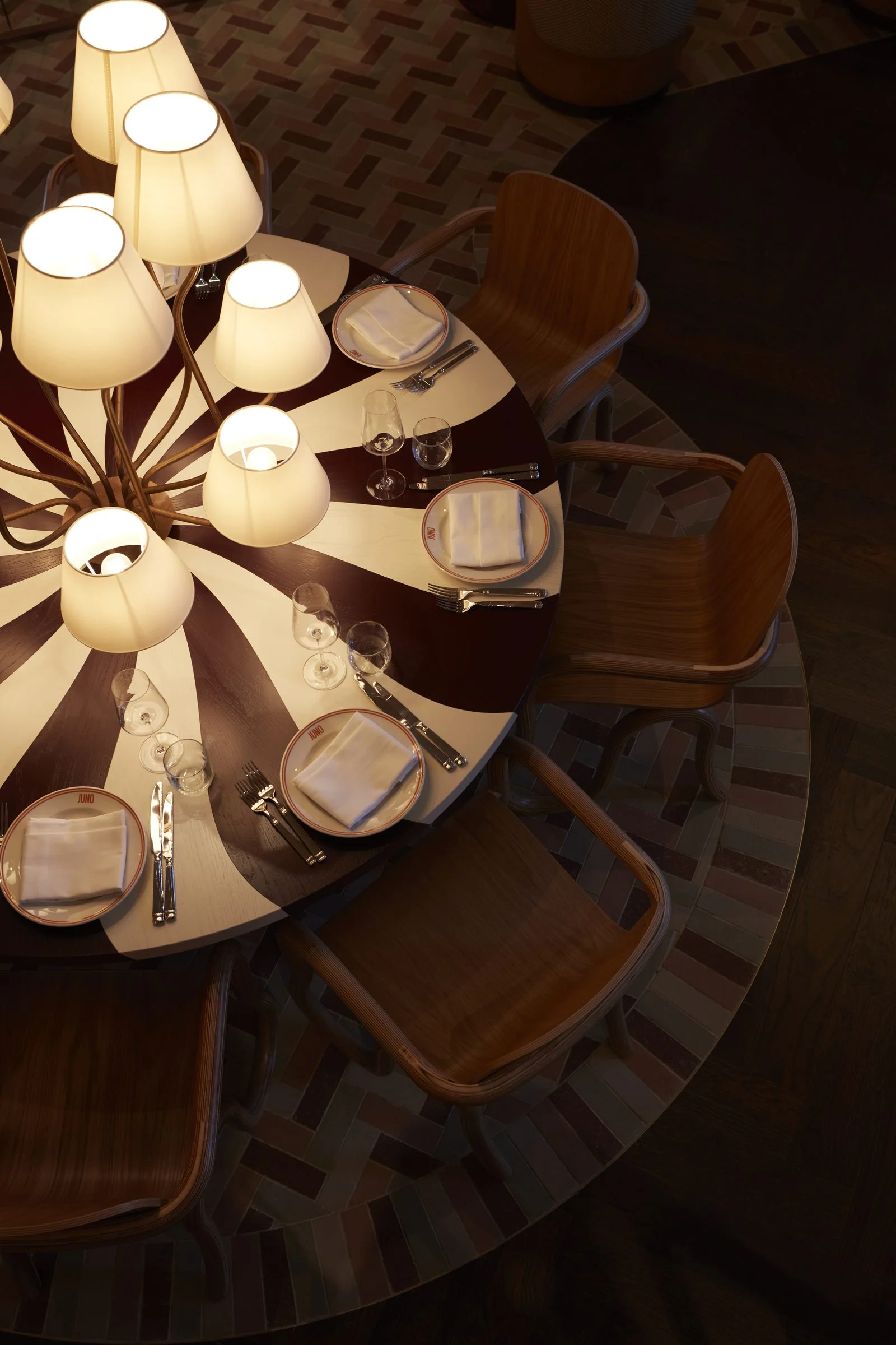
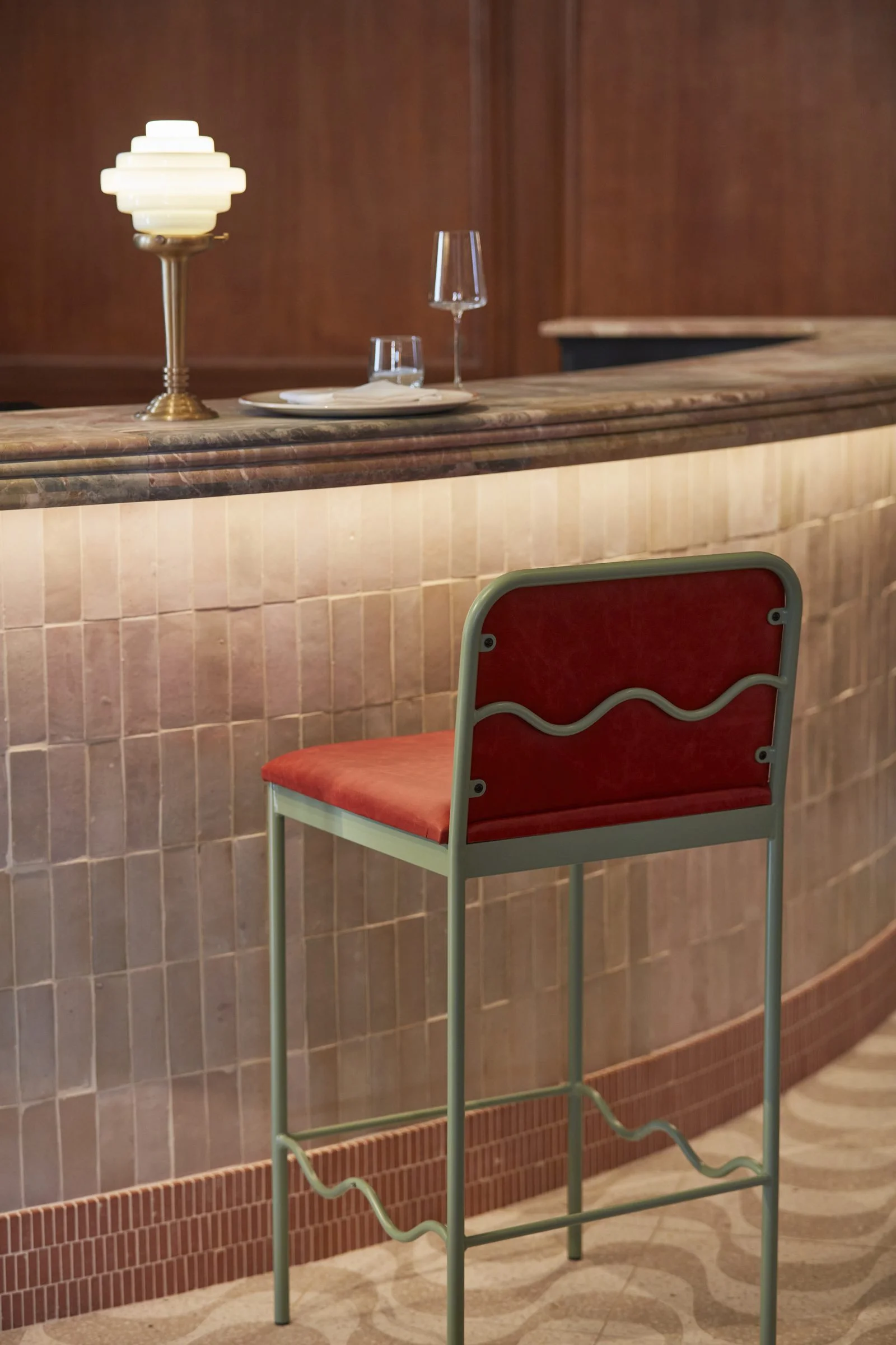
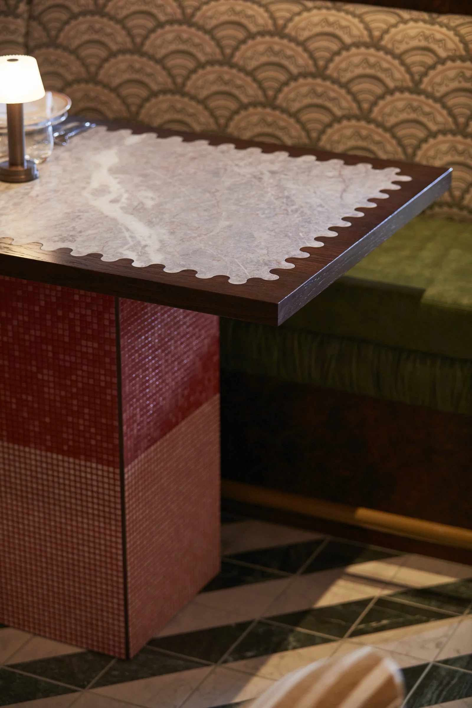
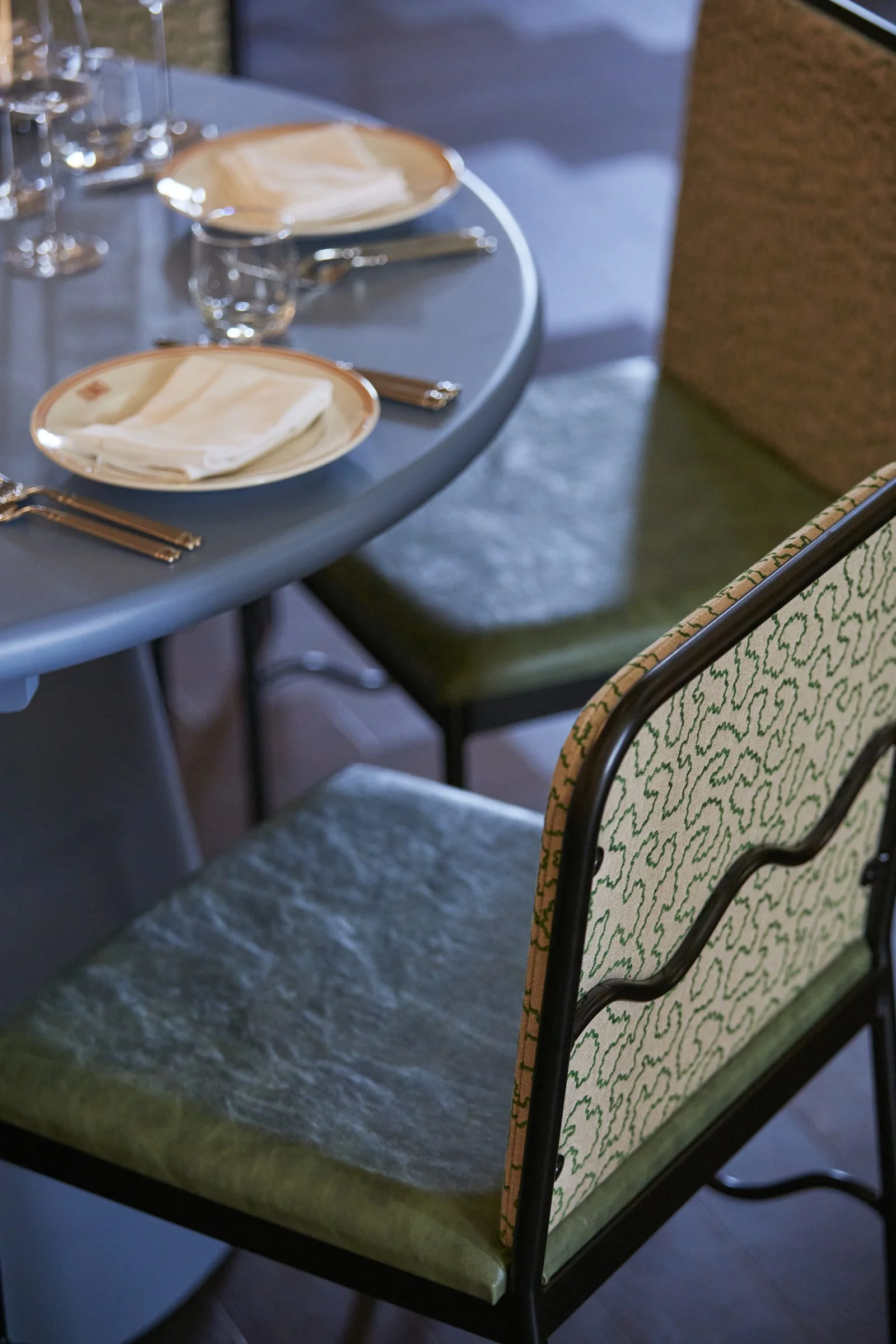
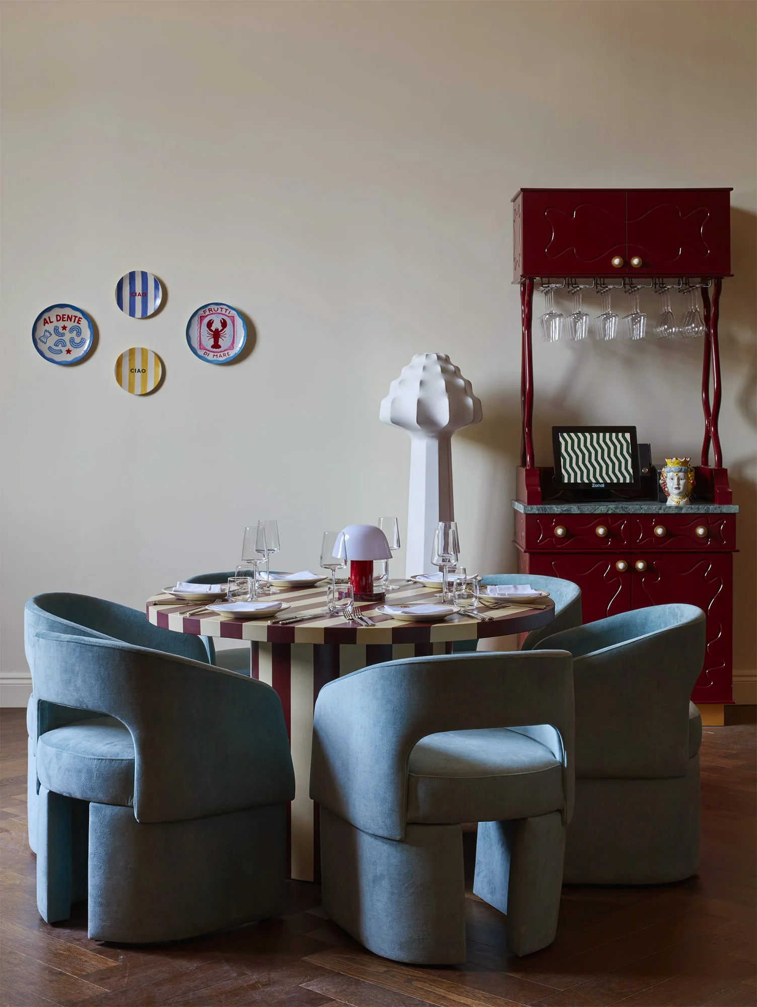
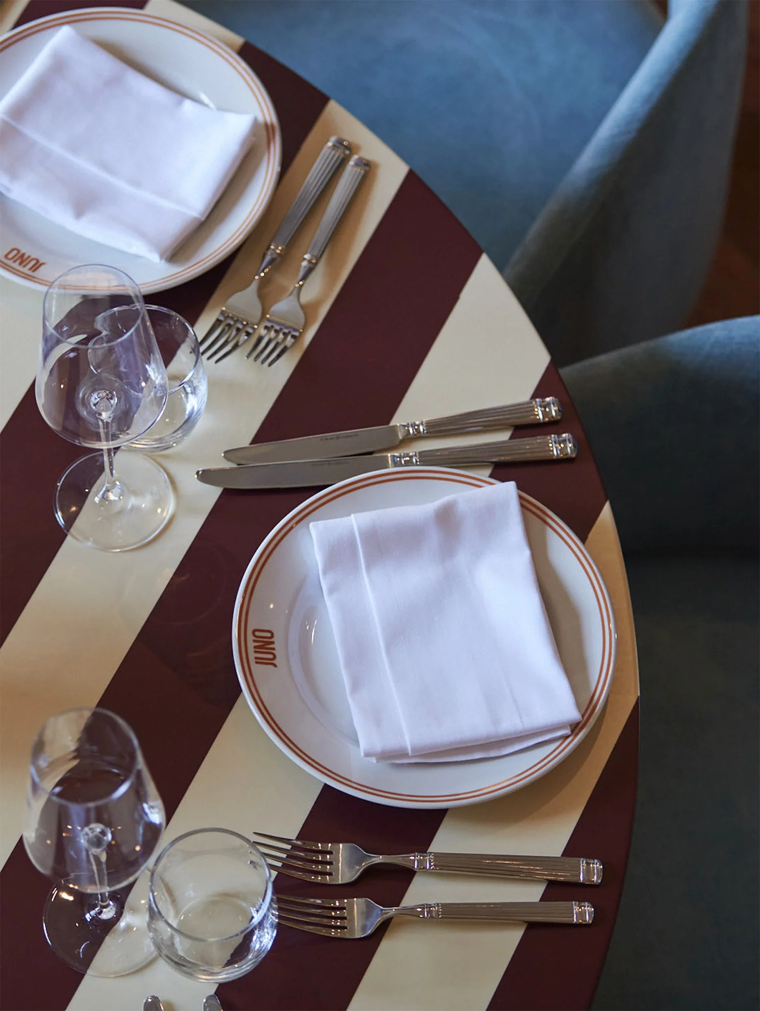
The custom furniture programme runs right through the building. Tables combine timber swirls, stripes, marble, burl and cane. Chairs and stools pick up the same fluid forms found in the graphic work. Square and curving shapes, checks and wavy fabrics make a playful patchwork against the historic backdrop.
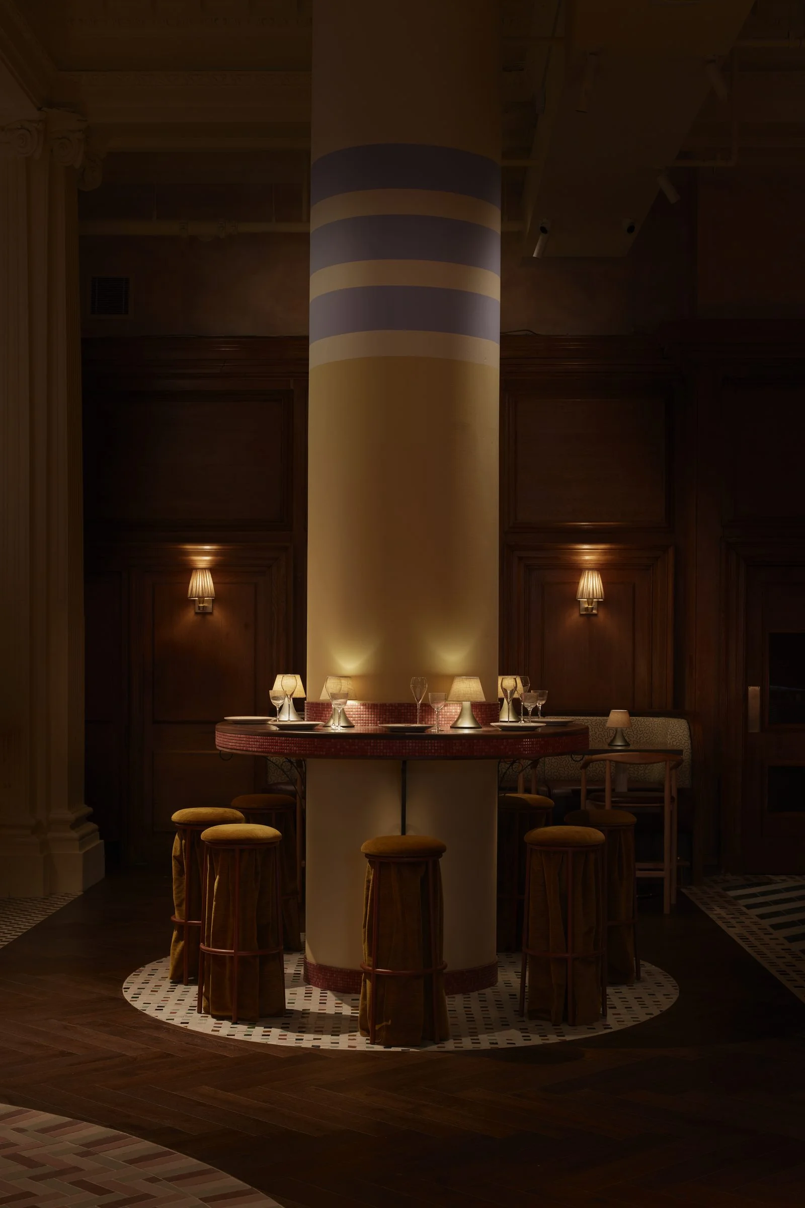
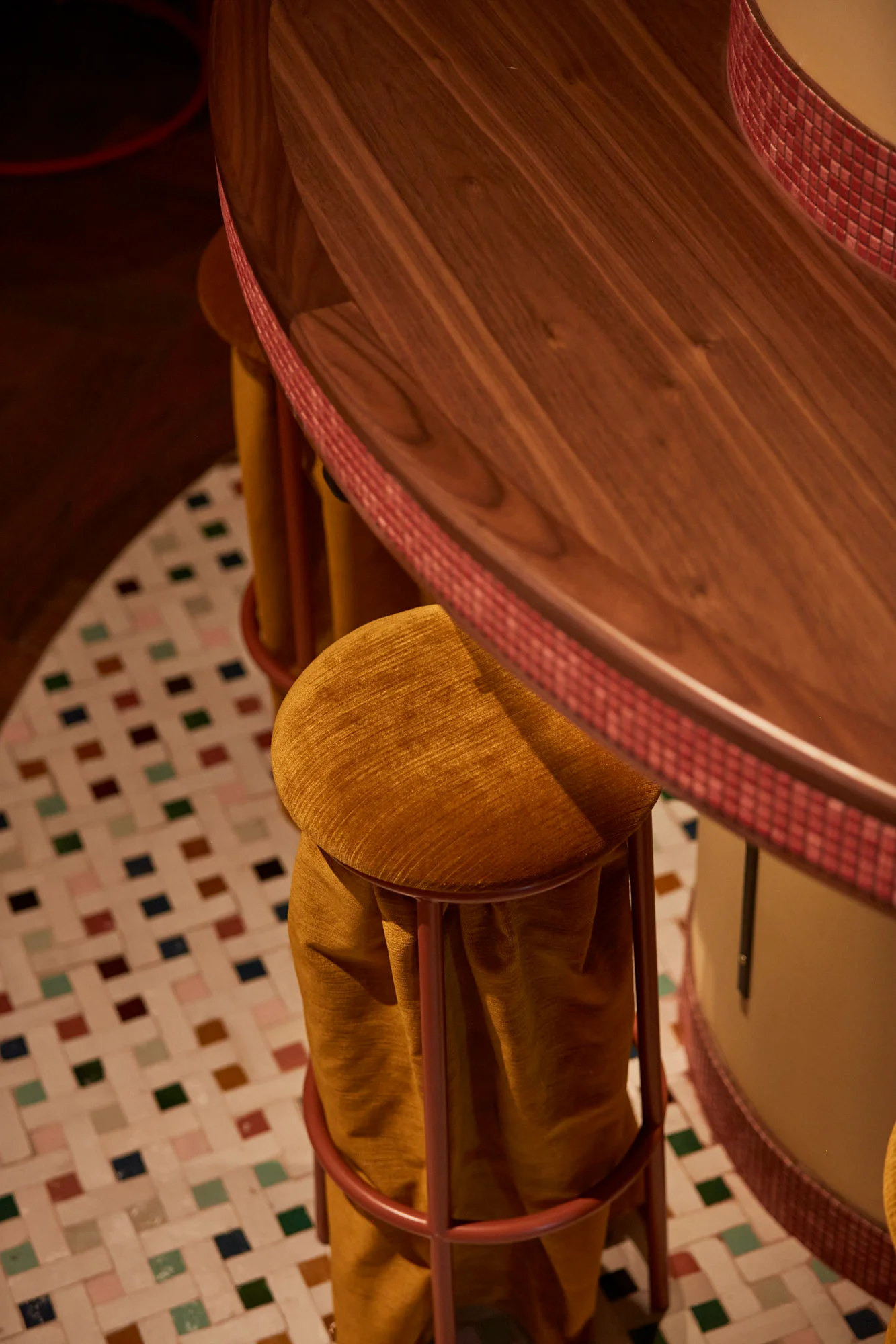
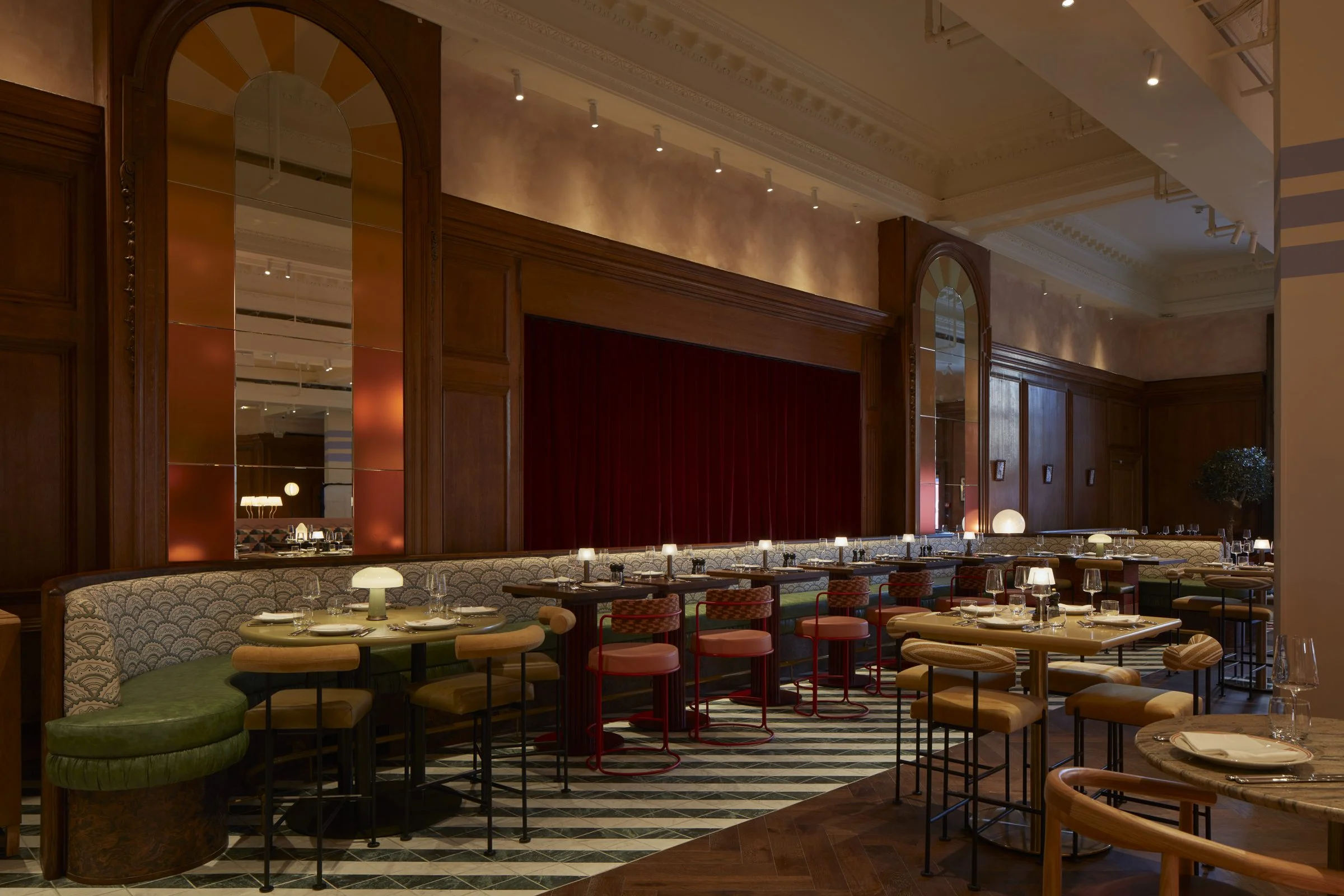
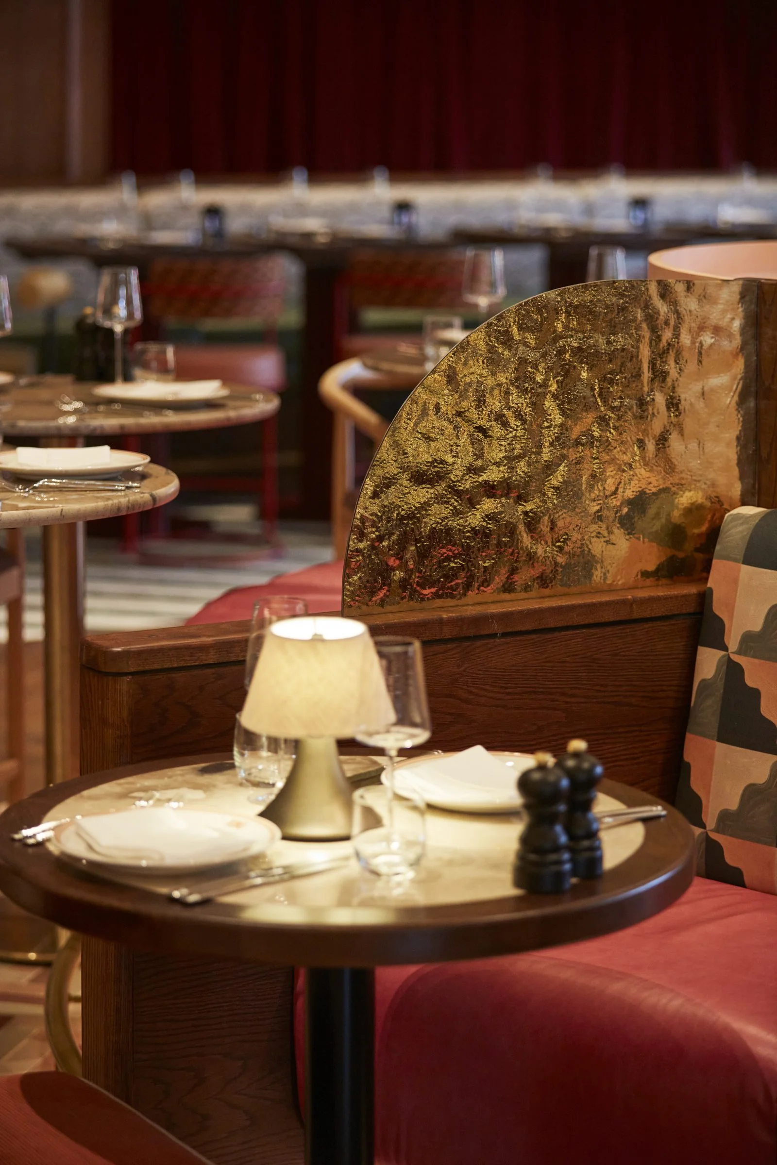

We took cues from the glamour and optimism of Italy's goldenage and gave them a playful contemporary edge. Blush, claret, coral and green sit alongside warm timbers, marble, terrazzo, patterned floors, vintage-inspired glass, brass and gold. The sorbet shades evoke coastal Italy, balanced by deep red velvet. Curves, scallops, stripes and squiggles establish a visual language that moves between elegance and irreverence.
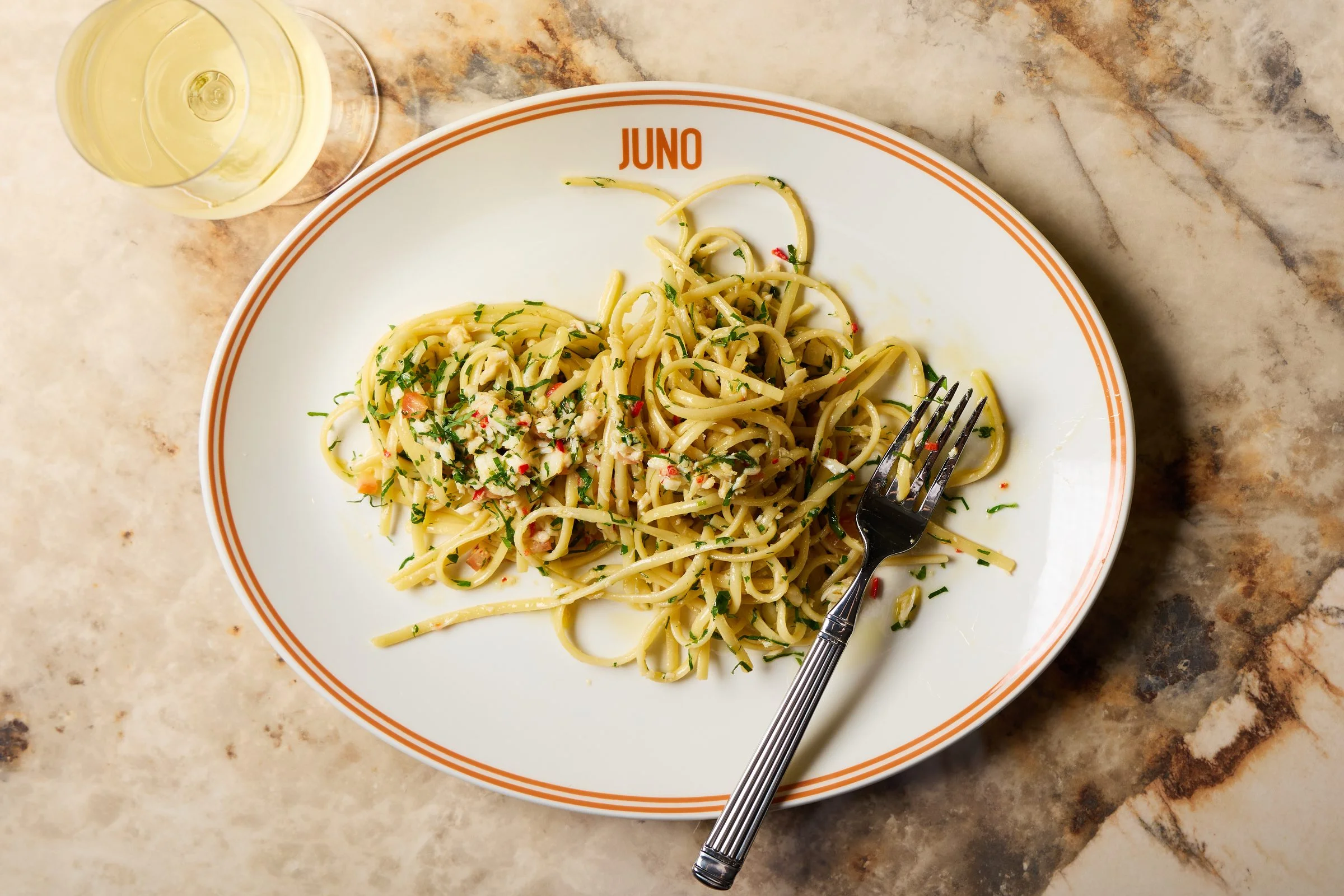
Rather than recreating familiar trattoria tropes, we drew on Italian materiality more expressively. Murano lighting, Sicilian ceramics and richly veined marbles bring an unmistakably Italian sensibility, while unexpected colours and forms keep the space contemporary and distinctly Juno.


ART AT THE WRONG SCALE, ON PURPOSE
The design team drew miniature portraits of Juno and her peacock by hand and hung them throughout. Their size is deliberately dwarfed by the monumental heritage panelling, another playful shift in scale. They appear fixed flat to the panelling, an effect achieved with discreet suspension wires. We had planned an antique brass rod above the heritage pelmet, then switched toan invisible cable so the work could hang closer to the wall.




ONE CREATIVE WORLD
Across Juno, mythology slips into materiality, branding into joinery and performance into the ordinary ritual of dinner. Historic architecture and contemporary intervention sit comfortably together, held by a creative language that runs from the smallest graphic detail to the scale of the room itself.
That only works if the brand and the interiors are imagined side by side from the very beginning. At Juno they were.
FROM LUNCH TO LATE
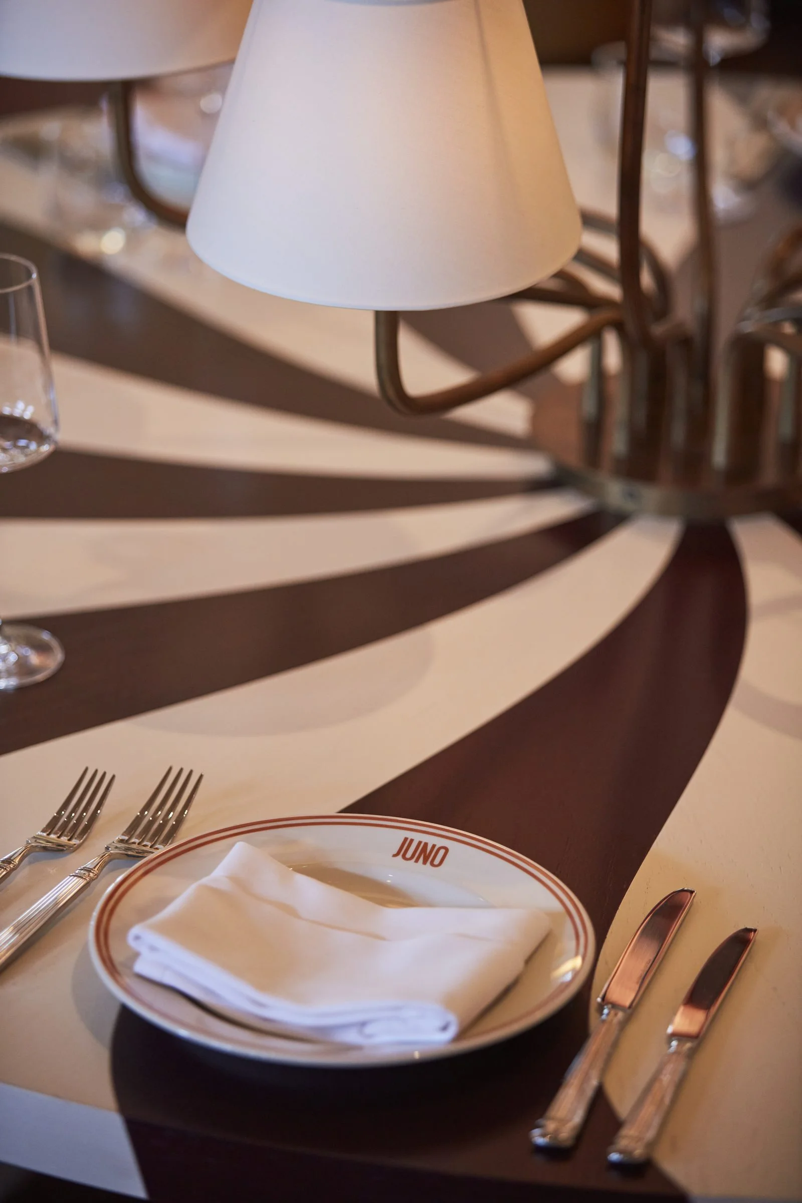
Juno had to carry a full hospitality day, so we designed itto change. By day the room is energetic, warm and sociable. As evening arrivesthe lighting drops, the bar begins to glow, and the vastness of the hall givesway to something more intimate for dinner, drinks and performance. Overheadfittings create drama while table lamps bring warmth directly to each setting,including a multi-arm lamp we designed for the project.
The playfulness carries all the way into the toilets, withpink basins, striped pebble mirrors and richly veined marble.