At Run For The Hills we are known for our fondness of a graphic map. We love designing local area maps for our restaurant and workspace clients.
Here are some of our favourites:
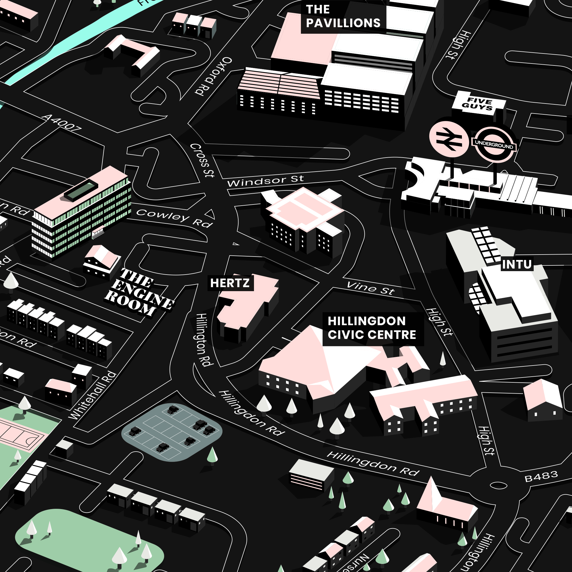
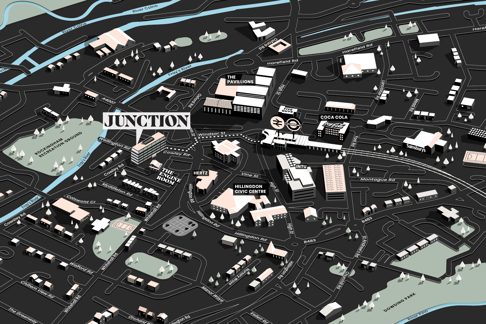
JUNCTION
A local area map of Uxbridge for our workspace project, Junction.
See it full screen over here: junctionuxbridge.co.uk
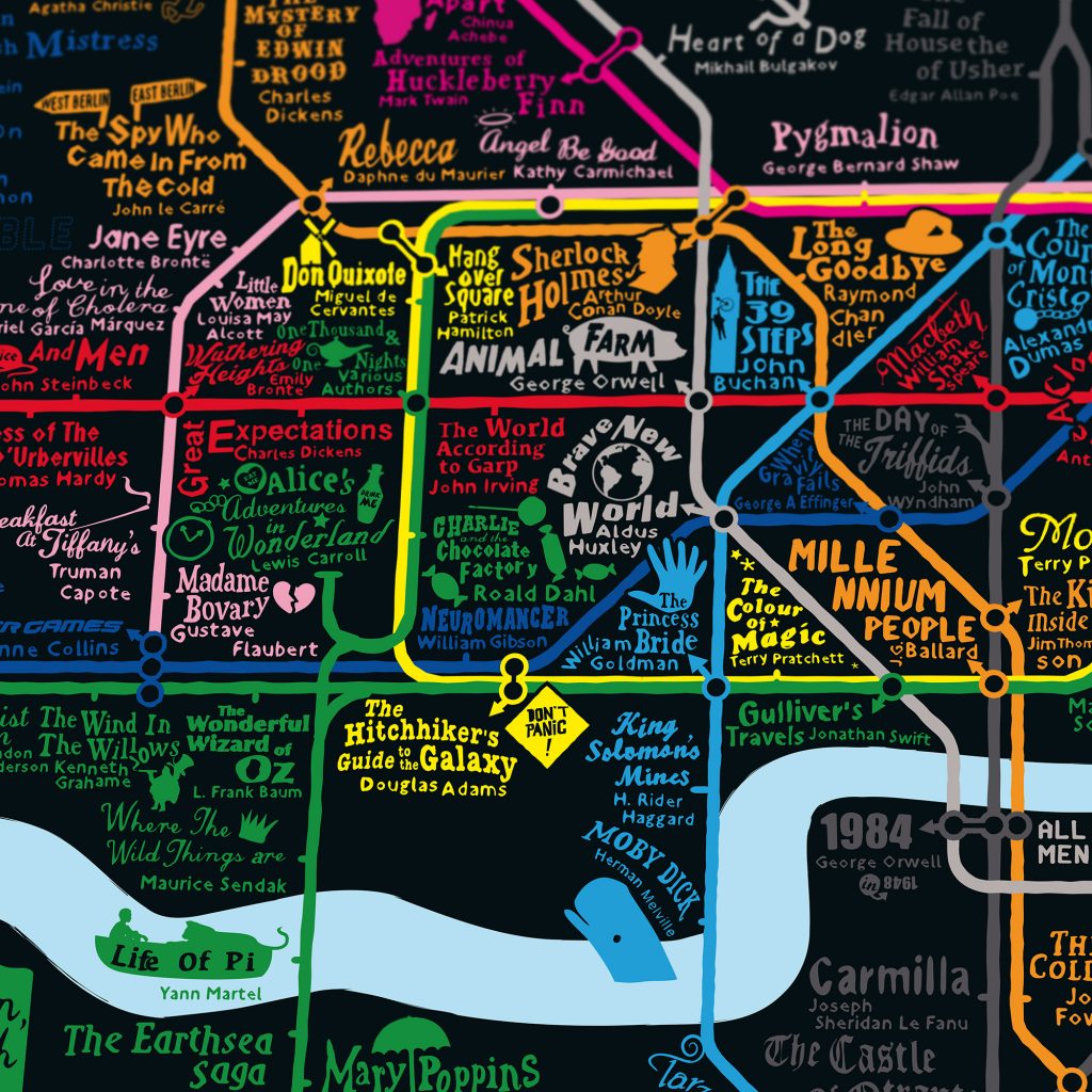
STORYLINES
Our popular tube map, a journey through different styles of storytelling, with the individual tube lines turned into genres of literature. The depths of the Northern Line have been made into the aptly named Horror Line. The Bakerloo Line coursing past Sherlock Holmes’s Baker Street becomes the Crime & Mystery Line. Stations falling on intersecting Storylines get a sub-genre cross over.
Buy a Limited Edition print over here.
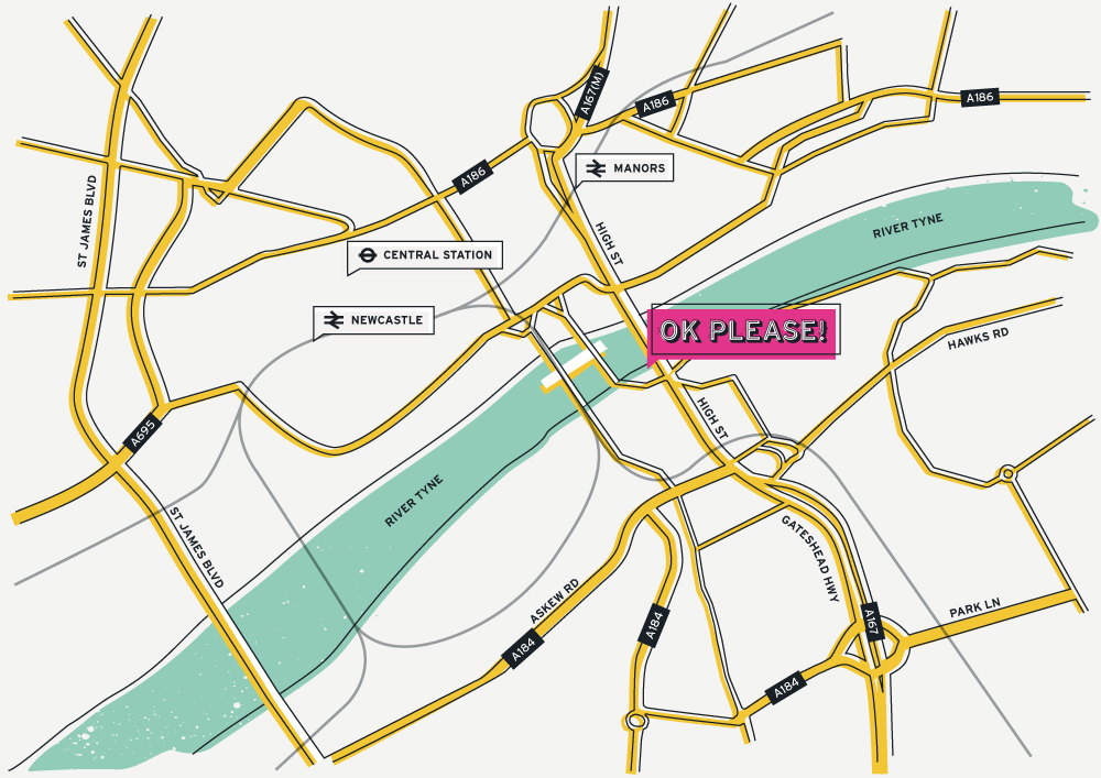
OK PLEASE
A map of Newcastle showing the location of OK Please’s yellow shipping container in the HWKRMRKT under the river Tyne bridge. A slightly offset, brightly coloured creation that fits perfectly with the street food brand we designed for them.
Check out the website: https://okplease.co.uk
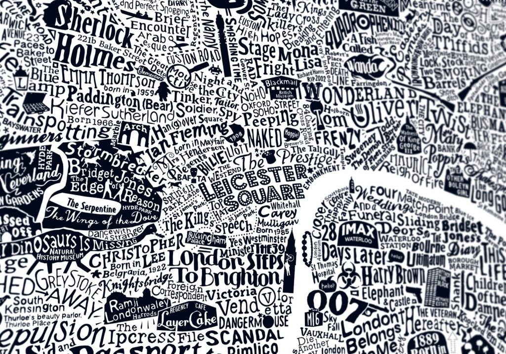
LONDON FILM MAP
A close up from the intricate hand-crafted typographic map of London swarming with film titles, actors and directors, plotted on the map where they most made their mark. Also featuring some of London’s most iconic picture houses, film studios and red carpet locations. Combining hand-drawn typography and illustration, this is one of a number of typographic maps we’ve created of our beloved capital.
See them all here: https://www.londonartprints.co.uk/category/typographic-maps
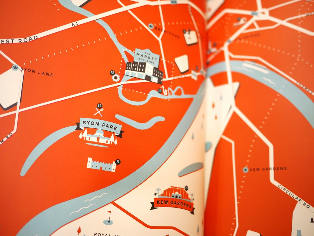
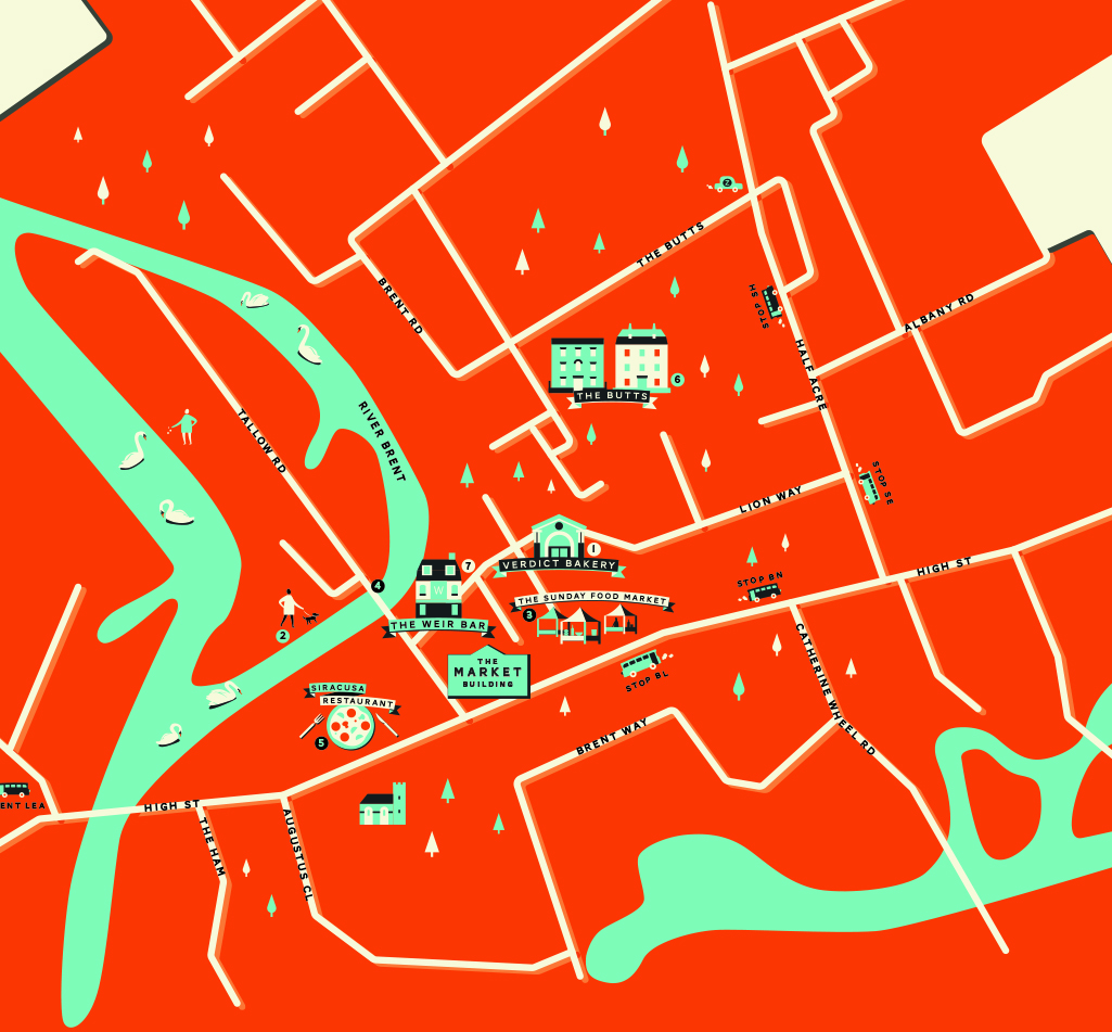
THE MARKET BUILDING
Here is the map we made as part of our branding work for residential development The Market Building, shortlisted for the Property Marketing Awards in 2017. The map featured as a fold-out of the colourful brochure we designed for the development.
Find out more on our case study: https://runforthehills.com/portfolio/the-market-building/
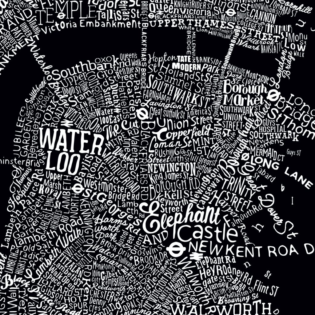
TYPOGRAPHIC STREET MAP OF CENTRAL LONDON
A painstakingly intricate, hand-crafted type map which is designed to actually be navigable. Find the road you live on, the street you hang out in or the patch you’re itching to move to. Use it to plot a new cycle route to work, or plan a day’s riverside hopping along the curved sweep of the Thames.
Buy one over here.
THE WIRELESS FACTORY
A fun, interactive map of the local area for another workspace project in leafy Isleworth.
Check out the website over here.
![]()
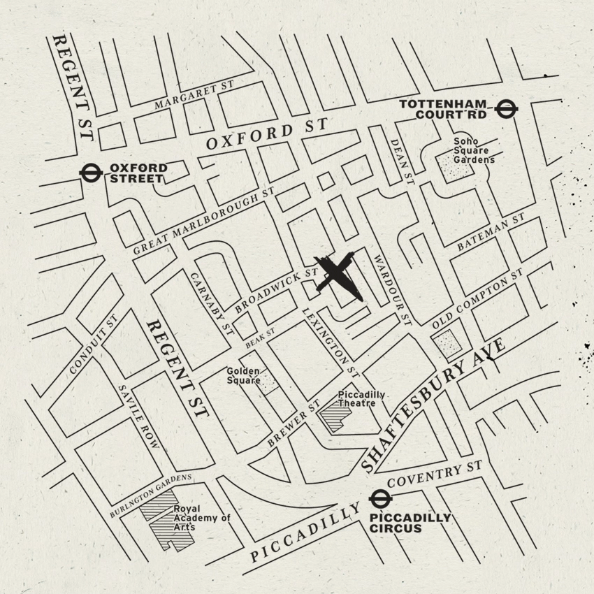
TEMPER RESTAURANTS
Here are three maps we made, one for each of Temper’s three London restaurants. We wanted a lo-fi charcoal feel to them, in keeping with the brand refresh we gave them, on the new website we designed for them:
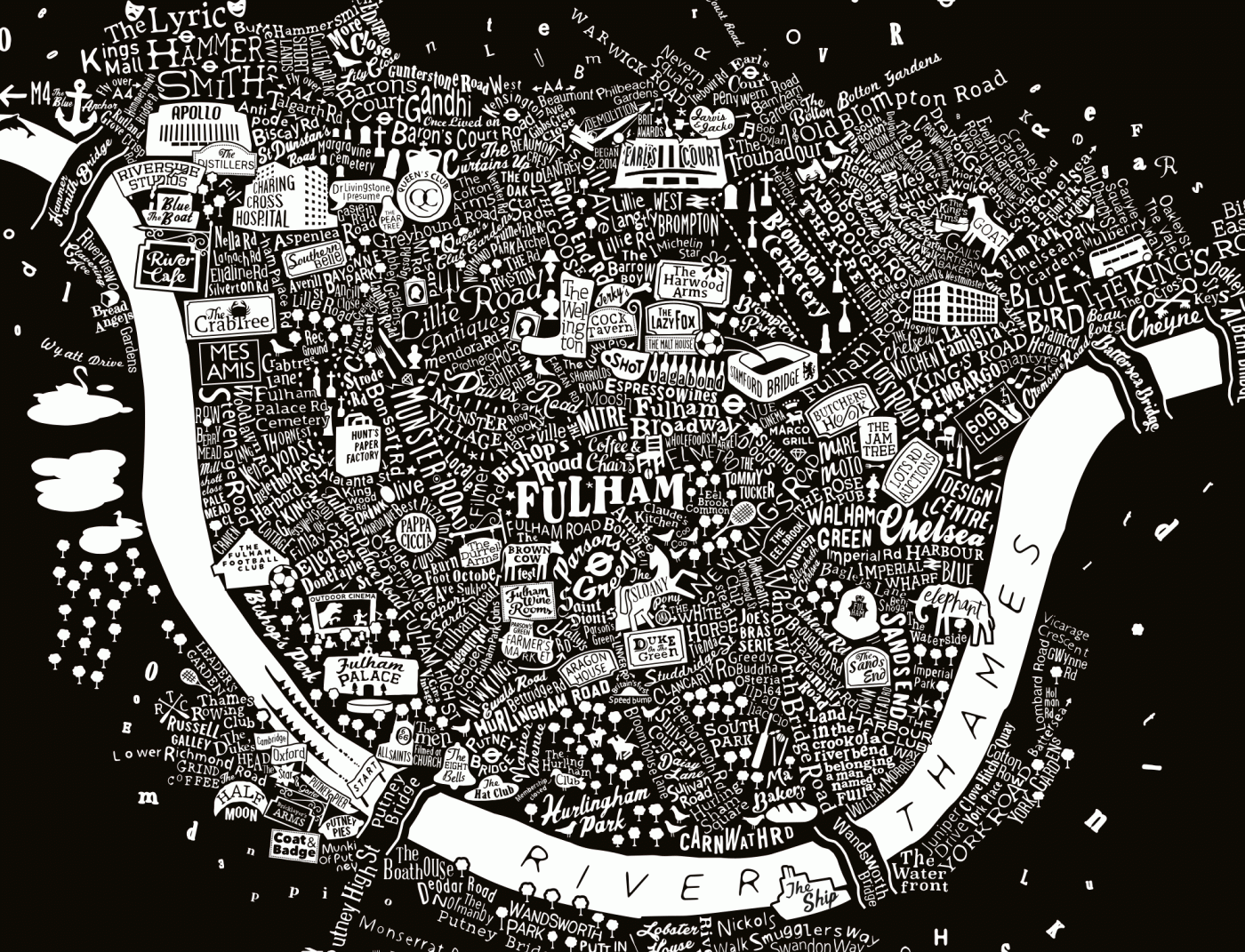
HUNT’S PAPER FACTORY
A typographic map we created for another residential development in Fulham that converted an old paper factory into 34 luxury apartments.
Winner of the 2016 Property Marketing Award for Residential Regeneration.
View our case study over here.