Viva La Revolution
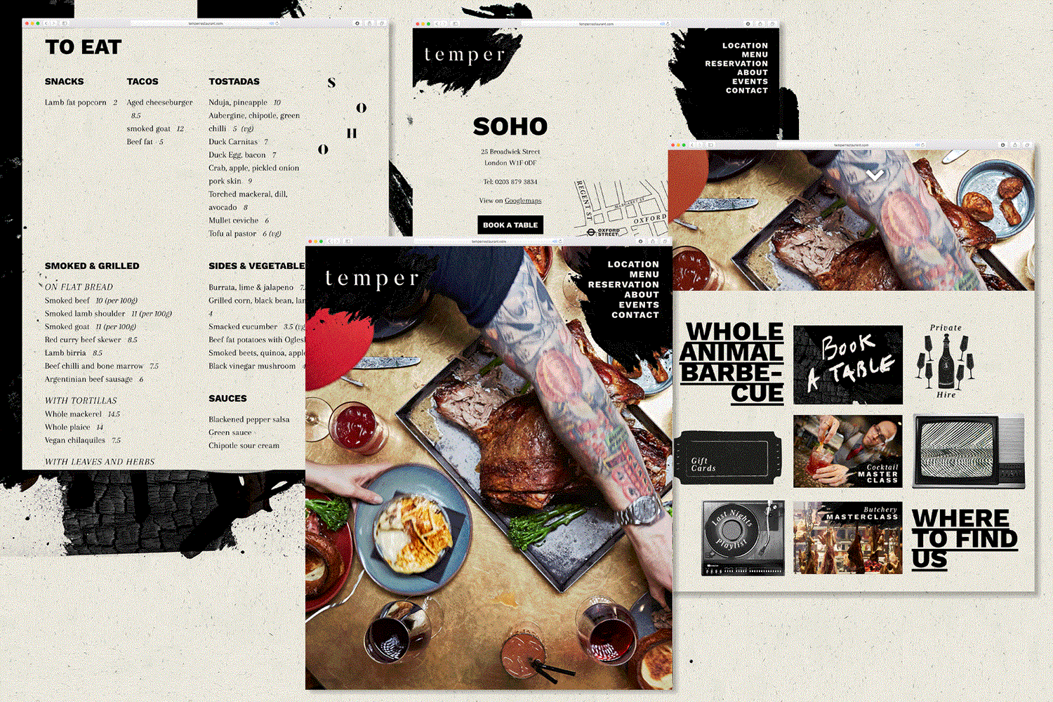
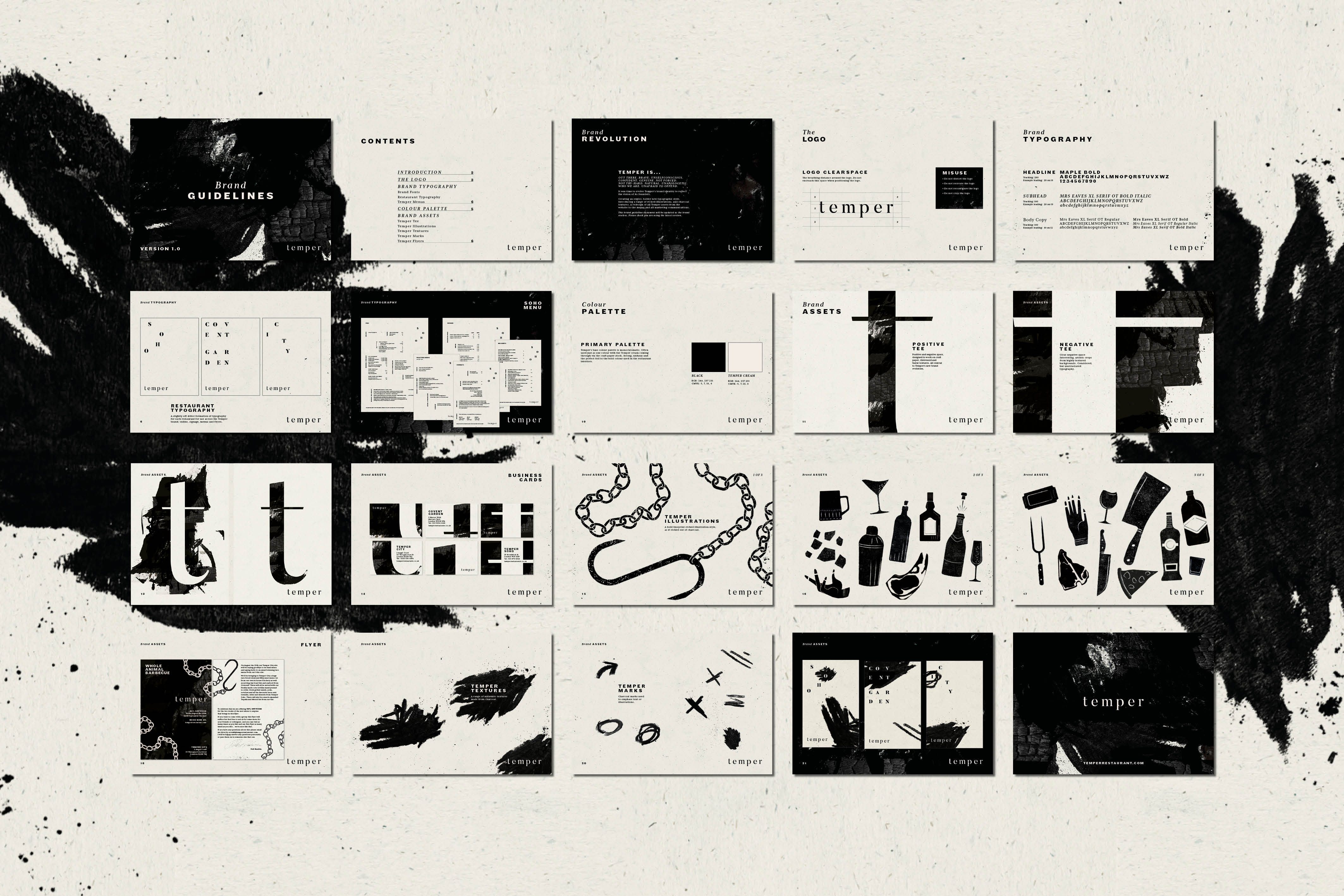
We were recently tasked with evolving London restaurant group Temper’s brand identity to reflect the vision of its founders. The brief was a re-design of all Temper assets from the website to the menus and all marketing communications. Game on. We set about creating an edgier, bolder new typographic style. Then introducing a range of etched illustrations, and charcoal textures.
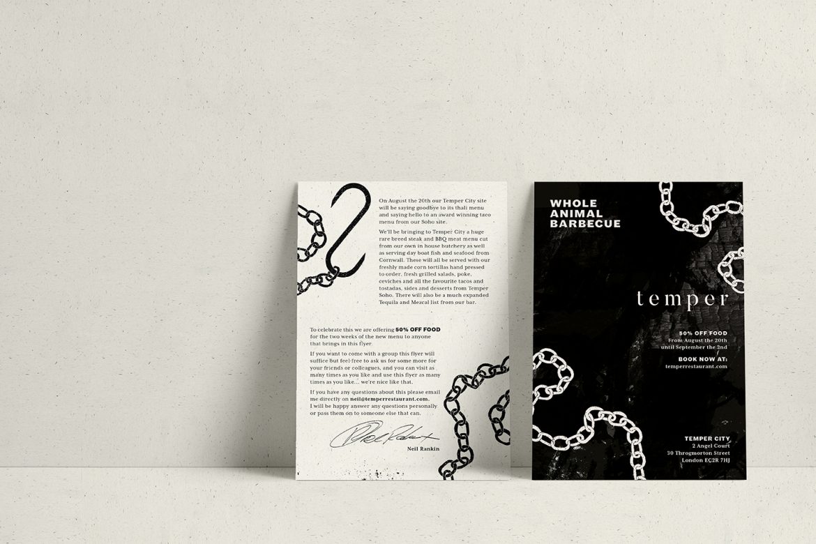
Whole Animal Barbecue
Our graphic branding design works were cooked up in the studio with Neil Rankin and Sam Lee over the last six months. The jewel in the crown is Temper’s shiny new website; inky & charcoaly, full of triple shot attitude and edgy-cool, befitting the chef man himself.
In fact, Neil’s tattooed arm takes centre stage in a stop frame animation kind of way and the website is full of quirky animation. The site also heralds the culinary heroics of the whole Temper kitchen and front of house team, and tells tales of some of Temper’s much-loved suppliers.
Playful
Asymmetry
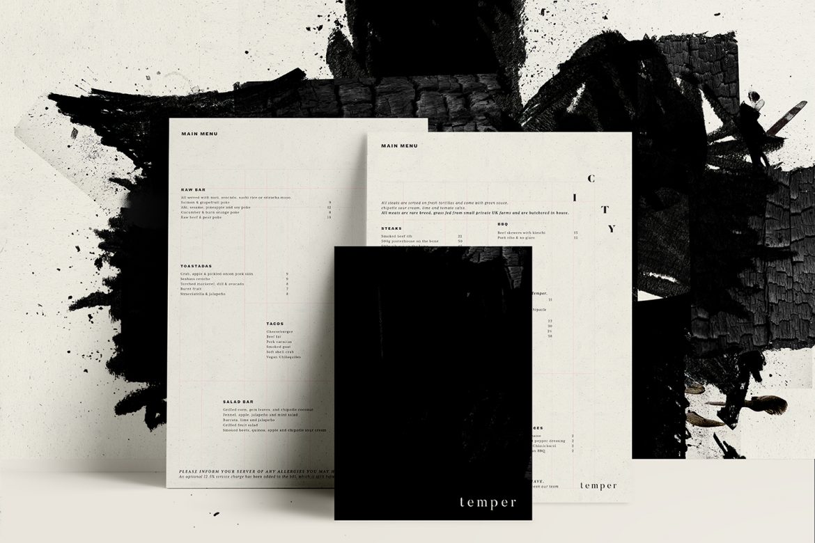
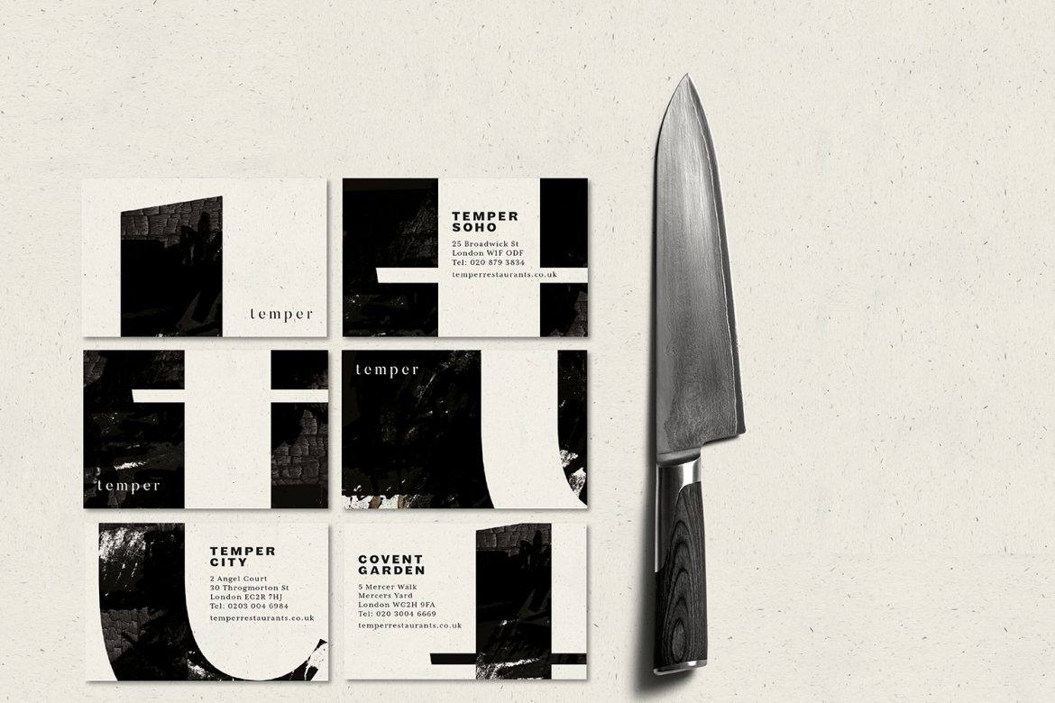
At the heart of our new graphic look and feel is a slightly off-kilter formation of typography, which we created for each restaurant. Designed for them to use across every element of the Temper brand; online, signage, menus and flyers. To keep with the love-of-off, we also gave the menus a pleasing lack of symmetry, on a range of recycled craft papers that can be printed in-house to allow the team to respond to an often-changing food offer.
Brand Personality
For the brand styling, we played with positive and negative space, distressed and burnt textures, set upon recycled paper. We used interesting, artistic crops from highly textural backgrounds and formed very carefully-considered, but thoroughly unstructured-feeling typography. All of these assets are designed to create a visual tone of voice, which is central to Temper’s new brand evolution.
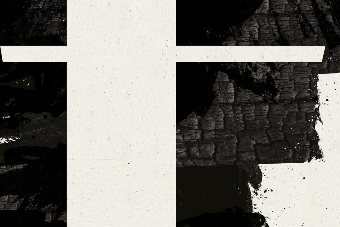
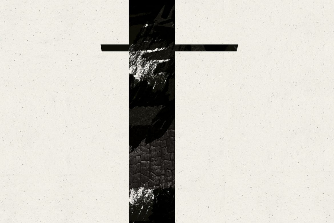
Etch Etch & Away
We hand crafted a bold, linoprint illustration style for the project, as if etched out of charcoal. Smudgy chains, knives, mezcal & gin bottles, smoke and fire aplenty.
Insta Takeover
We also took to Temper’s instagram feed. And designed a curated new look and feel, filling a host of insta squares with some of our favourite new creations, illustrations and brand assets. Using the feed to introduce the new visual identity, shot through with lashings of attitude and whole Temper cool.
Services used
Website Design
Illustration
Branding
Menu Design
After Effects