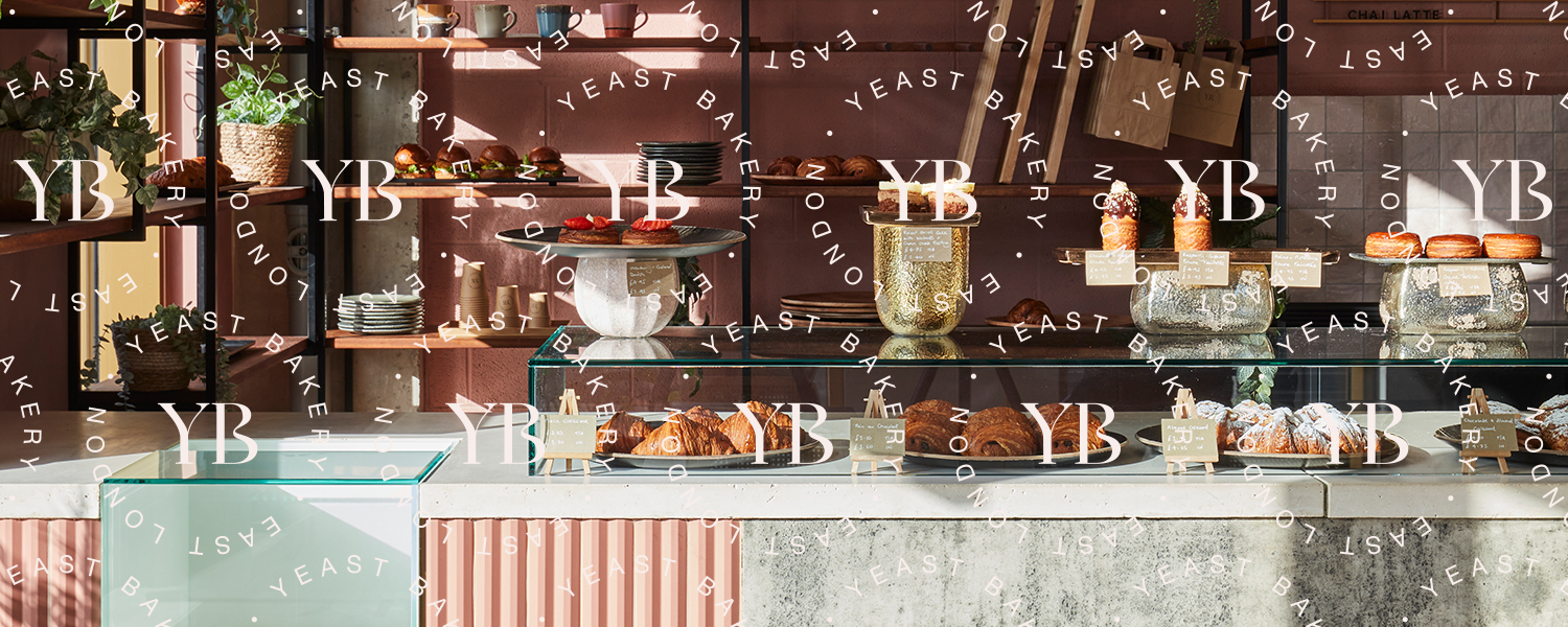
Ahead of the move to their new canalside premises, our graphics team gave Yeast Bakery a clean and simple brand refresh. Creating a new timeless and elegant bespoke logotype and two minimal lettermark roundels.
The client gave us quite an editorial fashion steer on the branding that we were happy to run with. Contrasting a bespoke serif font with simple Helvetica for the logotype, but making the lettermark roundels the main focal point. For the colour palette we chose a pale pink and a pinkish charcoal colour that compliment perfectly the bakery’s new interiors.
The Brief
Owners Ben Keane and Angela Chan started the bakery in 2011 with a simple goal – to make the perfect croissant. Focusing on simple, quality ingredients, they combine the craft, care, and attention to detail of baking to make their viennoiserie and bread. Researching, tasting and testing to ensure everything their bakery makes is delicious:
“When we decided to take on a larger new home, we wanted to take our brand and interior design to another level and enlisted the help of Run For The Hills to do that. We were particularly drawn to them as they have both branding and interior design disciplines in-house, and we loved the idea of being able to work with one creative agency on both, as we believe both reinforce one another.”
We used the idea of ‘broken plan’ within their new spatial design concept, to allow for a smooth customer flow and openness, whilst creating distinct zones. Each area was designed to feel part of a family design language, but each had their own identities (not just from a graphical perspective, but also in terms of the materiality used). Using largely loose furniture to help differentiate these zones, which have a double purpose, allowing the clients to use the space for event hire, easily transforming and reconfiguring it for live music performances and specialist gatherings.
Interior Finishes
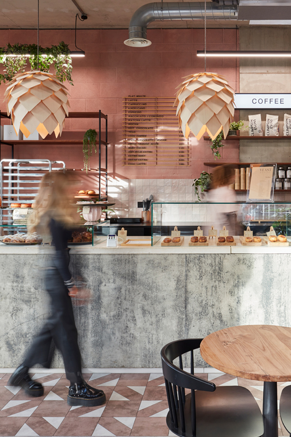
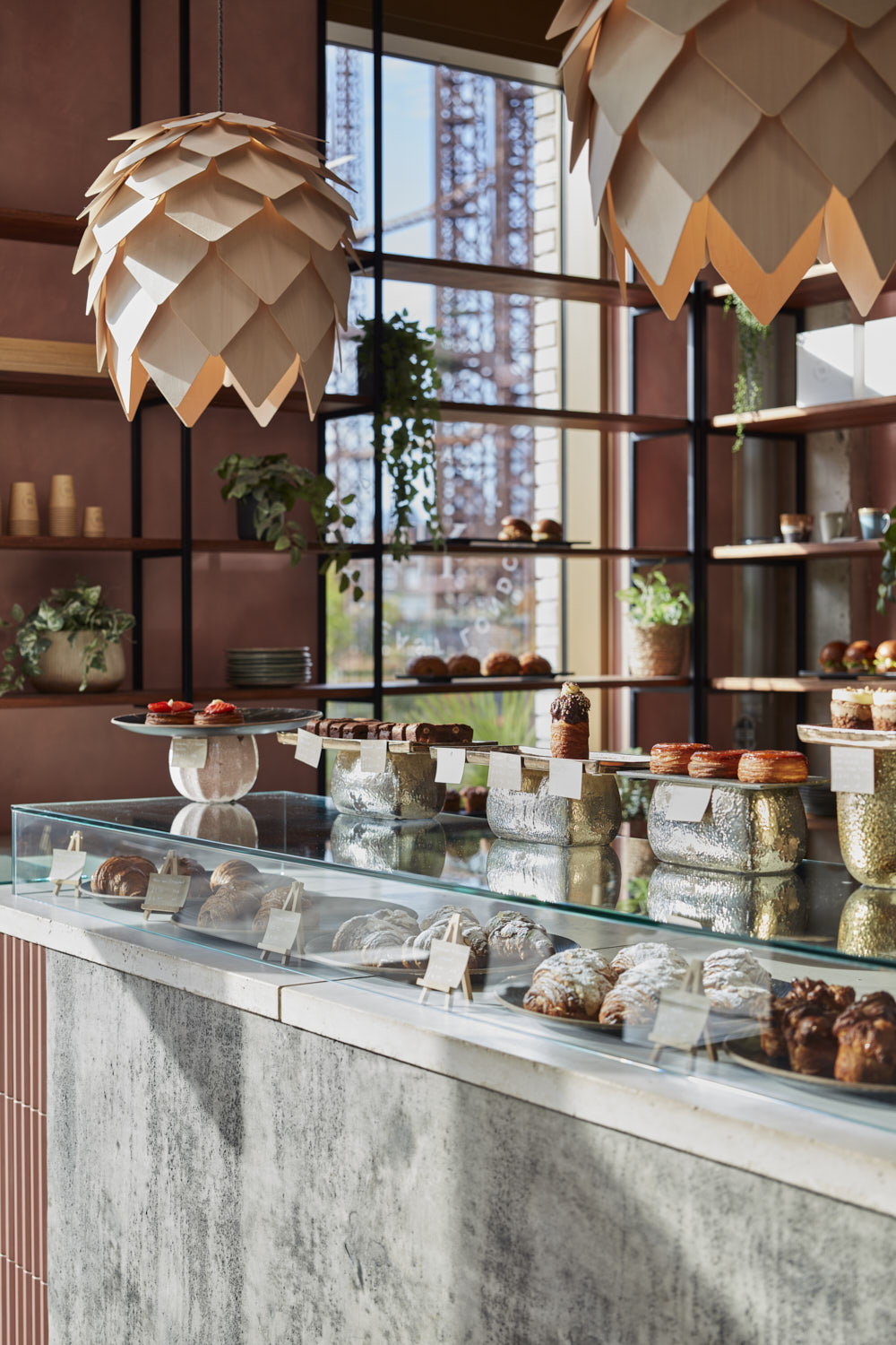
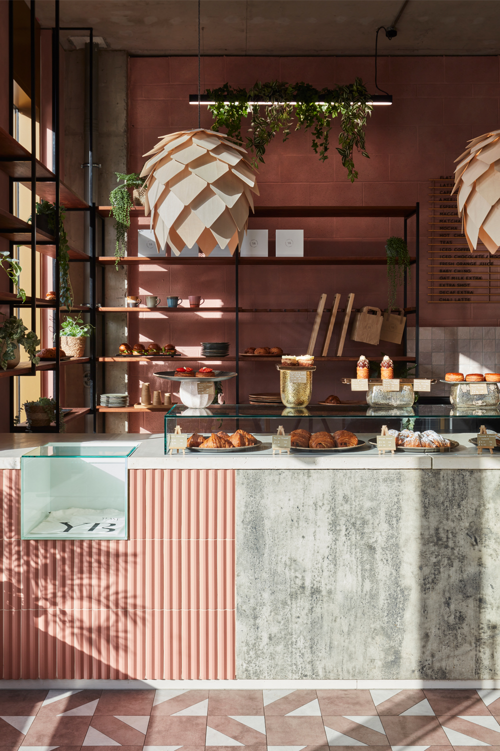
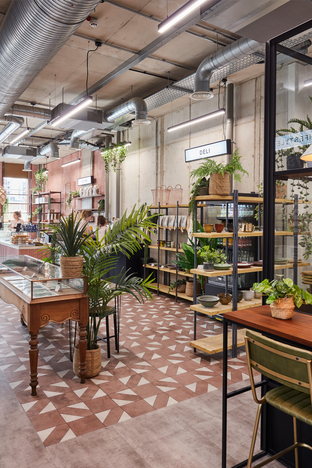
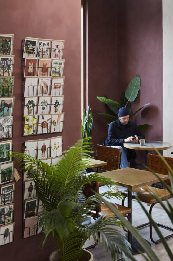
Our design team specified Bauwerk Limewash for the walls to add a vintage, lived in look to the previously stark white walls. Choosing a rich plum tone in the cafe seating niche and a dusky soft pink behind the main bar counter. The movement and texture in limewash also makes it age really well, recquiring less maintenance than standard paint. The deep paint colours allow the exposed concrete pillars around the venue to add a touch of fresh rather than feeling raw or cold as they had against the previous white-washed walls. The colourful, sophisticated decorative palette plays well against the Industrial exposed ceiling and galvanised extraction pipework, adding a much softer feel to the industrial unit.
The Bar & Dining
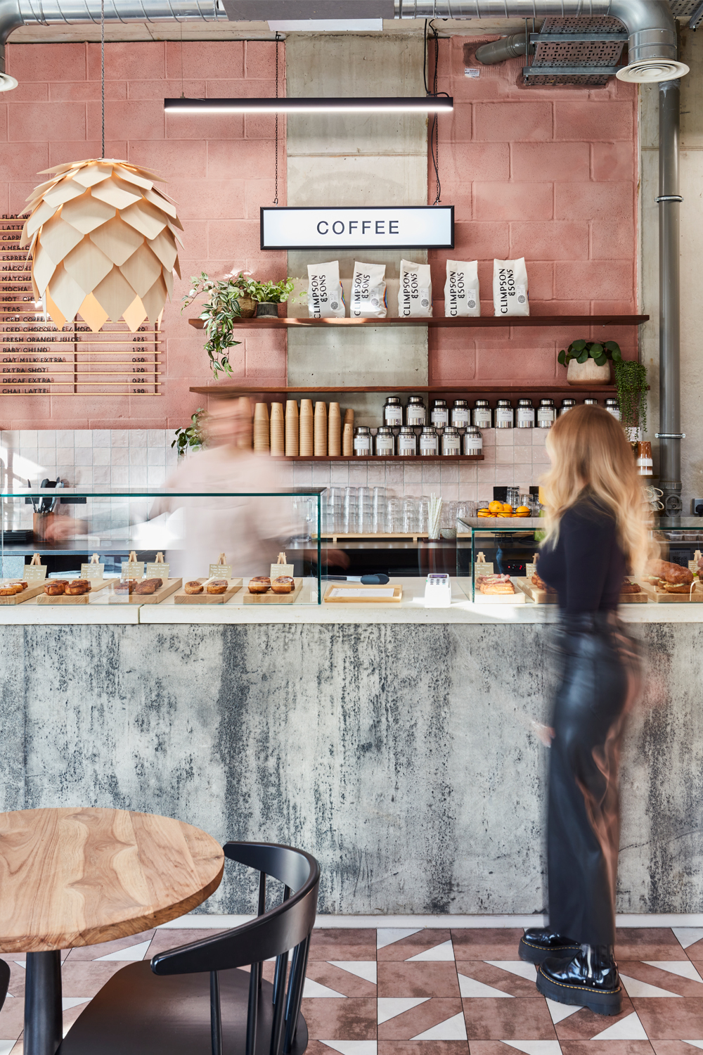
The cafe / deli counter is topped in solid concrete with a textured concrete front with soft pink 3D porcelain tiles from ArchiTile. Beautiful frame-less pastry display cases showcase products at counter level, with artisan tiered displays above, creating a low-level display allowing for maximum view of the tracks of breads displayed behind. Bakery display shelving made from rich timber and blackened steel wraps in an L shape around the back of the bar across the full height of the main front window, displaying pastries and bread.
The cafe/bakery flooring is a mix of concrete and white and pink patterns. Crittall glazing designed by Run For The Hills, divides the large open kitchen bakery space from the cafe.
Customers enjoy coffees, pastries and light bites at a mix of seating set ups, including a timber high bench table, tactile, leather topped tables with timber frames and a mix of zinc and black tables with eclectic dining chairs. Rattan and woven bohemian furniture was selected for the outside terrace to soften the glazed box shopfront.
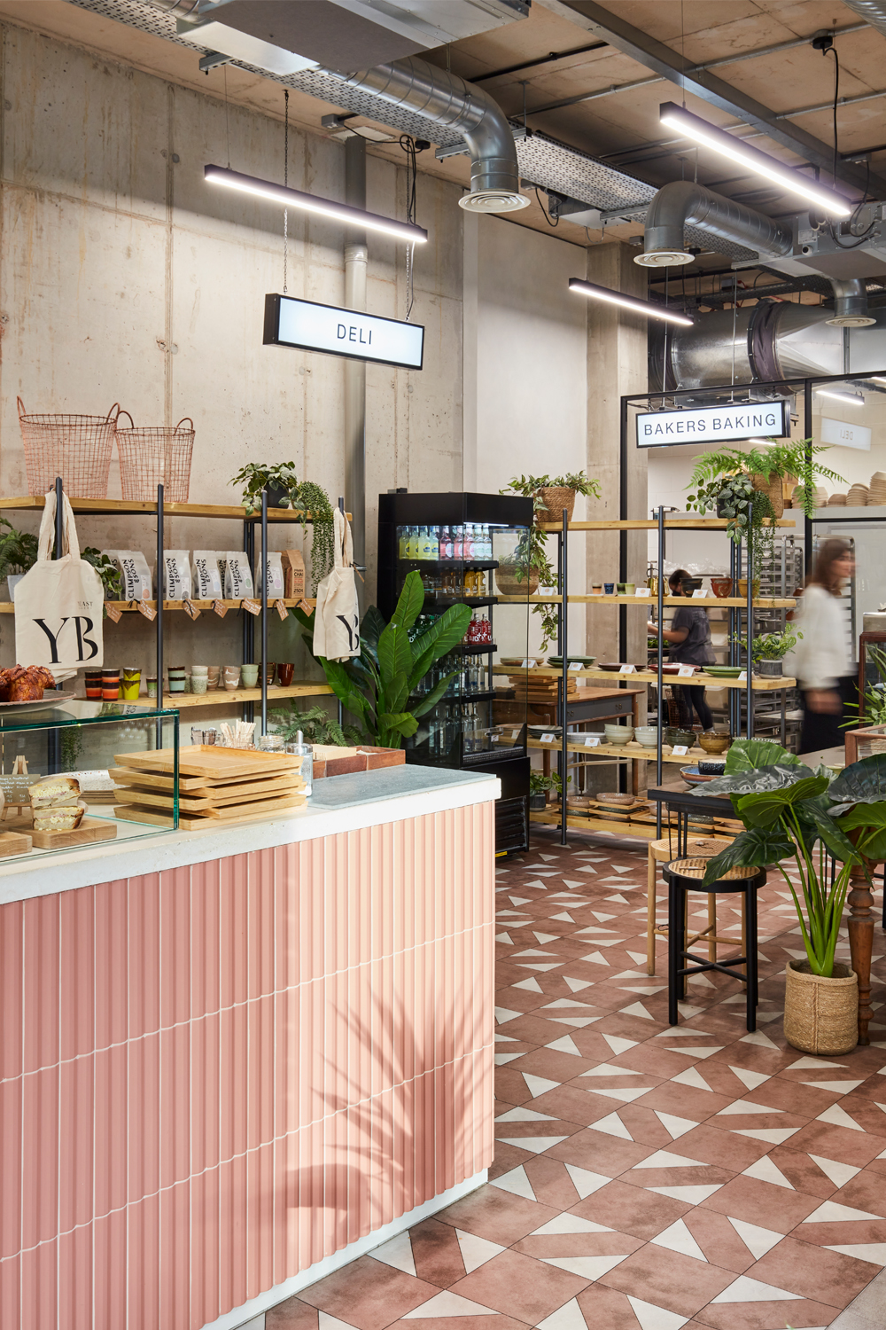

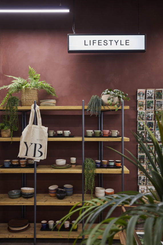
Industrial timber and metal shelving units were designed to display coffee beans, chai tea and handmade gifts, cards and accessories. Retail display space is also used as a key part of the zoning between cafe and working bakery.
For in-venue graphics, we developed designs for a series of blackened steel framed lightboxes hanging on metal chains to help zone each space. Which add lots of character and extra personality to the brand environment, as well as being useful and functional.
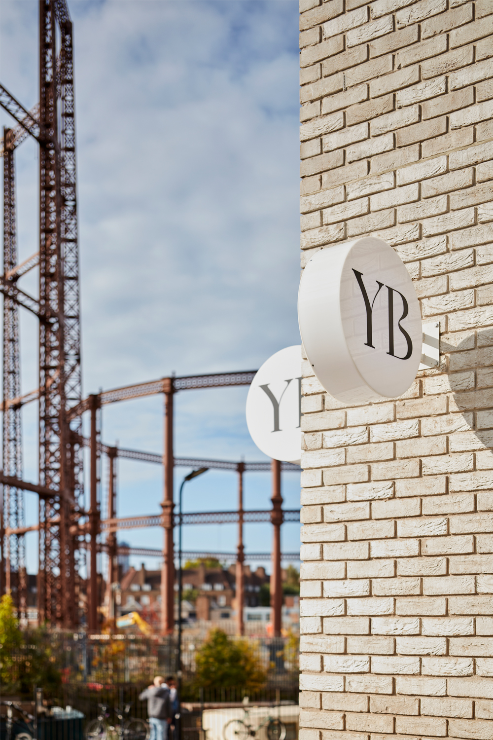
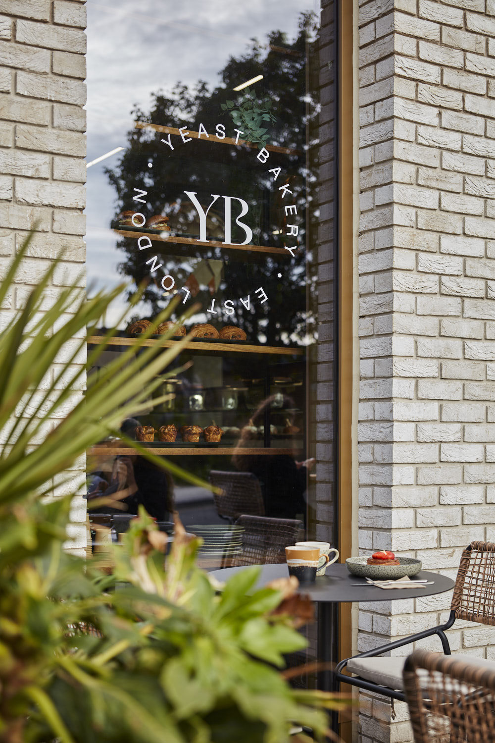
External Signage
For the exterior we designed two fresh white projecting signs with the new lettermark, and creative white brand decals on the windows. Not just to add messaging for passersby, but to also create a cozier, more intimate feel for customers inside. Sitting beside a giant glazed window can feel a little bit like being inside a goldfish bowl.