LUNCH MEN OF MUMBAI
Award-winning Street Food Pioneers Dabbawal approached us to help them refresh their brand. Dabbawal, winners of the British Curry Awards 2015, have two popular restaurants in Newcastle. One in High Bridge, in the heart of city, and the second in the leafy suburb of Jesmond.
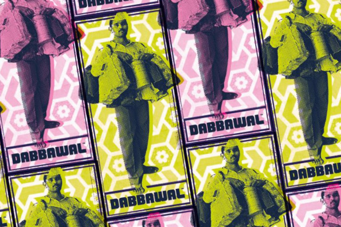
Inspired by the famous Dabbawala lunch delivery men of Indian cities, they created their urban kitchen concept long before the craze for street food hit the UK.
And they’re still breaking the mould, serving up unique dishes derived from traditional street favourites in busy kitchens which buzz with conversation and comings and goings – just like home.
Full case study over here.
UNBRANDED BRAND
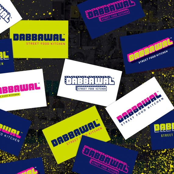
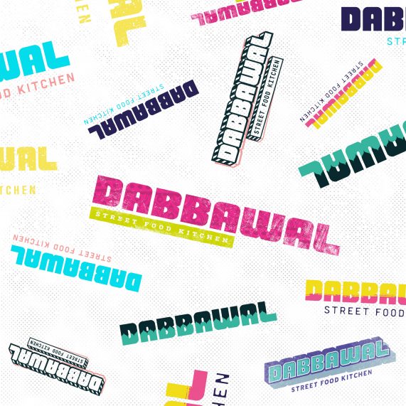
More a brand ‘evolution’ than a rebrand. We started by developing a bold new colour palette and refreshing the logo. Creating a suite of brand assets including business cards, press adverts, in venue graphics and a complete website overhaul.
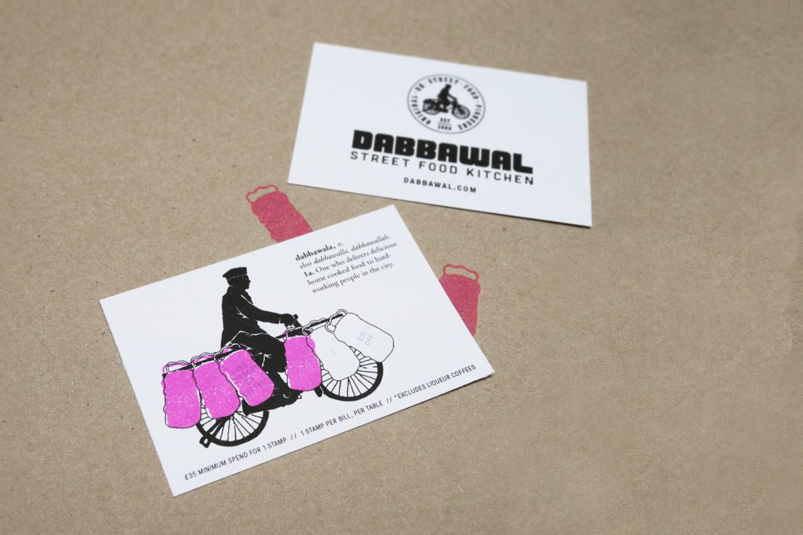
Keeping Dabbawal at the cutting edge, we developed a revolutionary ‘unbrand’ style. Not one logo, but a set of logos. Rather than one business card we create a range of them. Different colours and styles, yet clearly from the same brand family.
A VIBRANT LIFE
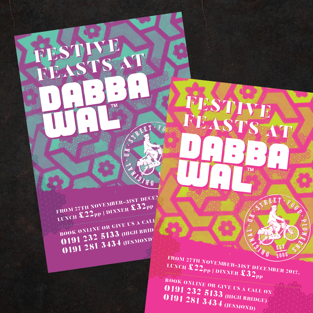
The sub continent of India is full of vibrant colours, and we wanted Dabbawal’s brand to reflect that. Zingy lime greens, hot pinks, yellows and dark purples.
BRAND INFUSION
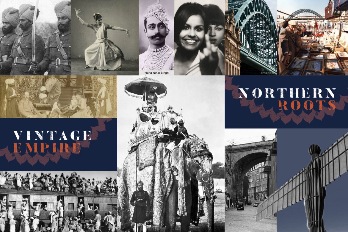
We took inspiration from themes of Vintage Empire, Bollywood Kitsch, Indian Signage and patterns, whilst retaining their proud Geordie roots in the North of England.
STREET FOOD PIONEERS
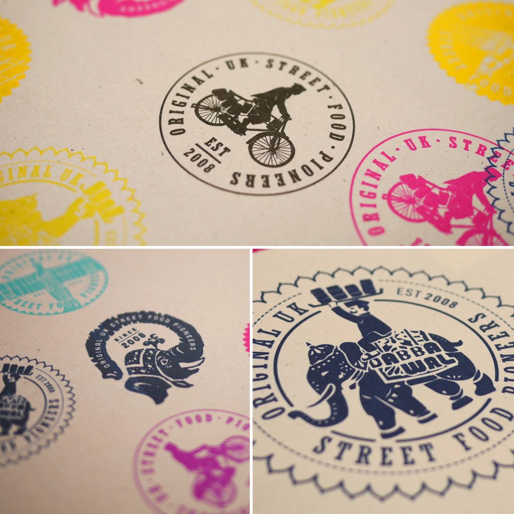
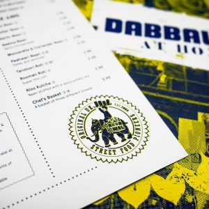
A key deliverable for us to create was a roundel stamp that proudly heralded their role as one of the early pioneers in the street food revolution.
We developed a few ideas, themes of Indian Elephants, Dabbawalas, as well as a nod to the Angel Of The North. And in keeping with our new brand unbrand direction they decided to use them all!
IN THE BACKGROUND
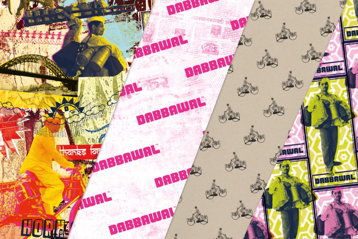
We developed a range of wallpaper and pattern designs that were used in venue, on packaging, online and in marketing collateral.
COLLATERAL DAMAGE
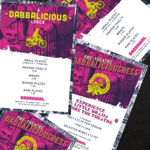
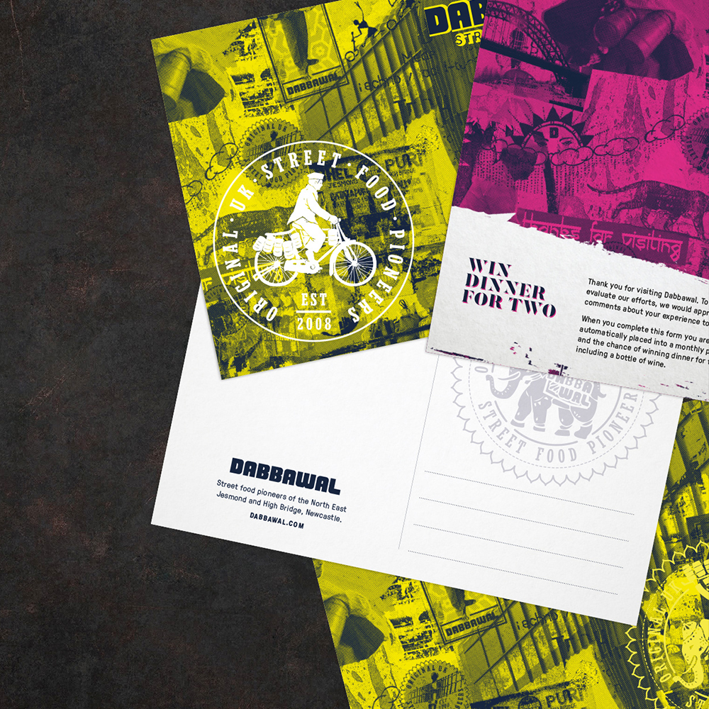
We really enjoyed shaping such a fun brand. Designing promotional materials like postcards and press advertising. There was a lot of flexibility in the new brand to go a little off piste here and there.
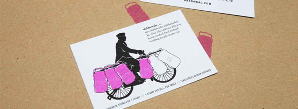
LOYALTY CARDS
The loyalty card, of course, has a Dabbawala on his bike, laden with tiffins full of delicious home-cooked goodness.
WEBSITE EVOLVED
We wanted the bold, colourful vibrancy of the restaurants to be reflected online.
Starting afresh, we built a new responsive WordPress website. Taking inspiration from Indian signage, we wanted the site to be playful with an approachable and friendly tone of voice, making it fun to explore.
The menus are clearly and stylishly presented. A bespoke reservation system that we developed to be integrate seamlessly into the site making it easier for our customers to book a table.
www.dabbawal.com
MAKING MANY MENUS
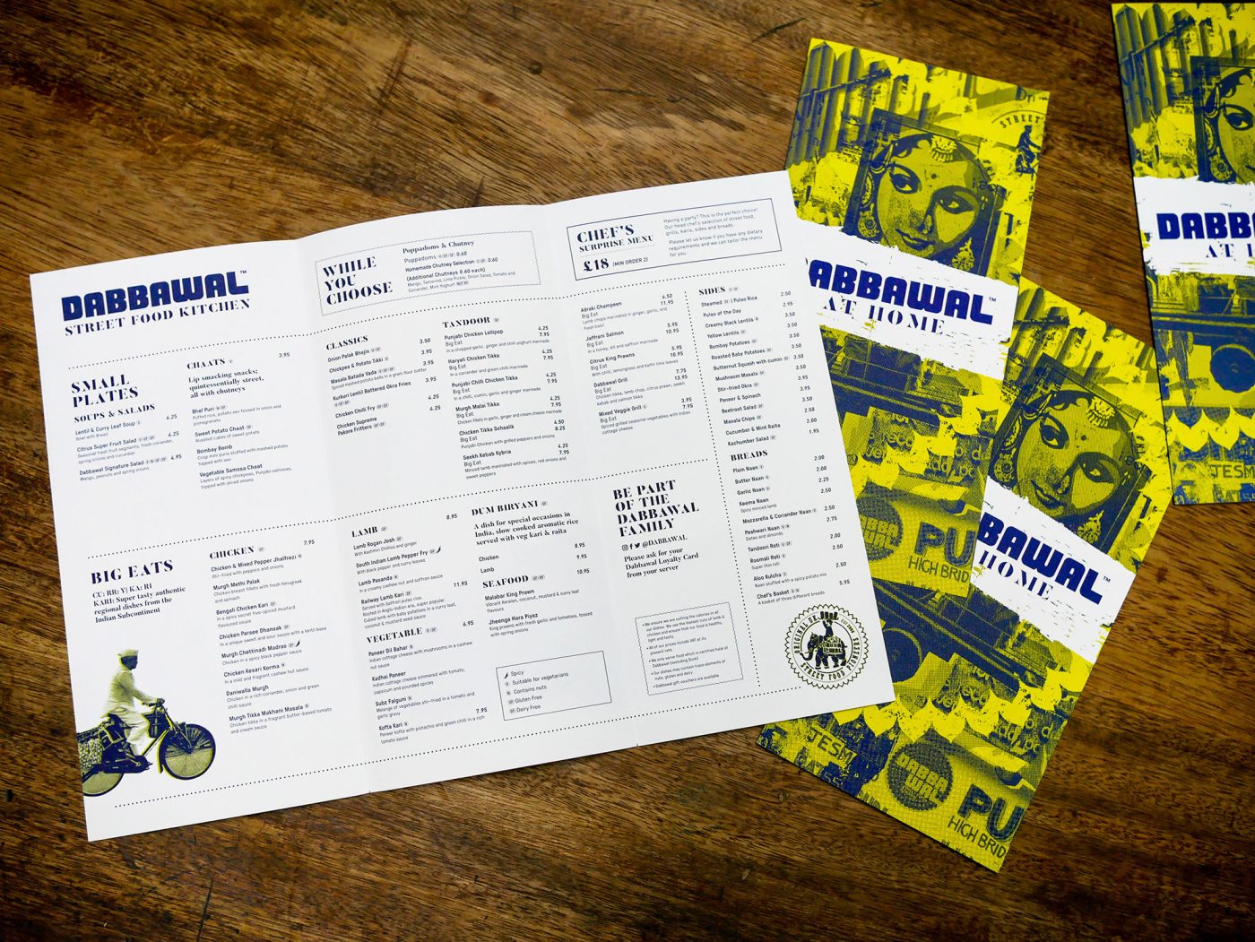
We love designing menus, particularly when you have a brand that is brave enough to run with some of the crazy ideas and designs our team came up with. Full of elephants, Indian montages and dabbawalas. From the current trend of table top disposable craft paper menus, to large size colourful Dabbawal At Home takeaway menus. Single page lunch special menus and book-bound hard cover drinks menus.
SaveSaveSaveSave
SaveSave
SaveSaveSaveSave
SaveSave
SaveSave
- AI
- Animation
- Art
- art deco
- Awards
- bar design
- branding
- coffee
- Custom Neon
- Exhibition
- Graphic Design
- great spaces
- hospitality
- hotel
- illustration
- Images
- images that make you stop
- In Conversation with...
- In Venue Graphics
- Inspiration
- interior design
- jobs
- Lighting Installations
- Limited Edition Art Prints
- maps
- miscellany
- Nature
- Neon
- New work
- Opinion Piece
- Our Process
- photoshoot
- Press Coverage
- product design
- residential design
- restaurant design
- shop
- sourcing
- styling
- Taxidermy
- tee shirt design
- The Other Art Fair
- The Studio
- Travels to remember
- Uncategorized
- Video
- Wallpaper
- website design
- window decals
- workspace

